Shopify is one of the top platforms in the rapidly expanding e-commerce industry. It continually empowers millions of merchants worldwide and attracts and engages customers.
But how does Shopify do this?
One of Shopify’s secrets to capturing the attention of visitors is through its visually appealing banners. For online stores and merchants, banners serve as powerful tools. They help showcase your brand, promote products, announce sales, and create a welcoming atmosphere for potential buyers. But there’s a catch! To make the most out of these digital billboards, it’s essential to understand the ideal Shopify banner sizes and their design principles.
So, here’s an all-you-need-to-know guide to the rescue! Here, we’ll provide you with the best practices to create stunning and effective banners for your Shopify store. In this guide, we cover a bunch of strategies for optimizing banner images, choosing the right formats, and maintaining image quality. As an added bonus, we’ll explain some design principles and offer you a bunch of tips to help promote your band and ultimately enhance customer engagement.

What’s-in-a-Banner?
Shopify stores require a variety of images. These include product images, collection images, and slideshow images, to logo images and banner images.
Though, understanding the difference between banners and other images is key. Similar to slideshow images, Shopify banners can incorporate text.
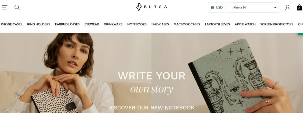
However, unlike product or collection photos, banners typically appear at the top of your store’s homepage. This makes them a prime spot to grab visitors’ attention. To ensure a clear and appealing first impression, use high-resolution banner images that are free of clutter.
Why Does Banner Size Matter?
Before we get going, it’s crucial to first know whether or not you need to get your banner size right. As we already talked about, visually compelling and aesthetically pleasing banners only appeal to their best when they fit their specific dimension sizes.
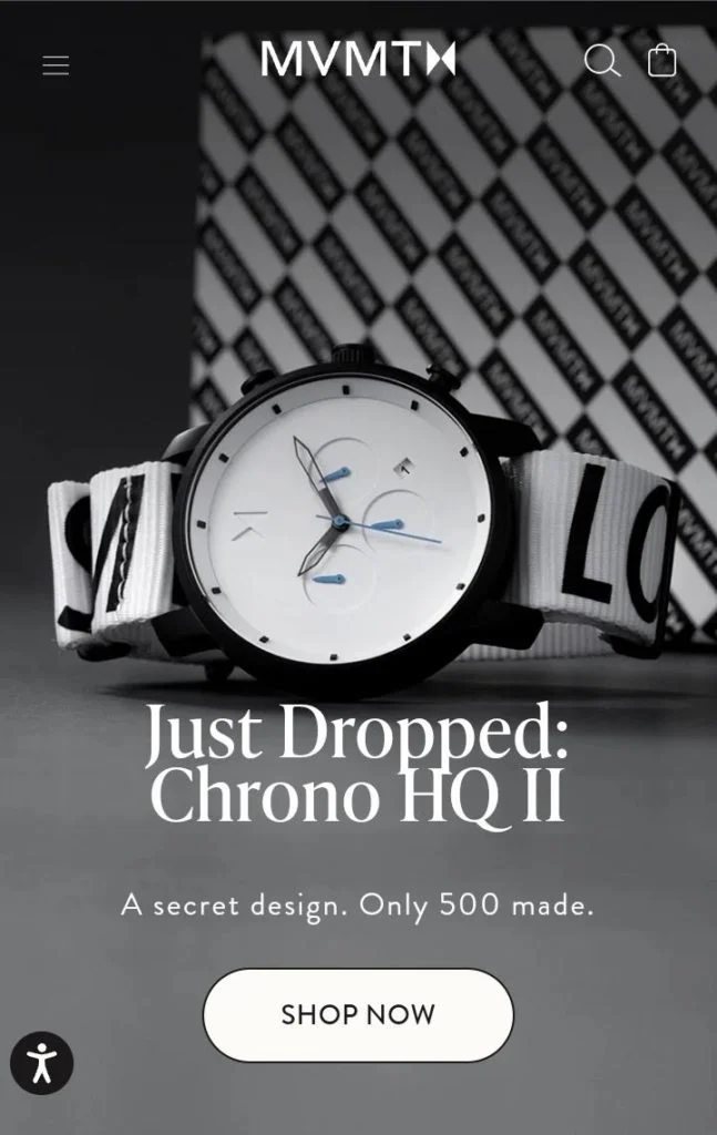
For example, pictures appropriately fit on various devices, including desktops, laptops, tablets, and smartphones have their specific dimensions. A flexible design is essential given the ever-increasing popularity of mobile shopping. It helps maintain a consistent and good user experience across all devices. This in turn enhances consumer engagement and conversion rates.
Shopify Banner Size Guide
Let’s get started with this guide! This guide will act as a valuable resource to provide you with essential information specifically to create visually appealing and eye-catching banners for your online store!
Maximum and Minimum Banner Sizes
First off, it’s crucial that your banner is displayed correctly, and that it doesn’t get cut off or distorted. For that, it’s important to know the maximum and minimum dimensions allowed on Shopify.
Maximum Size: On Shopify, banners can have a maximum width of 2560 pixels. This makes it more likely to display properly on bigger displays without degrading or cutting out.
Minimum Size: Although there isn’t a set size requirement, it’s typically advised to have a banner width of at least 1024 pixels. This keeps the visual quality at a basic level and avoids pixelation on bigger screens.
Recommended Banner Dimensions
The best practices for Shopify banners include dimensions around 1200-2500 pixels in width and 400-600 pixels in height. In terms of aspect ratio, a landscape orientation, or 16:9 aspect ratio works best!
These dimensions pretty much take up all space and make good use of it. A height of 400 pixels will leave you some space for other elements.
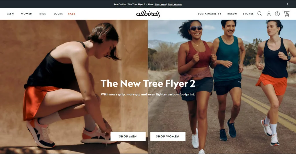
Allbirds uses 1240x540px sized images, which take up almost all of the landing page view.
For mobile devices, consider designing banners with dimensions of 300-350 pixels wide and 50 pixels tall. This size ensures that the banner adapts well to smaller screens without losing important information or visual appeal.
File Formats for Banners
Shopify supports various image file formats, but for banners, the most commonly used formats are JPEG and PNG. JPEG is excellent for photographs and images with a lot of colors and details. JPEG compresses the file size without compromising much on quality. It also makes the page loading time faster while maintaining the visuals.
On the other hand, PNG is ideal for graphic banners that require transparency or have a simple design with limited colors. By choosing the appropriate file format, you can ensure that your banners load quickly and look stunning on your Shopify store.
Optimizing Banner Images
One thing we know for sure is that Shopify banners need to be of the best quality. Appealing visuals with no compromise in the resolution will speak to your visitor like nothing else! But that also means that your banner image might be heavy in size. Large image files can slow down your website’s loading speed.
You might not think much of a few-second delay, but it can negatively impact user experience and search engine rankings.
But that also means that your banner image might be large in size. Large image files can slow down your website’s loading speed. Even a few-second delay in loading web page time can negatively impact user experience and search engine rankings.
To be on the safer end, it’s always best to optimize your banner images. You can do this using compression tools like TinyPNG or JPEG Optimizer. These tools reduce the file size without sacrificing image quality. All so your online store visitors can enjoy faster loading times and improved performance.
Shopify Social Power!⚡️
Use your products to power your social media marketing. Try Predis.ai for FREE.
TRY NOWBonus Strategy: Shopify Banner Size Guide
If you want your Shopify banner to attract visitors effectively, simply selecting the right dimensions and file formats isn’t the end! It’s crucial to have a non-messy banner, that cuts through all the noise and appeals directly to the viewers. Here are five essential design principles to keep in mind!

5 Design Principles for Effective Banners
- Clear and Concise Messaging: The heart of a successful banner is its message. It needs to be delivered to your target audience in a clear and concise way. Effective banners are informative, easy to read, and contain only the most relevant details. Remember, cluttered banners can overwhelm viewers and make it difficult for them to grasp your message quickly. Focus on getting straight to the point and avoid information overload.
- High-Quality ImagesSettling for the resolution is a big no-no. Grainy or pixelated images are a turn-off for potential customers. Instead, use high-resolution visuals that showcase your brand or products in the best light. Incorporating your official brand colors is a smart move. It fosters brand recognition and memorability. High-quality visuals not only enhance the banner’s aesthetics but also build trust with visitors.
- Brand ConsistencyAs we talked about before, your brand’s colors, typefaces, and design must be consistent enough for viewers to recognize at first glance. This visual recognition builds a strong brand identity and creates a smooth shopping journey for visitors. They’ll easily recognize your store and develop trust over time. Maintaining consistent branding makes your customers feel comfortable and familiar with your brand.
- Call to Action (CTA)Make use of marketing techniques and use phrases like “Shop Now,” “Learn More,” or “Get 50% Off”. These push the viewers into action and help you improve click-through rates.
- Seasonal Updates: Make use of the seasons and create a diverse range of banners. Showcase upcoming promotions, highlight holiday sales, or announce new product launches with color-coordinated banners. This not only keeps your visitors informed but also shows that you are in line with the trends. Seasonal banners can also create a sense of urgency. In turn, it encourages visitors to take advantage of limited-time promotions before they disappear.
Use Predis.ai's Banner Maker to make captivating banners for your Shopify store!
Wrapping up
Shopify banners are effective graphic tools that may help draw visitors to your website and eventually increase sales.
You may use your imagination to display aesthetically appealing yet productive banners by learning how to determine the proper size, optimize image files, and adhere to design guidelines. These will increase consumer engagement as well as the visibility of your business. Remember to keep your store banners vibrant, current, and in line with your brand’s identity. You’re now ready to go!

⭐️⭐️⭐️⭐️⭐️
“Great App! Would Recommend to anyone looking to boost their social media posts.”
Related articles
How To Create Shopify Product Videos on Social Media
Best Shopify Tools For Marketing
How To Connect Instagram To Shopify Store
