

Explore this content with AI:
Most brands don’t fail because their product is bad. They fail to look like they have it together. A customer visits your Instagram, then your website, then opens a PDF from your sales team — and it feels like three different companies. That’s not a product problem. That’s a brand consistency problem. A brand style guide fixes that.
It’s the single document that answers the question: “How are we supposed to present ourselves?” — and makes sure everyone on the team, plus every freelancer you hire, gives the same answer.
This post breaks down real brand style guides from brands across SaaS, fintech, beauty, media, and food. You’ll see exactly what makes each one work — and walk away with a simple blueprint to build your own.
What Is a Brand Style Guide?
A brand style guide (also called a brand kit, brand book, or brand guidelines) is a reference document that defines the visual and verbal rules for your brand. It’s not just a logo file. It covers how the logo is used, which colors are allowed, which fonts are used in which contexts, how photos should feel, and how the brand speaks to people.
The terms “brand guidelines” and “style guide” are sometimes used interchangeably — though “style guide” can also refer to a document covering written content only, while brand guidelines typically include rules for both visual and written elements.
Think of it as a creative rulebook that lets anyone — a new designer, a freelance copywriter, a partner agency — pick it up and produce work that looks and sounds unmistakably like your brand.
What a Brand Style Guide Usually Covers
Before diving into the examples, here’s what most good style guides include:
- Logo rules — acceptable sizes, spacing, color variations, and what you must never do with the logo (stretch it, put it on a clashing background, add a drop shadow).
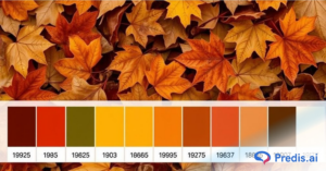
- Color palette — primary and secondary colors with exact hex codes, CMYK values, and Pantone references. The best guides also show when to use each color and what not to pair together.
- Typography — heading fonts, body fonts, font weights, and size scales. Many guides include examples showing the font in context rather than just listing a name.
- Photography and visual style — whether your imagery is bright and airy or dark and editorial, candid or studio-shot, people-first or product-first.
- Tone of voice — the personality of your brand in words. Usually expressed as a few adjectives plus examples of copy written in-brand vs. off-brand. This helps make content that sounds like your brand.
The best brand guidelines are more than just an instruction manual — they include text and images illustrating how to apply brand elements, often with dos and don’ts for different file types and use cases.
25 Brand Style Guide Examples for Inspiration
SaaS & Tech Brands
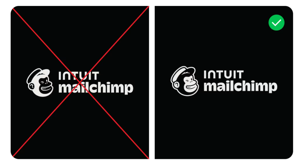
1. Mailchimp
Mailchimp’s guide is a masterclass in making a brand feel human. Playful custom illustrations, a warm yellow palette, and a friendly-but-not-goofy voice come together in a system that works just as well in an email campaign as on a billboard.
- High Utility UX: Instead of a buried PDF, it’s a scannable web page with instant downloads (SVG/PNG) and clear HEX codes and palettes, making it easy for partners to use correctly.
- Practical “Do’s and Don’ts”: It uses clear visual examples to show exactly how to treat assets like their mascot, Freddie, preventing brand dilution.
2. Asana
Clean geometric layouts paired with bright gradient colors. Asana’s guide demonstrates how a productivity tool can still feel energetic and forward-moving.
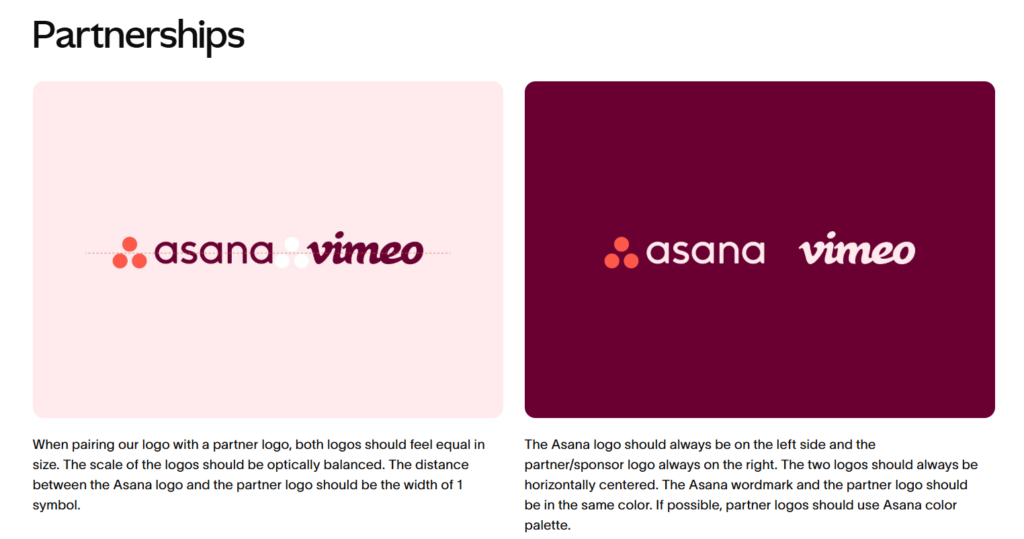
- Detailed Collaboration Specs: Because Asana is a tool for teams, the guide includes specific instructions on how to pair their logo with partner logos (maintaining equal visual weight), which is a level of detail many brands miss.
- Logic-Driven Design: It doesn’t just say “use these colors.” It explains why (e.g., using “Clarity” to reduce mental clutter), which helps designers make better decisions when a specific rule isn’t covered.
3. Slack
Bold flat colors and a deceptively simple icon system. Slack’s guide shows how to use a colorful palette consistently without it becoming chaotic.
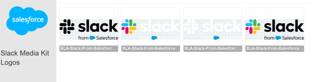
- Technical Optimization: It provides assets in every necessary format (SVG for designers, PNG for office use). It ensures that no matter the technical skill of the user, the brand looks high-quality.
- Global-First Thinking: It provides product screenshots in multiple languages (English, German, Japanese, etc.). This ensures brand consistency in international markets, a detail most documents overlook.
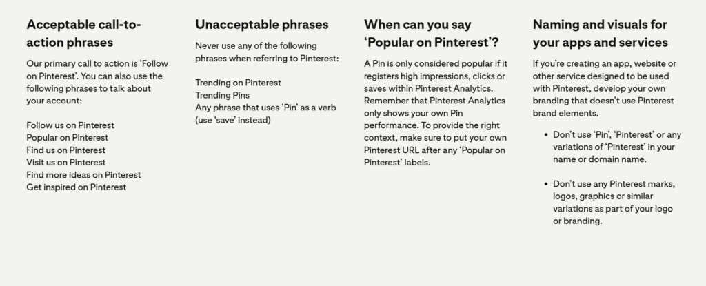
4. Pinterest
Pinterest’s style guide prioritizes “ecosystem integrity” by strictly limiting how its brand marks are used in external marketing to prevent any false sense of partnership.
- Contextual Call-to-Actions: Requires that every use of the logo be paired with a specific, approved phrase like “Follow on Pinterest” or “Find more ideas on,” turning a static image into a functional bridge to a user’s profile.
- Data-Driven “Popularity”: Sets a rigorous standard for the phrase “Trending on Pinterest,” requiring that it only be used when backed by specific Pinterest Analytics data to ensure the brand’s credibility isn’t used for false marketing claims.
Fintech & Business Brands
5. Wise
Wise’s design system (wise.design) is a publicly accessible design language guide. Clean, modern, and clarity-first — which makes sense for a company whose entire product promise is transparency.
- Truly Global: Custom typography and UI assets are designed to work in 140+ languages and cultures, not just English-speaking markets.
- Fintech Challenger: By ditching “Banking Blue” for “Bright Green,” the guide codifies a brand that feels energetic and modern.
- Highly Technical: It uses a “Design Token” system that makes it a functional tool for developers, not just a static PDF for designers.
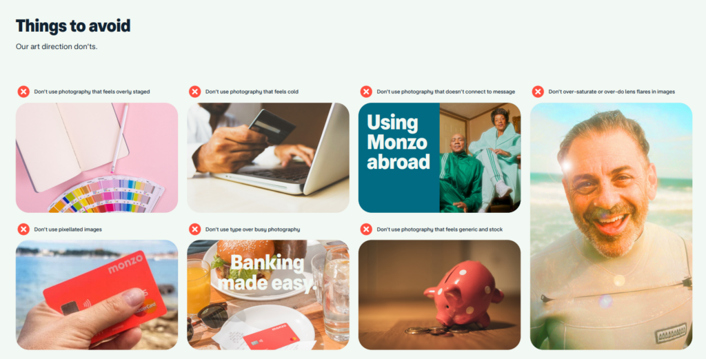
6. Monzo
Coral branding that’s impossible to miss, paired with friendly fintech visuals. Monzo’s guide captures something rare: a financial brand that genuinely feels approachable.
- Abstract Product Design: It uses a unique “Product Visualisation” system that uses lighting and shadows rather than specific phone models, making the document future-proof.
- Prescriptive Art Direction: It provides a literal “recipe” for photography (blurs, flares, and saturation) to ensure all imagery feels warm and “aspirational” rather than like cold stock photos.
- Comprehensive Guardrails: Every section concludes with a “Things to Avoid” page, using clear visual “Don’ts” to prevent common design errors at a glance.
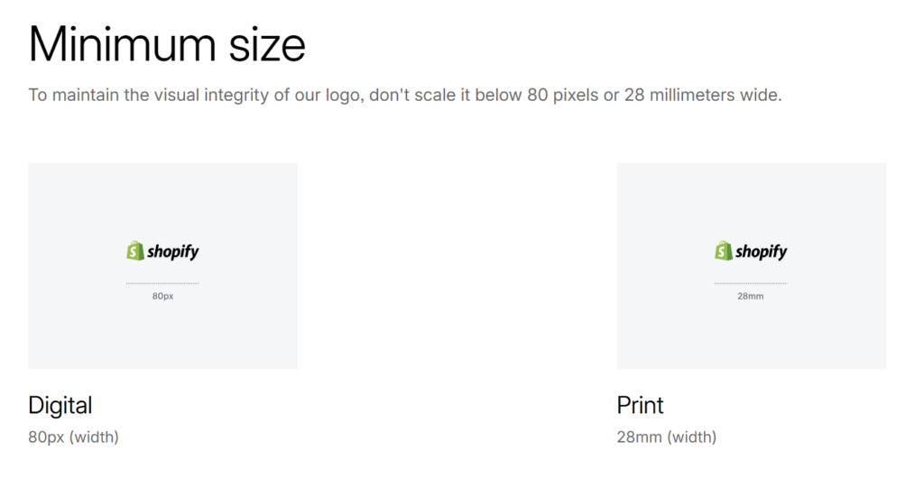
7. Shopify
A commerce-first design system built around Shopify’s signature green. The guide is broad enough to cover a global platform while still feeling cohesive.
- Ecosystem Trust: Uses standardized badges to create a “verified” look across thousands of independent apps and partners.
- Frictionless Utility: Offers one-click downloads of high-quality assets (SVG/PNG) with no login required.
- Mobile Optimization: Focuses on strict minimum-size and spacing rules to ensure the brand stays legible on small screens.
Media, Entertainment & Creative Brands
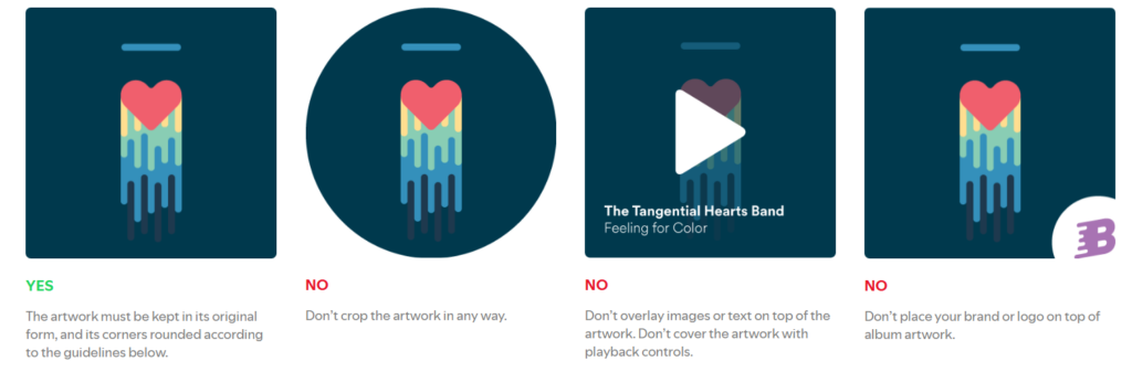
8. Spotify
Green and black, mixed with expressive campaign typography. Spotify’s guide powers everything from app UI to giant outdoor murals, and keeps both ends of the spectrum unmistakably Spotify.
- Frictionless Utility: Built for speed, allowing partners to download exactly what they need with zero technical guesswork.
- Color Dominance: Reinforces Spotify Green as a functional tool for navigation and brand recognition, not just decoration.
- Content Protection: Strict rules for how album art and artist metadata are displayed to maintain the platform’s integrity.
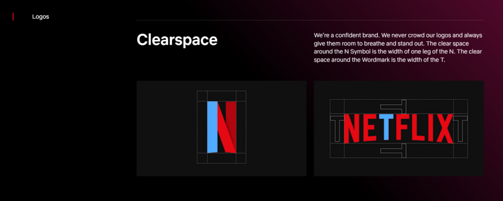
9. Netflix
Cinematic red and black with restrained typography that lets content take center stage. Netflix’s brand guide is all about getting out of its own way.
- Brand Authority: It leverages “owning a letter” (the N) to create a universal, instantly identifiable symbol.
- Color Integrity: Mandates “Netflix Red” as a functional requirement for brand recognition, not just a preference.
- Proportional Spacing: Uses parts of the logo (the “leg” of the N or the “T”) to define clear space, making the rules easy to follow at any scale.
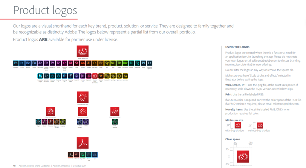
10. Adobe
Clean, systematic, and self-referential — Adobe’s brand identity reflects the precision it asks of its own users.
- The “Red Tag” Anchor: Establishes the iconic red logo as a “tag” that must always be anchored to the edge of a layout, creating a consistent “cornerstone” for the brand across millions of different creative assets.
- Mathematical Spacing Logic: Uses a highly technical “X-height” spacing rule for co-branding and sub-branding, ensuring that Adobe’s identity never feels crowded or secondary when paired with partner logos.
- Product Brand Architecture: Provides a brilliant “Mendeleev-style” periodic table for its product icons (like Ps, Ai, Id), using a 2-letter mnemonic system that allows for infinite expansion without losing brand recognition.
11. Duolingo
Possibly the most viral brand guide on this list. Duolingo’s system is built around its green owl mascot, humor-first social content, and a playful typographic voice that has redefined how SaaS brands can behave on social media.
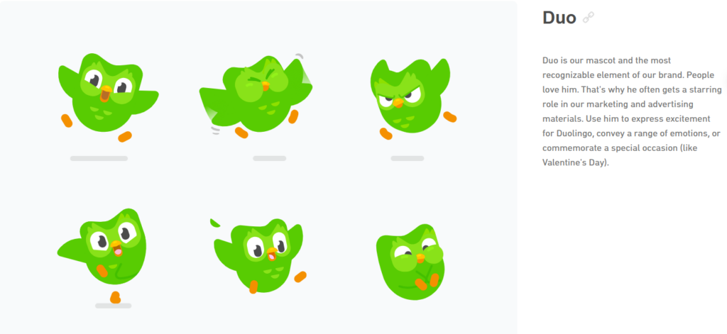
- Character-Driven: Centers the brand on a “protagonist” (Duo the Owl), giving the company a human (and slightly chaotic) personality.
- Proprietary Typography: Uses the “Feather” font to mirror the physical shapes of the mascot, creating total visual harmony.
- Gamified Aesthetic: Explicitly avoids “academic” styles in favor of high-energy, game-like visuals that encourage user engagement.
- Inclusive World-Building: Provides a rigorous framework for a diverse cast of characters, ensuring the brand is representative and story-led.
Food & Beverage Brands
12. McDonald’s
The most recognized color combination on the planet. McDonald’s red and yellow aren’t just colors — they’re a global sensory cue. The brand guide governs one of the largest and most consistent visual identities in the world.
- Appetite Appeal: Sets world-class standards for food photography to ensure global consistency in how products look.
- Frictionless Press Access: A highly organized, searchable library that allows the media to download “rights-cleared” high-res assets instantly.
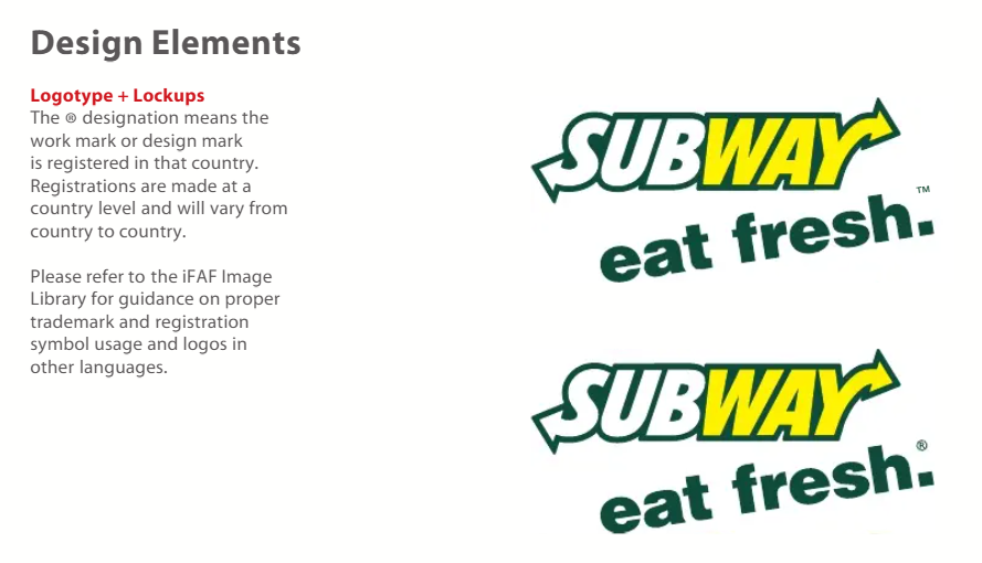
13. Subway
Subway’s style guide is uniquely focused on the legal and psychological nuances of “freshness,” ensuring that every sandwich depicted is not just appetizing, but legally compliant with global truth-in-advertising laws.
- The Psychology of the Palette: Codifies a “Primary Tenet” color system where Green equals “Health,” Yellow equals “Value,” and Red equals “Indulgence,” allowing the brand to subconsciously signal its product benefits without writing a word of copy.
- Truth-in-Advertising Rigor: Enforces strict “Visual Honesty” rules, such as forbidding the use of US photography (which includes banana peppers) in markets where those ingredients aren’t available, to prevent consumer misrepresentation.
- The “Eat Fresh” Lockup: Mandates the exact proximity of the “Eat Fresh” tagline to the logo, ensuring that the brand name and its core health promise are perceived as a single, inseparable mental unit.
14. Heineken
Heineken’s guide masters the art of “physicality,” ensuring their signature green and “smiling e” feel as premium on a digital screen as they do on a frosted glass bottle.
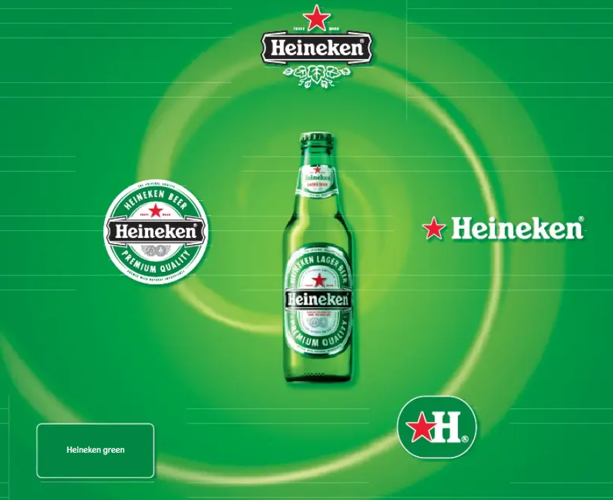
- Iconic Minimalism: Elevates the Red Star into a standalone global icon that doesn’t need the brand name to be recognized.
- Material Consistency: Provides industrial-grade color specs to ensure “Heineken Green” is identical across glass, metal, and screen.
- Physical Architecture: Offers advanced grid systems for applying branding to complex 3D objects like bottles and beer taps.
The Brand Style Guide Blueprint: A Simple Checklist
Here’s what a functional first version of a Brand style guide looks like:
| Element | What to Define |
|---|---|
| Signature color | 1 primary hex + 2 supporting colors |
| Typography | 1 heading font + 1 body font |
| Photo style | Bright vs. dark, studio vs. natural, product vs. people |
| Tone rules | 5 adjectives + 2 “we say / we don’t say” examples |
| Templates | 3 reusable designs: social post, story, ad |
Start here and expand. Most established brands didn’t build their full guide on day one — they codified what was already working and added rules as edge cases came up.
Tools to Build Your Brand Style Guide
A few tools worth knowing:
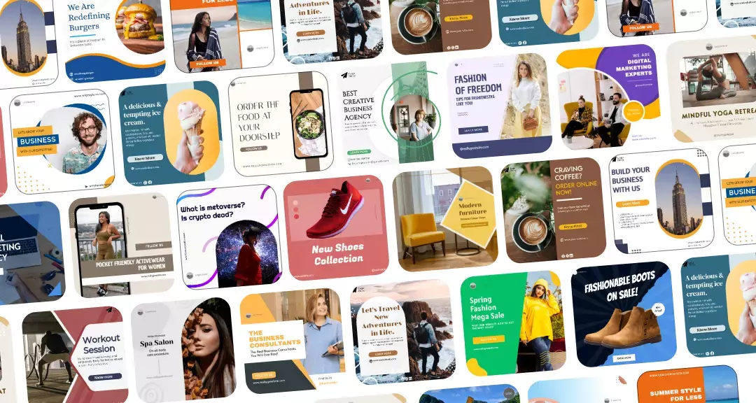
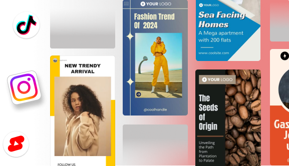
For teams managing social content specifically, Predis AI is worth adding to the toolkit — it generates on-brand social posts and templates that reference your visual identity, so you’re not rebuilding the wheel every time you need a caption or a carousel.
Notion works well as a lightweight documentation layer. It won’t replace a visual design tool, but it’s a clean place to write tone of voice guidelines, store links to assets, and onboard new team members.
Conclusion
The brands on this list didn’t get recognizable by accident. They made deliberate decisions, wrote them down, and enforced them across every touchpoint. That’s it.
Your brand doesn’t need a 60-page document before it can be consistent. It needs clear rules and the discipline to follow them. Start with the checklist above. Pick one or two examples that match your aesthetic to build something you’d actually use — not something that lives in a folder and never gets opened.
The goal isn’t a beautiful PDF. It is the ability to be recognized!
Frequently Asked Questions
A brand style guide defines how your brand looks and sounds across all channels — logo usage, color palette, typography, photography style, and tone of voice. It’s the reference document that keeps everything consistent.
At minimum: logo rules, color palette with exact codes, typography choices, photo or visual style guidance, and tone of voice principles.
Start with your logo, pick a signature color and two supporting colors, select two fonts, and write five tone adjectives. That’s version one. Build from there.