
Explore this content with AI:
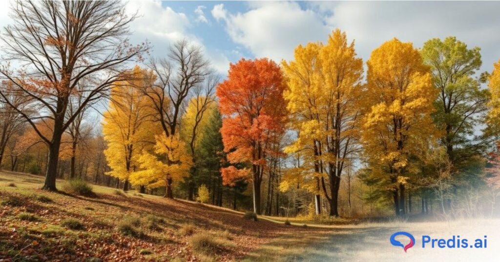
The fall season brings a breathtaking transformation in nature, painting the world in shades of amber, rust, and golden brown. With vibrant leaves and rich earth tones, autumn is one of the most visually inspiring seasons. This season is perfect for drawing color inspiration into design projects. A well-chosen fall color palette can add warmth, depth, and sophistication to your branding, marketing, and personal projects.
Fall colors include a wide range of shades, from warm oranges and deep reds to soft neutrals like taupe and beige, along with lush greens and earthy browns. These hues are versatile, giving you the freedom to adapt them to various settings, from digital design to physical spaces. Fall colors aren’t just for seasonal decor; they’re also ideal for rebranding, fresh marketing campaigns, and other creative ventures. Embracing these colors in design can evoke the season’s cozy and inviting vibe, connecting audiences with nature’s beauty.
Exploring several color palettes is an excellent method for developing design ideas. We’ve compiled a list of our favorite fall color palettes in 2025, as well as advice on how to apply them. We’ll also cover color theory so you can understand what makes a good palette. You will also learn how to choose colors for yourself.
As a bonus, all hex codes, design ideas, and inspirations for each fall color palette are included as well.
What are Fall Color Palettes?
The colors most associated with autumn include orange, red, yellow, and brown. These colors are inspired by the seasonal change in the hues of leaves as temperatures drop and daylight diminishes. Although most people identify autumn colors with warmth, the specific hues maintain their emotional associations.
- Red, for example, is linked with strength and excitement, and this is true in the autumn as well as the rest of the year. However, by combining many warm colors, an overall fall mood might be achieved.
- Traditional autumn palettes include fiery orange (spiced gingerbread, pumpkin orange), brown (almond, rich chestnut, cinnamon, terra cotta), yellow (ochre yellow, soft pastel yellow, mustard), red (maple leaf red, pomegranate, cranberry), and purple (rich eggplant, magenta). As you’ll see, various color combinations evoke ideas of seasonal products.
- Designers, marketers, and even homeowners turn to these autumnal hues for various projects. Fall colors are more than just the visuals of the season! They bring warmth and character to designs, making them ideal for branding, marketing, and personal projects. A well-curated fall color palette combines both primary and accent tones that balance richness with subtlety.
- You are also encouraged to think outside the pumpkin to develop your fall color palette for photos.
- All this while keeping the designer’s recommendations in mind. Simply add a touch of blush pink, cobalt blue, or a Prism Mask to the usual autumn color pallet may cause wonderful things to happen. Your final edits will undoubtedly evoke some fresh autumn vibes. So, if you’re looking for colors that make people feel at home, fall palettes are a perfect choice.
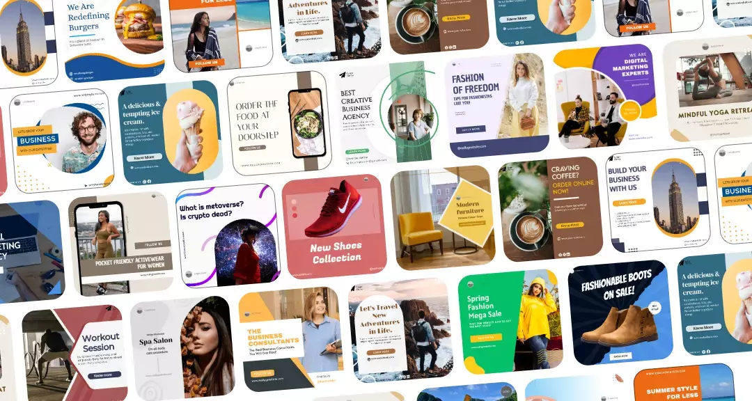
Top 20 Fall Color Palette Inspirations For Your Brand & Business
As the crisp fall air rolls in, it’s the perfect time to explore new color palettes. Fall colors have a special ability to evoke feelings of comfort, nostalgia, and change. This makes them ideal for brands looking to refresh their visuals.
Color is important in branding and design. Colors elicit a wide range of emotions, moods, and ideas, and determining what emotions you want to elicit in a customer is important.
A simple example would be how food and beverage firms prefer to use red and orange color combinations in their marketing. This is because it boosts the appetite and excites the taste buds.
Simply said, by effectively employing colors, you would be able to convey tales and develop emotions by penetrating their subconscious via the power of colors.
Let’s dive into the best fall color palette inspirations, broken down by individual color categories to help you see how each shade can work for your brand’s designs. Each color palette includes hex codes for easy use. This will help you with the tools to seamlessly incorporate these fall colors into your projects.
Brown Fall Color Palette
The brown fall color palette embodies the earthy, warm tones that define the essence of autumn. Browns are deeply associated with the natural world – fallen leaves, tree trunks, and the richness of the soil. This color palette can give your brand a grounded, stable, and organic feel. This is indeed perfect for creating a sense of reliability and warmth.
Brown shades work beautifully in combination with greens, golds, and even hints of soft reds. Making them versatile enough for branding, seasonal marketing, or any design project that seeks to evoke autumn’s natural beauty.
Whether you’re going for a rustic, vintage look or a more refined, minimalist style, brown fall shades offer depth and sophistication. Let’s explore the different fall color palettes featuring these warm, grounding brown shades.
1. Rich Black + Wheat + Mahogany
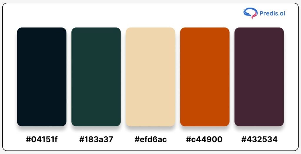
Hex Codes:
- Rich Black: #04151f
- Dark Teal: #183a37
- Wheat: #efd6ac
- Mahogany: #c44900
- Deep Plum: #432534
This fall color palette blends dark, sophisticated tones with warm, inviting hues, making it a perfect match for a refined and luxurious brand look. The rich black and deep teal provide an elegant and grounding foundation. While the wheat and mahogany add warmth and vibrancy. A touch of deep plum introduces depth and makes the palette visually engaging.
Imagine these colors being used in seasonal campaigns, where the darker shades create a backdrop of sophistication, and the warm tones bring in the comforting elements of fall. Ideal for high-end brands, this palette is particularly suitable for industries like fashion, home décor, and hospitality.
Use Case Tip: Utilize rich black as the primary background to create an upscale feel, then layer with wheat and mahogany accents in text or product highlights to draw attention. Adding plum as an accent color can further elevate the overall aesthetic. This is perfect for brands looking to evoke luxury with a seasonal twist.
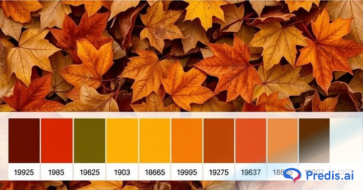
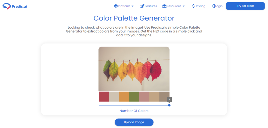
One quick way to generate a fall color palette is to use the Predis.ai Color palette generator. Just upload your fall image and get your fall color palette in an instant!
2. Antique Brass + Desert Sand + Ash Gray
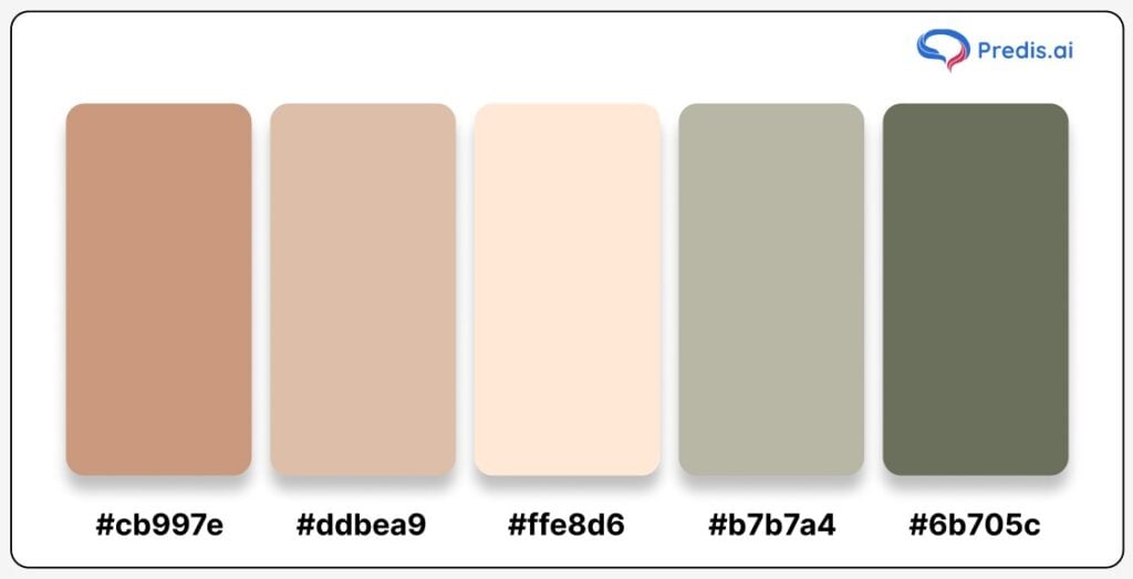
Hex Codes:
- Antique Brass: #cb997e
- Desert Sand: #ddbea9
- Soft Peach: #ffe8d6
- Ash Gray: #b7b7a4
- Olive Green: #6b705c
This fall palette beautifully balances warm, earthy tones with soft neutrals, capturing the essence of autumn’s subtle elegance. Antique Brass and Desert Sand add warmth and depth, while Ash Gray and Olive Green bring a grounded, natural quality. Soft Peach adds a touch of brightness to the mix, keeping the palette fresh and adaptable across various brand applications.
This color scheme is ideal for brands aiming to evoke an organic, welcoming feel. This makes it perfect for lifestyle brands, wellness products, and eco-conscious companies. The neutrality of the colors ensures they blend well, creating a harmonious and understated look.
Use Case Tip: Use Antique Brass and Olive Green as your primary colors for an earthy, inviting background. Add highlights in Soft Peach and Desert Sand to keep the overall design soft and accessible. Incorporating Ash Gray sparingly can add a sleek touch to product packaging or as an accent in brand visuals. This helps to keep the earthy palette grounded and modern.
3. Tan + Brown Sugar + Almond Brown Fall Color Palette
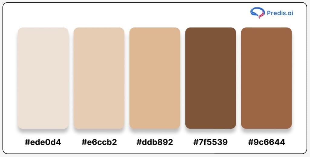
Hex Codes:
- Tan: #ede0d4
- Brown Sugar: #e6ccb2
- Almond Brown: #ddb892
- Cinnamon Brown: #7f5539
- Warm Chestnut: #9c6644
This warm, monochromatic fall palette combines varying shades of brown, evoking the cozy and inviting feel of the autumn season. The colors resemble the richness of fall foliage, earthy landscapes, and even the comfort of spiced drinks on a crisp day. The lighter Tan and Brown Sugar tones create a soft, approachable background. While Almond Brown, Cinnamon Brown, and Warm Chestnut bring depth and richness, perfect for highlighting details.
Ideal for brands seeking a sophisticated yet warm look, this palette works well for home decor, culinary arts, and lifestyle brands. Such brands who are aiming to bring a sense of warmth and nostalgia. The subtle gradients between these shades allow for versatile use across print and digital media.
Use Case Tip: Use Tan as a base for backgrounds or larger elements to keep the design light and airy. Layer in Brown Sugar and Almond Brown for secondary accents, which can add depth without overwhelming. Cinnamon Brown and Warm Chestnut work beautifully as focal points or text colors to add contrast. This balance of light and dark shades can lend a timeless, elegant appeal to fall promotions and branding, capturing the cozy charm of autumn in every design element.
Purple Fall Color Palette
The purple fall color palette brings an elegant and mystical vibe to the season. While autumn traditionally celebrates warm tones, purple adds a unique twist, representing the beauty of early sunsets, blooming asters, and the deepening colors in nature as the days grow shorter.
Purple shades can evoke feelings of creativity, luxury, and depth, giving your designs a fresh, unexpected look. Purples pair beautifully with muted tones like soft grays, dusty pinks, or deep blues. This makes them versatile for a range of brand aesthetics.
Whether you’re aiming for a bold statement or a subtle, refined touch, purple fall shades provide endless possibilities for creating a memorable design. Let’s explore the different fall color palettes featuring these rich, moody purple shades.
4. Gunmetal + Desert Sand + Terra Cotta
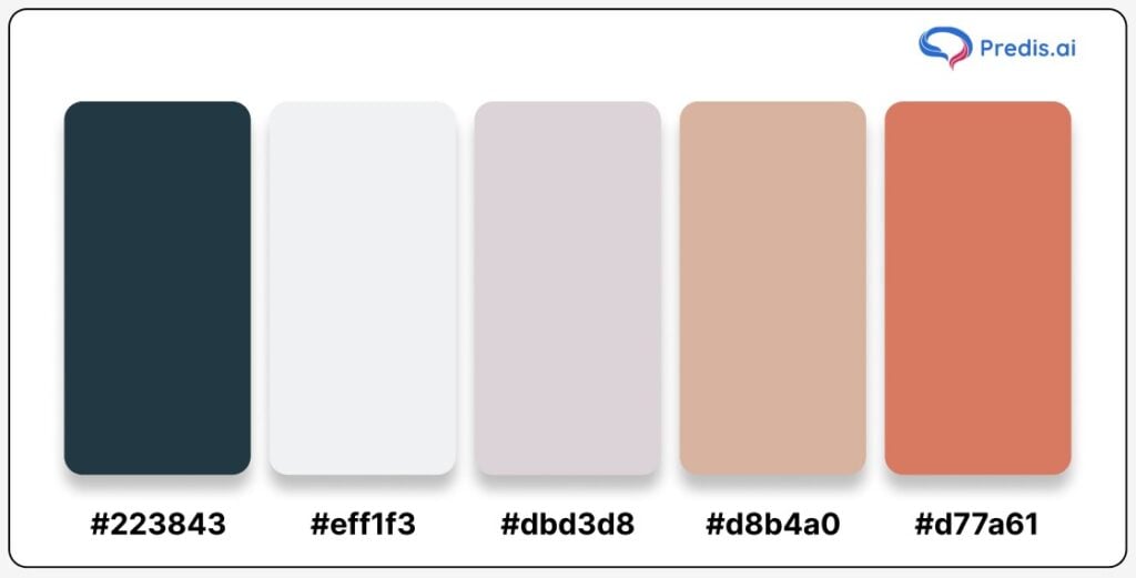
Hex Codes:
- Gunmetal: #223843
- Ivory: #eff1f3
- Silver Pink: #dbd3d8
- Desert Sand: #d8b4a0
- Terra Cotta: #d77a61
This color palette beautifully blends cool and warm tones. This makes it versatile for any season, but it especially shines during the fall. The combination of gunmetal and terra cotta creates a striking contrast. As the dark, moody hues of gunmetal balance perfectly with the rich, earthy warmth of terra cotta. Desert sand and ivory add a neutral, light touch to the palette, making it flexible and adaptable for different design contexts.
This palette is perfect for brands looking to capture a modern, yet warm and inviting aesthetic. The gunmetal shade provides an anchor of sophistication, while the terra cotta introduces warmth, reminiscent of autumn leaves and clay. The lighter tones of desert sand and ivory add softness and can be used to balance out the intensity of the deeper hues.
Use Case Tip: Use gunmetal as the primary background to create a sleek, modern look. While terra cotta and desert sand can be used in accents and key design elements to add warmth. Incorporating ivory or silver pink in text, logos, or CTA buttons can provide a light, airy contrast that makes the overall design feel more inviting. This palette is especially suitable for interior design brands, fashion collections, or cozy seasonal marketing campaigns.
5. Sugar Plum + Coral + Light Salmon Fall Color Palette
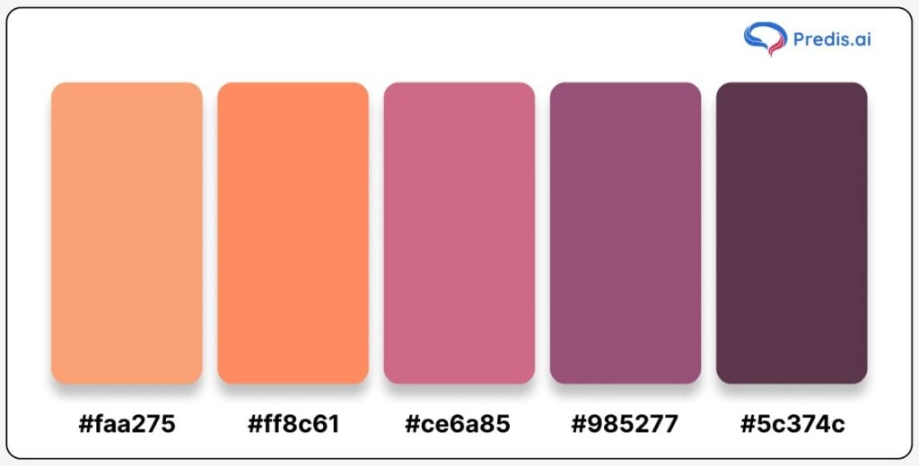
Hex Codes:
- Light Salmon: #faa275
- Coral: #ff8c61
- Sugar Plum: #ce6a85
- Mulberry: #985277
- Deep Plum: #5c374c
This fall color palette balances soft and vibrant hues with a mix of warm pinks and purples. Light salmon and coral bring a warm, playful feel, while the deeper purples – sugar plum, mulberry, and deep plum – add a touch of depth and elegance. This palette feels both delicate and grounded, making it perfect for brands that want to capture the warmth and sophistication of autumn without the usual earth tones.
The coral and light salmon shades give off a fresh, inviting vibe, while the sugar plum and mulberry shades create a cozy contrast, grounding the palette with a more sophisticated touch. This palette works particularly well for brands in beauty, lifestyle, and creative fields, as it brings both an inviting and artistic feel to seasonal designs.
Use Case Tip: Use light salmon or coral as background colors to keep the design light and approachable. The deeper shades like sugar plum or deep plum work well as accents in text, borders, or product features, adding contrast and visual interest. This palette is perfect for fall-themed social media graphics, lifestyle branding, and seasonal marketing materials where a soft, yet refined look is desired.
6. Melon + New York Pink + Persian Orange
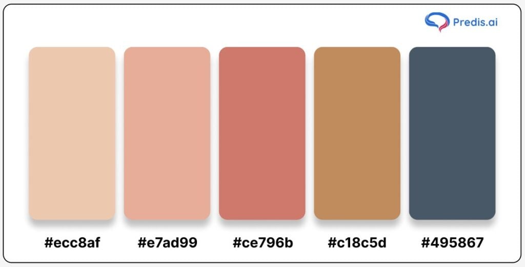
Hex Codes:
- Melon: #ecc8af
- New York Pink: #e7ad99
- Dusty Rose: #ce796b
- Persian Orange: #c18c5d
- Charcoal Blue: #495867
This fall palette combines a blend of soft, warm colors and rich undertones, creating a cozy, worn-in vibe that feels both timeless and approachable. Melon and New York Pink offer a subtle warmth, with hues that echo the gentle tones of fallen leaves, while Dusty Rose and Persian Orange bring an earthy depth that’s perfect for autumnal themes. Charcoal Blue provides a subtle, grounding contrast, keeping the palette sophisticated and easy on the eyes.
This palette’s versatile, neutral shades work wonderfully for brands aiming to create a nostalgic, warm look. It’s especially suited for industries like home decor, wellness, and artisanal brands where a natural, vintage aesthetic can shine. The color harmony between warm oranges, pinks, and subtle blues makes it a flexible choice that adds warmth to any design without overpowering the visuals.
Use Case Tip: Use Melon or New York Pink as background colors to maintain a light, inviting look. Persian Orange and Dusty Rose work well as accent colors, especially in product highlights or text, adding depth and focus to the design. Charcoal Blue can be used sparingly to introduce contrast, drawing attention to specific elements. This palette is ideal for fall-themed packaging, social media posts, and marketing materials where a soft, cozy feel is desired.
7. Rose Dust + Tumbleweed + Mn Blue Fall Color Palette
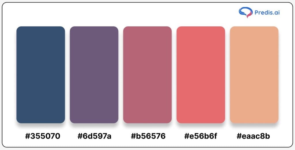
Hex Codes:
- Mn Blue: #355070
- Dusty Plum: #6d597a
- Rose Dust: #b56576
- Burnt Coral: #e56b6f
- Tumbleweed: #eaac8b
This fall color palette combines muted, desaturated hues with warm autumn tones, capturing a soft, peaceful mood perfect for fall. Mn Blue introduces a grounding, cool shade that contrasts beautifully with Dusty Plum and Rose Dust, both of which evoke a subtle, comforting warmth. Burnt Coral and Tumbleweed add a touch of earthy elegance, rounding out the palette with a mix of warmth and sophistication.
Ideal for brands that want to convey warmth without the intensity of vibrant colors, this palette is especially effective for lifestyle, wellness, and creative industries. These soft, complementary shades are easy on the eyes and can create a feeling of relaxation, making them suitable for digital marketing, seasonal branding, and product packaging that wants to appeal to a cozy, fall-inspired audience.
Use Case Tip: Use Mn Blue and Dusty Plum as background colors to create a serene base, letting the other shades shine in focal points like text, icons, or product highlights. Rose Dust and Burnt Coral work well as accent colors, adding subtle warmth to visual elements, while Tumbleweed can be used in borders or dividers to maintain balance. This palette’s gentle, grounded vibe is perfect for autumn-themed social media, website designs, and promotional content where a calm, inviting tone is desired.
Green Fall Color Palette
The green fall color palette captures the enduring beauty of nature even as it transitions into autumn. Green symbolizes life, growth, and renewal, and in the fall, it takes on a deeper, more grounded tone – think evergreen pines, moss-covered stones, and the last shades of green on changing leaves.
Green brings a balanced, calming presence to any design, grounding it with a sense of freshness and stability. Incorporating green into your fall designs can add depth and warmth, especially when paired with earthy browns, muted yellows, and gentle grays.
Perfect for brands aiming to emphasize sustainability, wellness, or a connection to nature, green fall shades can be both vibrant and soothing, making them ideal for seasonal branding or refreshing your color scheme. Let’s explore the different fall color palettes featuring these timeless, grounding green shades.
8. Peach + Tumbleweed + Charleston Green Fall Color Palette
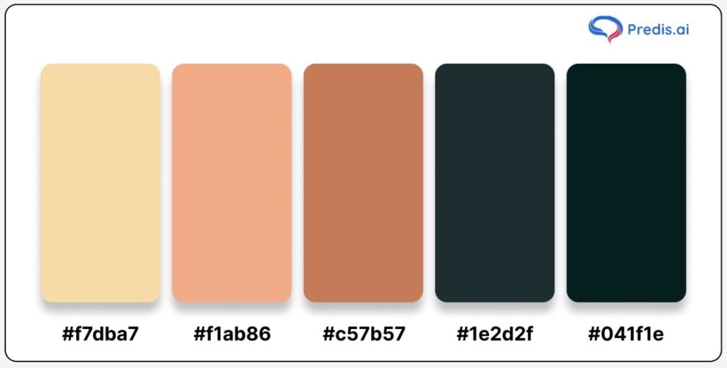
Hex Codes:
- Peach: #f7dba7
- Tumbleweed: #f1ab86
- Chestnut Brown: #c57b57
- Charleston Green: #1e2d2f
- Deep Green: #041f1e
This unique fall color palette blends soft, warm tones with deep, grounding greens, creating a sophisticated balance that feels both refreshing and autumnal. Peach and Tumbleweed bring in a warm, lighthearted vibe, while Chestnut Brown adds depth with its rich earthy hue. The dark, almost black-green tones of Charleston Green and Deep Green provide a strong, contrasting base, adding structure and sophistication to the mix.
Perfect for brands that want to bring in a hint of fall without going full-on traditional, this palette combines warmth and elegance in a way that’s ideal for digital media, brand collateral, or seasonal campaigns. It’s versatile enough for lifestyle brands, cafés, and even fashion, where the dark greens serve as a powerful background while the warm tones invite a cozy, welcoming feel.
Use Case Tip: Start with Charleston Green or Deep Green as your background for a strong, polished look, then layer in Peach and Tumbleweed as highlights to soften the overall feel. Chestnut Brown can be used for accents, like button colors or small icons, to add richness without overwhelming the design. This palette’s mix of warmth and depth works wonderfully in both digital and print formats, making it a great choice for autumn-themed content, product packaging, or branding that wants to strike a balance between inviting and sophisticated.
9. Ash Gray + Dark Slate + Dark Sea Green
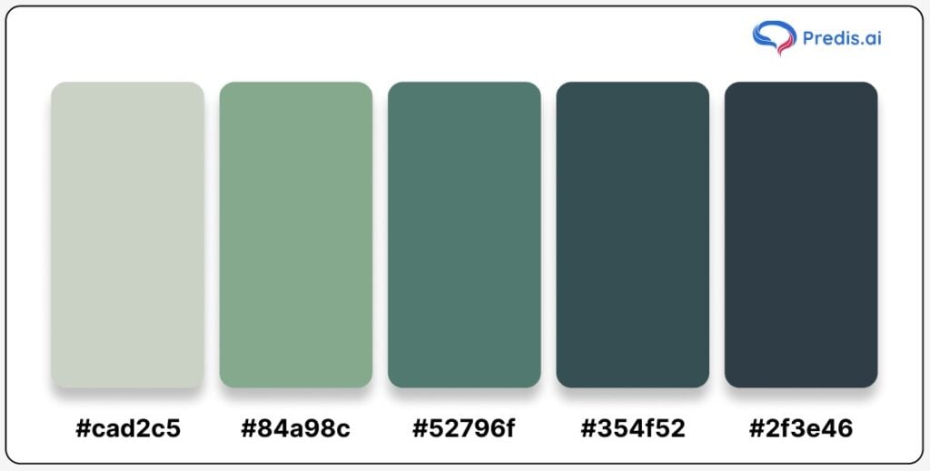
Hex Codes:
- Ash Gray: #cad2c5
- Dark Sea Green: #84a98c
- Forest Green: #52796f
- Dark Slate: #354f52
- Deep Slate: #2f3e46
Not all fall color palettes need to revolve around the usual oranges and browns. The Ash Gray + Dark Slate + Dark Sea Green palette brings refreshing, grounding shades of nature to your designs, reminiscent of misty forest mornings and evergreen landscapes. This palette captures the tranquil side of fall, drawing from muted grays and lush greens for a look that feels calming and balanced. It’s ideal for brands that want a subtle nod to fall without diving into warmer tones, perfect for organic skincare, wellness, and sustainable brands.
Ash Gray provides a soft, neutral base, while Dark Sea Green and Forest Green introduce a touch of nature’s depth. The darker greens of Dark Slate and Deep Slate add an earthy richness, making this palette versatile and refined. Together, these colors create a visual harmony that’s soothing to the eyes and perfect for evoking feelings of freshness and natural beauty.
Use Case Tip: Use Ash Gray as a background to keep the overall look light and calming, then layer with Dark Sea Green for headers or main accents. Dark Slate and Deep Slate can be used for text and icons, giving a grounded feel to any design without overshadowing the lighter hues. This palette is great for websites, product packaging, and even social media posts where you want to bring a hint of the forest into your fall theme.
10. Darkened Yellow + Dark Salmon + Tea Green Fall Color Palette
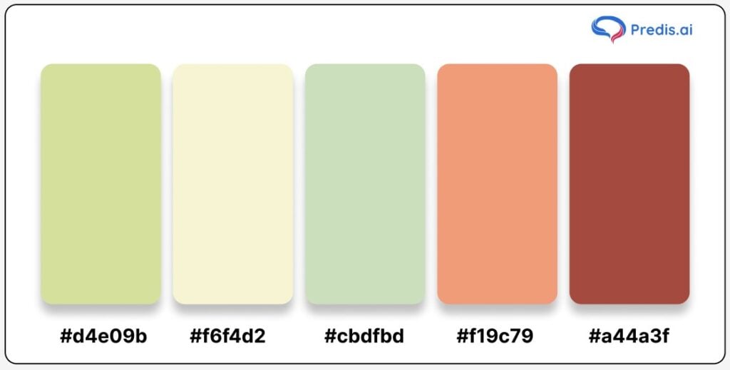
Hex Codes:
- Tea Green: #d4e09b
- Soft Cream: #f6f4d2
- Muted Green: #cbdfbd
- Dark Salmon: #f19c79
- Warm Maroon: #a44a3f
This unique fall palette combines the earthy warmth of autumn with a fresh touch of green and soft yellow, reflecting the blend of lingering summer tones and the onset of fall. The Tea Green and Soft Cream hues bring a hint of brightness, while Dark Salmon and Warm Maroon ground the palette with cozy, rustic warmth. The result is a refreshing yet grounded color scheme that captures the soft transitions of nature during fall, ideal for projects that want to embrace autumn’s warmth without losing a hint of liveliness.
Darkened Yellow and Tea Green add an unexpected lightness that works well with the darker tones, making this palette adaptable for a range of designs, from brand logos to seasonal social media posts. The Soft Cream and Muted Green hues provide a harmonious, subtle background, creating a calming effect, while Dark Salmon and Warm Maroon add depth and warmth, perfect for drawing attention to focal points.
Use Case Tip: Utilize Tea Green as a background color for a soft, calming effect, while incorporating Dark Salmon and Warm Maroon for text, icons, or accent elements to add warmth and contrast. This color combination is particularly effective in website banners, blog posts, or printed materials where you want to evoke a sense of natural change and cozy vibrancy.
11. Cornsilk + Fawn + Kombu Green Fall Color Palette
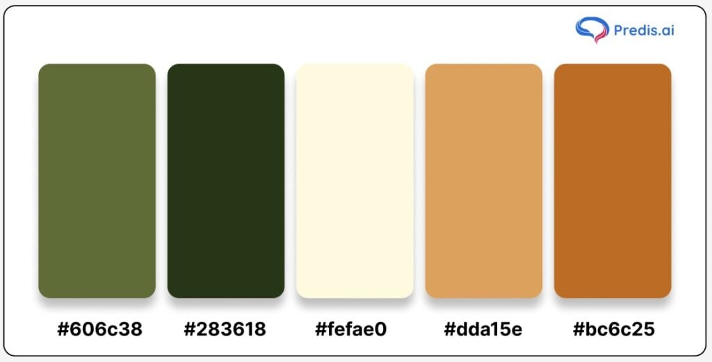
Hex Codes:
- Kombu Green: #606c38
- Deep Olive: #283618
- Cornsilk: #fefae0
- Golden Fawn: #dda15e
- Burnt Sienna: #bc6c25
This fall color palette brings to life the peaceful charm of an early autumn forest, blending the deep greens of foliage with warm, earthy browns and a touch of soft cornsilk. The result is a palette that captures the essence of nature’s transition from summer to fall, offering a balanced mix of light and dark tones. Cornsilk adds a subtle brightness, while the richness of Kombu Green and Deep Olive creates a grounding effect. Golden Fawn and Burnt Sienna then tie it all together with their cozy warmth, reminiscent of sunlit leaves and woodland trails.
This palette is perfect for brands looking to convey a sense of harmony with nature, warmth, and a bit of rustic charm. It’s versatile enough to work in both digital and print, from eco-friendly packaging to seasonal marketing campaigns.
Use Case Tip: Use Cornsilk as a background to bring lightness to your design, allowing Kombu Green and Deep Olive to anchor key elements like text or icons. Golden Fawn and Burnt Sienna can add a pop of warmth to frames, buttons, or product highlights, creating a balanced and inviting look perfect for brands with a natural or outdoorsy focus. This palette shines in designs that call for an earthy, organic feel, capturing the simple beauty of autumn’s early days.
Stand Out with AI-Generated Designs and Graphics 🌟
Orange Fall Color Palette
The orange fall color palette radiates the warmth and energy that defines the autumn season. From the deep hues of pumpkin and spice to the soft tones of sunset and apricot, orange embodies the cozy yet vibrant feeling of fall. It evokes images of harvest festivals, fallen leaves, and the golden hour glow that makes everything feel a bit more inviting.
Orange is a color that adds liveliness and warmth to any design, making it perfect for creating a welcoming, cheerful atmosphere. When paired with rich browns, muted greens, or hints of gold, orange adds a pop of warmth without overpowering, making it ideal for seasonal promotions, branding refreshes, and festive designs.
Whether you’re looking to evoke a sense of nostalgia or bring a modern, energetic twist to your branding, orange fall shades provide versatility. Let’s explore the different fall color palettes featuring these vibrant, inviting orange shades.
12. Indigo Dye + Orange Soda + Orange Yellow
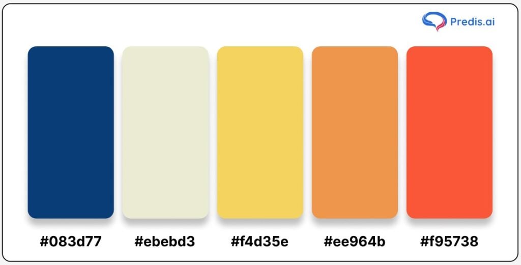
Hex Codes:
- Indigo Dye: #083d77
- Ivory Cream: #ebebd3
- Orange Yellow: #f4d35e
- Orange Soda: #ee964b
- Fiery Red: #f95738
This fall color palette brings a fresh, bold twist to autumn, blending deep indigo with vibrant orange and yellow tones that feel both warm and dynamic. The Indigo Dye offers a cool, grounding contrast to the playful energy of Orange Soda and Fiery Red. Orange Yellow and Ivory Cream add brightness and a touch of softness, balancing the rich indigo and fiery shades for a palette that’s lively without overwhelming.
Perfect for brands looking to break free from the traditional, muted fall shades, this palette works beautifully for modern, creative designs that need a touch of flair. It’s especially well-suited for digital projects, fashion campaigns, and branding that leans into contemporary and playful aesthetics.
Use Case Tip: Start with Indigo Dye as the primary background to create a deep, rich base. Accent with Orange Yellow or Ivory Cream for headlines or important design elements, letting Orange Soda and Fiery Red shine in buttons, highlights, or decorative patterns. Mixing these tones creates a captivating contrast that feels fresh and eye-catching – ideal for brands wanting to capture attention with a lively seasonal twist.
13. Tyrian Purple + Ruby Red + Spanish Orange
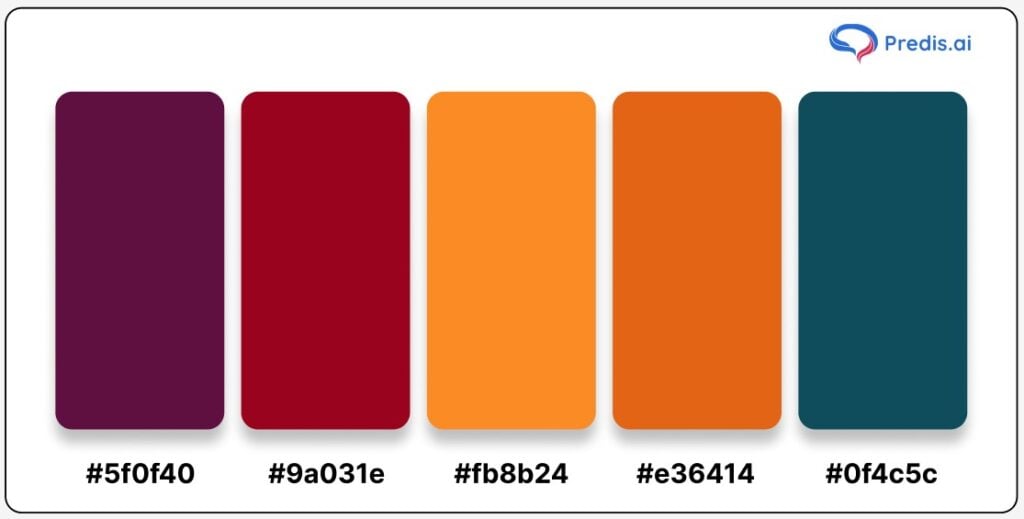
Hex Codes:
- Tyrian Purple: #5f0f40
- Ruby Red: #9a031e
- Spanish Orange: #fb8b24
- Deep Carrot Orange: #e36414
- Teal Blue: #0f4c5c
This fall color palette draws from the warmth and opulence of gem tones, bringing a luxurious touch to any design. Tyrian Purple and Ruby Red exude a sense of elegance and depth, reminiscent of the richness of fall leaves and autumn sunsets. Spanish Orange and Deep Carrot Orange add vibrancy and warmth, creating a harmonious contrast with the darker hues. Teal Blue provides a fresh accent, balancing the warmth of the other colors and adding a touch of sophistication.
Ideal for brands aiming to evoke a sense of coziness and richness, this palette is perfect for seasonal branding, high-end marketing campaigns, or any creative project looking to highlight the beauty of fall’s natural color transitions. Whether for fashion, lifestyle or even digital illustrations, these colors bring a dramatic yet refined look.
Use Case Tip: Use Tyrian Purple or Ruby Red as background colors for a bold and luxurious base. Accent with Spanish Orange and Deep Carrot Orange for highlights, call-to-action buttons, or text to create a pop of color that feels both striking and cohesive. Teal Blue works beautifully as a secondary accent, adding an unexpected twist and helping to ground the warm tones with a cooler note. This palette is especially effective for branding and packaging where a rich, sophisticated feel is desired.
14. Steel Teal + Cedar Chest + Cadmium Orange Fall Color Palette
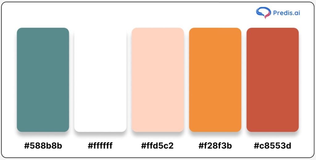
Hex Codes:
- Steel Teal: #588b8b
- White: #ffffff
- Peachy Pink: #ffd5c2
- Cadmium Orange: #f28f3b
- Cedar Chest: #c8553d
This vibrant fall color palette brings together the crispness of autumn with a warm, welcoming feel. Steel Teal provides a grounding, slightly cool tone that pairs effortlessly with Cedar Chest and Cadmium Orange, capturing the essence of autumn foliage. The soft Peachy Pink and White add a gentle brightness, making this palette versatile and eye-catching without feeling overpowering. This balance of warm and cool tones creates a harmonious, autumnal look that’s both refreshing and inviting.
Perfect for seasonal branding, product packaging, or even social media graphics, this palette can bring to life everything from lifestyle photography to fashion campaigns. The colors are well-suited for projects that want to convey warmth, nostalgia, and the beauty of the outdoors during the fall season.
Use Case Tip: Use Steel Teal as a backdrop for a crisp and clean foundation. Add contrast and visual interest by using Cedar Chest and Cadmium Orange in bold accents or design elements. For an inviting touch, incorporate Peachy Pink and White as highlights, text backgrounds, or subtle overlays. This palette is especially effective for lifestyle brands, autumn product launches, or any project aiming to blend elegance with a cozy, seasonal appeal.
Yellow Fall Color Palette
The yellow fall color palette captures the bright and cheerful side of autumn. Inspired by the golden hues of wheat fields, turning leaves, and the warm autumn sun, yellow adds a burst of optimism and light to any design. It’s a color that symbolizes happiness, warmth, and energy, making it perfect for creating inviting visuals that feel both fresh and vibrant.
Yellow shades in a fall palette can range from soft mustard and amber tones to rich gold, bringing warmth without overwhelming. Yellow is a versatile color for branding and seasonal designs. Paired with deep greens, browns, and rich reds, it complements the natural colors of autumn beautifully.
For any brand looking to bring a sense of positivity and warmth to its fall visuals, yellow offers a bright, refreshing touch. Let’s explore the different fall color palettes featuring these sunny, inviting yellow shades.
15. Black Pearl + Vermilion + Selective Yellow
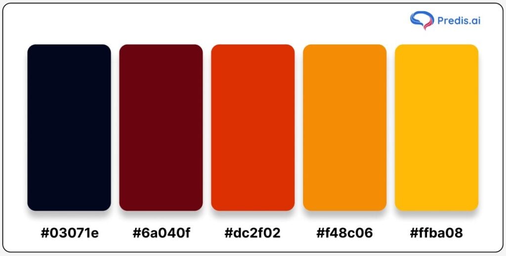
Hex Codes:
- Black Pearl: #03071e
- Deep Burgundy: #6a040f
- Vermilion: #dc2f02
- Amber: #f48c06
- Selective Yellow: #ffba08
This bold fall palette brings a punchy mix of colors that balances deep, rich tones with bright, eye-catching accents. The Black Pearl hue adds a moody, grounding element, ideal for creating depth and contrast. Vermilion and Amber introduce warm, autumnal shades that mimic the fiery reds and oranges of changing leaves, while Selective Yellow brings an energetic pop that keeps the palette vibrant and engaging.
Perfect for brands wanting to grab attention and create a lasting impression, this palette is particularly effective for seasonal advertising, social media graphics, or even product packaging aimed at an adventurous, young audience. The high contrast between Black Pearl and Selective Yellow makes each element stand out while still maintaining a cohesive and autumn-inspired aesthetic.
Use Case Tip: Use Black Pearl as the primary background color for a sleek, modern look, and let Vermilion and Amber serve as bold accent colors that highlight key details. Selective Yellow works beautifully for buttons, calls-to-action, or focal points that demand attention. This palette shines in applications like event posters, fashion lookbooks, or fall-themed digital banners where contrast and vibrancy are essential for capturing interest.
16. Deep Space + Auburn + Indian Yellow Fall Color Palette
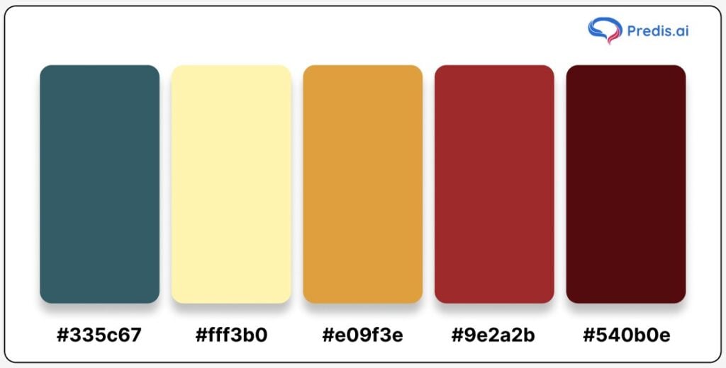
Hex Codes:
- Deep Space: #335c67
- Buttercream: #fff3b0
- Indian Yellow: #e09f3e
- Auburn: #9e2a2b
- Ox Blood: #540b0e
This fall palette beautifully captures the warm, nostalgic tones of autumn, bringing together shades that evoke cozy evenings, falling leaves, and seasonal gatherings. Deep Space, a dark teal hue, serves as a grounding background color that sets a moody, rich foundation, while Buttercream and Indian Yellow introduce warmth and vibrancy. Auburn and Ox Blood provide depth and intensity, reminiscent of autumn foliage and the season’s natural richness.
Ideal for brands looking to create an inviting, comforting feel, this palette is well-suited for seasonal promotions, event invitations, or social media posts centered around fall holidays like Thanksgiving. The harmonious blend of dark and warm tones makes it versatile and effective for industries such as food, hospitality, and home décor.
Use Case Tip: Use Deep Space as a background to establish a calming foundation, letting Indian Yellow and Auburn pop as accent colors for text or product highlights. Soft Yellow works well as a complementary color to add subtle details or as a soft overlay, while Rich Burgundy can serve as a striking focal point for buttons, calls-to-action, or headers. This palette is especially impactful in marketing materials or website themes for brands aiming to capture the warm essence of autumn in a refined, approachable way.
Red Fall Color Palette
The red fall color palette embodies the bold and fiery spirit of autumn. From the deep crimson of maple leaves to the vibrant hues of ripe apples, red symbolizes warmth, energy, and passion. This color palette is perfect for creating visuals that grab attention and evoke a strong emotional response.
Red shades can bring a sense of excitement and urgency to your designs while still maintaining a connection to the natural world. Red works beautifully in combination with browns, oranges, and even purples, making it ideal for branding, seasonal campaigns, or any design project looking to capture the essence of autumn.
It adds intensity and richness to any color scheme, giving your visuals depth and warmth. Let’s explore the different fall color palettes featuring these striking red shades.
17. Sage + Catawba + Peach Fall Color Palette
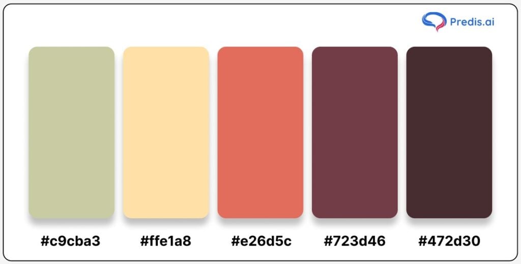
Hex Codes:
- Sage: #c9cba3
- Soft Peach: #ffe1a8
- Warm Catawba: #e26d5c
- Deep Berry: #723d46
- Chocolate Brown: #472d30
This fall color palette is all about creating warmth and harmony. The soft, muted greens of Sage add a grounding element, evoking calmness and stability, while Catawba and Peach bring in cozy, warm notes that reflect the hues of autumn leaves and fading sunsets. Deep Berry and Chocolate Brown deepen the palette, giving it a rich, layered feel that is ideal for seasonal designs with a sophisticated edge.
The Sage + Catawba + Peach palette is perfect for brands looking to create a refined, approachable look that still feels fresh. These colors work well for lifestyle brands, especially those in wellness, home decor, and fashion, where a balanced mix of earthy and warm tones can convey comfort and trust. Additionally, Sage’s trendy appeal keeps this palette feeling current, making it suitable for rebranding efforts that want to feel grounded yet modern.
Use Case Tip: Use Sage as the dominant color to create a serene background, adding accents of Peach for softness and Catawba for warmth. Deep Berry can be used to create depth in headings, buttons, or focal points, while Chocolate Brown provides an ideal contrasting shade for text. This palette’s inviting, harmonious feel makes it ideal for social media posts, website themes, or branding materials that aim to capture the relaxed, cozy vibe of fall.
18. Mango Tango + Antique Bronze + Max Yellow Red
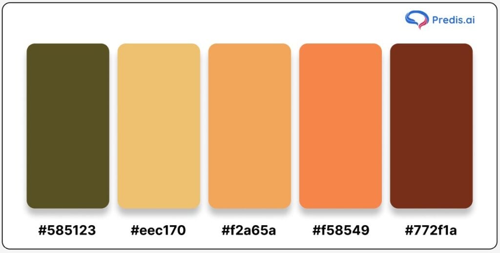
Hex Codes:
- Antique Bronze: #585123
- Max Yellow Red: #eec170
- Mango Tango: #f2a65a
- Sunset Orange: #f58549
- Deep Rust: #772f1a
This fall color palette is a nostalgic nod to the retro hues of the 1970s and 1980s, evoking memories of cozy kitchens, warm gatherings, and the rich autumn tones of days gone by. The earthy shade of Antique Bronze provides a grounded feel, while the vibrant Max Yellow Red and Mango Tango add warmth and energy to the palette. Sunset Orange and Deep Rust round out the palette with a touch of intensity, creating a dynamic yet balanced collection of colors.
Perfect for brands aiming to capture a vintage-inspired yet contemporary look, this palette is well-suited for food and beverage brands, retro-themed social media designs, or home decor items with a classic twist. The deep hues in this palette can bring a cozy, homey feel, making it ideal for seasonal product packaging, website designs, or autumn-inspired promotional materials.
Use Case Tip: Use Antique Bronze as the primary background to create a rustic, earthy canvas. Mango Tango and Max Yellow Red can be incorporated as accents to bring warmth and brightness, ideal for text, call-to-action buttons, or small design elements. Sunset Orange and Deep Rust add richness and depth, making them great choices for borders, logo designs, or highlighting key visuals. This palette captures the essence of a comforting, retro autumn look, perfect for brands looking to evoke nostalgia while staying stylishly relevant.
19. Dark Sienna + Rust + Blood Red
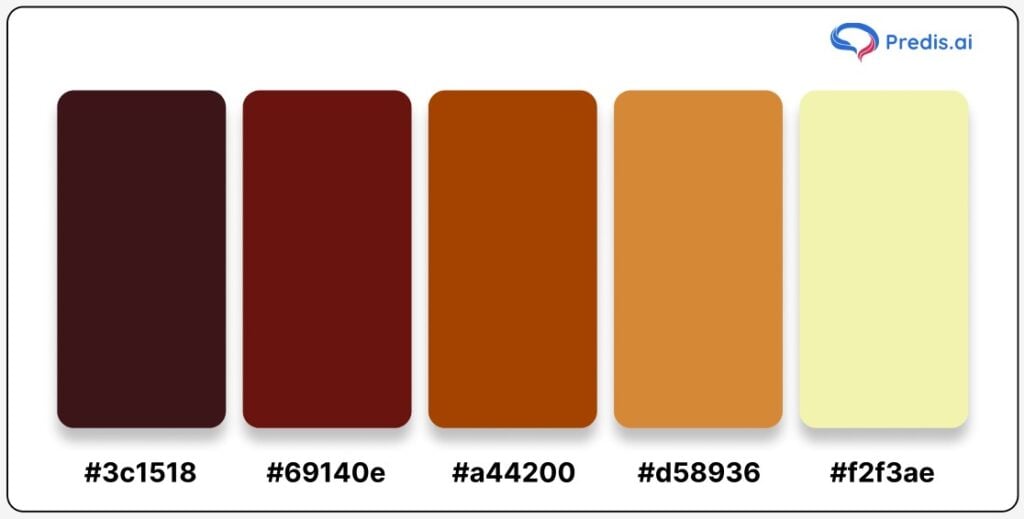
Hex Codes:
- Dark Sienna: #3c1518
- Blood Red: #69140e
- Rust: #a44200
- Golden Ochre: #d58936
- Ivory Yellow: #f2f3ae
This rich fall color palette stays true to the deep, earthy hues of autumn, centering on the iconic shades of red, orange, and yellow that signal the changing leaves and cozy warmth of the season. Dark Sienna anchors the palette with a robust, grounding tone, while Blood Red and Rust provide a vibrant contrast, adding warmth and intensity. Golden Ochre introduces a softer, golden hue, balancing the boldness with a touch of sophistication, and Ivory Yellow brings in a light, gentle brightness to complete the look.
Ideal for brands looking to evoke strength and passion with a touch of elegance, this palette suits industries from fashion to home decor to gourmet food. It works beautifully in seasonal campaigns, holiday promotions, and designs that call for a classic yet bold autumn feel. The high contrast between the dark and bright tones also makes it versatile for creating visual layers, allowing for easy readability and focal points in designs.
Use Case Tip: Start with Dark Sienna as a background color for a dramatic effect, and use Rust and Blood Red as accent colors for elements that need to pop, such as headlines, icons, or buttons. Golden Ochre can be used sparingly to add a hint of luxury or warmth, especially in text or logos. Ivory Yellow is ideal for subtle highlights or backgrounds, creating depth and a warm glow that makes the entire palette feel inviting. This combination makes a strong, memorable impression and captures the bold essence of fall in all its fiery beauty.
20. Skobeloff + Champagne Pink + Golden Gate Bridge
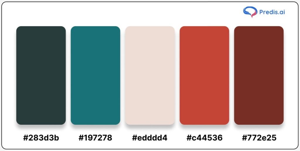
Hex Codes:
- Skobeloff: #283d3b
- Teal: #197278
- Champagne Pink: #edddd4
- Golden Gate Bridge: #c44536
- Deep Burgundy: #772e25
This dynamic fall color palette blends the timeless hues of autumn with a modern twist. The deep teal shades of Skobeloff and Teal introduce a refreshing, cool tone, while the warm reds of Golden Gate Bridge and Deep Burgundy add a sense of bold elegance. Champagne Pink softens the look, bringing a gentle contrast that enhances the overall composition. Together, these colors create a balanced, vibrant, and unique fall aesthetic perfect for brands aiming to make a statement without sticking to conventional palettes.
This combination is particularly suited to brands in fashion, art, and creative industries looking to stand out with an unexpected fall look. It provides a sense of depth and luxury, which works well for packaging, seasonal advertisements, or social media graphics. The cool teal tones add a modern vibe, while the warm reds anchor the palette in autumn’s earthy charm.
Use Case Tip: For a balanced look, start with Skobeloff or Teal as your base to keep the design grounded and sophisticated. Use Champagne Pink as an accent to soften the palette, making it more approachable and refined. Finally, Golden Gate Bridge and Deep Burgundy can be used as pop colors for focal points, like call-to-action buttons, product highlights, or seasonal promotions. This palette’s harmony of cool and warm tones will lend a modern yet inviting feel to any fall-themed design.
Top 10 Tips to Utilize Fall Color Palette
Fall colors set a cozy vibe that encourages people to get a cup of hot chocolate and relax by the fire. However, that shouldn’t be your only inspiration to use these beautiful colors in your designs.
Below are handy tips that can help introduce variety while keeping things cohesive in your designs:
1. Keep it Consistent
Consistency is the cornerstone of a well-designed color scheme. Make sure each palette you choose has at least one color that ties it to the others, whether through complementary, analogous, or tetradic relationships. This approach ensures that even if you’re working with a variety of designs – be it branding or seasonal product sets – they’ll all feel connected.
2. Experiment with Texture
Fall colors have a natural depth that can be accentuated with textures like wood grain, linen, or watercolor effects. These textures bring out the richness in earthy hues like pale yellows, sage greens, or warm browns. By layering in textures, you can prevent lighter colors from fading into the background and add more character to your design.
3. Maintain Visual Balance
A balanced palette is key to avoiding a color-heavy or overly rich design. If you’re using deeper shades like wine red or burnt orange, balance them with lighter neutrals to create contrast. This visual balance helps establish a clear hierarchy and keeps the design from feeling overwhelming.
4. Play with Light and Shadow
Lighting effects can add drama and depth, emphasizing certain hues while softening others. Consider using shadows or highlights to make specific colors stand out or recede. This technique is especially effective in digital designs where lighting effects can add a sense of dimension and mood, enhancing the seasonal vibe of the palette.
5. Incorporate Seasonal Elements
Autumn is associated with iconic visuals like falling leaves, cozy sweaters, and pumpkin spice. Integrating these elements subtly within your design – such as in backgrounds, icons, or decorative accents – enhances the fall theme without overpowering your main content.
6. Embrace Metallic Tones
Adding a metallic tone, such as bronze or copper, can elevate your fall palette, adding an element of luxury and intrigue. Metallics not only provide texture but also help highlight certain elements, making them perfect for emphasizing headings, icons, or specific sections in your design.
7. Choose a Subtle Background
Not every design benefits from a bold background, especially if you’re aiming for elegance and subtlety. To allow other colors to pop, choose a neutral or muted shade for your background. For instance, creamy beige or soft gray can set the stage for more vibrant colors to shine. However, if you’re going for a dramatic look, a bold background color like deep forest green or charcoal can create an eye-catching contrast.
8. Add Visual Interest with Gradients
Gradients add movement and visual interest to your designs without being too overpowering. Blend autumnal shades like warm orange fading into a deep maroon or golden yellow transitioning to burnt sienna. Gradients create a soft, seamless transition that’s pleasing to the eye and adds a modern twist to traditional fall colors.
9. Use Fall Colors in Typography
Your choice of typography colors can make a significant impact. Darker fall colors like espresso or rust can ground your headings, while lighter shades like cream or champagne work well for body text. Keep readability in mind and ensure there’s enough contrast between text and background.
10. Test Across Devices
Remember that colors can appear differently on various devices or print mediums. Test your fall palette across multiple screens to ensure it looks consistent. Adjustments may be necessary to maintain the depth and vibrancy of your chosen colors.
Embracing these tips will help you create Instagram post with AI that not only celebrate the beauty of fall but also feel polished, professional, and inviting. With the right approach, you can fully harness the warmth and coziness of a fall color palette to connect with your audience in a meaningful way.

Importance of Color Theory for Brands and Businesses
Color isn’t just for aesthetics – it’s a tool that can shape how people feel about your brand, create memorable first impressions, and even drive actions. The colors you choose for your branding go beyond visual appeal; they become a language that communicates your brand’s values, personality, and promises without words.
Color theory is vital to branding and business. It can create visual interest, convey a message, or make a product more appealing. When used correctly, color can be a powerful marketing tool.
When using color in branding and business, keep a few things in mind. First, it’s important to understand the meaning of each color. Second, consider the audience you’re trying to reach. Finally, use color purposefully and sparingly.
Understanding the meaning of colors is key to using them effectively in branding and business. Each color has its associations and connotations. For example, red is often seen as aggressive and exciting, while blue is associated with trustworthiness and calmness. If you’re trying to create a feeling of excitement, red might be a good choice. Or if you want to convey a message of trustworthiness, blue might be a better option.
Let’s see why understanding and using color theory is so important for brands and businesses:
1. Create Memorable First Impressions
People form opinions about a brand in seconds, and color plays a big role in that snap judgment. Warm colors like red grab attention and convey energy, while cool colors like blue evoke calm and trust. Selecting the right colors helps your brand leave an impact and instantly sets the tone for what customers can expect.
2. Build Strong Brand Recognition
Think of colors as part of your brand’s signature. When used consistently, colors become an unmistakable part of your identity, like the red of Coca-Cola or the blue of Facebook. This consistent use across all touchpoints builds recognition, helping customers remember and return to your brand.
3. Spark Emotional Connections
Each color brings a mood or feeling. For instance, green often represents growth and health, while purple can signal creativity or luxury. Choosing colors that align with the emotions you want to inspire allows your brand to connect with customers on a deeper level, making them feel understood.
4. Guide Customer Actions
Color can gently steer your audience toward specific actions. Bold, bright colors like orange and red work well for buttons and calls to action, drawing attention where it’s needed most. Subtle backgrounds in softer tones keep the focus on essential elements, enhancing the user journey.
5. Create a Cohesive Brand Image
A thoughtful color palette brings a sense of unity to your brand. When customers see the same color scheme on your website, ads, and social media, it feels cohesive, strengthening trust and making your brand look polished. Cohesion is key for brand recognition and credibility.
6. Appeal to Target Audiences
The right colors can help you connect with your audience. For example, younger audiences might enjoy vibrant, playful hues, while a more traditional audience may respond better to classic, muted tones. Tailoring your palette to your audience’s preferences boosts relatability and appeal.
In short, color theory is more than design; it’s a powerful way to communicate with customers, enhance brand recall, and inspire action. By tapping into color psychology, you can create a brand identity that resonates and stands out in the market.
Conclusion
A fall color palette is impossible to go wrong with, whether building a new brand, updating your corporate identity, or adding seasonally suitable visual assets to your communications plan.
As the saying goes, there’s a reason we don’t perceive the world in black and white. That’s because colors, whether we recognize it or not, have the capacity to impact us and generate compelling storylines.
Learn how to use various colors as well as the significance and energy of each hue. Not only will you have developed a more meaningful product or brand, but you will also be able to elicit the appropriate emotions in your audience.
With a thoughtful approach to balance, consistency, and creative expression, fall colors can bring fresh life to your designs, making them more engaging and memorable. And if you’re looking for an effortless way to experiment with these seasonal shades, check out Predis.ai‘s Instagram post generator to generate beautiful color palettes easily.
For more social media tips and updates, follow us on our Instagram!
FAQs
The fall color palette typically includes deep, earthy tones inspired by autumn’s natural landscape. The seven common colors are rich brown, burnt orange, mustard yellow, olive green, deep red, maroon, and warm beige. These colors bring out the warmth and coziness that define the fall season.
Fall colors evoke warmth, comfort, and a sense of grounding, making them perfect for creating an inviting and approachable brand image. Using these colors in your designs or marketing materials can help connect with customers on an emotional level, especially as they’re associated with a season known for gathering, relaxation, and renewal.
Start by identifying the message and vibe you want your brand to convey. Then, experiment with different shades in your fall palette to see which ones resonate best with that vibe. Tools like Predis.ai’s color palette generator make it easy to mix and match shades to find the perfect combination that reflects your brand’s personality.
Yes! Fall color palettes can add warmth and visual interest to websites, social media posts, and digital ads. Rich, muted tones tend to work well on screens and can make your content stand out, especially during the autumn months.