

Explore this content with AI:
Color can have a major influence on the overall messaging and efficacy of a new brand, whether you’re starting from scratch or producing an exciting new product. Certain color combinations have the ability to capture our attention, elicit emotion, and ultimately produce a lasting impression. Browse our aesthetic color palette to raise your creative game and get the benefits. Knowing what colors work together is a talent in and of itself that may benefit you in many aspects of your life.
You’ll see how colors may impact perceptions after you learn what they signify and the theory of color. You can then use this for personal or commercial purposes. Color can assist you to reach your goal of making your audience feel something. It is the same whether you are selecting colors for a leaflet, an image, a business card design, or selecting the ideal color combination for your logo or website.
Choosing the proper aesthetic color palette for your brand or website is just as crucial as selecting the right font for your logo design or having a memorable brand name. In this post, we’ll look at some amazing aesthetic color palettes that might help your business stand out.
What Is a Color Scheme?
A color scheme is a collection of colors. A color scheme incorporates one or more of the color wheel’s twelve colors. By blending colors, you may create a variety of color palettes.
It is entirely up to you whether you choose comparable or contrasting colors. There are certain color combinations that work well in most situations. However, you must exercise extra caution when selecting colors since they will influence how people view your brand, goods, website, and so on.
However, deciding on the best aesthetic color palette and how to employ it is not a simple task. Colors have a big impact on how people engage with you and what they think about your business. As a result, it is vital to choose them prudently.
We connect some hues with trust, such as blue, while others, such as red, elicit excitement. We’ll go into more depth about it later. Choosing the appropriate aesthetic color palette might influence how people see your brand.
Color schemes are important because they reflect your ideals. Thus, the colors you pick may influence how people see you and what they think of you. Furthermore, colors impact many purchasing choices. Some color schemes work better than others.
Here is an example of color schemes:
What Is Color Psychology?
Each color can be associated with a different meaning. Color meanings or the feelings that colors evoke in others differ throughout civilizations. The study of colors in relation to human behavior is known as color psychology.
Color psychology attempts to explain how colors influence our attitudes, responses, emotions, sensations, behavior, and choices, among other things. Colors are seen differently by various individuals depending on their personality, age, gender, culture, personal experience, and other factors.
Color psychology is a little vague. However, there is no denying that colors have an impact on us. When we go shopping, we are drawn to products based on their colors. Others, on the other hand, do not tell us anything and do not draw our attention to themselves.
Why Pay So Much Attention to Colors?
While it is important that the core content is of high quality, the colour palette also has a significant role to play. This is even more so for social media marketing strategies where colours leave a strong first impression, which could be the last if not selected carefully.
Let’s understand why it is important to select the right colour palette for your content, regardless of what form it is in—be it blogs, photographs, videos, portfolios, or anything else.
1. Associations
The human mind has a tendency to form associations quickly, and this is especially true for colours. For example, when looking at yellow, the first things that comes to mind is something positive and bright,—like the sun, mangoes, daisies, sunflowers, etc.
Therefore, if your page is going to talk about positivity and well-being, colour palettes that incorporate yellow are an excellent choice.
2. Visual Impact
The second most important aspect of choosing colours is creating a visual impact. Think black and white—when used properly with the right contrast and sharpness, black and white images can instantly captivate a viewer.
The way colours are paired and complemented with other colours and tones can leave a strong impact on your audience. This can help set the overall idea of your content—for example, using brown, earthy tones to reflect reliability and grounded nature or using blues to represent independent ideas.
3. Accessibility
Diversity and inclusion are important when choosing brand colours. Owing to their visual capabilities, some people in your audience may not be able to make the same associations with the colours in your brand palette as others.
Thus, it becomes important to have several brand colour palettes that consider those with impaired vision, like colorblind people. Creating palettes that include them in your brand message sends a strong impression that you care for all your audiences.
4. Emotional Connection
Colors have the power to evoke emotions and stir feelings within your audience.
Whether it’s the warmth of reds and oranges igniting passion or the coolness of blues and greens invoking a sense of calm, the emotional resonance of your chosen color palette can deeply impact how your audience engages with your content.
5. Brand Identity
Consistency in color usage across your brand materials reinforces brand recognition and identity.
Selecting a cohesive color palette that aligns with your brand values and personality helps to establish a strong and memorable brand presence. It ensures that your audience can easily recognize and associate your brand with its unique visual identity, fostering trust and loyalty over time.

20 Best Aesthetic Color Palette Design Inspirations For Your Brand
1. Yellow + Magenta + Cyan + Black Aesthetic Color Palette
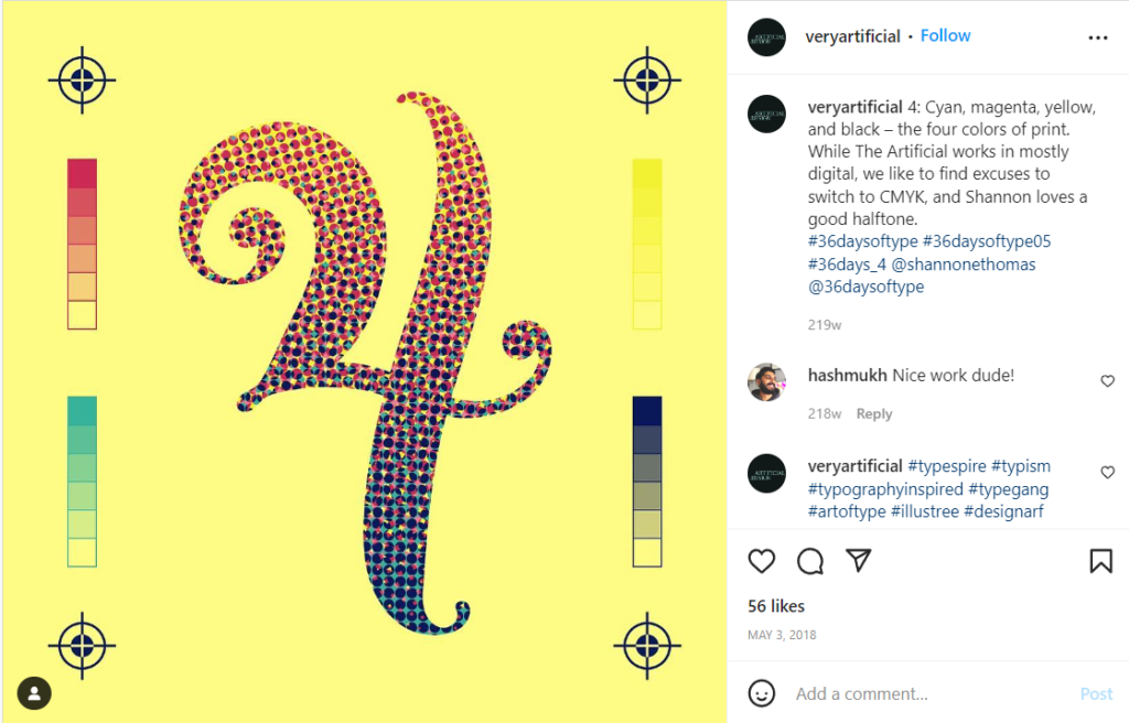
Hex code: #e2d810 | #d9138a | #12a4d9 | #322e2f
These four ink colors are used in almost every print production. They can create any color conceivable when combined. They work together to produce an aesthetic color palette that is vibrant, modern, and full of life.
2. Shades of Pink + Brown Aesthetic Color Palette
Hex code: #e75874 | #be1558 | #fbcbc9 | #322514
Pink is trendy, young, and elegant, and combining various tones gives movement and depth to the design. Pink with dark brown offers a significant amount of contrast and gravitas.
3. Navy + Ochre + Burnt Sienna + Light grey Aesthetic Color Palette
Hex code: #26495c | #c4a35a | #c66b3d | #e5e5dc
The natural colors of this earth-tone aesthetic color palette pop off the packaging with neutral backgrounds.
4. Blue + Maroon + Indigo
Hex code: #408ec6 | #7a2048 | #1e2761
Blue, being the primary color in this design, promotes trust and responsibility. We feel the cutting-edge passion as the gradient goes towards indigo and maroon.
5. Red + Sea-foam + Jade + Violet
Hex code: #d72631 | #a2d5c6 | #077b8a | #5c3c92
This triadic-based combination has mellow, flowery hues that evoke feelings of serenity and regeneration while adding a vintage touch.
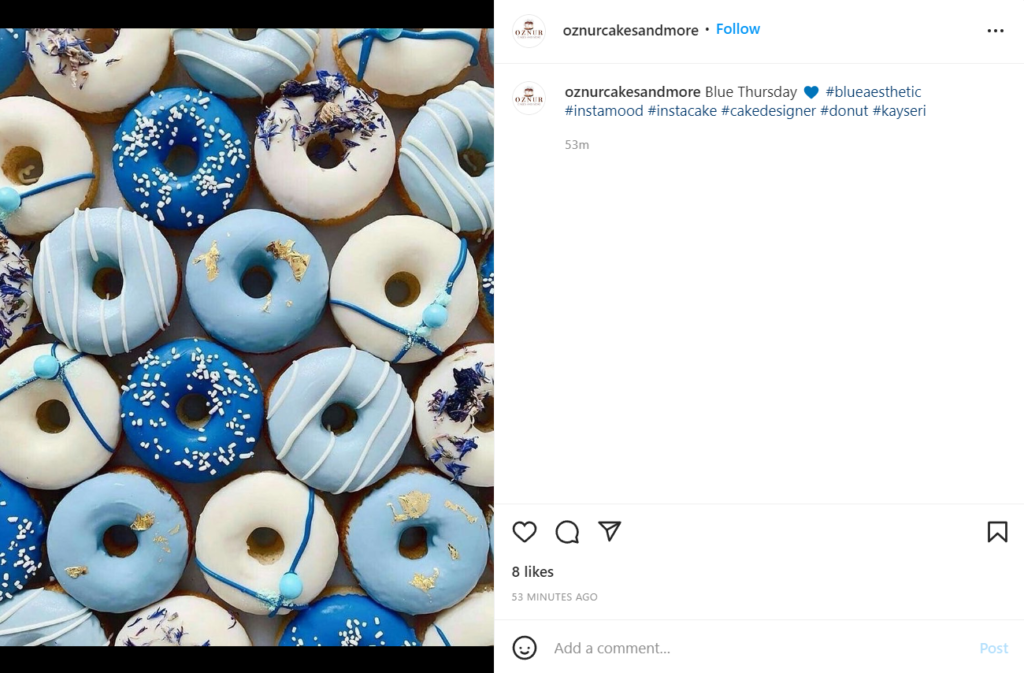
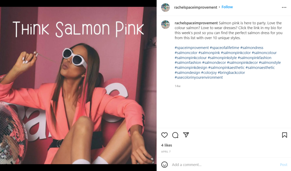
6. Peach + Salmon + Teal Aesthetic Color Palette
Hex code: #efb5a3 | #f57e7e | #315f72
Salmon and peach are two colors that look great together. The teal accent adds another degree of depth.
7. Tan + Deep turquoise + Black Aesthetic Color Palette
Hex code: #ecc19c | #1e847f | #000000
This combination highlights turquoise’s adaptability as a hue that suggests nature and rebirth over a natural, manly tan foundation. The use of nude colors works well in the context of fashion and beauty, read more about the nude color palette.
8. Rouge + Green + Magenta
Hex code: #da68a0 | #77c593 | #ed3572
Vibrant femininity, rich luxury, and a powerful life accent. This amazing combination packs a lot of punch into just three basic colors and adds a pop of color to any black and white design.
9. Yellow-green + Olive + Forest green Aesthetic Color Palette
Hex code: #e1dd72 | #a8c66c | #1b6535
These three green colors are the ideal complement to this mint and lime beverage. They combine to provide a stunning combination of enthusiasm and freshness.
10. Turquoise + Mustard + Black
Hex code: #7fc3c0 | #cfb845 | #141414
This traditional aesthetic color palette of cold and warm tones promotes both tranquility and happiness. The black offers a striking, modern touch.
11. Mustard + Sage + Forest green Aesthetic Color Palette

Hex code: #e3b448 | #cbd18f | #3a6b35
These three harsh tones allude to wood, trees, and leaves—the same natural colors seen in the image.
12. Deep pine green + Orange + Light peach

Hex code: #1d3c45 | #d2601a | #fff1e1
Orange stands out in the crowd as one of the least utilized aesthetic color palettes. This hue is energizing and enlivening. Light peach offers a youthful touch, while rich pine green accents provide warmth and natural comfort. This is familiar to a fall color palette, read more about it here.
13. Mauve + Sapphire + Powder blue
Hex code: #d9a5b3 | #1868ae | #c6d7eb
This aesthetic color palette has a deep mauve and delicate powder blue screams femininity. The vivid sapphire provides another element of modern style.
14. Navy + Almond + Red-orange + Mango Aesthetic Color Palette
Hex code: #1e3d59 | #f5f0e1 | #ff6e40 | #ffc13b
This blue aesthetic color palette with flaming accents provides dependability and an aggressive punch against the bland almond.
15. Magenta + Goldenrod + Turquoise + Brick Aesthetic Color Palette
Hex code: #cf1578 | #e8d21d | #039fbe | #b20238
This multicolored palette packs a lot of flair into a little space. Yellow, as the dominant hue, conveys warmth and accessibility, while the accent colors create a sense of liveliness and sophistication.
16. Raspberry + Shades of blue
Hex code: #8a307f | #79a7d3 | #6883bc
The base of this combo, like the palette above, is trustworthy blue, while the pinkish-purple touch of raspberry provides exquisite elegance.
17. Fuchsia + Sepia + Hot pink + Dark violet
Hex code: #d902ee | #ffd79d | #f162ff | #320d3e
In this magnificent combo, brilliant warmth brings a golden hour sunset to life. Three contrasting pinks and violets suggest luxury, while the sepia accent lends a retro touch.
18. Fuchsia + Yellow + Magenta Aesthetic Color Palette
Hex code: d13ca4 | #ffea04 | #fe3a9e
Modern: check. Young: check. Bold: check, check, check. This vibrant aesthetic color palette doesn’t have to work hard to create an immediate first impression.
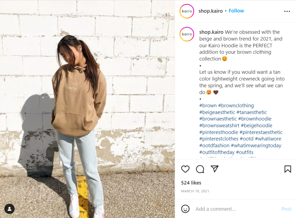
19. Beige + Slate + Khaki Aesthetic Color Palette
Hex code: #f6ead4 | #a2a595 | #b4a284
Two complementing brown tones lean macho. A khaki-grey accent provides a hint of refinement and sophistication.
20. Light pink + Green + Sea-foam Aesthetic Color Palette

Hex code: #f5beb4 | #9bc472 | #cbf6db
This delicate aesthetic color palette combines natural greens and blues with a feminine pink accent for a sense of calm, warmth, and elegance.
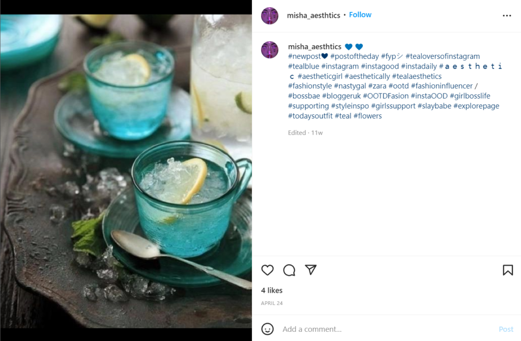
21. Teal + Peach + Azure Soft Pastels
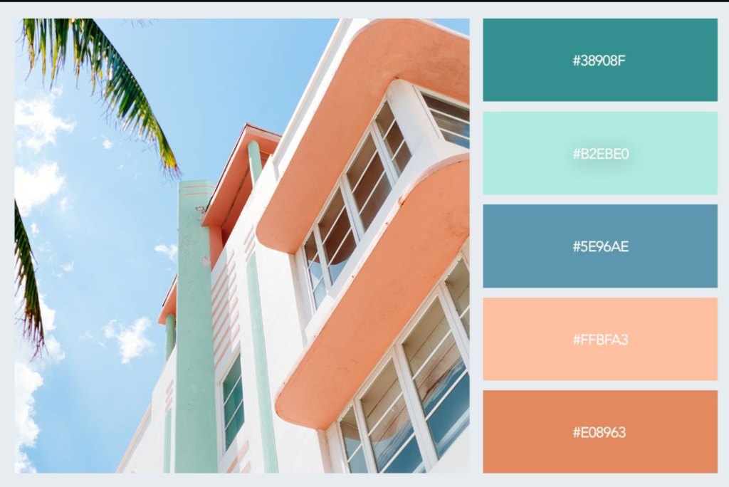
[Source]
Hex code: #38908F | #B2EBE0 | #5E96AE | #FFBFA3 | #E08963
Soft pastel shades create a serene and tranquil ambiance, evoking a sense of peace and relaxation. Their gentle hues exude subtlety and harmony, steering clear of bold, saturated colors often associated with vibrant energy.
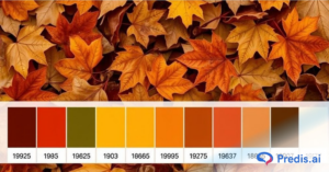
22. Season’s Colors
[Source]
Hex code: #EC8306 | #053BBF | #F77122 | #F1F0EF | #D3CFCF
You can create some of the most stunning visual effects for your social media feed by capturing the colours of the season through a dynamic colour palette. The autumn season would be heavy with oranges and browns, whereas the winter season would have more whites and beiges.

Color Combination: An Overview of Color Wheel
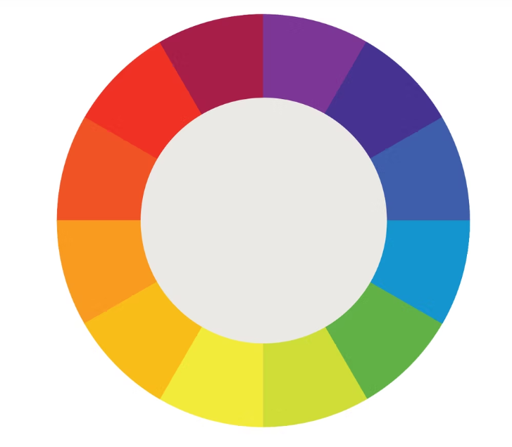
Understanding how various colors interact with one another is essential for effective aesthetic color palettes. Understanding the color wheel and color harmonies (what works, what doesn’t, and how color communicates) can help you blend colors, establish a stronger brand, and interact with designers and printers more effectively.
The color wheel is made up of three primary colors (red, yellow, and blue), three secondary colors (green, orange, and purple are generated when primary colors are combined), and six tertiary colors (colors made from primary and secondary colors, such as blue-green or red-violet).
Draw a line in the center of the wheel to divide the warm (reds, oranges, and yellows) from the cool colors (blues, greens, purples).
Warm colors are generally linked with vitality, brightness, and movement, while cold colors are often connected with quiet, tranquility, and serenity. When you grasp that color has a temperature, you can see how employing it might affect your message.
When colors combine, they form a color scheme or color combination.
- Complementary colors are color wheel opposites. Because of the stark contrast between the two colors, they can truly make pictures jump, but utilizing them too often might get tedious.
- On the color wheel, analogous colors are close to one another. When designing a similar color scheme, one color will dominate, another will support, and another will accent.
- Triadic colors are uniformly distributed over the color wheel and are particularly vivid and vibrant. They generate visual contrast and harmony, allowing each thing to shine out while also making the entire picture stand out.
You can build a variety of excellent color schemes by using the color wheel. It all comes down to picking the appropriate color combination for the right time. One great approach is to use an image that inspires you. Upload the image in a tool like the Predis.ai Color Palette Generator to generate an aesthetic color palette from the image using AI.
Brand Color Palette
Choosing an aesthetic color palette for your business is not a simple task. We all have colors that we enjoy and colors that we don’t like. However, your brand’s color palette must be attractive to your target demographic.
How can you determine which colors will look best together? The answer is not that simple, but what is certain is the need to do audience, competition, and market research.
As colors influence how people view your brand, you must understand color psychology and brand color combinations.


Colors have universal connotations that most people identify with. The trick, though, is to determine the appropriate color combinations. The aesthetic color palette you pick will be determined by your brand’s personality and the feelings you wish to convey.
There is no question that if you want to enhance sales, you must discover the proper brand identification color palette. People choose brands that are readily recognized. They also like brands with which they can identify.

How To Choose Your Brand Colors?
Colors that symbolize your brand are known as brand colors. You must employ them regularly because they can increase brand exposure and recognition. But how many colors can a brand have?
Most companies use five to ten colors, which include main, secondary, and neutral hues. And how do you determine which brand colors work best for your company? You should hunt for ideas from your competition and strive to differentiate your brand.
As a result, learning how to choose your brand colors is critical. Let’s go through everything in further depth!
1. Define your brand identity
Before you choose your brand colors, you must first decide what traits your brand has. I mean, you should consider your brand’s identity. You must spend time evaluating how your consumers, shareholders, and investors view you.
Once you’ve identified some brand personality attributes, you may look into color symbolism to see what colors would work well for your business. Colors have universal meanings; however, they may vary when combined with different colors. As a result, it’s critical to bring your attention to potential color combinations as well.
2. Look for inspiration
In terms of inspiration, you can look up your rivals’ brand colors and see how people view them. Just because your rivals have picked particular colors does not imply you should follow suit.
It is preferable to use a brand color scheme that is distinctive or at least distinguishes you from your competition. This will not happen if you use the same colors. Many people will be confused by you two.
As a result, although you should strive to learn from your competition, you should not mimic them. Not only may you receive unique ideas from your rivals, but also businesses in other sectors.
3. Test your brand colors before making a decision
It is common wisdom to experiment with numerous color combinations before making a final selection. Furthermore, make sure your color pallet is easily accessible. Some colors, when combined with others, make it impossible to read. You must guarantee that this does not happen with your brand colors.
4. Pick colors that resonate with your brand identity
There is no question that you must choose colors that are consistent with your brand’s identity. As a result, you must be familiar with color theory, color symbolism, color combinations, and other related concepts. However, you must use this knowledge to deliver the desired message.
You can’t just choose colors because you like them. Colors should be chosen to complement the characteristics of your brand. People will be able to better grasp your brand this way. And, if they identify with your brand, you’ll probably receive more sales.
Using a digital color picker allows designers to precisely select from a range of hues, ensuring consistency and harmony across their visual projects.
5. Conduct extensive research
Whether you want to raise brand recognition or are confused about what colors to utilize for your business’s aesthetic color palette, you must do a comprehensive study. You should not just look at your competition but also at the market and your target audience.
You should be aware of any colors that are often utilized in your sector. And if your brand’s colors have a distinct effect depending on where you are. Not to mention that understanding which colors your consumers favor and identify with is critical to your success.
6. Choose your primary, secondary and neutral colors
It’s time to choose your brand’s colors. You must begin selecting your dominating color. This color is usually the main color, although it does not have to be. Red in Coca-Cola, for example, or blue in Tiffany’s.
Your dominant color must be the color that best represents your brand. Nonetheless, most companies augment it with secondary and tertiary hues. There are several color combinations to pick from, such as similar, complementary, monochromatic, and so on. The majority of companies choose two to four secondary colors.
However, you should not underestimate the impact of neutral hues. They may appear in your written content or in the backdrop of your assets. As a result, they are important. White, black, and gray are neutral hues.
So, how many colors should you use? It all depends on the message you want to send. Most businesses keep things simple by using just a few colors as brand colors. However, depending on your industry, you may need to choose a few more.
Wrapping It Up
Color schemes should not be picked at random; instead, they should be chosen with care. Making the perfect decision requires careful preparation, research, and a little snooping on your competition.
Remember the importance of color theory and the feelings that colors and their combinations elicit in us. Not to mention how colors influence purchase choices.
We’ve looked at aesthetic color palettes from all around the spectrum, from color theory to traditional combos. The appropriate aesthetic color palette will complement your brand in every manner, elevating it to become identifiable and iconic, whether it is clean and simple or edgy and eclectic.
We hope you’ve been inspired by the aesthetic color palette. Try out the Predis.ai color palette generator to generate beautiful color palettes easily.