

In the high-velocity digital landscape of 2026, a background is no longer just “the space behind the subject.” It has evolved into a functional tool that dictates brand authority, accessibility, and user retention. Whether you are designing a high-converting landing page, a cinematic Instagram Reel, or a professional presentation, the background is your silent narrator.
As we move toward an era of “Neo-Deco” elegance and “After-Dark” cinematic aesthetics, understanding the mechanics of background design is essential for any creator. This guide will walk you through the essential types of backgrounds, professional techniques to master them, and the technical specs you need to stay ahead.
Why Do I Need a Background?
Before diving into the “how,” we must understand the “why.” A well-designed background serves three critical functions:
- Context and Mood: A textured grain background feels organic and trustworthy, while a liquid gradient feels futuristic and innovative.
- Visual Hierarchy: It separates the “signal” (your text/call-to-action) from the “noise,” ensuring the viewer’s eye goes exactly where you want it.
- Brand Signature: Consistent use of specific background styles—like a “Bento Grid” or a custom color overlay—makes your content instantly recognizable in a crowded feed.
The 10 Essential Types of Background Design
1. Solid Color Backgrounds

The ultimate in Bold Minimalism. Solid colors are high-impact and load instantly on web platforms.
A solid background strips away every atmospheric crutch — no gradient to add depth, no texture to add warmth, no image to add story. Every piece of content that sits on top of it is fully exposed. Typography has nowhere to hide its weaknesses. Spacing decisions become obvious. Color relationships between elements become the entire visual conversation.
This is exactly why solid color backgrounds are so powerful when they work: they demand a level of design rigour that more decorated backgrounds can paper over.
2. Solid High-Contrast Backgrounds
This technique uses extreme tonal separation to make elements “pop.” The practical discipline here is palette restraint. When contrast is doing the heavy lifting, two or three colors are almost always enough to create an aesthetic palette. Introduce a fourth, and suddenly the eye has too many decisions to make. Stick to a dominant background, one primary content color, and one accent — and let contrast between those three carry the design.
- The “After-Dark” Aesthetic: Combining deep charcoals or navies with neon accents.
- Best For: Social media headlines where you have less than a second to stop a scroll.
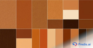
3. Textured Backgrounds

In a world dominated by AI-generated smoothness, tactile visuals are making a massive comeback.
Textures work by introducing a suggestion of the physical world into an inherently flat medium. Paper textures imply craft, editorial care, and handmade quality. Concrete and raw material textures signal urban authenticity. Fabric textures — linen, canvas, woven cotton — evoke warmth and tactility. Grain and noise textures (tight, film-like) add depth to flat color without making a statement.
- Types: Organic grain, paper textures, or “Gimme Gummy” inflated 3D textures.
- Advantage: They add a sense of “physicality” and authenticity to digital designs.
4. Gradient Backgrounds
Gradients in 2026 have moved away from harsh rainbows to Soft Glow Gradients and Liquid Blends.
The sophisticated use is expressive: choose colors that mean something together, control the transition to direct the eye, and integrate the gradient into the overall visual system rather than applying it as a skin.
Gradients communicate things flat colors can’t. A gradient shifts the emotional register of a page as the eye moves across it — creating a sense of journey, depth, or transformation. That’s hard to achieve with any other background technique.
- Linear vs. Radial: Linear gradients guide the eye in a specific direction (top-to-bottom), while radial gradients create a “spotlight” effect on your central subject.
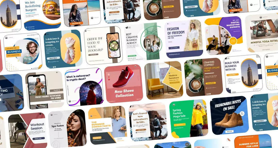
5. Image Backgrounds
Nothing beats the emotional resonance of a full-bleed photograph.
A construction company with a stunning full-screen photograph of a completed home tells you immediately — before the headline, before the navigation, before any text — that they do beautiful work. A meditation app with soft, diffuse light and gentle natural blue tones tells you this experience is going to feel calm before you’ve consciously registered anything. An outdoor adventure brand with a wide-angle mountain shot tells you this is about scale and ambition.
That’s the specific advantage of image backgrounds: they front-load the emotional argument. They show rather than tell, and they do it at the speed of perception rather than the speed of reading.
- The Strategy: Choose “quiet” images with plenty of negative space (empty areas), so your text isn’t fighting for attention against a busy city street or a crowded forest.
6. Transparent & Translucent Backgrounds
Often called “Glassmorphism,” this style uses blurred overlays to create a layered, high-tech look.
The appeal is genuinely functional: a translucent panel creates visual separation without complete visual interruption. The user can still sense the context behind the panel — a rich gradient, a photograph, an abstract scene — while the content on the panel remains clearly in focus. It feels layered, premium, and three-dimensional in a way that opaque cards simply don’t.
Apple’s operating system design is the most studied reference point for this approach. Their notification panels, control center overlays, and dock backgrounds all use blur and transparency to maintain environmental awareness while keeping UI content legible.
- Best For: Modern UI/UX designs and sophisticated brand decks.
7. Pattern Backgrounds
From geometric Neo-Deco lines to organic leaf motifs, patterns provide a rhythmic backdrop.
Scale is perhaps the most important variable in pattern design. A tiny, tight-repeating pattern reads almost like texture — the individual motif disappears and what remains is visual depth. A large-scale pattern where each element is clearly legible makes a statement, positions itself as foreground rather than background, and demands that whatever sits on top of it be equally assertive.
8. Illustrated Backgrounds

Using custom doodles or architectural illustrations gives your brand a unique “hand-drawn” voice.
When a background is illustrated — genuinely drawn, painted, or crafted — it communicates that someone cared about this. Not just about what the product does, but about what the experience of encountering it feels like. That kind of warmth is hard to manufacture and impossible to fake.
The styles available to designers are wide. Watercolor scenes bring softness, whimsy, and authenticity — especially effective for food, wellness, education, and children’s products. Flat vector illustration brings playfulness and clarity, common in SaaS marketing and apps targeting younger professionals. Hand-drawn line work brings energy and personality, often used by creative agencies and independent studios. Abstract painterly backgrounds bring artistic seriousness, frequently found in cultural institutions and premium editorial contexts.
- Impact: It feels human and approachable—a direct contrast to the perfection of stock photography.
9. White (and Neutral) Backgrounds

White space (negative space) is a design element in its own right. It conveys luxury, clarity, and “Calm Modernity” as per color psychology.
When all of those elements are strong, white and neutral backgrounds produce results that no other approach can match. Clarity. Focus. Elegance.
The reason Apple, editorial design, and luxury fashion have collectively gravitating toward white and neutral backgrounds for decades isn’t a lack of imagination — it’s the knowledge that restraint is harder to execute than decoration, and the results speak more quietly but more permanently.
- Target: Use this when your product or message is complex and needs room to “breathe.”
10. Using Shapes and Block Text
The “Bento Grid” is the layout of the year. By using rounded rectangles and geometric blocks in your background, you can organize a large amount of information into digestible chunks.
The fundamental idea is that a shape — a rectangle, a band of color, an organic blob, a geometric form — acts as a stage for the text placed on it. The shape provides a stable, controlled tonal environment for the type, while the background behind it remains visible and active. This separates the readability problem from the atmospheric one.
Professional Techniques for Background Design Mastery
- Creating a Blurred Background: Use a “Gaussian Blur” on a busy photo. This keeps the vibe of the image but removes the detail, turning it into a beautiful, abstract color palette that supports your text.
- Adding a Color Overlay: If an image is too bright, add a black or brand-colored layer at 30%–50% opacity. This “tints” the photo and ensures your white text meets accessibility standards.
- Allowing for Text Space: This is the “Rule of Thirds” for backgrounds. Always ensure the most interesting part of your background image isn’t directly behind your headline.
Technical Specs: 2026 Size Guide For Background Design
To ensure your backgrounds look crisp and professional, you must design for the specific platform.
| Platform | Format | Recommended Size | Aspect Ratio |
| Instagram Reels / TikTok | Full Vertical | 1080 X 1920 px | 9:16 |
| Instagram Feed | Vertical/Portrait | 1080 X 1350 px | 4:5 |
| Facebook Post | Landscape/Square | 1080 X 1080 px | 1.91:1 / 1:1 |
| Desktop Background | Full HD / 4K | 1920 X 1080 px | 16:9 |
| LinkedIn Banner | Wide Header | 1584 X 396 px | 4:1 |
How to Effectively Create a Background (Step-by-Step)
- Define the Tone: Is this for a “Fast-Fashion” sale (High contrast, bold shapes) or a “Wellness Retreat” (Neutral tones, organic textures)?
- Select the Foundation: Start with your base color or image.
- Apply Depth: Add a subtle gradient or texture to prevent the design from looking “flat.”
- Create Safety Zones: Use a color overlay or blur in the areas where you plan to place text.
- Check Accessibility: Use a contrast checker. Your text-to-background ratio should be at least 4.5:1 for standard text.
Common Mistakes & Pro Tips
- Mistake: The “Busy” Trap. Never let your background be more interesting than your message. If people are squinting to read your text, the background has failed.
- Pro Tip: Add “Noise.” Digital gradients can sometimes “band” (showing ugly stripes). Add a 1%–3% film grain or noise filter to smooth out the transition.
- Pro Tip: Sync with Motion. If you are designing for video, ensure the background “vibe” matches the tempo of the music. Fast cuts require high-contrast, simple backgrounds; slow pans work best with textures or images.
Comparison: Pros and Cons of Background Types
| Type | Pros | Cons |
| Solid Color | Fast loading, high legibility | Can feel “cheap” if not styled well |
| Gradient | Modern, adds depth and mood | Can be difficult to manage for accessibility |
| Textured | Tactile, premium, unique | Can increase file size and loading time |
| Image | High emotional connection | Most difficult to overlay text onto |
Conclusion
In 2026, the strongest background designs are those that feel deliberate. Whether you are embracing the raw energy of Neo-Brutalism or the serene glow of Liquid Gradients, remember that the background is the foundation of your visual story. Use it to guide the eye, set the mood, and ultimately, amplify your message.
FAQs
Use a photo when you need to evoke a specific place or emotion (e.g., a luxury hotel). Use a gradient when you want to highlight innovation or energy (e.g., a tech app).
Dark gray background (#333333) with off-white text (#EEEEEE) is widely considered the most readable combination for users with light sensitivity or visual impairments.
Layering is key. Add a subtle shadow behind your text, a very light grain texture over your solid color, or a soft vignette (darker edges) to pull the viewer’s eye toward the center.