


Every product ad you’ve ever remembered the Nike swoosh, Apple’s “Think Different,” Coca-Cola’s holiday campaigns has something in common: clarity wrapped in emotion. Designing a successful product advertisement isn’t just about making something look good. It’s about making something mean something.
In an era where consumers scroll past hundreds of visuals every day, attention has become the most expensive commodity. The difference between an ad that converts and one that disappears in the feed often comes down to design how intelligently it blends visual hierarchy, emotional triggers, and storytelling.
For marketing professionals, entrepreneurs, and designers, mastering ad design means understanding not just what looks good, but why it works. It’s a mix of psychology, data, and creativity three things that rarely coexist comfortably, yet must work together for any campaign to succeed.
This guide breaks down that process in detail. We’ll explore how to:
- Identify what makes an ad truly successful.
- Decode the psychology behind color, layout, and messaging.
- Build designs that tell stories and inspire action.
- Balance creativity with clarity across platforms.
- Measure and optimize ad performance using data.
By the end, you’ll know exactly how to design ads that don’t just sell products — they shape perception, build trust, and make people feel something.
TL;DR 🖋
Designing a successful product advertisement takes more than aesthetic appeal — it’s a blend of psychology, storytelling, and strategic visual design. Great ads don’t just show products; they make people feel something, then guide them to act.
Here’s what you’ll learn:
Understanding Product Advertising Fundamentals
- How clarity, consistency, and emotional connection drive conversions.
- The anatomy of a successful ad: message, layout, emotion, and CTA.
The Psychology Behind Visual Communication
- Why color, composition, and human perception shape ad effectiveness.
- Case insights on emotional triggers and visual flow.
Crafting a Compelling Message
- Writing headlines that hook and copy that converts.
- Using storytelling to transform features into relatable benefits.
The Role of Emotion in Advertising
- How emotion drives 95% of buying decisions.
- Case studies like Always’ #LikeAGirl campaign and its lasting impact.
Visual Hierarchy and Layout Principles
- How scale, contrast, and whitespace guide attention.
- Proven frameworks like Z-pattern and F-pattern layouts.
Using Typography and Color for Maximum Impact
- How fonts and colors influence brand perception and trust.
- The science of color psychology and design consistency.
Real-World Examples of Great Product Ads
- Lessons from Apple, Dove, Nike, and Airbnb on authenticity, emotion, and clarity.
Understanding the Core of a Successful Product Advertisement
Before opening Photoshop or Canva, pause. A successful product ad begins long before the visuals with strategy, empathy, and purpose. You need to know exactly who you’re speaking to, what they care about, and why your product matters to them. The creative execution only works when these foundations are solid.
What Defines a ‘Successful’ Advertisement?
Success in advertising can’t be measured by likes or views alone. A truly successful product advertisement achieves one thing: it moves people to action. That could be buying, clicking, sharing, or remembering your brand days later.
The best ads align three elements: business objectives, audience insight, and creative clarity. For some campaigns, that means generating leads or driving purchases. For others, it’s brand awareness or emotional resonance.
According to Nielsen’s 2024 Global Ad Study, emotionally engaging ads deliver twice the sales impact of rational ones. That’s because humans decide first emotionally, then justify logically. The role of design is to amplify that emotional spark visually through color, composition, and storytelling.
When planning your ad, define what “success” looks like before designing a single pixel. Whether it’s conversions, recall, or sentiment, your design decisions should serve that goal deliberately.
Understanding Target Audience Psychology
Every successful product ad begins with empathy. Who are you designing for, and what are they feeling when they see your ad?
Your audience isn’t a demographic it’s a mindset. A 25-year-old designer and a 45-year-old entrepreneur might both respond to the same message if it reflects their shared values of innovation or freedom. The more deeply you understand these motivations, the more persuasive your visuals become.
Here’s how to tap into that psychology:
- Identify emotional drivers: fear of missing out, aspiration, belonging, self-improvement.
- Speak their visual language: Gen Z audiences resonate with motion, authenticity, and imperfect realism; luxury audiences expect refinement and subtlety.
- Align imagery and copy with lifestyle cues they already trust.

Case Study: Nike’s “Just Do It” isn’t about shoes; it’s about empowerment. Apple’s “Think Different” didn’t show product specs; it celebrated imagination. Both brands connected with core human emotions motivation and creativity rather than features. That’s what turns an ad into a movement.
The Intersection of Branding and Design
Design without branding is decoration. Every color, font, and layout decision should reinforce who you are as a brand. A cohesive visual identity makes your product instantly recognizable and subconsciously trusted.
Forbes reports that consistent branding across all platforms can increase revenue by 23 percent. That consistency breeds familiarity, and familiarity breeds loyalty.
To achieve this:
- Use a defined brand color palette and typography family across campaigns.
- Keep your logo placement and visual tone uniform but adaptable.
- Reflect your brand’s values through subtle design cues — eco-friendly brands might use natural textures; tech brands might emphasize clean geometry.
The Psychology Behind Visual Communication
Design is silent persuasion. Before a viewer reads your copy or clicks your link, they’ve already formed an opinion based entirely on what they see. The color, typography, imagery, and layout all work subconsciously to trigger trust, curiosity, or indifference. Understanding this psychology turns design from a guessing game into a science-backed tool for influence.
1. Color Psychology and Emotional Triggers
Color is the emotional heartbeat of advertising. It’s the first cue our brains process and one of the strongest factors in how we perceive a brand. A study by the University of Winnipeg found that up to 90% of snap judgments about products are based on color alone.
Every shade of color psychology for advertising communicates emotion:
- Red energizes. It creates urgency, passion, or appetite — that’s why it dominates food and clearance sale ads.
- Blue builds trust and calm, which is why financial institutions and tech companies rely on it.
- Green suggests health, balance, and renewal — a natural choice for eco-friendly or wellness brands.
- Black and Gold convey sophistication and exclusivity, ideal for luxury products.
When designing your product advertisement, align colors with both brand personality and campaign goal. For example, a skincare ad might use soft, muted tones to evoke calm, while a sports ad may lean into bold contrasts to spark energy.
2. Typography and Readability
Typography silently shapes your message’s tone. A serif font like Times New Roman feels traditional and trustworthy; a sans-serif like Helvetica signals modernity and clarity. The typeface you choose can shift perception before a single word is even understood.
Good ad typography or fonts for ads follows a few timeless rules:
- Prioritize hierarchy. Make the headline bold and readable even from a glance.
- Avoid overcrowding. Too many fonts or weights create visual confusion.
- Optimize for platform. A billboard needs legibility from distance; a mobile ad needs scannability.
3. Visual Hierarchy and Focal Points
Humans don’t read ads they scan them. A well-structured layout guides the viewer’s eye naturally from focal point to CTA. This is where visual hierarchy becomes your secret weapon.
Designers often use the Z-pattern or F-pattern, depending on the medium. The Z-pattern (common in print and display ads) directs attention from top-left to bottom-right, while the F-pattern (dominant in web and mobile) mirrors how people read text-heavy layouts.

Case Study: Coca-Cola’s “Share a Coke” campaign is a masterclass in visual hierarchy. The eye goes straight to the personalized name on the bottle — not the logo, not the tagline. That’s intentional. By placing the emotional trigger (personalization) at the focal point, Coca-Cola turned a simple product into an experience.
4. Use of Imagery and Iconography
Humans process visuals 60,000 times faster than text, and 65% of people are visual learners. So, the imagery in your ad isn’t decoration — it’s persuasion.
Use high-quality, authentic photos that match your message. Overly polished or generic stock images create distrust, while candid, real-life visuals build relatability.
Icons and illustrations can also enhance clarity — especially in complex products. Use them to guide attention or simplify abstract ideas.
When possible, feature people using your product. Research shows that ads with human faces increase engagement because viewers instinctively mirror emotions. A smiling customer subtly communicates satisfaction better than any tagline.
Crafting a Compelling Message
A visually striking ad might catch attention — but the message decides whether people care. The best product advertisements don’t just describe what’s being sold; they articulate why it matters. In other words, they sell the story, not the specs.
Every word in your copy should work toward one goal: to connect emotionally, spark curiosity, and move the viewer to act. Let’s break down how to write ad messaging that sticks.
1. The Core Message: What Are You Really Selling?
Before writing a single line, ask the fundamental question: What problem does this product solve, and for whom?
The biggest mistake brands make is focusing on features instead of benefits.
For instance:
- A blender that has 1200 watts of power (feature) doesn’t mean much until you say it crushes ice in seconds so your smoothie is ready before your coffee cools (benefit).
Every product ad should communicate one core promise — something your target audience instantly relates to. The more specific, the better.
Template for clarity:
👉 “Our product helps [audience] achieve [specific result] without [pain point].”
Example: “Our skincare serum helps women over 30 restore natural glow without harsh chemicals.”
That’s clarity. That’s positioning.
2. Writing Headlines That Hook
Headlines are the entry point — the difference between a scroll and a click. You have about 3 seconds to make an impression.
The strongest headlines follow a simple principle: clarity over cleverness. Don’t overcomplicate. Instead, combine emotion, benefit, and curiosity.
Examples that work:
- “Wake Up to Better Skin in 7 Days.”
- “The Only Bag You’ll Ever Need for Work and Travel.”
- “Goodbye Cables. Hello Freedom.”
Each headline is short, concrete, and emotionally charged. The goal is not to be poetic; it’s to make the reader stop.
3. The Power of Storytelling
Facts inform, stories persuade. Storytelling gives meaning to your message and makes your product memorable.
Consider Apple’s classic “Shot on iPhone” campaign. It wasn’t about megapixels or resolution; it was about real people capturing real moments — stories that made the camera’s power tangible.
A strong product ad follows a mini story arc:
- The Problem – What’s frustrating your audience?
- The Turning Point – How does your product enter the scene?
- The Transformation – What changes once they use it?
This structure creates emotional resonance, especially in video or social ads where you have a few seconds to build empathy and payoff. This is especially effective when creating AI-powered product review videos, where short-form visuals, real use cases, and emotional cues help viewers quickly understand value and trust the product.
4. Tone and Voice
Your tone should match your audience’s mindset. A fitness ad should sound energetic and motivating; a skincare ad should feel reassuring and trustworthy.
A simple rule:
Speak like your audience, not at them.
If your ad sounds like a corporate announcement, it’s already lost. Instead of “Introducing a revolutionary new formula,” say “Meet the serum your skin has been waiting for.”
That shift from formal to human instantly builds connection.
5. Crafting a Strong Call-to-Action (CTA)
Your CTA is where interest becomes action. Yet most ads lose momentum here with generic lines like “Buy Now” or “Learn More.”
A good CTA completes the story by answering: What happens next?
For example:
- “Try It Risk-Free for 30 Days.”
- “Get Your Personalized Plan.”
- “Join 10,000 Happy Customers.”
Each one adds context, reassurance, and momentum.
The Role of Emotion in Advertising
Logic may convince, but emotion converts. When people see an ad, they don’t process it like a checklist they feel it. Every color, sound, and phrase subtly taps into emotion before reason ever kicks in. Studies show that ads with emotional appeal perform twice as well as those focused purely on rational messaging.

This is why emotional advertising isn’t a creative afterthought; it’s a psychological necessity. Let’s unpack how emotion fuels successful product ads and how you can intentionally design for it.
1. Why Emotion Drives Buying Decisions
We’d like to think people buy because of logic, but neuroscience says otherwise.
A Harvard Business School study found that 95% of purchasing decisions are subconscious, driven by emotion rather than reason.
Here’s how that plays out:
- Joy builds association and positive recall (think Coca-Cola’s happiness campaigns).
- Fear creates urgency and action (insurance, cybersecurity, or health awareness ads).
- Aspiration fuels lifestyle branding (Nike’s “Just Do It”).
- Belonging taps into identity (Apple’s “Think Different” community).
Emotional advertising works because it gives consumers permission to feel before they justify their choice.
2. Emotional Design in Visuals and Copy
Every element — from color to font to photography — can trigger emotion when used deliberately.
Here’s how to align them:
- Colors: Warm hues (red, yellow, orange) amplify excitement and urgency. Cool tones (blue, green) promote trust and calm.
- Typography: Rounded fonts feel friendly; bold sans-serifs convey confidence; serif fonts communicate authority.
- Imagery: Use authentic human expressions — not stock photos — to reflect genuine emotion.
- Language: Choose words that mirror your customer’s feelings, not your product’s features.
Example: Instead of “Advanced hydration formula,” say “Skin that feels like it’s finally breathing again.” One talks about the product; the other makes you feel it.
3. Case Study: Always “#LikeAGirl” Campaign
A brilliant example of emotional storytelling is Always’ “#LikeAGirl” campaign.
Instead of selling a hygiene product, the brand challenged a limiting social stereotype — transforming a common insult into a badge of pride.
This emotional pivot didn’t just win awards; it changed perception.
- The campaign saw a 50% increase in brand loyalty among young women.
- Millions engaged with the hashtag worldwide.
What worked wasn’t the product; it was the emotional truth behind the message — empowerment.
4. Evoking Emotion Without Manipulation
There’s a fine line between emotional resonance and emotional exploitation. Manipulative fear-based tactics might work short term, but they erode brand trust fast.
Instead:
- Ground emotions in truth — show authentic challenges your audience faces.
- Offer a hopeful resolution through your product.
- Avoid guilt or shame; inspire empowerment or relief instead.
When emotion connects to honesty, it deepens trust.
5. How to Identify Emotional Triggers for Your Brand
To design with emotion, start by asking:
- What emotion do I want my audience to feel after seeing this ad?
- What emotional state are they currently in before seeing it?
- How can my product bridge that emotional gap?
You can map these insights using tools like empathy maps or customer journey moodboards, helping your creative team visualize emotional flow — from awareness to conversion.
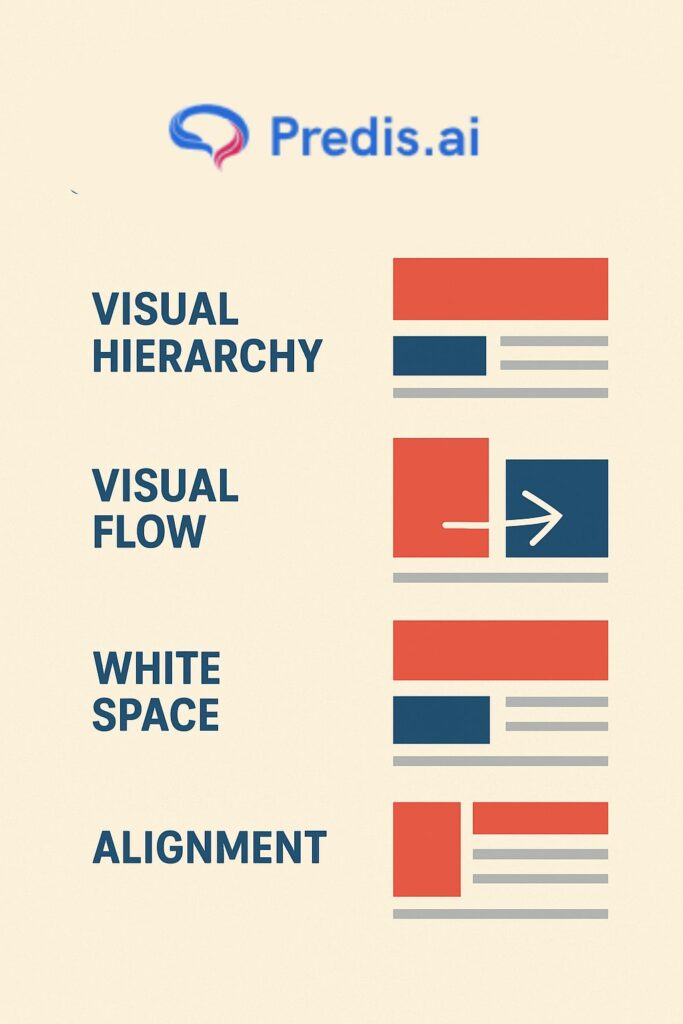
Visual Hierarchy and Layout Principles
Even the most beautiful ad can fail if the viewer’s eye doesn’t know where to go first. That’s what visual hierarchy fixes — it guides the viewer’s attention, creating a natural flow from what’s most important to what comes next.
Good design isn’t about filling space. It’s about creating intentional order. In advertising, that means organizing visuals and text so people instantly understand the message and feel motivated to act.
1. What Is Visual Hierarchy?
Visual hierarchy is the art of directing attention. It uses size, contrast, color, and placement to show viewers what matters most.
Key principles include:
- Scale: Bigger elements draw attention first. Use size to emphasize your product or key message.
- Contrast: Bold text against a muted background highlights the message.
- Proximity: Group related elements together — product, tagline, and CTA should feel like one visual thought.
- Alignment: Keep visual balance; misaligned text or objects create subconscious tension.
- Whitespace: Don’t fear empty space — it improves focus and sophistication.
A study by the Nielsen Norman Group found that users read only about 20% of text on a page, scanning visually for cues. That’s why strong hierarchy keeps them anchored and helps your core message land instantly.
2. Layout Frameworks That Work
Every great ad follows a structure that feels “right” to the human eye. Some classic frameworks:
- Z-pattern layout: Ideal for print or display ads. The eye naturally scans left-to-right, top-to-bottom, forming a “Z” shape — perfect for placing the logo, product image, and CTA strategically.
- F-pattern layout: Common in web and social media ads. Viewers scan horizontally first, then vertically down — great for headline-heavy designs.
- Centered composition: Strong for luxury or minimalist brands; keeps focus on one central element (like a product close-up).
These aren’t rules to restrict you — they’re blueprints that make your creativity work harder.
3. Case Study: Apple Product Ads
Apple’s product visuals are a masterclass in hierarchy and restraint. Notice how:
- The product dominates the visual field.
- The background stays clean and consistent.
- Text is sparse — usually one headline and one CTA.
- Whitespace amplifies focus rather than emptiness.
This design clarity isn’t accidental. It ensures the audience’s eye moves from product → benefit → action without friction. It’s why Apple ads feel both premium and effortless.
4. Balancing Text and Imagery
Visual hierarchy isn’t just about visuals — it’s about balance between visuals and copy.
- Too much text overwhelms the design.
- Too few words create ambiguity.
To find the sweet spot:
- Lead with imagery that creates emotional context.
- Use concise copy to clarify what the viewer should think or feel.
- Keep your CTA visually distinct (different color or shape).
In digital ads, eye-tracking studies show that CTA buttons with high-contrast colors improve conversions by up to 32%.
5. Actionable Design Checklist
Before finalizing an ad layout, ask:
- Is the focal point clear within one second?
- Is the headline easily readable on all devices?
- Does every element have breathing space?
- Does the visual flow lead to the CTA naturally?
If you can answer “yes” to all, your layout likely works both emotionally and visually.
Using Typography and Color for Maximum Impact
Typography and color aren’t just decoration — they’re silent persuaders. They shape perception before a single word is even read. The right font and color palette can make your product look premium, trustworthy, or fun — while the wrong ones can kill credibility in a second.
Designing a successful product advertisement means understanding how these visual tools influence emotion, hierarchy, and brand recognition. Let’s break it down.
1. Typography: The Voice of Your Design
Typography is essentially visual tone of voice.
Every typeface carries personality:
- Serif fonts (like Times or Garamond) suggest tradition, authority, and reliability — perfect for luxury, editorial, or financial brands.
- Sans-serif fonts (like Helvetica or Lato) feel modern, clean, and approachable — great for tech, wellness, and D2C brands.
- Script fonts add elegance or intimacy — best used sparingly for emphasis or emotion.
But here’s the key: readability over style. Fancy fonts may look cool, but if your audience struggles to read them, the message is lost.
Pro Tip: Limit yourself to two fonts per design — one for headlines (to grab attention) and one for body text (to communicate clearly).
2. Hierarchy and Consistency in Typography
Consistency builds trust. Use typography intentionally to signal importance:
- Headlines should be bold and clear.
- Subheadings guide the reader’s flow.
- Body text should feel effortless to scan.
Set clear size ratios — for example, 3:1 between headline and body text to maintain visual order. This keeps every design in sync across campaigns and platforms.
Case Study Example:
Nike’s “Just Do It” typography remains consistent across every medium. The simplicity of their sans-serif font reinforces confidence and action mirroring their brand ethos perfectly.
3. The Science of Color in Advertising
Color psychology influences how consumers perceive value, energy, and trust. A study from the Institute for Color Research found that people make a subconscious judgment about a product within 90 seconds of viewing it — and up to 90% of that assessment is based on color.
Let’s decode some emotional associations:
- Red: urgency, energy, power — works for sales or activewear.
- Blue: trust, calm, intelligence — ideal for tech or finance.
- Green: nature, health, renewal — common in wellness or eco brands.
- Black: sophistication, luxury, control — often used in premium products.
- Yellow: optimism, youth, warmth — grabs attention in lifestyle ads.
The secret lies in pairing colors with your brand archetype the emotional identity your audience already associates with your product.
4. Combining Typography and Color Strategically
Typography and color should never compete they should collaborate.
To combine effectively:
- Choose font weights that contrast your color palette (light text on dark, or vice versa).
- Use color to highlight keywords or CTAs.
- Ensure accessibility: contrast ratios must meet visual readability standards, especially on digital ads.
Example: Spotify’s vibrant green paired with bold white sans-serif text makes every campaign unmistakable simple, loud, and energetic. That’s visual identity done right.
5. Testing and Optimization
Design isn’t guesswork — it’s iteration.
A/B testing typography and color combinations can reveal surprising insights about audience behavior.
Try testing:
- Font weight and size (impacting readability and engagement).
- Button or CTA colors (affecting click-through rates).
- Background vs. foreground contrast (impacting attention span).
Sometimes, a subtle shift say, from blue to orange in a CTA button can increase engagement dramatically.
Real-World Examples of Great Product Advertisements
It’s one thing to talk about good advertising principles it’s another to see them in action. The most successful product ads don’t just look good; they make you feel something instantly, often without a single word.
Here are a few iconic campaigns that nailed design, emotion, and strategy and what you can learn from each when designing your own product advertisement.
1. Apple: Simplicity That Sells
Apple has built an empire on minimalism. Their ads rarely use more than a few words often just a product image, one line of copy, and whitespace.
Why it works:
- Clarity over clutter: Every Apple ad puts the product at the center, literally and psychologically.
- Confidence through silence: Sparse design implies power. Apple doesn’t need to shout; the product speaks for itself.
- Consistent typography and tone: Their use of Helvetica and white backgrounds builds instant brand recall.
2. Dove: The Power of Real Beauty
Dove’s “Real Beauty” campaign broke norms by featuring real women instead of models. The visuals were natural, the tone was kind, and the message was revolutionary: beauty comes in all shapes, tones, and ages.
Impact:
- Over 700% sales increase within the first year.
- Dove became synonymous with authenticity and empowerment.
3. Old Spice: Humor and Reinvention
Before “The Man Your Man Could Smell Like,” Old Spice was viewed as an outdated brand. The campaign flipped perception overnight.
How they did it:
- Unexpected tone: Humor and exaggeration turned a boring product into entertainment.
- Visual absurdity: Fast cuts, surreal scenes, and bold colors made it unforgettable.
- Targeted reframing: It appealed to both men and women men who use it, women who buy it.
Result: Sales doubled within months, and the brand went viral globally.
4. Airbnb: Belong Anywhere
Airbnb’s “Belong Anywhere” campaign humanized travel. Instead of showing hotel-like amenities, the visuals focused on faces, families, and neighborhoods.
Why it resonated:
- Emotion over function: They sold belonging, not accommodation.
- Warm color palettes: Soft lighting and organic tones created an intimate mood.
- Minimal typography: Each frame looked like a postcard personal and universal at once.
Stat: Airbnb saw a 30% rise in user engagement post-campaign.
5. Case Study: Nike’s “Dream Crazy”
The 2018 campaign featuring Colin Kaepernick was more than an ad; it was a statement. Nike tied its product to a social cause courage and conviction aligning perfectly with its “Just Do It” ethos.
What made it powerful:
- Emotional courage: It spoke to belief, risk, and resilience.
- Monochrome visuals: Black-and-white contrast mirrored the theme of conviction.
- Typography: Clean and confident letting words hit harder than visuals.
Result: Despite initial controversy, Nike’s online sales jumped 31% immediately after the campaign.
Conclusion
Designing a successful product advertisement isn’t just about good visuals or clever words it’s about alignment. Every element, from typography to tone to emotional strategy, must work together to make people feel something first and think second.
The best ads don’t scream for attention; they earn it quietly through relevance, clarity, and honesty. They tell a story one where the product isn’t the hero, but the helper that makes the customer’s life better, easier, or more meaningful.
As technology evolves and audiences grow more discerning, the timeless principles remain the same:
- Understand the human behind the click.
- Speak visually and emotionally, not just verbally.
- Design for action, but earn trust through authenticity.
Whether you’re a marketer, designer, or entrepreneur, remember this: good advertising sells a product, but great advertising builds a belief. And belief once earned lasts far longer than any campaign.