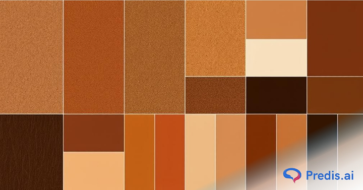
Tired of sticking to the usual color schemes? It’s time to step into a world where sophistication meets nature’s charm – the world of brown color palettes. Brown is more than just an earthy shade; it’s a symbol of warmth, stability, and timeless elegance.
Recently, brown color palettes have been making a big splash in design trends, from branding to interior decor and digital aesthetics. Whether you’re designing a cozy living space, building a modern website, or creating striking visuals for your brand, brown palettes are the go-to choice for adding a natural and sophisticated touch.
Why is brown such a versatile choice? Brown’s versatility lies in its ability to morph into an array of captivating shades. From deep chocolate tones to warm terracottas and soft beige hues, brown palettes can transform any creative project. Their connection to nature makes them soothing and relatable, while their subtle richness adds a refined touch.
Ready to embrace the organic beauty of brown? In this blog, we’ll showcase 15 of the best brown color palettes, complete with hex codes and examples. These palettes will inspire you to use brown creatively, making it a cornerstone of your next project.
Let’s dive in!
What Makes Brown Palettes Unique?
Brown color palettes are an incredible blend of versatility, warmth, and sophistication. Unlike more vibrant hues, brown is a neutral tone that can ground a space, design, or artwork while adding depth and character. But don’t mistake its subtlety for dullness – brown palettes hold a unique charm that makes them irreplaceable in many creative endeavors.
Brown palettes consist of various shades of brown, ranging from rich, dark chocolates to soft, muted beiges. They often include complementary hues like creams, greens, or reds to enhance their natural appeal. These palettes are inspired by earthy tones found in nature, such as soil, wood, leather, and autumn leaves. Whether bold or understated, brown tones create a sense of stability and comfort.
Brown palettes serve as a bridge between vibrant colors and neutral tones. Their warm undertones evoke feelings of security, resilience, and coziness. Here’s why they’re significant:
Brown shades never go out of style and adapt seamlessly to changing trends. They work well in both minimalistic and luxurious designs. Brown palettes reflect organic elements, adding authenticity and warmth to any project. Their muted tones create a soothing and inviting environment, perfect for interiors, branding, or digital content.
The beauty of brown lies in its adaptability. Whether used as a primary or secondary shade, it complements other colors effortlessly, making it an essential tool for any creative palette.
Benefits of Using Brown Color:
Using brown as the brand color has many implications. Some of the key benefits include:
- There are many psychological feelings associated with using different colors, which is why brands put so much effort into picking them. By picking brown, you induce emotions such as warmth, stability, and trustworthiness.
- Although brown cannot be used in association with black, it can very well be used as a replacement for black and create contrast with white backgrounds.
So, let’s explore this further with Top 15 Brown Color Palette Inspirations, complete with hex codes and examples to identify areas for you to implement them!
Top 15 Brown Color Palette Inspirations
Brown is more than just a neutral – it’s a powerhouse of warmth, versatility, and natural beauty. From deep, rich chocolates to soft, sandy beiges, these palettes reflect the organic elegance of nature while being incredibly adaptable to any design aesthetic. Ready to dive into the world of earthy tones? Let’s explore 15 stunning brown color palettes that are sure to inspire your next project!
1. Copper Palette
The Copper Palette exudes warmth, richness, and sophistication, making it a favorite choice for both traditional and contemporary designs. This palette draws inspiration from the earthy elegance of copper tones and their subtle sheen. The primary hue, copper brown, is complemented by deeper and lighter brown shades, creating a harmonious blend that works well in both home decor and digital design projects.
This palette is ideal for adding depth and coziness to living spaces, branding materials, or websites. It pairs seamlessly with cream, beige, or even muted greens to enhance its earthy charm. Use it for rustic themes, modern metallic aesthetics, or a refined, natural vibe.
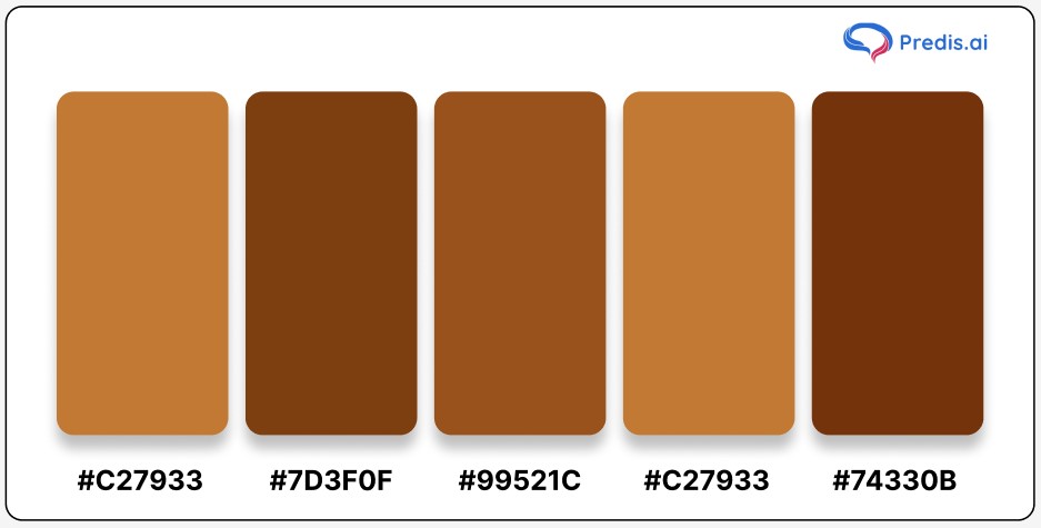
Hex Codes and Color Names:
- Copper Brown: #C27933
- Café Royale: #7D3F0F
- Rope: #99521C
- Peru: #C27933
- Saddle Brown: #74330B
The Copper Palette is versatile, timeless, and undeniably chic, perfect for making a bold yet grounded statement in any project.
2. Raw Sienna Palette
The Raw Sienna Palette is a graceful mix of warm, earthy tones and soft pinkish hues, making it an excellent choice for designs that exude elegance and serenity. This palette balances darker browns with lighter nude shades, creating a versatile and cohesive color scheme. Its warmth and subtle sophistication make it perfect for home interiors, branding, and fashion.
This palette works beautifully in cozy, natural settings or when paired with soft whites and pastel colors. Whether designing a minimalist logo or creating a warm, inviting living space, the Raw Sienna Palette offers endless possibilities.
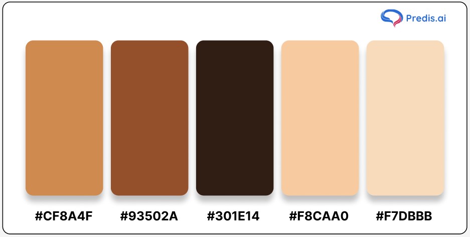
Hex Codes and Color Names:
- Raw Sienna: #CF8A4F
- Mule Fawn: #93502A
- Eclipse Brown: #301E14
- Corvette: #F8CAA0
- Wheat Nude: #F7DBBB
The Raw Sienna Palette is your go-to for adding a touch of understated elegance and natural warmth to any project.
3. Earthen Palette
The Earthen Palette captures the rich, grounding tones of nature, blending deep browns and warm neutrals to create a serene and balanced aesthetic. Inspired by the earth’s natural beauty, this palette features shades that evoke feelings of stability and peace, making it perfect for cozy interiors, rustic designs, and organic branding. Its versatile hues effortlessly connect spaces or designs to the calming rhythm of the natural world.
This palette is ideal for creating tranquil environments or enhancing eco-friendly and sustainable themes. Pair it with muted greens or soft whites for an even more harmonious look.
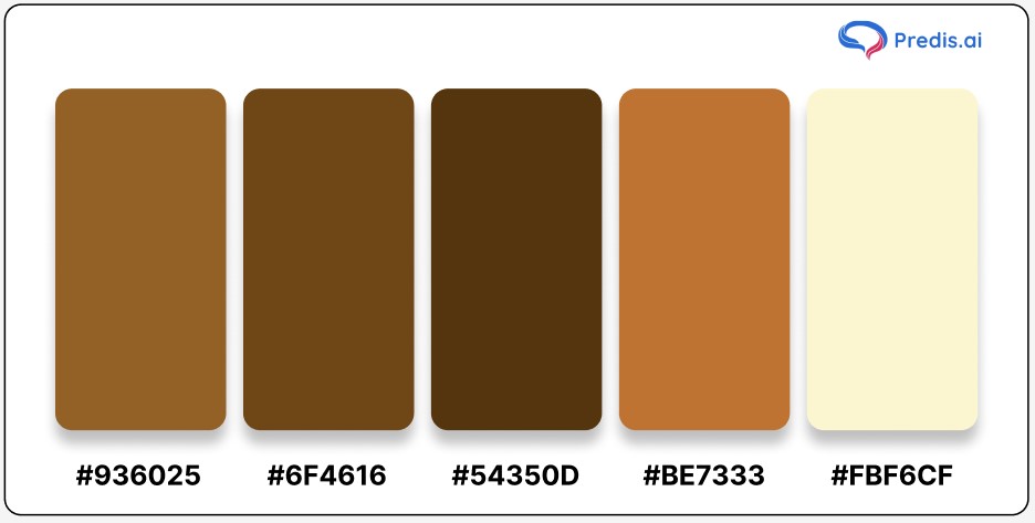
Hex Codes and Color Names:
- Kumera: #936025
- Sepia: #6F4616
- Chocolate Brown: #54350D
- Copper: #BE7333
- Creamy Yellow: #FBF6CF
Let the Earthen Palette bring an understated elegance and natural warmth to your next creative project.
4. Wood Palette
The Wood Palette draws inspiration from the timeless beauty of natural wood, showcasing a spectrum of shades that reflect its grain, texture, and warmth. From the dark richness of cedar brown to the soft neutrality of cream white, this palette exudes a rustic charm that adds depth and character to any design. It embodies a connection to nature, evoking feelings of warmth, reliability, and comfort.
This palette is perfect for interior design projects, especially in creating cozy living spaces or stylish, rustic environments. It also works beautifully in branding, packaging, and other creative projects that aim to highlight sustainability or natural elegance. Pair it with greenery or muted accents for a balanced, harmonious aesthetic.
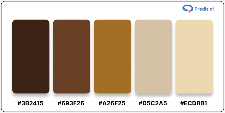
Hex Codes and Color Names:
- Cedar Brown: #3B2415
- Pickled Bean: #693F26
- Desert Brown: #A26F25
- Akaroa: #D5C2A5
- Cream White: #ECD8B1
Let the Wood Palette bring the essence of the outdoors into your designs, creating a timeless and welcoming atmosphere.
5. Coffee Color Palette
The Coffee Palette captures the rich and inviting essence of everyone’s favorite beverage. Just like a cup of coffee can range from a creamy latte to a strong espresso, this palette features a variety of warm browns that add depth and coziness to any design. It symbolizes comfort, energy, and a sense of connection, making it perfect for projects that want to evoke warmth and familiarity.
This palette is ideal for branding cafes, lifestyle products, or home decor designs. It can also be used to create soothing and elegant digital designs, adding a touch of sophistication with its earthy tones. Pair it with soft neutrals or deep greens for a timeless, harmonious look.
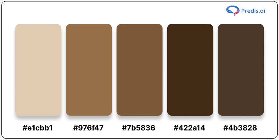
Hex Codes and Color Names:
- Grain Brown: #e1cbb1
- Cape Palliser: #976f47
- Brown Derby: #7b5836
- Dark Brown: #422a14
- Smoked Brown: #4b3828
Bring the charm of coffee into your designs and let its inviting tones create a comforting yet stylish aesthetic.

6. Ironstone Palette
The Ironstone Palette exudes strength, resilience, and an earthy elegance. Inspired by the raw beauty of stones and rocks, this palette combines rugged greys, deep browns, and soft nude tones to create a balanced and versatile color scheme. It signifies durability and sophistication, making it perfect for designs that want to blend natural strength with understated beauty.
This palette works well for industrial-style interiors, nature-inspired branding, or digital designs requiring a grounded yet refined aesthetic. Pair these colors with metallic accents or soft whites for a striking contrast.
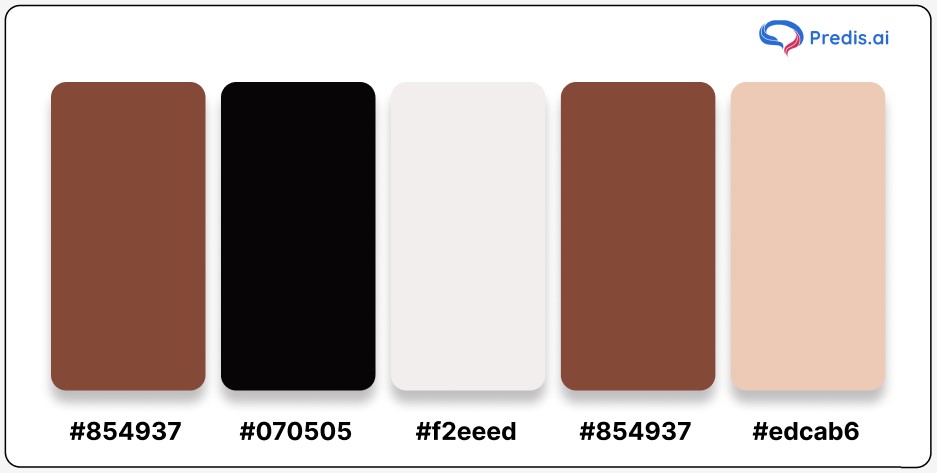
Hex Codes and Color Names:
- Ironstone: #854937
- Code Gray: #070505
- Core Nude (Pink Undertone): #f2eeed
- Ironstone: #854937
- Cape Palliser: #edcab6
Harness the beauty of earthy tones and rugged textures with the Ironstone Palette to create designs that stand out with strength and subtle charm.
7. Orange-Brown Color Palette
The Orange-Brown Palette combines the vibrant warmth of orange with the earthy depth of brown, creating a versatile and uplifting color scheme. This palette is reminiscent of autumn leaves, cozy sunsets, and pumpkin patches, making it perfect for designs that seek to evoke a sense of warmth, energy, and comfort.
This palette works beautifully in rustic interiors, seasonal branding, or marketing materials aimed at invoking a sense of nostalgia and connection. It pairs well with neutral tones or muted greens for a harmonious look.
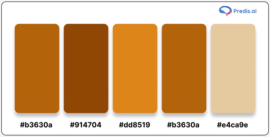
Hex Codes and Color Names:
- Pumpkin Skin: #b3630a
- Oregon Zest: #914704
- Chocolate Brown: #dd8519
- Orange-Brown: #b3630a
- Wheatish Nude: #e4ca9e
Whether you’re designing a fall-inspired theme or looking to add cozy warmth to your visuals, the Orange-Brown Palette provides a rich and dynamic range of shades to explore.
8. Dust Palette
The Dust Palette elegantly blends muted brown and gray tones, creating a versatile and understated color scheme. This palette is inspired by earthy landscapes and weathered textures, making it ideal for designs that aim for subtle sophistication and calm. The combination of warm caramel shades with deep browns and grays strikes a perfect balance between softness and structure.
This palette is perfect for minimalist designs, rustic themes, or branding projects that require a neutral yet engaging visual aesthetic. It works seamlessly in interior design, creating cozy and tranquil spaces when paired with cream or off-white accents.
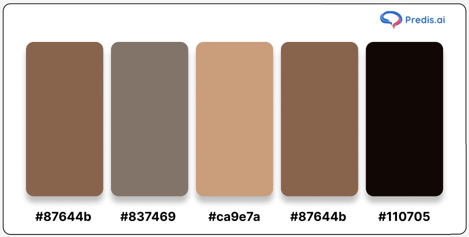
Hex Codes and Color Names:
- Shadow: #87644b
- Dune: #837469
- Caramel Brown: #ca9e7a
- Nude Brown: #87644b
- Asphalt Black: #110705
Whether for branding, décor, or artwork, the Dust Palette’s timeless appeal makes it a reliable choice for refined and balanced compositions.
9. Yellow-Brown Color Palette
The Yellow-Brown Palette radiates warmth and opulence, making it perfect for designs that aim to evoke richness and sophistication. The royal gold tones combined with earthy browns create a harmonious balance, ideal for both modern and traditional aesthetics. This palette is a great choice for projects that need a subtle yet striking color scheme, such as branding, packaging, or even home décor.
The blend of golden hues with muted browns can be used to highlight key elements in a design, adding a sense of grandeur. Pair this palette with creamy whites or deep greens for a nature-inspired and elegant look.
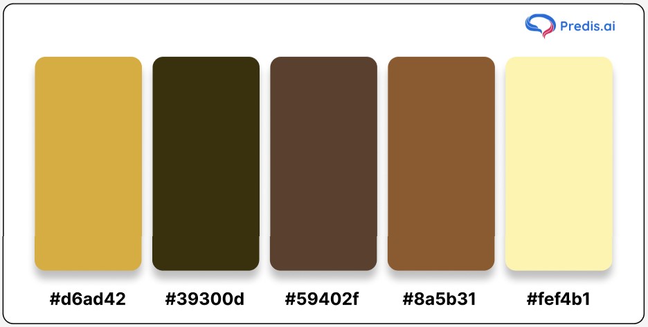
Hex Codes and Color Names:
- Old Gold Brown: #d6ad42
- Beige: #39300d
- Brown Tumbleweed: #59402f
- Dark Chestnut: #8a5b31
- Millbrook Brown: #fef4b1
From luxurious packaging designs to rustic interiors, the Yellow-Brown Palette offers versatility with a touch of golden charm.
10. Totem Palette
The Totem Palette embodies warmth, vibrancy, and earthy charm, drawing inspiration from natural and cultural hues. With rich shades of brown, fiery orange, and deep red, this palette exudes the essence of a blazing sunset or the intricate artistry of totem designs. It captures a sense of heritage and boldness, making it perfect for creative projects that aim to tell a story or make a statement.
This palette works beautifully in branding, art installations, and rustic interiors. Pair these colors with neutral shades like beige or cream for balance, or with deep greens for a dramatic effect.
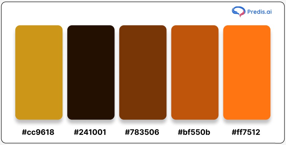
Hex Codes and Color Names:
- Golden Sand: #cc9618
- Deep Black Brown: #241001
- Burnt Orange: #783506
- Golden Brown: #bf550b
- Vivid Orange Red: #ff7512
The Totem Palette is a stunning choice for projects that need a dynamic yet grounded color scheme, symbolizing strength and connection to nature.
Stand Out with AI-Generated Designs and Graphics 🌟
11. Grape-Brown Color Palette
The Grape-Brown Palette stands out with its unique blend of rich grape hues and earthy brown tones. This palette introduces a subtle hint of purple to the brown spectrum, creating a sense of sophistication and depth. Perfect for elegant designs, cozy interiors, and branding projects that require a touch of luxury, the Grape-Brown Palette exudes charm and creativity.
The pairing of gray-brown, nude, and clay tones with deep grape hues offers endless versatility. It’s ideal for creating a balanced, polished look, whether for digital content, packaging, or home décor.
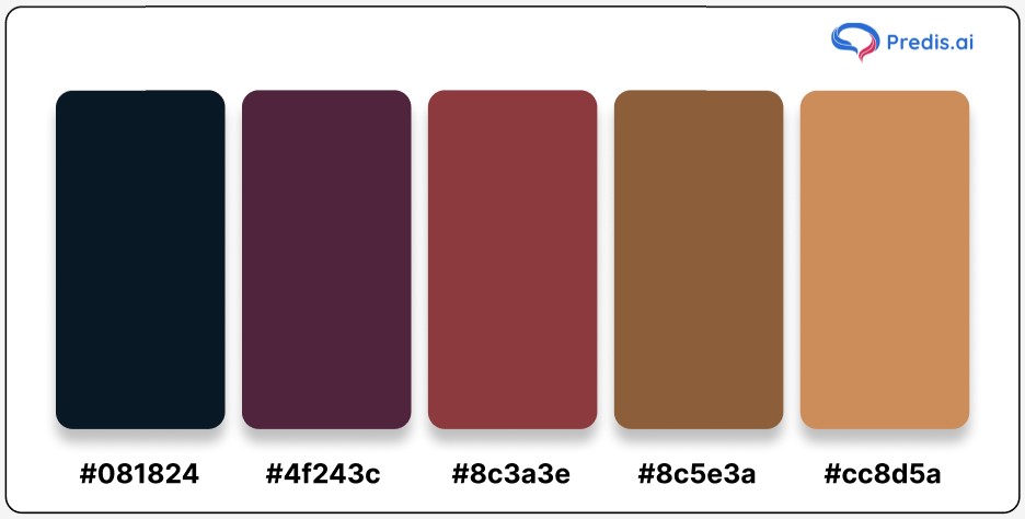
Hex Codes and Color Names:
- Midnight Grape: #081824
- Deep Plum: #4f243c
- Clay Red: #8c3a3e
- Milk Chocolate: #8c5e3a
- Nude Earth: #cc8d5a
The Grape-Brown Palette bridges bold and neutral tones, making it a go-to choice for adding character and sophistication to your projects.
12. Natural Brown Color Palette
The Green Brown Color Palette is inspired by the harmonious hues found in nature. It combines the warmth of earthy browns with vibrant greens and soft reds, creating a palette that exudes vitality and organic beauty. This palette is perfect for designs emphasizing sustainability, eco-friendliness, or a connection to the natural world. Whether you’re curating a garden-inspired aesthetic or branding a nature-based product, this palette offers endless possibilities.
The blend of mocha, carmine, and matcha green tones complements each other beautifully, making it ideal for websites, packaging, or interior spaces that call for a lively yet grounded look.
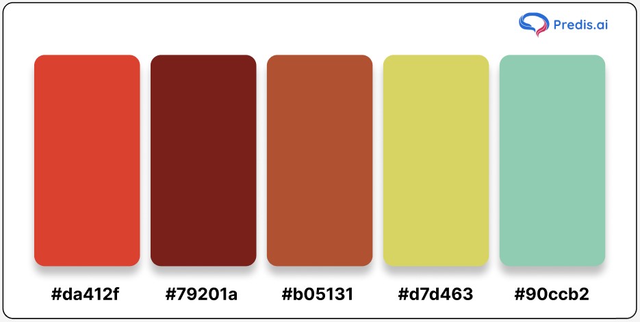
Hex Codes and Color Names:
- Carmine Red: #da412f
- Rich Mocha: #79201a
- Earthy Cinnamon: #b05131
- Matcha Green: #d7d463
- Seafoam Teal: #90ccb2
This green and brown color palette brings a refreshing vibrancy to earthy tones, making it a versatile choice for projects that celebrate the beauty of the outdoors.
13. Sea Bed Palette
The Sea Bed Palette draws its inspiration from the serene beauty of the ocean floor, combining earthy browns with tranquil shades of blue. This brown and blue color palette captures the balance between the grounding tones of the seabed and the calming hues of the surrounding waters. It’s a versatile choice for designs that evoke a sense of depth, tranquility, and natural harmony. Perfect for coastal themes, marine-inspired branding, or creating soothing interior spaces, this palette offers an effortless blend of elegance and calm.
The browns provide a warm foundation, while the blues add a refreshing contrast, making this palette ideal for creating a cohesive and relaxing aesthetic.
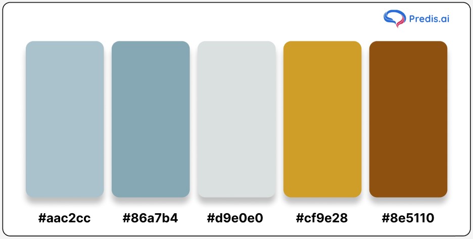
Hex Codes and Color Names:
- Casper Blue: #aac2cc
- Bali Hai Blue: #86a7b4
- Soft Gray-Blue: #d9e0e0
- Sandal Brown: #cf9e28
- Iron Brown: #8e5110
Bring the serenity of the ocean into your designs with this harmonious combination of earthy and aquatic tones, with a color palette of blue brown.
14. Sand Palette
The Sand Palette captures the essence of serene desert landscapes and the layered beauty of sandy shores. With warm, golden tones combined with deeper browns and soft blacks, this palette is perfect for creating designs that feel earthy, grounded, and inviting. The subtle gradation in the shades mimics the natural variations found in sand dunes and riverbeds, offering a timeless and natural aesthetic.
Use this palette to add a cozy yet sophisticated touch to home decor, branding materials, or website designs. Its versatility makes it ideal for themes revolving around nature, minimalism, and organic textures.
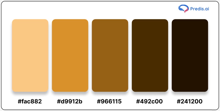
Hex Codes and Color Names:
- Chardonnay: #fac882
- Brandy Punch: #d9912b
- Warm Brown: #966115
- Dark Bronze: #492c00
- Deep Black: #241200
Bring warmth and texture into your visuals with the Sand Palette—a harmonious blend inspired by nature’s finest grains.
15. Pink-Brown Color Palette
The Pink and Brown Palette offers a delightful fusion of earthy tones and soft pink hues, creating a perfect blend of warmth and elegance. The brown shades provide a grounding effect, while the complementary pink and magenta tones add a playful and vibrant touch. This palette is versatile and works well for designs aiming to balance sophistication with charm.
Ideal for fashion branding, feminine aesthetics, and cozy home decor themes, the Pink-Brown Palette adds a sense of harmony to any project. Whether you’re creating social media graphics, wedding invitations, or website designs, this palette ensures a refined yet approachable look.
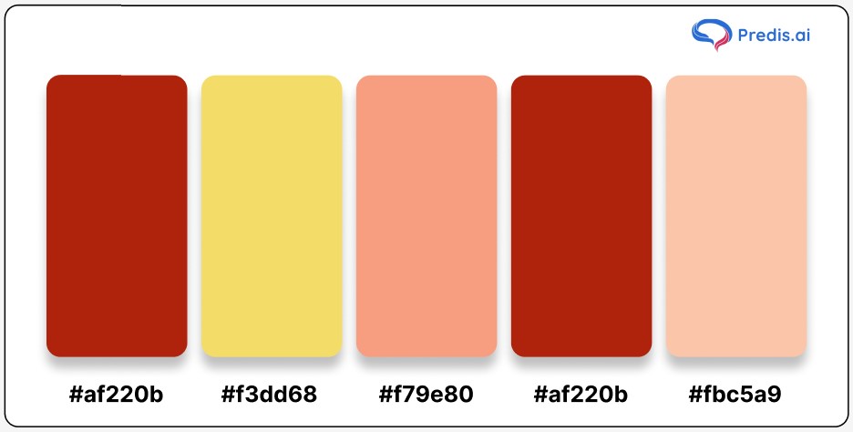
Hex Codes and Color Names:
- Totem Pole: #af220b
- Energy Yellow: #f3dd68
- Geraldine: #f79e80
- Khaki: #af220b
- Navajo White: #fbc5a9
Bring together the vibrancy of pink and the grounded charm of brown with this eye-catching and balanced palette.
Get ready to explore how to select the ideal brown color palette for your next project, whether it’s for interiors, fashion, or digital design!

Tips for Choosing the Perfect Brown Palette
Selecting the right brown palette can elevate your designs and bring out the perfect mood for your project. Here are some practical tips to help you choose the best shades of brown for your needs:
1. Understand the Mood You Want to Create
Brown tones can evoke various emotions. Light shades like beige and taupe create a calming and minimalist atmosphere. Darker hues like chocolate brown or espresso add depth and warmth, making spaces feel cozy and sophisticated. Think about the vibe you want to achieve and choose accordingly.
2. Pair with Complementary Colors
Brown pairs beautifully with a variety of colors. Combine it with greens for an earthy, natural look or soft blues for a soothing contrast. For a modern touch, pair brown with metallics like gold or copper. A neutral palette of browns with whites or creams is perfect for timeless elegance.
3. Consider the Purpose of the Design
Whether you’re decorating a room, creating a logo, or designing a website, the purpose dictates the palette. For interiors, use muted browns for walls and richer shades for furniture. In digital design, use brown as a background or accent color for a grounded and reliable look.
4. Test in Different Lighting
Colors can look drastically different under various lighting conditions. Always test your brown palette under natural light, warm artificial light, and cool white light. This ensures that the colors appear consistent and appealing in all environments.
5. Balance Light and Dark Shades
A balanced palette includes both light and dark tones. Use lighter shades like camel or tan for larger areas to keep things airy. Darker shades like mocha or walnut can be used sparingly to add contrast and drama. This combination creates a visually pleasing effect.
6. Use Inspiration from Nature
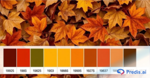
Take cues from natural elements like wood, soil, and autumn leaves to create a palette that feels grounded and organic. Nature-inspired palettes are universally appealing and add a touch of authenticity to your designs.
7. Don’t Overdo It
Brown is a versatile color, but too much of it can feel overwhelming. Use it as an accent color or balance it with brighter hues to maintain visual interest. The strategic use of brown ensures that it enhances your design rather than dominating it.
By following these tips, you can create a harmonious and impactful design using the perfect brown palette. Whether for home décor, fashion, or digital projects, the right shades of brown can make all the difference!
Next up, explore creative strategies to bring out the best in brown color palettes across various design projects.
Want the easiest way to remove the background and make your images transparent? Look no further, just upload your image and let our Free AI Background Remover do the magic!
How to Effectively Use Brown Color Palette in Design? [With Examples]
The brown color palette is a very sophisticated color combination. This color is rich and posh-looking. It is seen in a lot of places. Did you ever notice how it was the major color seen in Hogwarts in the movie Harry Potter?
It signifies warmth mostly. Hence, this color surrounds us and makes us feel a sense of security as well. Brown color has a lot of significance in art, fashion, makeup, culture, and interiors/exteriors.
The brown color palette is a versatile choice across various creative fields. Its natural tones and earthy hues make it perfect for adding warmth, sophistication, and charm. Let’s explore five unique ways to incorporate brown into your designs, complete with examples to inspire your creativity.
1. Interior Design
The psychology of color presents brown as a hue that signifies stability, reliability, and a sense of security. By incorporating brown hues into our living spaces, we are not just selecting a color; we are curating an atmosphere that supports mental well-being.
It’s about creating environments that echo the organic beauty of nature, fostering a connection to the Earth, and grounding us in the present moment.
Brown is one such color that is always present in décor in some way or the other, either in the form of furniture and cabinets, if not something else. In terms of painting the room in a brown shade, there can be a lot of color combinations that can be used these days.
To create a brownish look, the key is to stick to wooden furniture or wooden cabinets. As for wall color, combinations like mahogany and cream white, coffee and pale pink, lemon yellow and grey-brown, caramel and lilac work well. These are new combinations that can be used to bring out the best in interior design. This will also make the home look warm and neat.
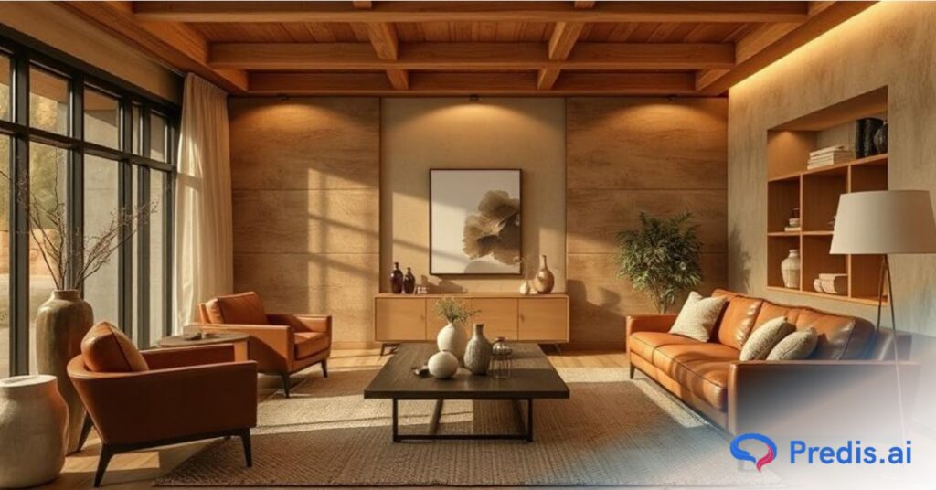
The versatility of brown allows for seamless integration with various design elements. Whether it’s the warmth of wooden furniture, the elegance of leather accents, or the timeless appeal of earth-toned textiles, brown harmonizes with diverse materials, contributing to a holistic and balanced aesthetic.
Another way of incorporating a brown color palette into home décor is by using brown mats, carpets, and curtains with the appropriate color combination. The various color combinations with brown are mentioned ahead in detail.
2. Outdoor Décor
Outdoor décor can also be done with the help of brown color. The natural earth color and nature help in incorporating brown elements into the outdoor décor. Unlike interior home décor, outdoor home décor will already have trees, sand, and various natural elements adding to the décor.
Furthermore, furniture made of wood can be used to add a brown element to the balcony, weddings, parties, and resorts. The hotels can be painted in brown and other combination shades to get the brown color palette element. These will add a quirky yet warm element to the whole outdoor look. To make the décor more interesting, brown curtains or shades can also be used for outdoor weddings and parties.
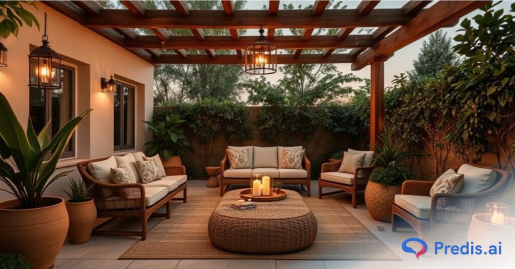
Flower arrangements in light brown and pink, nude brown shades, and purple colors are all good options. These will make the whole place look subtle and elegant. These are some ways to make brown color palette arrangements.
Use the Predis.ai Color Palette Generator to generate beautiful color palettes from your images.
3. Fashion and Makeup
In the field of fashion, brown is a staple element. A Brown coat, shirt, blouse, skirt, pants, and boots are like a must-have in the wardrobe of a fashion enthusiast. This is very much visible when one sees fashion influencers these days. And what more? The color brown in itself matches every skin tone and skin type. This makes it a go-to color for coats and shoes, mostly.
A brown leather skirt with a white or cream blouse is a perfect combination for a get-together, small events, casual outings, and even work. A Brown suit is one of the must-haves in a man’s wardrobe. A brown lehenga has also become a trend these days in marriages and functions. It has replaced the mainstream color red. This demands a neutral brown tone makeup or a nude makeup look.
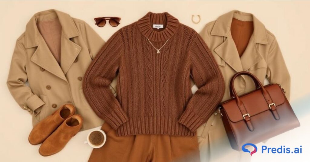
Minimalistic makeup with brown eyeshadow or brown lipstick is becoming more popular these days. Brown is a very versatile color and is the master of neutrality. Even though it is a dark color, it enhances a minimalistic vibe.
4. Art and History
Brown has been an ancient color of art and architecture. The walls of ancient art are seen to have scriptures in grey and mostly brown colors. There are animals painted on the walls, like horses, which are again brown. Elements like iron oxide and clay were used in painting earlier, and also depict the wide use of brown color in art.
Vases, flower pots, and pottery have all been brown-oriented since old age. It is still in trend and doing well. It is instilled with multiple colors now, but it has still retained the staple brown color palette. In the late 15th Century, artists started instilling brown into art. At present, brown is a staple color in art and architecture. It is the way nature can be depicted in scenic paintings and art forms.
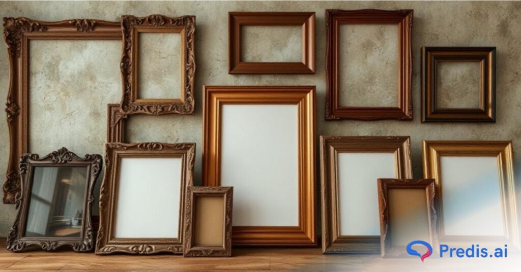
In the later ages, portraits with brown detailing became famous for giving paintings a prestigious touch. Portraits and paintings were seen more in a brown tone after the era of the 19th and 20th centuries. It was also seen as a uniform color in a lot of places and became the color of resilience and warmth. Brown was also seen in abstract art in modern-day art. This color is famous in the form of coffee paintings these days. Hence, it has been running since old time in the field of art.
5. Digital Design
One notable application of brown in digital editing has been the surge in popularity of photos imbued with brown light effects. This technique imparts a distinctive black-and-white aesthetic, infusing the visuals with an old-school charm that resonates with contemporary tastes.
Contrary to misconceptions, this vintage-inspired effect is anything but mundane; it captivates viewers with its intriguing and timeless elegance.
In web design, the color brown finds its place in the palette of many designers, gracing pages with a sense of warmth, reliability, and sophistication. Logos, in particular, have embraced the versatility of brown, either as a background or font color, to convey a message of stability and superiority.
Brands seeking a balance between classic appeal and modern sensibilities often turn to brown as a choice that resonates with a discerning audience.
The subtle shades of brown, when skillfully applied in photo editing, create an atmosphere of understated luxury. This is especially evident in works where brown undertones are seamlessly woven into the fabric of the image, elevating the overall visual experience.
The artistry lies in the delicate interplay between the digital medium and the innate richness of brown, resulting in compositions that stand out for their elegance and timelessness.
Conclusion
The brown color palette is a timeless choice, offering versatility and elegance for a wide range of designs. Whether you’re decorating a cozy living space, designing an outdoor setup, or creating a brand identity, brown brings warmth, sophistication, and a touch of nature. Its many shades – from light beige to deep chocolate – provide endless possibilities for creativity.
Using brown effectively requires balance and the right combinations. Pair it with complementary colors, experiment with textures, and let the tones work their magic. Whether you’re seeking a minimalist vibe, a rustic charm, or a bold statement, there’s a brown palette perfect for the job.
Remember, brown isn’t just a color; it’s a mood, a connection to the earth, and a symbol of resilience and comfort. By incorporating these rich hues into your projects, you can create designs that feel grounded yet extraordinary. So go ahead, explore the depth of brown, and let it transform your creative ideas into something truly remarkable!
Elevate your design game with Predis.ai! Whether you’re creating social media graphics, exploring stunning color palettes, or generating content effortlessly, Predis.ai has you covered. Transform your ideas into visually captivating designs and take your creativity to the next level. Start exploring today at Predis.ai!
FAQs
Brown pairs beautifully with a variety of colors, making it incredibly versatile. Soft neutrals like cream, beige, and ivory create a cozy and elegant look. For a bold contrast, try pairing brown with navy blue, teal, or olive green. Warm tones like rust, mustard yellow, and burgundy also harmonize well with brown, adding depth and vibrancy to designs. The key is to balance the shades for a polished result.
Absolutely! Brown palettes are perfect for digital design because they evoke warmth, reliability, and sophistication. Many brands use brown tones in their logos, websites, and marketing materials to establish trust and a timeless appeal. Whether it’s creating earthy website themes, modern graphics, or vintage-style edits, brown can add a unique character to digital projects.
Brown palettes are trending because they embody simplicity, warmth, and a connection to nature. As people lean towards minimalism and eco-friendly aesthetics, brown has become a go-to choice for its grounding and calming effects. In fashion, interiors, and digital design, brown offers a refreshing alternative to overly bright or stark palettes, making it a timeless trend.
Combining brown with other colors is easy when you focus on balance. Pair light browns with soft pastels like pink or baby blue for a delicate look. For darker shades like chocolate or espresso, combine them with metallics like gold or bronze for a luxurious vibe. If you’re aiming for a modern touch, mix brown with cool greys or muted greens. Always consider the mood you want to create and experiment with different tones to find the perfect blend.
