
Explore this content with AI:
In the early days of the digital age, graphic design was a walled garden. To create something as simple as a professional-looking flyer, you needed expensive, “heavy” software like Adobe Illustrator, a high-powered workstation, and years of specialized education to understand the cryptic terminology.
Today, that wall has crumbled. We are living in the golden age of democratic design. With the rise of intuitive, AI-powered tools, free online platforms, and a wealth of high-quality tutorials available at the click of a button, the barrier to entry has vanished. If you have an idea and a laptop, you have a design studio.
Why Everyone Needs Basic Design Skills Today
In 2026, design is no longer a niche profession; it is a vital communication skill. Whether you are an entrepreneur trying to build a brand on social media, a corporate professional wanting your presentations to stand out, or a student looking to elevate a project, visual literacy is your secret weapon.
We live in an attention economy where people “read” images before they read words. If your visuals are cluttered or confusing, your message—no matter how brilliant—will be ignored.
Design is a Learnable Skill, Not an Inherited Gift
The most common myth in the creative world is that you are either “born with it” or you aren’t. Research consistently debunks this. Deliberate practice, the process of studying fundamentals and applying them repeatedly, far outweighs natural aptitude. Design isn’t magic; it’s a series of logical decisions based on how the human brain processes visual information.
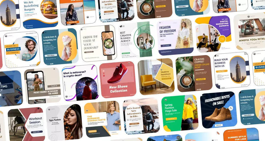
These graphic design tips are designed to move you past the “beginner” look. They will help you create visuals that look intentional, professional, and—most importantly—on-brand.
The Fundamentals: Graphic Design Tips
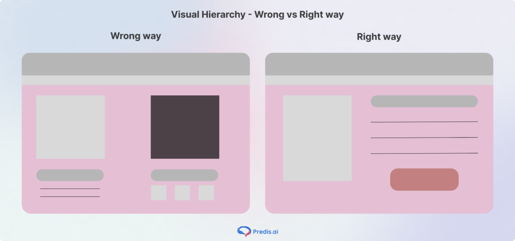
Tip 1: Master Visual Hierarchy
Visual hierarchy is the arrangement of elements in a way that implies importance. If everything is bold, nothing is bold. You must guide the viewer’s eye. Use scale (making the most important thing biggest) or color (using a pop of red against a gray background) to ensure the first thing the viewer sees is your primary message.
Tip 2: Embrace White Space
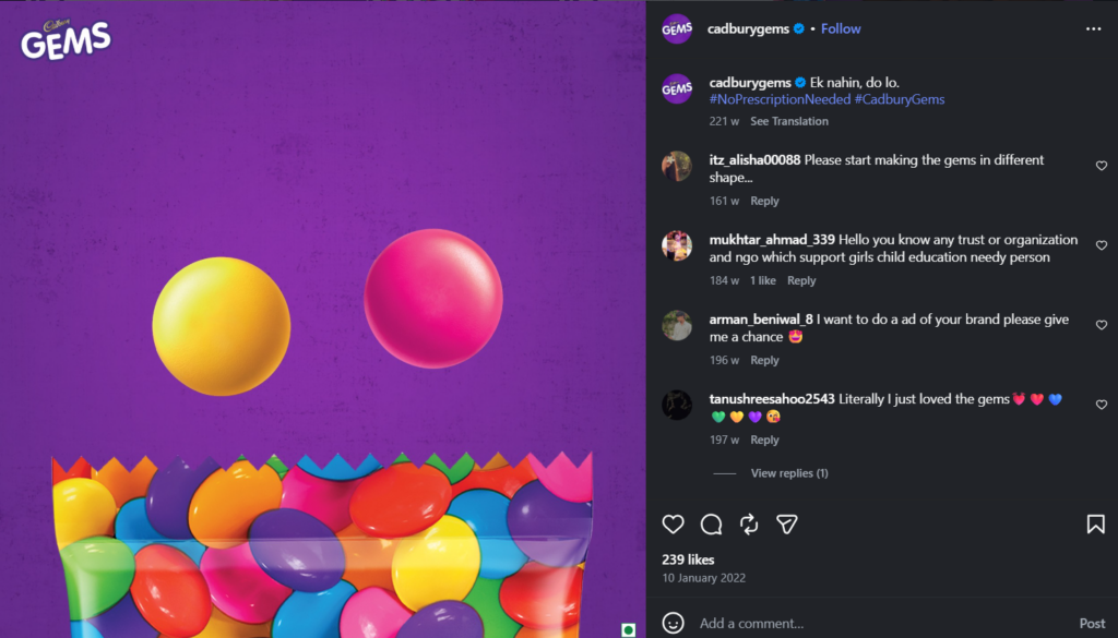
Beginners often suffer from horror vacui—the fear of space. They feel the need to fill every corner with “stuff.” Professional designers know that empty space (white space) is a powerful tool. It gives your content room to breathe, prevents eye fatigue, and makes your central elements pop.
Look at the amount of vacant space in this image by Cadbury:
Tip 3: Use the Rule of Thirds
Imagine your canvas is divided by two horizontal and two vertical lines, creating a nine-square grid. The four points where these lines intersect are the natural “sweet spots” where the human eye gravitates. Instead of centering every image, try placing your focal point on one of these intersections. Your designs will immediately feel more dynamic and balanced.
Look at how Coca-Cola used that rule in their photography example:

Tip 4: Create Clean, Crisp, and Clear Imagery
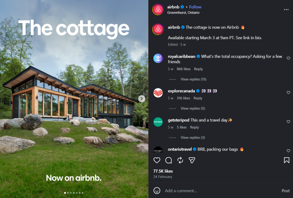
Clarity is the hallmark of professional work. Avoid “muddy” designs where elements overlap awkwardly, or images appear pixelated. Ensure your assets are high-resolution and your edges are sharp. A “clean” design is one where the viewer doesn’t have to squint or guess what they are looking at.
For example, Airbnb’s whole business is built on aesthetic and clear images, like this one:
Typography Tips:
Tip 5: Choose Fonts That Match Your Message
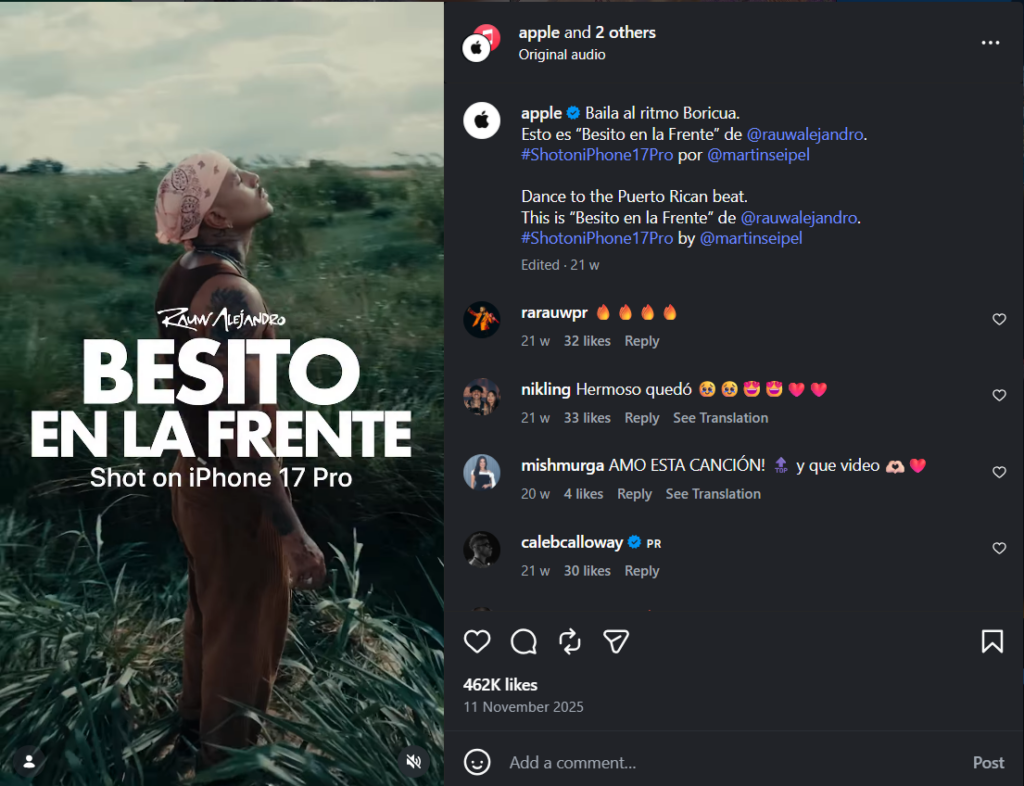
Typography has “personality.” A sleek, thin sans-serif font feels modern and tech-focused; a heavy, traditional serif font feels authoritative and established. If you’re designing an invitation for a corporate law firm, don’t use a “bubbly” font. Match the font’s “vibe” to your brand’s voice.
Look at how Apple uses its sans-serif font elegantly in its designs:
Tip 6: Stick to Two Fonts Maximum
One of the fastest ways to make a design look amateur is to use five different fonts. It creates visual “noise.” Stick to a “Pairing Rule”: one font for your headlines (to grab attention) and one highly readable font for your body text. That’s it.
Tip 7: Use Font Size to Create Hierarchy
Don’t just rely on bolding text. Use dramatic size differences to tell the reader what to read first. Your headline should be significantly larger than your subhead, which should be larger than your body copy. This “staircase” of information makes your content scannable.
Tip 8: Never Sacrifice Readability for Style
There are thousands of beautiful, artistic fonts that are completely unreadable. If your audience has to work to decipher your text, you have failed. Always test your font choices at smaller sizes and ensure there is high contrast between the text color and the background.
Tip 9: Be Original (and Watch Your Spacing)
While it’s tempting to copy exactly what everyone else is doing, try to inject originality by tweaking your “kerning” (space between letters) and “leading” (space between lines). Tight, cramped text feels suffocating. Giving your letters just a bit of extra room can make a generic font look custom and high-end.
Color Tips:
Tip 10: Understand Basic Color Theory
You don’t need to be a scientist, but you should know the wheel.
- Complementary colors (opposites like Blue and Orange) create high energy.
- Analogous colors (neighbors like Blue and Green) create harmony.
- Monochromatic (shades of one color) creates a sophisticated, cohesive look.
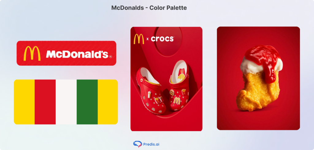
Look at how McDonald’s created their color palette with warm shades that look seamless together:
Tip 11: Limit Your Color Palette
The “60-30-10” rule is a great starting point to build your color palette: 60% of a dominant color, 30% of a secondary color, and 10% of an accent color. This prevents your design from looking like a box of spilled crayons.
Tip 12: Use Color to Create Emotion
Color psychology is real. Blue evokes trust (think banks and tech); Green evokes growth and health; Red evokes urgency and passion. Choose colors based on the feeling you want to leave behind, not just your personal favorite color.
Tip 13: Always Check Contrast
Accessibility is a core part of design in 2026. Use tools like the WebAIM Contrast Checker to ensure that people with visual impairments (and people looking at their phones in bright sunlight) can actually see your content. Light gray text on a white background is a design sin.
Tip 14: Stay Consistent With Your Brand Colors
Consistency builds memory. Use specific HEX codes (e.g., #FF5733) to ensure the “Red” on your Instagram post is the exact same “Red” on your business card. This creates a “visual thread” that makes your brand instantly recognizable.
Layout and Composition Tips:
Tip 15: Understand Print Design vs. Digital
These graphic design tips isn’t just for screens. If you’re designing something to be printed, you must understand “Bleed” (extra space so the printer doesn’t cut off your image) and “CMYK” color modes. What looks vibrant on a backlit screen might look dull on paper if you don’t prepare the file correctly.
Tip 16: Create a Mood Board Before You Design
Never start with a blank canvas. Spend 15 minutes gathering images, color swatches, and fonts that inspire you. This “mood board” acts as your North Star, keeping you from drifting off-track once you start the technical work.
Tip 17: Keep Your Files Organized
Professionalism starts in your folders. Name your layers (e.g., “Headline_Text” instead of “Layer 52”) and organize your files with clear version numbers. There is nothing worse than searching for “Final_Final_v3_USE_THIS.png” ten minutes before a deadline.
Tip 18: Be Conscious of Global Events (and Keep a Notebook)
Design doesn’t exist in a vacuum. Be aware of the cultural context of your visuals. Furthermore, keep a notebook (digital or physical) to jot down design inspiration you see in the “wild”—a cool billboard, a unique menu layout, or an interesting color combo on a bus.
Tip 19: Test Across Devices
Your design will be viewed on a 27-inch monitor and a 5-inch smartphone. Always export a draft and check it on your phone. If your text is too small to read on a mobile screen, you need to go back to the drawing board.
Tools and Workflow Tips:
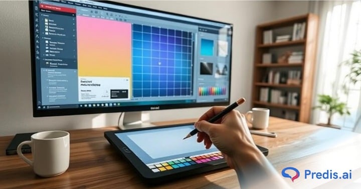
Tip 20: Start With Beginner-Friendly Tools
Don’t feel pressured to buy Photoshop on day one. Canva is an incredible entry point. For those looking to go deeper into UI/UX or professional layout, Figma is the industry standard and offers a robust free tier. Many beginners also start with a picture ai generator to create mockups and inspiration boards before moving into advanced design platforms.
Tip 21: Use Templates as a Learning Tool, Not a Crutch
Templates are great, but don’t just “plug and play.” Deconstruct them. Ask yourself: Why did the designer put this text here? Why does this color combo work? Try to recreate a template from scratch to build your technical muscle.
Tip 22: Build a Personal Style Guide
Create a one-page document that lists your 2 fonts, your 3 HEX codes, and your logo usage rules. This simple step will save you hours of decision-making fatigue in the future.
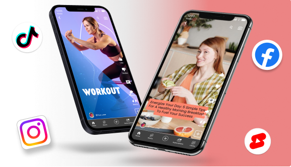
Tip 23: Use Predis.ai for AI-Powered Design
In the modern workflow, AI is your assistant, not your replacement. Tools like Predis.ai can help you generate on-brand social media visuals and captions in seconds, allowing you to focus on the high-level strategy while the AI handles the repetitive formatting.
Predis AI can make anything from social media posts to UGC videos with AI avatars, making it an efficient tool that can handle all your design requirements. For example, look at this sample AI avatar video that Predis AI generated:

Tip 24: Practice Every Day, Even for 20 Minutes
Consistency beats intensity. Spending 20 minutes a day playing with a new tool or trying a new layout will do more for your skills than an 8-hour marathon once a month.
Common Graphic Design Mistakes Beginners Make
Here are some common mistakes and graphic design tips beginners need to remember:
- Over-designing: Trying to use every filter and shadow at once.
- Ignoring Alignment: Elements that are “almost” aligned but not quite make the viewer feel subconsciously uneasy.
- Designing Without a Goal: If you don’t know who the design is for, it will fail.
- Chasing Trends: “Neon-Brutalism” might be cool today, but will it look dated in three months? Stick to principles first.
Conclusion
Graphic design tips aren’t about using expensive software or a specialized degree; it’s about empathy for the viewer. It’s about making information easy to digest and pleasant to look at. By following these 24 tips, you aren’t just making things “pretty”—you are becoming a more effective communicator.
The journey from “non-designer” to “competent creator” is shorter than you think. Start simple, practice daily, and remember: every world-class designer once struggled to align a text box. The only difference is they didn’t stop.
Frequently Asked Questions
No. While degrees are valuable for deep theory, most practical design skills can be learned through online courses, practice, and portfolio building.
With consistent daily practice, most people see a significant leap in quality within 3 to 6 months.
Stick to a limited color palette, use plenty of white space, and ensure your alignment is perfect. By using the graphic design tips we mentioned, you can minimize your chances of error.
Absolutely. Use AI to generate ideas, remove backgrounds, or suggest layouts, and even get the help of tools like Predis AI to generate content from scratch.