

Explore this content with AI:
Choosing your brand colors is one of the most consequential decisions you’ll make for your business. It’s the difference between looking like a high-end luxury disruptor or a friendly, neighborhood startup. Science backs this up, too: color is often the first thing a consumer perceives, influencing up to 90% of their initial judgment of a product.
But how do you move past “I just like blue” to a strategy that actually converts?
In this guide, we’re stripping away the guesswork. We’ll dive into the psychology behind different hues, explore the technical side of color theory, and provide a step-by-step framework for building a palette that resonates with your audience and sticks in their memory.
Why Your Brand Colors Matter More Than You Think
Choosing a color palette is often dismissed as a purely creative task, but it is one of the most significant business decisions you will make. Research consistently shows that color can influence a customer’s purchasing decision.
The First Impression Engine
You only have a fraction of a second to capture a lead. Color accounts for up to 90% of those first impressions. Even more impressively, using a consistent color palette can increase brand recognition by up to 80%. When people see that specific shade of “UPS Brown” or “T-Mobile Magenta,” they know exactly who is talking to them before they read a single headline.
The Emotional Shortcut
Colors act as a subconscious “fast lane” to the brain. They communicate your brand’s personality—whether you are high-energy, trustworthy, or luxurious—long before a user processes your copy. However, the cost of getting this wrong is high; a misaligned palette can quietly push your target audience away by creating a “gut feeling” that your brand isn’t the right fit for their needs.

Understanding Color Psychology: The Foundation
Color psychology is the study of how different hues trigger specific emotional and neurological responses. When we see certain colors, our brains release chemicals that affect our mood and perception.
Perceived Appropriateness
The “secret sauce” of branding isn’t just picking a “good” color—it’s picking an appropriate one. For example, a rugged construction company using soft pastel pink might feel “off” to consumers, not because pink is a bad color, but because it doesn’t fit the perceived identity of the industry.
The Role of Context
There is no universally “right” color. While blue is often associated with calm, it can also feel cold or depressing depending on the shade and the audience. Context, industry standards, and cultural backgrounds are the lenses through which your colors will be judged.
What Each Color Says About Your Brand
| Color | Perceived Feelings & Traits | Common Industries | Examples |
| Red | Passion, Urgency, Excitement, Hunger | Food, Retail, Automotive, Tech (Action-oriented) | Netflix, Coca-Cola, Tesla |
| Blue | Trust, Stability, Logic, Calmness | Finance, Tech, Healthcare, Insurance | Visa, PayPal, Samsung |
| Green | Growth, Nature, Health, Freshness | Sustainability, Wellness, Finance, Real Estate | Starbucks, Whole Foods, Shopify |
| Yellow | Optimism, Happiness, Warning, Clarity | Fast Food, Logistics, Energy, Education | McDonald’s, DHL, Nikon |
| Orange | Playfulness, Friendly, Vitality, Value | E-commerce, Kids’ Products, Entertainment | Amazon, Nickelodeon, Fanta |
| Purple | Luxury, Mystery, Creativity, Wisdom | Beauty, High-End Tech, Spirituality, Design | Cadbury, Twitch, Hallmark |
| Black | Elegance, Authority, Power, Prestige | Luxury Fashion, Automotive, Premium Tech | Chanel, Nike, Apple |
| White | Purity, Simplicity, Modernism, Space | Minimalism, Wellness, Tech, High-End Minimalist | Tesla (Secondary), Apple, Glossier |
| Brown | Earthy, Reliability, Ruggedness, Comfort | Outdoors, Coffee, Handcrafted Goods, Delivery | UPS, Timberland, Nespresso |
| Teal | Modernity, Healing, Clarity, Stability | Digital SaaS, Health-Tech, Sustainability | BrandCloud, Siemens, Canva |
How To Choose Your Brand Colors? – Step-by-step process
When choosing your brand colors, the whole process might feel ambiguous. But there is a framework that you can use to choose the right brand colors for your company. Let us walk through it step by step.
Step 1: Start With Your Brand Personality
Before looking at swatches, you need to define your brand as if it were a person. Are they a serious professor in a suit or a high-energy athlete in neon gear?
The Six-Question Framework
To narrow this down, ask yourself:
- Is it young or mature?
- Is it luxury or accessible?
- Is it classic or modern?
- Is it serious or playful?
- Does it work for the audience your brand caters to?
- Is it culturally appropriate to your target demographic?
Pro Tip: Your personal favorite color is irrelevant here. You are building a tool for your audience, not a wardrobe for yourself. Pick 5 adjectives (e.g., Bold, Innovative, Trustworthy, Simple, Clean) and use them to filter every color choice.
Tip 2:
- Age: Younger audiences usually gravitate toward highly saturated, bright colors. Older audiences often prefer muted, sophisticated, or traditional palettes.
- Culture: In Western markets, red can mean “danger,” but in China, it represents luck and celebration. In the West, white is for weddings; in some Eastern cultures, it’s the color of mourning. Cultural context is non-negotiable.
Step 2: Understanding Color Terminology
To get your brand looking professional, you need to understand the two main ways we “tweak” a color to make it fit a specific vibe.
1. The Three Color “Sliders.”
Every color you see on a screen or a product is made up of three ingredients. Changing just one can totally flip your brand’s personality:
- Hue (The “Name”): This is the base color, like Red, Blue, or Green. It’s the “address” on the color wheel.
- Saturation (The “Volume”): Think of this as the intensity. High saturation is a neon sign—it’s loud and demands attention. Low saturation is a dusty rose or a slate gray—it’s quiet, calm, and professional.
- Value (The “Light”): This is simply how much white or black is in the mix. High value is bright (like a sunny sky); low value is dark (like the deep ocean).
2. The “Mood” Adjusters
Once you have your base color, you use these three techniques to make it “match” your brand’s voice:
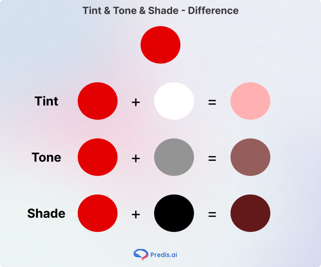
- Tints (Color + White): Adding white creates pastels. These feel airy, peaceful, and approachable. Great for wellness or baby brands.
- Shades (Color + Black): Adding black creates deep, rich colors. These feel powerful, mysterious, and high-end. Perfect for luxury cars or premium watches.
- Tones (Color + Gray): Adding gray “mutes” the color. This makes it look more sophisticated and less “childish.” Most modern tech companies use tones because they are easy on the eyes.
Why This Matters for Your Business
Beyond just looking good, mastering these basics is a practical necessity for your brand’s success.
- First, it ensures readability and accessibility; by picking colors with different “Values,” you make sure your text pops against the background so everyone can read your message.
- Second, it guarantees consistency across the board. Since screens and printers process color differently, knowing these terms helps you translate your “digital blue” into a “printed blue” without it looking “off.”
- Finally, it creates a visual hierarchy, allowing you to use your most “Saturated” color to act as a spotlight, naturally guiding your customer’s eye toward your “Buy Now” button.
Step 3: Picking the right color combination
Now that you have an idea of what the primary color for your brand should be, the next step is to come up with the appropriate color combination. And there is a science behind choosing those colors, and here are some of them:
- Monochromatic (The Single-Hue Path): This uses different tints, shades, and tones of one single color. It is the ultimate choice for a clean, minimalist, and deeply cohesive look that feels very “organized.”
- Analogous (The Neighbors): This involves picking 2–4 colors that sit side-by-side on the color wheel (e.g., Yellow, Yellow-Orange, and Orange). It creates a low-contrast, harmonious vibe often found in nature.
- Complementary (The Power Couple): This pairs two colors from opposite sides of the wheel (e.g., Blue and Orange). This creates the highest possible contrast, making the colors look more vibrant and helping elements “pop.”
- Split-Complementary (The Balanced Trio): You take a base color and pair it with the two colors next to its opposite. It offers the high energy of a complementary palette but is much easier to balance and less “harsh” on the eyes.
- Triadic (The Triangle): This uses three colors spaced evenly around the wheel (e.g., Red, Yellow, and Blue). It is bold and colorful, making it a favorite for children’s brands or high-energy startups.
- Tetradic (The Double-Complementary): This uses four colors arranged into two complementary pairs (forming a rectangle on the wheel). This is the most complex palette to master, but it offers the most variety for diverse brand assets.
Why These Methods Matter for Brand Selection
Following these formulas is essential because they provide a “logic” to your brand’s visual identity, preventing your design from looking cluttered or accidental.
By choosing a specific harmony, you ensure:
- visual stability, which builds trust with your audience—clashing colors often trigger a subconscious feeling of “unprofessionalism” or chaos.
- intentional contrast; for instance, using a complementary pairing ensures your “Buy Now” button is physically impossible to miss against its background.
- A flexible framework that maintains brand recognition across different platforms, ensuring that whether someone sees your logo on a white website or a dark shipping box, the colors always feel like they belong to the same family.
Step 4: Build Your Color Palette the Right Way
A professional palette usually consists of a primary color, a secondary color, and a high-contrast accent color, and here is how you can make your own aesthetic color palette.
The 60-30-10 Rule
To achieve visual harmony, follow this classic design ratio:
- 60% Dominant Color: Usually a neutral or your main brand color.
- 30% Secondary Color: Supports the main color.
- 10% Accent Color: Used for Call-to-Action (CTA) buttons and key highlights.
Tools and Accessibility
Use tools like Adobe Color, Coolors, or Muzli to find harmonious combinations. Most importantly, check for accessibility. Ensure your text-to-background contrast meets WCAG guidelines (at least 4.5:1) so users with visual impairments can still engage with your brand.
Step 5: Test Your Colors Before Going All In
A color that looks great on your monitor might look terrible on a cardboard box or a matte business card.
- Contextual Testing: Mock up your colors on social media tiles, website headers, and physical packaging.
- A/B Testing: Run two social media ads with different color schemes and see which one gets more clicks.
- The “Vibe Check”: Show your palette to people in your target demographic and ask them for three words that come to mind. If they say “boring” when you wanted “peaceful,” go back to the drawing board.
- Competitor research: See what your competitors are doing. This is the easiest way to know if you are going down the right road.
Step 6: Lock It In With a Brand Style Guide
Consistency is what turns a color into a “brand asset.” Once you’ve chosen your hues, document them in a Style Guide.
What to Include:
- HEX Codes: For web use.
- RGB/CMYK: For digital screens and professional printing.
- Usage Rules: Which colors go on which backgrounds? Which color is reserved for buttons?
This ensures your brand looks the same on a mobile screen in London as it does on a billboard in Sydney.
The primary purpose of a style guide is to achieve consistency at scale. Without one, your brand identity will slowly “drift” as different people make independent creative choices, leading to a fragmented image that confuses customers.
A solid guide protects your brand equity by ensuring every touchpoint—from an Instagram Story to a 50-page PDF report—feels like it’s coming from the same person. It also acts as a massive efficiency tool; instead of debating which font to use for every new project, your team can simply refer to the manual and get to work. Ultimately, a style guide transforms a logo and some colors into a disciplined, recognizable brand system that builds long-term trust with your audience.
Real Brand Examples
To see color theory in action, we can look at global giants that have used the “sliders” of hue, saturation, and value to claim a permanent spot in our subconscious.
1. Tiffany & Co. (The Power of a Signature Hue)
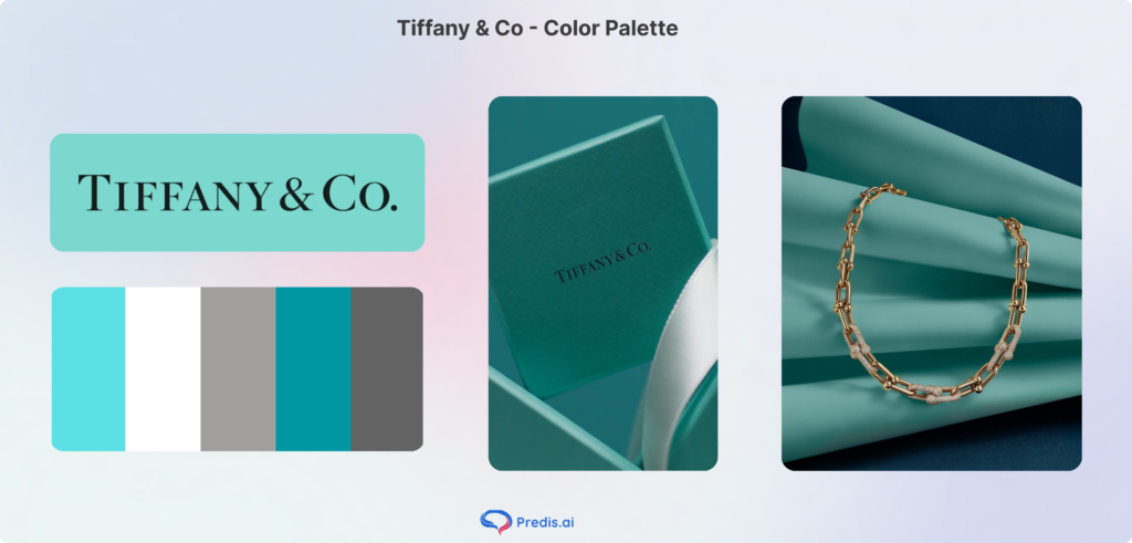
Tiffany & Co. didn’t just choose a color; they essentially “own” a specific shade of Robin’s Egg Blue, part of the blue color palette.
- The Strategy: They use a custom Tint of turquoise (now officially Pantone 1837).
- The Result: Because this color is applied consistently across all packaging (the famous “Blue Box”), the color itself has become synonymous with luxury, marriage, and exclusivity. Even without a logo, seeing that specific value of blue triggers an emotional response of “prestige.”
2. McDonald’s (The “High-Volume” Complementary Pair)
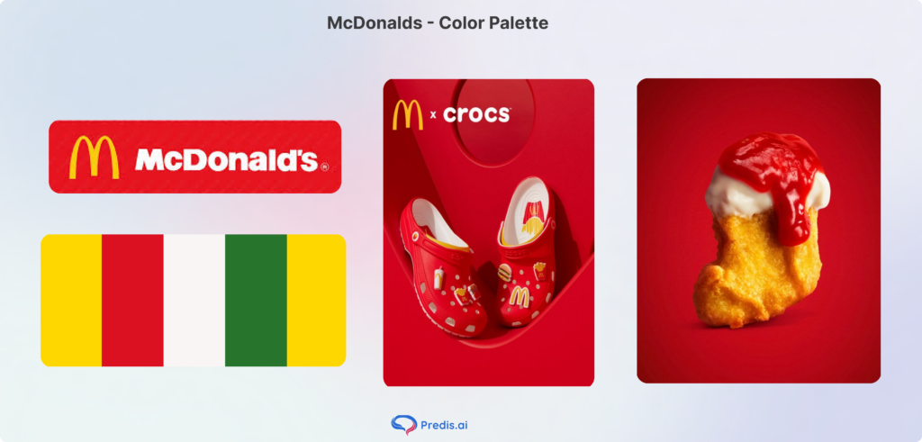
McDonald’s uses a classic Complementary-adjacent scheme of Red and Yellow, which has some parts of the fall color palette.
- The Strategy: They use a high-saturation Red to trigger appetite and urgency, paired with a high-value Yellow that symbolizes cheerfulness and speed.
- The Result: This combination is “high-energy.” It’s designed to be seen from a mile away on a highway and to encourage high turnover (you eat quickly and move on). It’s the gold standard for “fast-casual” branding.
Why These Choices Worked
- Emotional Alignment: Each brand picked a color that matched the feeling they wanted to evoke (e.g., Tiffany = Luxury, McDonald’s = Speed).
- The “Pop” Factor: They used Saturation to stand out in their specific environments—whether it’s a crowded mall or a busy street.
- Cultural Context: They respected the “meanings” of colors (like Green for growth or Red for action) to bypass the need for long explanations.
Conclusion
Choosing your brand colors is a long-term strategy, not a one-off task. The right palette acts as an emotional bridge between you and your customer, building trust and recognition every time they see it. By following this six-step process—from psychology to the final style guide—you ensure your brand doesn’t just look good; it performs.
FAQs
Aim for one primary, 1-2 secondary, and one accent. Keep it simple.
Yes, but it’s expensive and risky. It’s better to do the research now and get it right the first time.