


Explore this content with AI:
A plain screenshot of text sitting on a white background gets scrolled past in under half a second. A well-designed quote graphic — right font, right color, right breathing room — gets saved, re-shared, and screen-grabbed. The content is identical. The design does all the work.
Quotes are consistently among the most shared content types across Instagram, Pinterest, LinkedIn, and X. Quote graphics are fast to consume, emotionally resonant, easy to create, and endlessly repurposable. But the gap between a forgettable quote post and one that gets 3,000 saves comes down to a handful of design decisions most people skip.
This guide walks through all of them — from choosing the quote itself to exporting a file that looks sharp at any size.
Why Quote Graphics Perform So Well
Before diving into execution, it helps to understand the mechanics behind why quote content performs — because those mechanics should shape every design decision you make.
1. Relatability triggers sharing
When someone reads a quote that articulates something they’ve felt but never put into words, sharing it becomes a form of self-expression. They’re not sharing your content — they’re using it to say something about themselves to their own audience.
That motivation is powerful, and it’s why quotes consistently outperform more promotional content for saves and shares.
2. Visual breaks drive attention
A social media feed is a dense, fast-moving stream of faces, products, videos, and graphics. A clean quote on a minimal background creates what designers call a “pattern interrupt” — it’s visually different enough from everything around it that the eye naturally pauses. That pause is the opportunity.
3. Saves and shares signal quality to the algorithm
Platforms like Instagram weigh saves and shares more heavily than likes in their recommendation logic. A quote post that resonates enough to save — because someone wants to return to it, or share it later — actively improves your organic reach over time.
High-save content gets shown to more non-followers. It compounds.
4. Identity signaling
People share content that reflects the version of themselves they want others to see. A motivational quote about discipline signals something to a person’s followers. A quote about creative solitude signals something else.
Understanding the identity your audience wants to project helps you choose which quotes will travel furthest.
The Step-by-Step Process to Create Quote Graphics
Step 1: Select the Right Quote
The best-performing quotes tend to share a few traits: they’re specific enough to feel insightful, universal enough to apply to many people’s lives, and short enough to read in a single glance.
A rough rule: aim for under 25 words. Anything longer starts to feel like a caption, not a quote. “Do the work quietly. Let the results speak.” travels further than a 50-word paragraph on the same idea.
Source quotes that genuinely align with your brand voice. Mismatched quotes create a disjointed brand impression, even if the individual post performs well.
Step 2: Choose Your Canvas Size
Platform sizing is non-negotiable. Posting a graphic at the wrong ratio either crops it badly or reduces it to a thumbnail that makes the text unreadable.
| Platform | Recommended Size | Ratio |
|---|---|---|
| Instagram Feed (square) | 1080 × 1080 px | 1:1 |
| Instagram Feed (portrait) | 1080 × 1350 px | 4:5 |
| Instagram Stories / Reels cover | 1080 × 1920 px | 9:16 |
| 1000 × 1500 px | 2:3 | |
| 1200 × 627 px | 1.91:1 | |
| X (Twitter) | 1600 × 900 px | 16:9 |
Always design at the native resolution, not scaled down. Text that looks fine at 400px often pixelates or loses readability when displayed on a retina screen at full size.
Step 3: Establish Visual Hierarchy
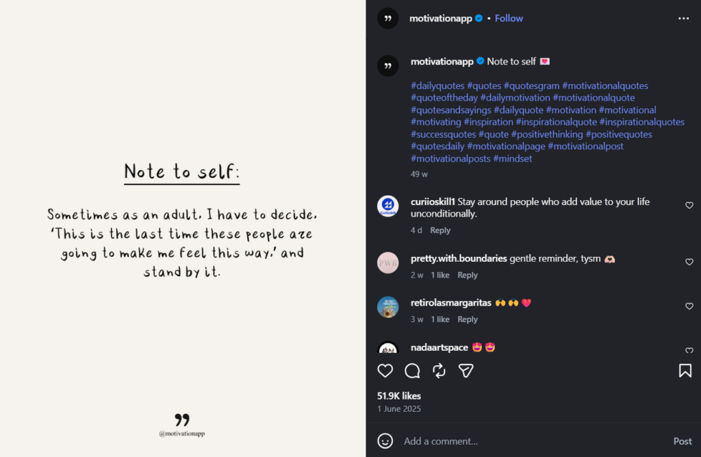
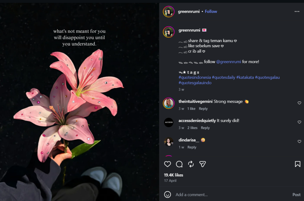
Visual hierarchy is the order in which the eye processes information. For a quote graphic, that order should be: quote → author → brand. The above example is a great way of establishing visual hierarchy.
The hero font carries the quote itself. Choose a typeface that matches the emotional tone of the content.
- A clean geometric sans-serif (like Inter or Montserrat) feels modern and confident.
- A serif (like Playfair Display or Lora) feels considered and literary.
- A script font can feel personal — but use it sparingly, as it often sacrifices readability.
The secondary font handles the author attribution. This should be visually subordinate — smaller, lighter weight, or in a contrasting style. If your hero font is a bold serif, a light sans-serif attribution line creates professional contrast. The reader’s eye should hit the quote first, then the name.
Never use more than two fonts on a single graphic. Three fonts are visual noise.
Step 4: Choose a Background That Doesn’t Compete
The background’s job is to make the text easier to read, not to add interest on its own.
Solid colors are the most reliable choice — especially when they’re pulled from your brand palette.
- A muted sage, a deep navy, a warm ivory: these create instant brand consistency across a series of posts.
- Gradients can work well when subtle (light to slightly darker of the same hue)
- Busy multi-color gradients fight with the text
If you use photography, choose images with significant negative space, or apply a color overlay at 60–80% opacity to reduce visual noise. A striking photo behind text with no overlay almost always hurts readability.
Step 5: Apply Brand Elements
Your logo, brand colors, and social handle should appear on every quote graphic — but subtly. A watermark in a corner, your handle in a small sans-serif at the bottom, your signature color as the background: these are the right scales for brand elements.
A logo that dominates the graphic signals “advertisement.” Brand elements that feel like a natural part of the design signal “quality content.” The goal is for someone who shares your graphic to carry your brand without it feeling like they’re sharing a promotional asset.
Step 6: Export at High Resolution
Export as PNG rather than JPEG for graphics with text. Always export content in the highest possible resolution to retain its quality when you publish it to your social media channels.
Pro Tips That Separate Good Quote Graphics from Great Ones
1. Master White Space
Crowded graphics feel anxious.
Ample white space — padding on all sides, line spacing that lets the text breathe — makes a graphic feel considered and calm. A common mistake is centering text in the canvas but pushing it too close to the edges. Build at least some margin on all sides as a baseline.
2. Use Color Psychology Intentionally
Color carries emotional information before the reader processes a single word. Some general patterns:
- Deep blues and greens: calm, trust, reflection — well-suited to wellness, mental health, or introspective content
- Warm oranges and yellows: energy, optimism, urgency — effective for motivational or entrepreneurial content
- Neutrals (cream, taupe, charcoal): sophistication, timelessness — work for lifestyle, fashion, and literary content
- High-contrast black and white: bold, direct, no-nonsense — strong for business and thought leadership
Don’t pick colors based on what you like. Pick them based on what the quote is trying to make someone feel.
3. Pair Fonts for Visual Tension
A single font used throughout a graphic is safe but flat. Pairing a serif headline with a sans-serif attribution — or a bold display font with a light body weight — creates professional contrast that makes the design feel intentional rather than default.
4. Try Micro-Animations
A static image competes with video for attention and loses. A quote graphic with a subtle entrance animation — text fading in, words appearing one at a time, a gentle background pulse — converts a static design into a video or GIF that autoplays in-feed.
5. Add Texture and Depth
Flat, solid-color backgrounds are clean but can feel generic after a while. Adding a subtle grain overlay (a common choice in editorial design), a faint paper texture, or a soft shadow behind the text adds depth that distinguishes your graphics from template-default outputs.
Tools like Predis AI can generate polished quote graphics from text input, with brand color and font controls. This makes it useful when you need to produce a volume of quote content while maintaining visual consistency. The result is a starting point you then refine rather than a final output.

The Bottom Line
A well-made quote graphic isn’t filler content. Done right, it’s one of the highest-leverage posts you can publish — low production time, high shareability, strong algorithmic performance when it lands. The design decisions covered here — hierarchy, background, typography, white space, texture — are what separate a graphic that gets 12 likes from one that gets 800 saves.
Start with one template to create a quote graphics. Get the font pairing, the margin, and the color right. Publish it, watch how it performs, and iterate from there. One strong template you refine over time is worth more than fifty variations you make once and abandon.
FAQs
Keep it under 25 words. That’s the threshold where a quote reads as a single complete thought rather than a paragraph that requires effort. The most shareable quotes tend to land between 8 and 18 words — long enough to carry real meaning, short enough to absorb instantly.
For public figures, published authors, and widely attributed quotes, proper attribution (crediting the name) is generally considered standard practice and falls within fair use for non-commercial content. Always credit the source.
For quotes from private individuals — a client testimonial, a community member’s comment — always get explicit written permission before publishing. When in doubt, paraphrase or reach out to the original speaker.
Once or twice a week is sustainable for most accounts, mixed in with original content. Quotes work well as a content type because they’re lower production effort, but a feed that’s mostly quotes signals that the account doesn’t have much original thinking to offer.
Use them as connective tissue between your own content, not as the main event.