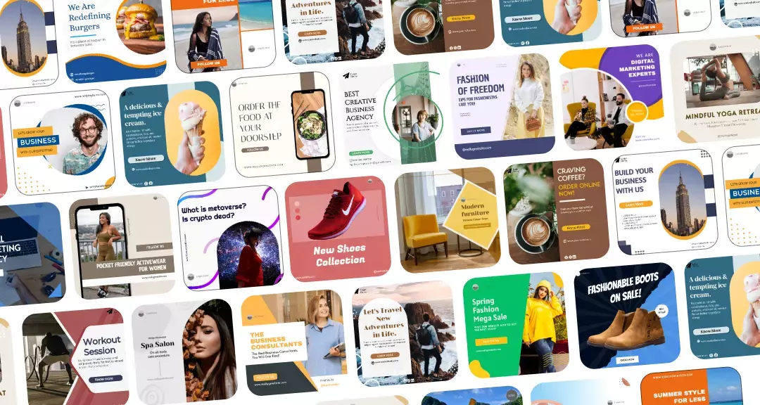
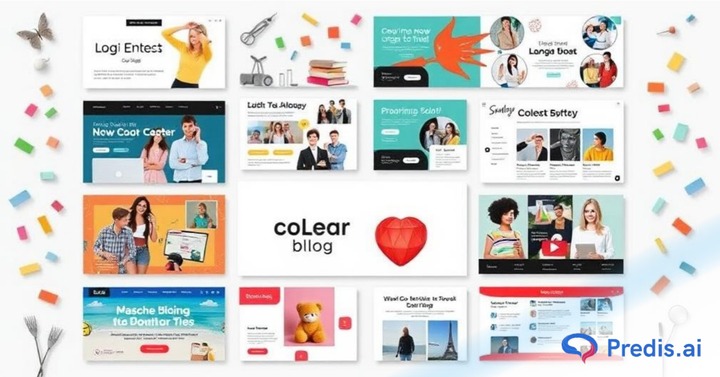
Have you ever wondered what tempts you to click on a blog and read it? Sometimes, it’s the catchy image you see at the top of the blog. That captivating image is none other than the blog banner.
A blog banner is a great option for driving the audience towards the brand and gaining engagement. A well-designed banner blog has several benefits, as it can communicate the post’s theme and keep people hooked on the content.
A report by Sweor highlights that 38% of people will stop engaging with a website if the content or layout is unattractive. Furthermore, it also states that it takes about 50 milliseconds for users to form an opinion about your website, emphasizing the importance of a strong visual impact. With these statistics in mind, investing in a captivating blog banner can significantly influence your blog’s success.
Having a compelling blog banner makes it easy to convey the blog’s message through the blog banner. Whether a newbie or a professional, you will benefit from a compelling blog banner. Let’s explore some inspiring blog banner ideas to elevate your blog’s visual appeal and reader engagement.
Blog Banner Ideas That Will Inspire You
Here is a list of 20 blog banner ideas you can consider while designing your next blog banner. You can select the one you find the most promising for your blog, whether you want a minimalist design or a banner with bold and vibrant graphics.
1. Banner for Listicles
When writing a listicle blog, you can add an infographic blog banner. There are many banners available that you can use to create a unique listicle blog banner. Add all the points you have covered in your blog in the banner itself. It will give the readers an idea about the things mentioned in the blog. You can customize the banner as per your preferences.
2. Banners with Bold Fonts
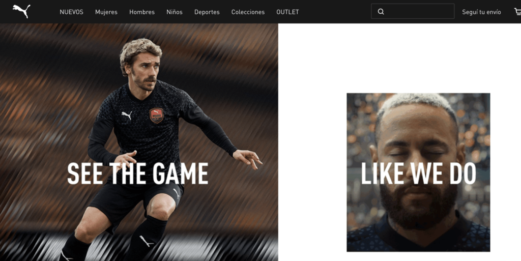
If you want to elevate the look of your blog instantly, consider bold fonts a simple yet effective move often highlighted in marketing strategy tips. Bold fonts naturally draw attention, increasing engagement and making your content stand out. Furthermore, bold fonts can create a unique aesthetic in the banner blog. Try to add large-sized text to highlight the bold font.
3. Transparent Banners
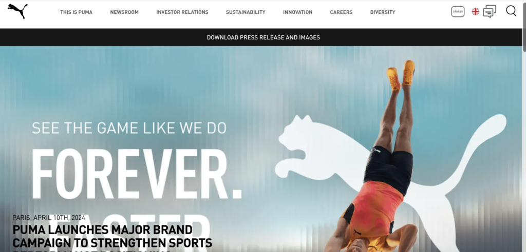
Transparent banners make blogs appealing. If you want to highlight your background image and create more impact, you can go for transparent blog banners. Transparent banners also increase the readability and usability of the blogs. Moreover, transparent banner blocks can help maintain consistency across the whole blog.
4. Banner with Separate Sections

This food blog has attractive food images. It is simple, with no excessive edits or filters. Though the blog banner is simple, it never fails to capture everyone’s attention. It has separate categories for side dishes, dinner, and all kinds of meals. Hence, you can easily navigate the entire website and find the dishes that interest you most. Similar can be done with other websites to categorize the information available.
5. Ted’s Blog
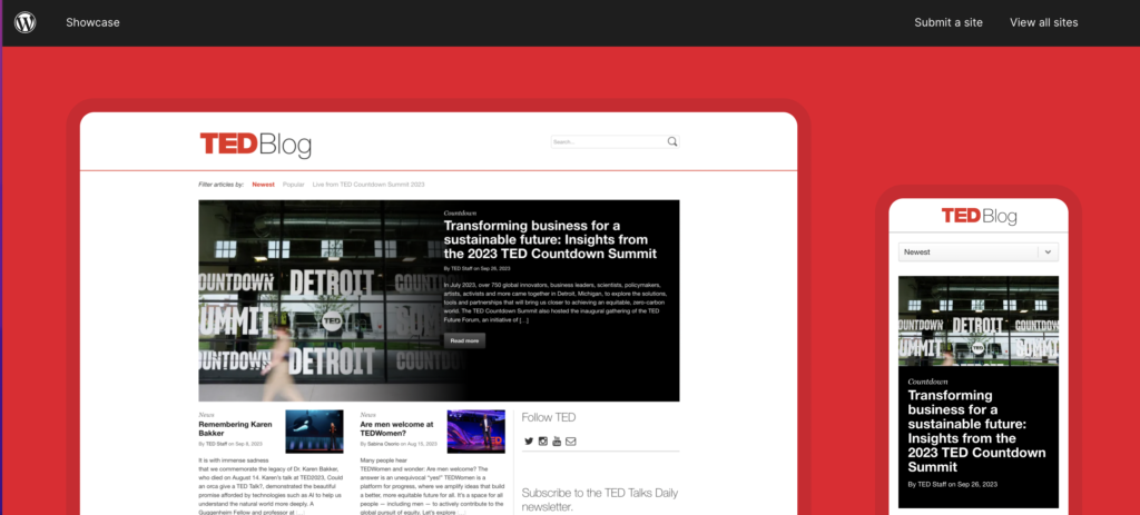
If you are looking for inspiration for a highly professional banner blog, Ted’s blog is one not to skip. The banner is quite large, which allows the viewers to quickly view the popular content. Its full-width layout also enables viewers to scroll through the entire page, finding the most relevant ones.
6. Formal Banners
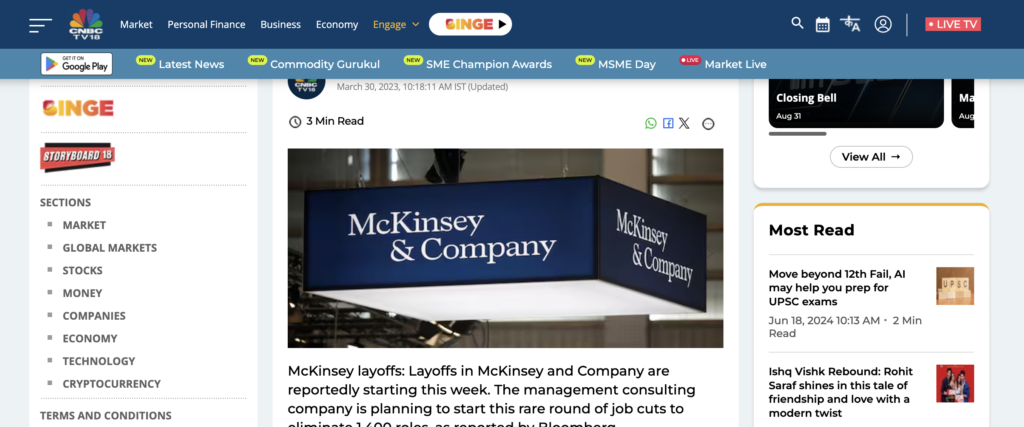
Formal manners are the evergreen banners. They are highly versatile; be it a blogger showcasing his expertise or a business promoting its services, everyone can use these banners. These banners have a positive impression on the audience. Moreover, formal banners also highlight a sense of professionalism in you.
7. Simple and Elegant Blog Banner Ideas
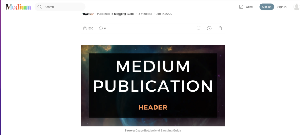
Simplicity never goes out of style. Similar is the case when going for Blog banners. The blog banner doesn’t need to have a variety of effects and styles. You can choose simple blog banners to create an impact on viewers. Besides, you can add high-quality images and go for impactful text to gain a larger audience. Even with a minimalist design, taking the time to carefully edit images ensures that every visual element enhances your message and keeps the focus clear and engaging.
8. Blog Banners with No Images

It might sound a little dull. But blog banners with no images also have an impact. These banners are one such banner that will never go out of style. They give the blogs a minimal look. In such banners, the entire focus is on text. These blogs can be made attractive by experimenting with the font shape and size.
Design striking Blog banners with Predis.ai's Free AI Banner Maker—enhance your Blog Page with custom banners made easy using AI.
9. Add Your Professional Image

Adding your image to the blog banner is something new that you can try. Adding a personal image can build more connection, as the readers might feel more engaged when they see the writer behind the content. It will also help in building a strong personal brand.
10. Photography-Based Banners
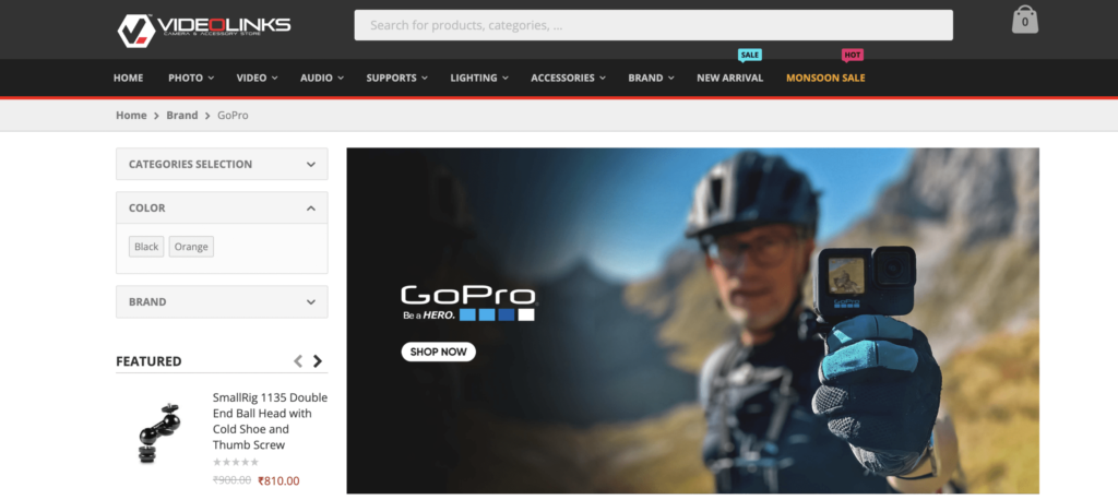
Photography-based banners leverage high-quality, visually striking images to capture the viewer’s attention instantly. These banners can convey a story, evoke emotions, and enhance the overall aesthetic of your website. By choosing images that are relevant to your content and brand, you can create a strong visual connection with your audience.
11. Banners with Icons
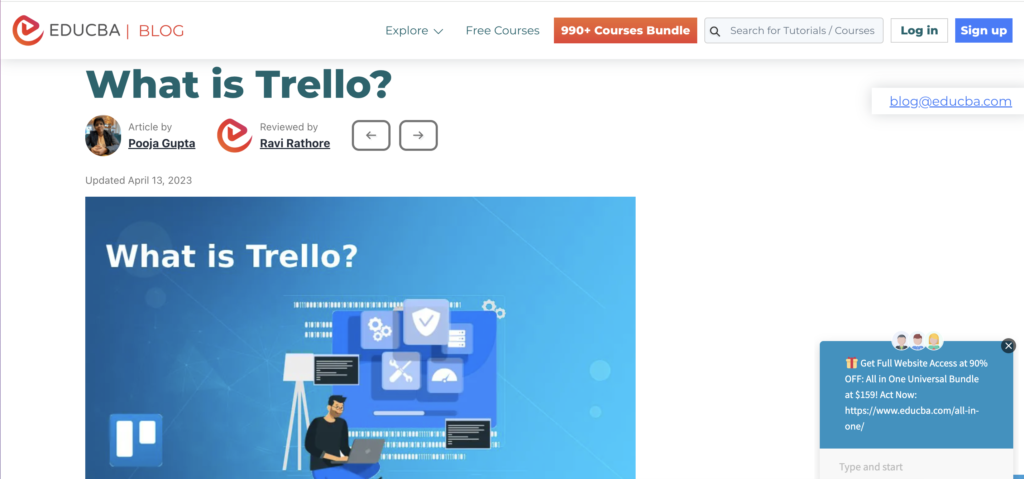
If you do not wish to add images to the blog banner, go for icons. It will make your banner quirky. Icons can add dynamic visual elements to the banner. You can use them to add a touch of creativity to your banner. Icons can help you convey your ideas to a broader audience without language barriers.
12. Bold Blog Banner Idea
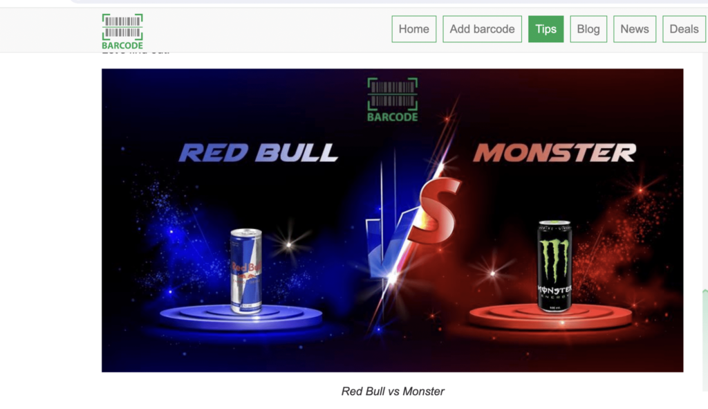
You can easily make a statement by going for bold blog banners. For this, you can go for a single bold background image with some attractive text. For example, in this blog banner, you can see the effect it instantly creates. It captivates the attention of the users and urges them to read further.
13. Minimal Blog Banner

Minimal blog banners with distinctive designs never fail to capture the audience’s attention. They give the website a professional outlook, avoid distractions, and keep readers engaged. Minimal blog banners also communicate the brand’s identity. As there are fewer elements in a minimal banner, you can customize it easily.

14. Creative Website Banner
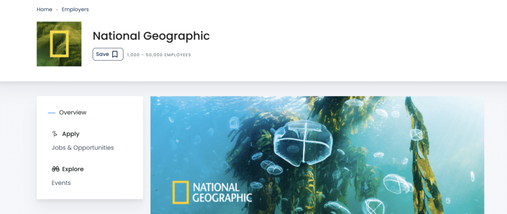
Catchy visuals can make an impact. The dark, plain background, light-colored font, and image are all set to grab the user’s attention instantly. You can take inspiration from this banner and create one for your website.
15. Digital Marketing Banner Ideas

Website blog banners for digital marketing need to be exceptionally brilliant to attract the audience. So, they can go for banners similar to this one. This banner is a good mixture of icons and images. If you wish, you can even add text to the banner to make it more descriptive.
16. Artistic Banners
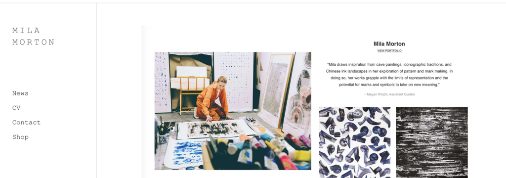
This blog banner design is apt for blogs that want to add an artistic feature to their blogs. Though they did not use any bold images, it still looks attractive. It gives off a serene and calm vibe. Therefore, if you want to go for something simple yet attractive, design something like this.
17. Dark Blog Banners Idea

Dark-colored images attract the user’s attention instantly. They also look more professional. The text written on dark mages often gets more attention. A dark-colored background with a light font creates an epic contrast. With dark backgrounds, you do not need many elements and can easily go with a minimal blog banner.
18. Layered Banners

Think outside the box and add layers to your blog banner to make it stand out. It will surely make the banner unique. Experiment with the color contrast, image, and text to create a cohesive blog banner. This banner will bring out the artist in you and help you create an authentic blog banner for your website.
19. Travel Banners

If you are designing a web page for travel blogs, keep images as the center of attraction of the banner. It will instantly create an urge to click on the read below section to find more about the place. The website banner blog for a travel website should consist more of travel-themed icons to add a touch of personalization.
20. Call-to-Action (CTA) Focused Banners

Call-to-Action (CTA) focused banners aim to drive user engagement and conversions by featuring clear, compelling CTAs such as “Join Now” or “Shop Now.” Designed to stand out with action-oriented language and contrasting colors, these banners guide users toward specific actions.
Effective CTA banners minimize distractions and may include directional cues, making it easy for users to follow through. Customizing CTAs based on user behavior can further enhance their effectiveness, boosting interaction and achieving desired outcomes.
Conclusion
A blog banner is more than just a visual element – it’s a powerful tool to draw readers in and convey your blog’s message effectively. Whether you prefer minimalist designs, bold typography, or interactive elements, the right banner can significantly enhance your blog’s appeal and engagement. By experimenting with different styles and customizing them to fit your brand, you can create a unique and captivating experience for your audience.
So, what is stopping you now? Take help from the above blog banner ideas, add personal touches, and use Predis.ai to create a compelling blog banner for your next post. For a free demo, sign up today!
