
![15 Infographics to Inspire Your Next Viral Post [2026 Edition]](https://predis.ai/resources/wp-content/uploads/2026/03/753adb8b-1638-432c-9f07-e091f08525bd-24.jpeg)
In the digital landscape of 2026, information is no longer a scarce resource—attention is. We are currently navigating a “Skim Culture,” where the average professional filters through thousands of data points every single hour. In this high-velocity environment, text-heavy content often acts as a barrier, while high-quality infographics act as a bridge. Research into neuro-marketing confirms that the human brain processes visual imagery in 13 milliseconds, making the infographic the most efficient weapon in a content creator’s arsenal. This guide deconstructs 15 world-class infographic examples to show you exactly how to use color, hierarchy, and spatial reasoning to command attention and drive conversions.
15 Inspiring Infographic Examples Explained
Category 1: Minimalist & Clean Designs
In 2026, minimalism is the “clutter-killer.” These designs work because they reduce the cognitive load on users who are likely experiencing “digital fatigue.” By stripping away non-essentials, you aren’t just making it pretty; you are making it faster for the brain to scan and internalize.
1. Font Psychology and Pop Culture
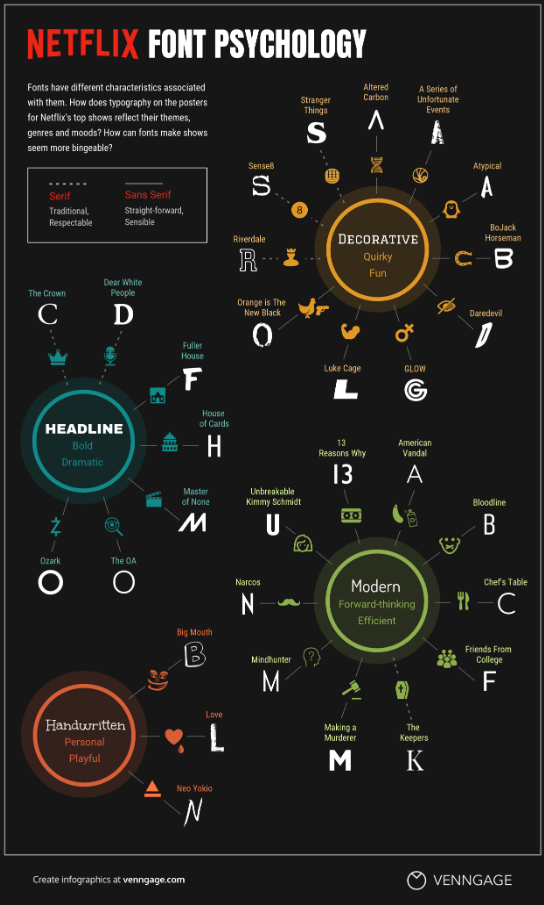
- Analysis: This is a masterclass in Associative Learning. By displaying the information in the font it is describing, it creates a dual-channel learning experience—the user reads the data while simultaneously feeling the “vibe” of the typography.
- Design Impact: It utilizes Semantic Congruence. When the visual style of a font matches the emotional tone of the text, information retention increases by up to 40%. It’s a “show, don’t tell” approach that saves the reader’s time.
2. Common Mythconceptions
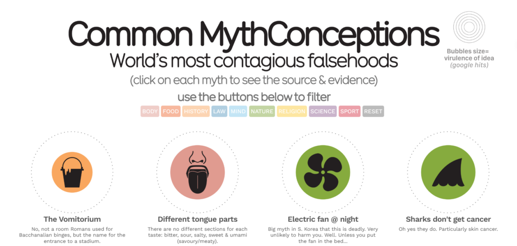
- Analysis: David McCandless uses Hierarchical Scaling to turn a boring list of facts into a “Data Galaxy” in this infographic examples. The size of each bubble corresponds to the “virality” of the myth, providing an instant sense of scale that a spreadsheet could never convey.
- Design Impact: This design breaks the “standard grid” to encourage Active Discovery. Because there is no set reading path, the user feels like they are “exploring” the data rather than being lectured, which significantly increases time-on-page.
Category 2: Data-Heavy & Statistical Infographic Examples
The challenge of 2026 is “Data Density.” These infographics aren’t just showing numbers; they are building “Decision Systems” that help users compare vast amounts of information in seconds.
3. The $117 Trillion World Economy
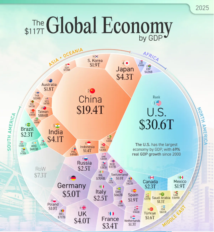
- Analysis: This Voronoi diagram is a masterclass in Spatial Reasoning. Instead of listing GDPs, it uses nested geometric shapes to represent “market share.” This allows the viewer to see the “share of the pie” for each country at a scale that standard bar charts fail to capture.
- Design Impact: It utilizes Centrality Bias. By placing the largest economies in the center and smaller ones on the periphery, the designer creates an intuitive hierarchy that the human brain understands without needing a numbered ranking.
4. History of Pandemics
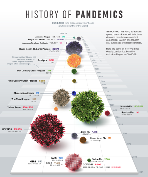
- Analysis: This uses Volume Visualization rather than a 2D area. The “blobs” representing different diseases are rendered with a 3D texture, making the massive death toll of the Black Death feel physically “heavier” and more imposing than modern flus.
- Design Impact: It triggers an Emotional Response to Scale. By comparing a tiny “SARS” dot to a giant “Spanish Flu” sphere, the designer uses visceral visual contrast to provide a perspective on history that numbers alone cannot achieve.
5. The 1%’s Share of U.S. Wealth
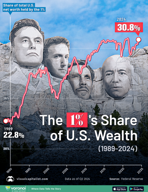
- Analysis: This is a Contextualized Area Chart. A simple line graph shows what happened, but by adding “blurbs” to the dips and peaks, the designer explains the why (e.g., the 2008 crash or the 2020 pandemic) directly on the chart.
- Design Impact: It utilizes Narrative Anchoring. By linking data spikes to historical events the reader remembers, the infographic moves from being “data” to being a “story,” which makes the information much more likely to be shared on social platforms.
Category 3: “How-To” & Process Flow Infographic Examples
In 2026, “How-To” content is the king of SEO. These designs focus on “Temporal Logic”—showing the user exactly how a situation changes from Step A to Step Z.
6. How to Build a Human
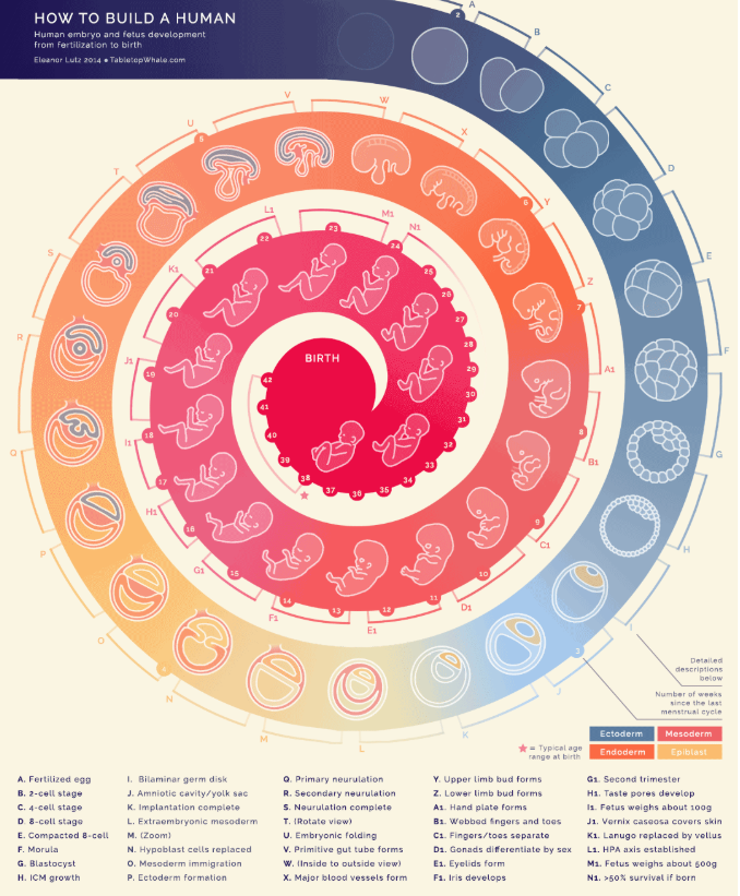
- Analysis: This uses Micro-Illustration to establish “Visual Authority.” The incredible level of detail in the anatomical drawings convinces the viewer that the source is scientifically credible before they even read a word.
- Design Impact: It encourages “Zoom-In” Behavior. On mobile devices, high-detail graphics force users to pinch and zoom, which increases “active engagement” time. This signal tells search engines that the content is highly valuable to the reader.
7. The Creative Process
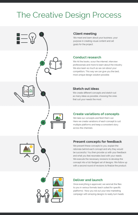
- Analysis: This graphic uses an Abstract Metaphor (the “Scribble to Straight Line”). It visualizes the messy, chaotic reality of the early “ideation” phase versus the clean, final product, which builds an immediate emotional connection with creative professionals.
- Design Impact: It leverages Visual Validation. By showing the “messy” part of the process, it validates the user’s personal struggles, making the brand behind the infographic feel empathetic and human rather than corporate.
8. How to Cook Ramen
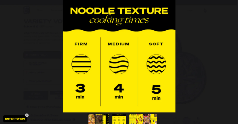
- Analysis: This is an Exploded View Diagram, a style borrowed from engineering manuals. By showing all the ingredients “floating” separately before they combine, it deconstructs a complex recipe into simple, non-intimidating assembly steps.
- Design Impact: It reduces Choice Paralysis. When all components are laid out clearly in an “exploded” view, the task seems significantly easier to start. This is a powerful tactic for tutorials and educational content.
9. NASA’s Eyes on Asteroids
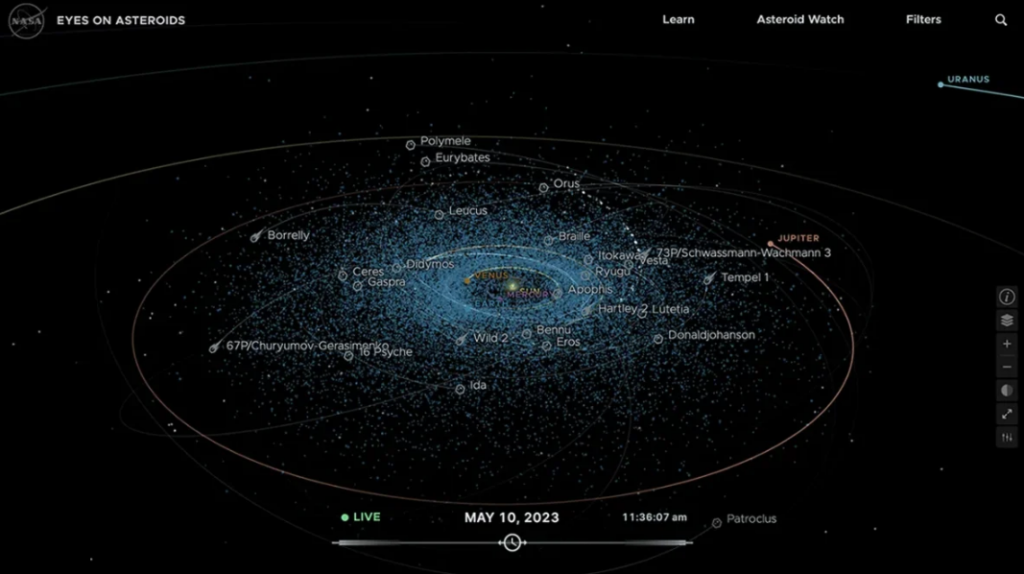
- Analysis: This graphic uses Temporal Mapping. It doesn’t just show where objects are; it uses curved “velocity lines” to show where they are going. This adds a four-dimensional element (time) to a two-dimensional image.
- Design Impact: It uses Vector Directionality. In 2026, our eyes are trained to follow paths (think GPS apps). By using these familiar “pathway” lines, NASA makes complex orbital mechanics feel as simple as a Google Maps route.
10. How to Preserve Wine
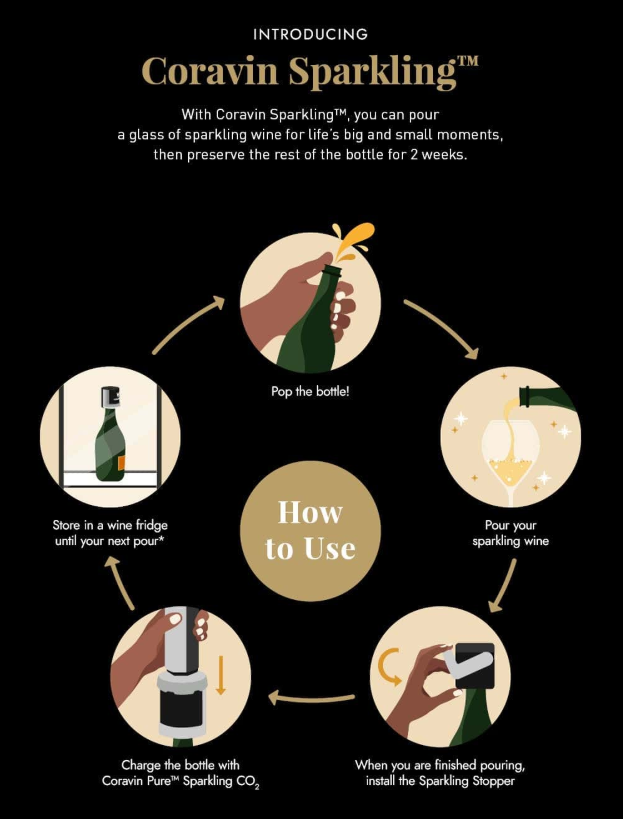
- Analysis: This uses Visual Anchoring instead of abstract shapes. Every icon is a simple, clear outline of the real product, like the stopper or the CO2 charger. By removing extra background details and focusing only on the parts you actually touch, the design makes a technical process feel like a simple, everyday habit.
- Design Impact: It triggers a Functional Sense of Security. The infographic focuses on the “success state” by making the green pressure light the star of the final step. This gives the user a quick visual “win,” replacing the worry of doing it wrong with a clear sign that the wine is officially protected.
11. Burger Recipe Visualized
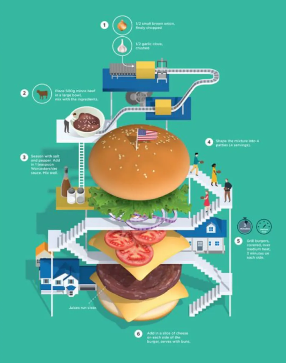
- Analysis: This uses a 3D Building Layout instead of a flat list. The burger is drawn as a giant, solid tower with stairs and levels. By treating the food like a physical building, the design makes the steps of a recipe feel like a big project where everything fits together in a clear, solid structure.
- Design Impact: It triggers a Sense of Play and Storytelling. By adding tiny people and small houses to the giant food, the designer makes a simple recipe feel like a fun, tiny world. This makes the instructions much more interesting to look at than just reading a list of steps in a book.
Category 4: Comparison & “VS” Infographic Examples
The ultimate goal here is “Binary Decision-Making.” These graphics are designed to convert a skeptic into a buyer by making the choice feel like a “no-brainer.”
12. Rug Sizes Visualized
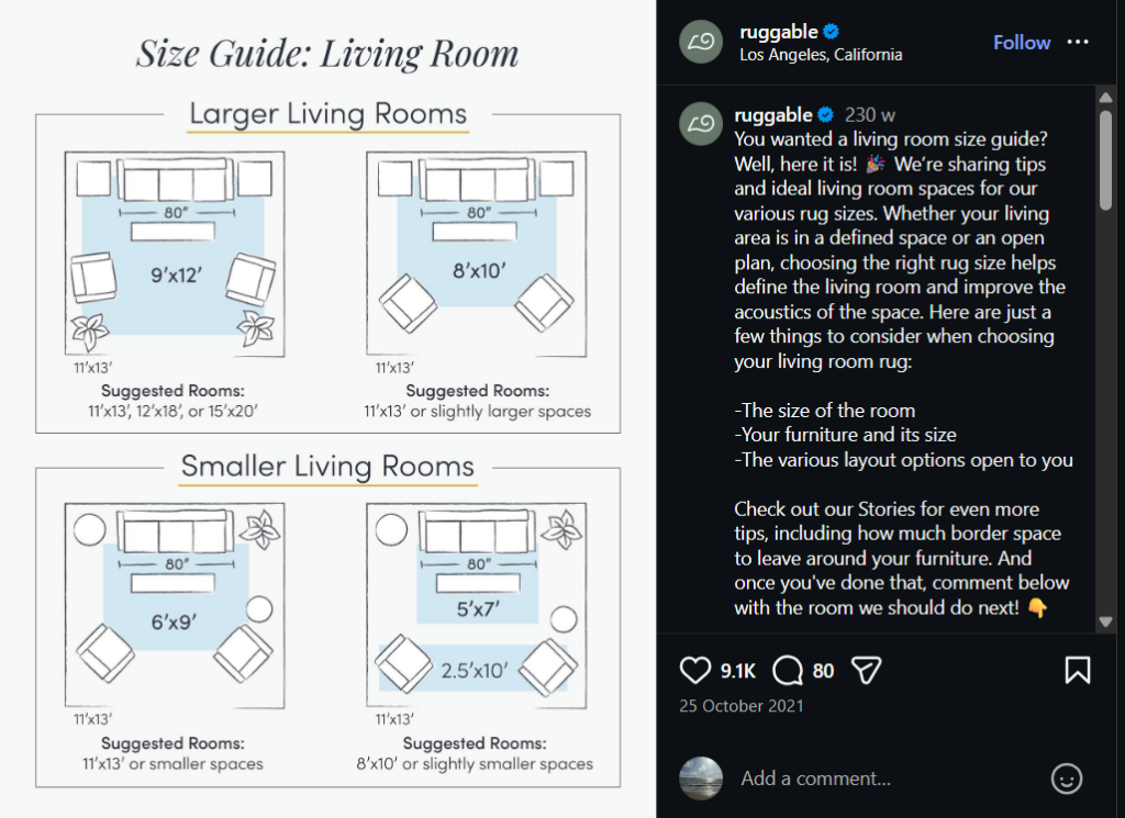
- Analysis: This is Contextual Anchoring. A number like “8×10” is abstract. An “8×10 rug under a Queen-sized bed” is a solution. By adding a human-scale object (the bed), the designer makes the data “shoppable.”
- Design Impact: It removes Friction in the Buyer’s Journey. By answering the question “Will this fit in my room?” visually, the infographic solves the #1 objection a customer has before they even reach the checkout page.
13. PayPal vs. Competitors
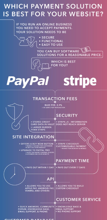
- Analysis: This is a Feature Matrix but with a twist—it uses Brand Color Coding. The checkmarks in the “PayPal” column match their exact brand blue, while competitors are often shown in neutral grays.
- Design Impact: It utilizes Positive Reinforcement Bias. By flooding the “preferred” column with bright, brand-specific colors, the user’s eye is naturally drawn to the “winning” side, making the other options feel “empty” by comparison.
14. Caraway vs. Traditional Cookware
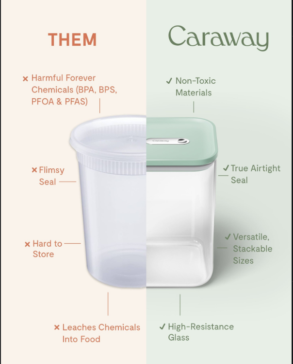
- Analysis: This uses a Split-Screen Contrast instead of a separate list. By cutting two different products down the middle and joining them together, the design makes the comparison feel like a physical “before and after.” This forces the eye to see the cheap plastic and the high-quality glass as two parts of the same story, making the upgrade feel like a logical necessity.
- Design Impact: It triggers a Sense of Trust through Color and Texture. The designer uses dull, “dirty” beige for the cheap side and a fresh, “clean” mint green for the brand side. This massive shift in color makes the brand’s product feel safer and more premium, helping the user make an emotional choice based on how the colors make them feel rather than just reading the text.
15. Most Commonly Used Internet Languages
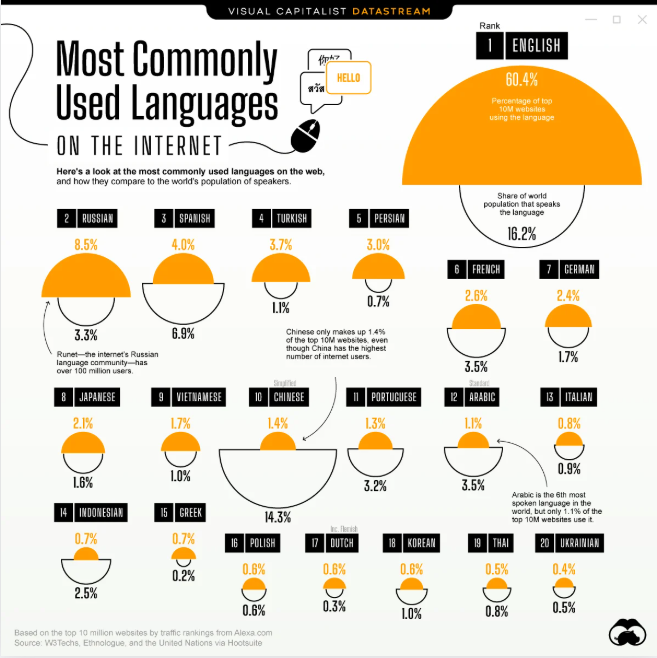
- Analysis: This uses Semicircle Comparisons instead of a standard bar chart. By stacking a colored shape on top of an empty outline, the design shows two different data points—internet usage vs. world population—in one spot. This makes it easy to see the “gap” between how many people speak a language and how much that language actually dominates the web.
- Design Impact: It triggers an Emotional Response to Imbalance. The designer uses a bright orange “top” to show internet dominance and a simple black outline for the population. When the orange part is much bigger than the outline (like with English), it instantly shows a “takeover” effect, making the data feel more dramatic than just looking at a list of percentages.
Why These Infographic examples Will Dominate Your Style in 2026
If you want your content to survive the 2026 “Information Flood,” you must shift from being a decorator to being a narrator. The infographics above work because they don’t just “show” data—they provide a perspective.
But making these infographics, now there lies a challenge that we need to tackle. Any time in history and you need to have made it from scratch or hired a designer to do it for you. But in 2026, tools like Predis AI have made it easier to create AI images from scratch with a simple text prompt – no skills, designers or expensive software required! So, sign up today and start making your infographic!
FAQ:
Our attention spans are shorter than ever. Infographics are processed in 13 milliseconds in the brain than text, making them the perfect “scroll-stopper” for fast-moving feeds like TikTok, Instagram, and LinkedIn.
It depends on your goal. Use a Split-Screen Contrast for product comparisons, a Vertical Cross-Section for “how-to” guides or recipes, and Semicircle/Bubble charts for comparing large sets of statistics.
Not anymore. While custom designs are great, tools like Canva, Predis AI, and specialized templates allow you to use professional techniques—like Visual Anchoring and Success State indicators—without starting from scratch.