
Explore this content with AI:
In a world where we scroll past thousands of digital ads daily, physical flyers cut through the “screen fatigue.” A flyer doesn’t disappear when you refresh a feed; it sits on a coffee table, hangs on a community board, or stays in a pocket, providing multiple “impressions” over time.
There is a psychological weight to a physical object. Handing a flyer to someone creates a tactile brand experience. The texture of the paper and the vibrant colors create a sensory memory that a digital pixel simply cannot replicate.
Flyers are equally effective for everything from Local events to launching your store, provided that the design is good and engaging. And that is exactly what we will be discussing in this blog – how to design a flyer from beginning to end.
The Importance of a Well-Designed Flyer
But why is it so important to have a Flyer that is well-designed? There are not exactly a lot of flyers to compete with, unlike the digital space. But, good design still matters, and here is exactly why:
1. Instant Information
A great flyer follows the “2-Second Rule.” A passerby should be able to identify the What, Where, and When without stopping their stride.
2. Cost-Effective Reach
Unlike digital Cost-Per-Click (CPC) models, where you pay for every “accidental” click, a flyer is a one-time investment. Once printed, your distribution costs are often just the time it takes to walk a neighborhood. So, if your flyer is not effective, there is no concept of doing over or A/B testing.
3. Local Targeting
Flyers allow for hyper-local precision. You can place your message exactly where your audience lives, works, and drinks coffee, ensuring zero “wasted” reach outside your service area.
Standard Flyer Dimensions and Formats
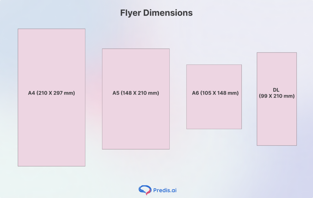
Choosing the right size is the first step in your design journey to design a flyer. Each format serves a specific psychological and functional purpose:
- A4 (210 X 297 mm): The “Big Picture” format. Best for corporate reports, detailed technical sheets, or posters intended to be read from a distance.
- A5 (148 X 210 mm): The industry favorite. It is exactly half an A4, making it cost-effective for printing and the perfect size for letterbox drops.
- A6 (105 X 148 mm): The postcard size. Its small footprint makes it feel “collectible.” Ideal for nightclub promos or high-value discount vouchers.
- DL (99 X 210 mm): “Dimensions Lengthwise.” This fits perfectly into a standard envelope or a tri-fold brochure rack.
Once you’ve finalised your format, use a mm to pixels converter to set up the exact canvas dimensions in your design tool. Just make sure to convert at 300 DPI to keep your design crisp and print-ready. Based on your message and the mode of distribution, the dimension of your flyer can vary, so choose wisely!
Core Elements of a High-Converting Flyer
When it comes to Flyers, many elements come together to make it work. From catchy content to visually striking images, each part of the flyer plays a crucial role. Only when these elements merge well together do we get a coherent and attention-grabbing flyer that later becomes a sale.
Here are some of these elements that can make or break your design, and ways in which you can ace it:
1. Images and Graphics: The Visual Hook
Why it matters: Humans process visual information many times faster than text. In a high-traffic environment, your “Hero Visual” is the split-second hook that stops a person from walking past. High-quality graphics build immediate professional credibility and tell a story without requiring the reader to decode a single sentence. If the image is blurry or generic, the consumer subconsciously associates that lack of quality with your brand.
- Use High Resolution: Always ensure images are at least 300 DPI to avoid “pixelation” when printed.
- Aspirational Imagery: Show the result of your service (a happy customer) rather than just the process.
- Faces Matter: Humans are biologically wired to look at faces; eye contact in a photo can increase engagement.
- Originality Wins: Avoid “stocky” stock photos; authentic, custom photography builds significantly more trust.
- Graphic Simplification: Use icons or illustrations to break up complex ideas into digestible visual bites.
2. Flyer Content: The Persuasive Narrative
Why it matters: Once the image stops them, the content must hold them. Effective flyer copy isn’t about how great your company is; it’s about how you solve the reader’s specific problem. Using the AIDA formula (Attention, Interest, Desire, Action) ensures that your text flows logically and leads the reader toward a decision without overwhelming them with “walls of text.”
- Benefit-Driven Headlines: Instead of “Our Services,” use “Save 20% on Your Energy Bill This Winter.”
- The Power of Brevity: Use bullet points and short sentences; if it takes more than 10 seconds to read, it’s too long.
- Speak to the Reader: Use “You” and “Your” to make the content feel personal and direct.
- Social Proof: Include a one-sentence testimonial or a “Trusted by 500+ Locals” badge to reduce purchase anxiety.
3. Fonts and Typography: The Tone of Voice
Why it matters: Typography is the “body language” of your flyer. A bold, clean sans-serif font screams modern and efficient, while a traditional serif suggests heritage and trust. If your fonts are difficult to read or clash with one another, the reader will experience “cognitive friction” and likely discard the flyer before finishing the first paragraph.
- Limit Your Families: Stick to a maximum of two font families (one for headings, one for body text) to maintain a professional look.
- Prioritize Legibility: Never use decorative or script fonts for critical information like phone numbers or dates.
- Size Hierarchy: Your headline should be at least 3x larger than your body copy to guide the eye.
- Watch the Leading: Ensure there is enough space between lines of text so they don’t look “clumped” together.
- Contrast is King: Ensure dark text sits on a light background (or vice versa); never put thin text over a busy image.
4. Color Psychology: The Emotional Trigger
Why it matters: Color is the first thing the brain perceives, often before shapes or words. Different hues trigger specific subconscious emotions: Blue fosters trust and security (common in finance), Red creates urgency and appetite (perfect for food), and Green evokes health and growth. Using color strategically allows you to “prime” the reader’s mood before they even read your offer.
- The 60-30-10 Rule: The 60-30-10 rule helps choose the right colors for a design. The rule states to use 60% of a primary brand color, 30% of a secondary color, and 10% for a bold accent (usually the CTA).
- Color Contrast: Use high-contrast pairings (like yellow on black) for the most important information to make it “pop.”
- Avoid the “Rainbow” Effect: Too many colors create visual chaos and look amateurish; keep your palette tight.
- Cultural Context: Be mindful of local color meanings (e.g., in some cultures, white represents mourning rather than purity).
- Check Print Vibrancy: Remember that colors often look brighter on a backlit screen than they do on matte paper stock.
5. Visual Hierarchy: The Eye’s Roadmap
Why it matters: Visual hierarchy is the intentional arrangement of elements to lead the reader’s eye in a specific order. Without a clear hierarchy, the reader doesn’t know where to look first, leading to confusion. A well-organized flyer usually follows an “F-Pattern” or “Z-Pattern”, starting with a bold headline and ending at the Call to Action.
- The “Squint Test”: Squint at your flyer from three feet away; if the most important element doesn’t stand out, your hierarchy is weak.
- Use White Space: Give your elements “breathing room” to prevent eye fatigue and emphasize key points.
- Grouping: Keep related information (like time, date, and location) physically close together.
- Scale and Weight: Use Bolding and Size to signal importance—the bigger it is, the more important it seems.
- Directional Cues: Use subtle arrows or the “gaze” of the person in your photo to point toward your CTA.
6. The Call to Action (CTA): The Final Destination
Why it matters: The CTA is the single most important part of your flyer. If you don’t tell the reader exactly what to do next, the rest of your design effort is wasted. A high-converting CTA is clear, urgent, and reduces the “cost of entry” for the customer. It transforms a reader into a lead.
- Be Command-Oriented: Use strong verbs like “Call,” “Visit,” “Scan,” or “Join.”
- Create Urgency: Add a deadline, such as “Offer expires Friday” or “First 50 callers only.”
- Low Friction: Make it easy—a QR code is significantly more effective than a long, typed-out URL.
- Incentivize the Action: Give them a reason to act now (e.g., “Bring this flyer for a free coffee”).
- Physical Placement: Always place your primary CTA in the bottom right or centered at the bottom, as this is the natural “exit point” of the eye.
Step-by-Step Process of How to Design a Flyer
1. Define Your Goal
Identify the Single Primary Action. Do you want them to visit a website, call a number, or show up at a physical location? Design everything to lead to that one point.
2. Drafting the Wireframe
Before opening the software, sketch your layout on paper. This helps you establish an Information Hierarchy—deciding which element is the “King” (usually the Headline) and which is the “Queen” (the Visual).
3. Setting Up Print Specs
To avoid a blurry or cut-off flyer, you must adhere to the “Golden Three”. By following these parameters, you can ensure the flyer you visualised on screen does not get compromised on print:
- Bleed (3 mm): This is an extra area of your design that extends beyond the trim line. It ensures that if the printer’s blade slips slightly, you won’t have a white border.
- Color Mode (CMYK): Screens use light (RGB), but printers use ink (Cyan, Magenta, Yellow, Key/Black).
- Resolution (300 DPI): Digital images are usually 72 DPI. Printing requires 300 “Dots Per Inch” to look crisp.
4. Choose a Design Platform
When it comes to designing your flyer, there are essentially two ways you can go. You can hire a designer, make them understand your requirements, and get your flyer designed and printed. There is a much simpler alternative route that allows you to design your own flyers, even if you have zero experience. This is by using design platforms and AI image creation tools.
AI tools like Predis AI can generate your flyer designs from scratch with a single text prompt. All you have to do is explain your vision in detail, and the AI will take care of the rest. The best part is that the turnaround time is very low, which means you do not have to wait days for a flyer design only to send it off with additional corrections. With Predis AI, the results are instant.
Things to Know: Print vs. Digital Flyers
1. The “Safe Zone”.
Keep all critical text and logos at least 5 mm away from the “Trim Line.” This is your safety net to ensure no important information is lost during the cutting process.
2. Resolution Matters
If you download a photo from a website to use on your flyer, it will likely look “pixelated.” Always use high-resolution stock photography or original high-res exports from your camera.
Flyer Design Cheat Sheet
| Element | Specification | Why it Matters |
| Resolution | 300 DPI | Ensures crisp, sharp images and text. |
| Color Mode | CMYK | Accurate color reproduction from screen to paper. |
| Bleed | 3 mm to 5 mm | Prevents white edges after the paper is trimmed. |
| File Format | PDF (Print Ready) | Preserves fonts and high-resolution assets. |
| Safe Zone | 5 mm Inner Margin | Keeps text from being cut off during trimming. |
Conclusion
In an age where digital ads are often swiped away and forgotten in milliseconds, a well-crafted physical flyer offers something rare: a tangible connection. By mastering the visual hierarchy, choosing the right color palette, and grounding your design in a clear, benefit-driven Call to Action, you transform a simple piece of paper into a 24/7 salesperson for your brand.
Remember, the most successful flyers aren’t just seen—they are kept. When you provide immediate value, whether through a compelling offer or essential information, you earn a spot on a customer’s fridge, desk, or bulletin board. Don’t let your message get lost in the noise; use these design principles to ensure your next campaign leaves a mark that lasts long after the initial handshake.
Frequently Asked Questions (FAQ)
For beginners, Predis AI offers text-to-flyer options, and Canva or Adobe Express offer excellent templates. For professionals requiring precise print control (like bleed management and Pantone colors), Adobe InDesign or Illustrator is the gold standard.
Templates are great for speed, but they can look “generic.” If your goal is brand authority, customize a template heavily or start from scratch to ensure your flyer doesn’t look like your competitor’s.