Why do certain Instagram ads instantly catch your eye?
Is it the bold pop of red, a calming shade of blue, or perhaps a pastel palette that just feels “right”? Chances are, it’s no accident. Behind every scroll-stopping Instagram ad is a thoughtful choice of colour—Color Psychology in Instagram Ad Design is designed. It is to create an aesthetic Instagram for your landscaping brand
This is the power of colour psychology in marketing—the study of how colours influence human emotions, behaviour, and decision-making. Brands use colour to tell stories, trigger feelings, and build recognition. Whether it’s trust, urgency, calm, or excitement, the right colour can shape how people perceive a message before they even read the text.
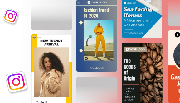
When it comes to Instagram ad design, colour isn’t just decoration—it’s strategy. Instagram is a visual-first platform where users scroll through hundreds of images and videos daily. In a sea of content, colours play a key role in grabbing attention, guiding the eye, and creating a lasting impression.
That’s why understanding the psychology in Instagram ad design is essential for any brand or creator looking to boost engagement, improve click-through rates, and connect more deeply with their audience. In this guide, we’ll explore how to use colour with purpose, backed by research and real-world examples that work.
What is Colour Psychology in Marketing?
Color Psychology in Instagram Ad Design is the study of how different colours affect the way we think, feel, and act. In marketing, it’s used to influence how people perceive a brand, product, or message—often within just a few seconds of seeing it.
Think about some of the world’s biggest brands: Coca-Cola’s red evokes energy and excitement, while Facebook’s blue suggests trust and stability. These choices aren’t random—they’re rooted in psychology and are designed to make you feel something before you even process the words or images.
In the context of marketing and branding, colour plays a powerful role in:
- Shaping brand identity and emotional tone
- Helping products stand out in competitive spaces
- Encouraging clicks, sign-ups, or purchases
- Building long-term brand recognition
According to research cited in several studies, up to 90% of a consumer’s first impression of a product is based on colour alone. Another report found that using a signature colour can increase brand recognition by 80%. These stats show just how crucial colour choices are—not just for design but for business results.
Colour influences everything from our emotions (like calmness, urgency, or joy) to our behaviour (like clicking a “Shop Now” button or pausing to read a caption). This taps into the broader field of marketing psychology, where visuals and emotional cues work together to guide consumer decisions.
When you use Color Psychology in Instagram Ad Design strategically, it becomes more than just a visual element—it becomes a silent salesperson, shaping the way your audience connects with your brand.
The Emotional Associations of Colours
Different colours trigger different emotions, and understanding what they represent can help you design Instagram ads that truly resonate with your audience. Here’s a breakdown of the most common Color Psychology in Instagram Ad Design and what they typically symbolise in the UK and Western culture, along with real-life brand examples for context:
🔴 Red – Urgency, Passion, Excitement
Red is bold, energetic, and impossible to ignore. It creates a sense of urgency, which is why it’s often used in sale banners or call-to-action (CTA) buttons. Red also evokes feelings of passion and excitement, making it perfect for time-sensitive offers.

Example: Coca-Cola uses red to reflect energy and emotion, helping the brand feel youthful and dynamic.
🔵 Blue – Trust, Calm, Professionalism
Blue is associated with trust, logic, and calm. It’s frequently used in industries like finance, tech, and healthcare, where reliability and stability matter most. Lighter blues feel peaceful, while darker tones add authority.

Example: Barclays and Facebook both use blue to appear trustworthy and dependable.
🟡 Yellow – Optimism, Energy, Creativity
Yellow is bright, cheerful, and grabs attention quickly. It creates a feeling of happiness and positivity, and works well in designs that aim to feel fresh, creative, or youthful.

Example: McDonald’s uses yellow to evoke friendliness and warmth—especially when paired with red for a bold contrast.
🟢 Green – Growth, Health, Nature
Green is strongly linked to nature, wellness, and balance. It’s ideal for ads related to eco-friendly products, nutrition, or personal growth. It can also signal wealth and stability in certain contexts.

Example: Whole Foods Market and Spotify both use green—one for health, the other for fresh, energetic vibes.
🟣 Purple – Luxury, Creativity, Wisdom
Purple blends the energy of red with the calm of blue, making it a symbol of creativity and imagination. It’s also traditionally associated with luxury and royalty, which is why it often appears in beauty, fashion, and wellness ads.

Example: Taco Bell, uses rich purple tones to feel indulgent and premium.
⚫ Black – Elegance, Power, Exclusivity
Black is sleek, modern, and sophisticated. It adds a sense of mystery or prestige to a brand and is often used in luxury products or high-end fashion. When paired with minimal design, it can feel very chic.

Example: Chanel and Apple often use black for a minimalist, high-end look.
⚪ White – Simplicity, Cleanliness, Minimalism
White represents purity, simplicity, and openness. It’s commonly used as a background to make other colours pop or to create a clean, uncluttered feel in Instagram ads.

Example: Glossier uses white to keep its aesthetic clean, fresh, and modern, allowing product colours to shine.
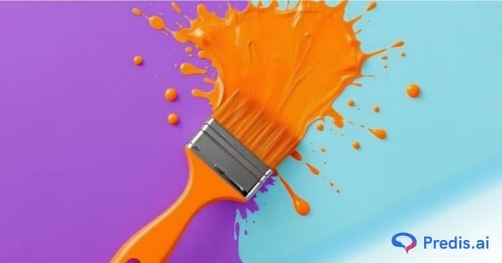
🟠 Orange – Enthusiasm, Friendliness
Orange is fun, confident, and energetic. It combines the warmth of red and the cheer of yellow, making it ideal for lifestyle, food, or service brands that want to appear friendly and accessible.

Example: Fanta and SoundCloud both use orange to express creativity and vibrancy.
🌸 Pink – Softness, Femininity, Playfulness
Pink is often seen as nurturing, romantic, and youthful. While traditionally associated with feminine brands, it’s now also being used in bold, modern ways to signal creativity and fun.

Example: Cosmopolitan and Too Faced use pink to speak to playfulness and confidence in beauty and lifestyle branding.
When creating your Instagram ads, think about the emotion you want your audience to feel and let colour guide the mood. Whether you’re aiming for urgency, calm, or curiosity, your Color Psychology in Instagram Ad Design has power.
Choosing the Right Colour for Your Instagram Ads
Picking the right colours for your Instagram ads isn’t just about what looks good. It’s about what feels right for your audience and aligns with your brand’s message. Here are some key factors to keep in mind when choosing colours and revamp your Instagram:
1. Your Brand Identity and Audience Preferences
Your brand colours should reflect your values, personality, and tone. Are you bold and edgy, or calm and professional? Your colour choices should echo that identity. For example, Nike Running.

Also, consider who you’re speaking to. Younger audiences may respond better to bright, playful tones like pink or orange, while older or more professional audiences might prefer cooler, classic colours like navy blue or grey.
2. The Type of Product or Service You Offer
Different colours suit different industries. For example:
- A wellness brand may lean towards green and white for a clean, natural look
- A luxury brand might favour black and gold to suggest exclusivity
- A tech startup may go for blue or silver to appear modern and trustworthy
Matching your colour palette to your niche helps your ads feel more relevant and trustworthy to potential customers.
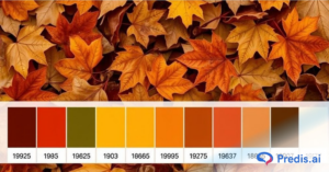
3. Seasonality and Design Trends
Certain colours trend at different times of the year.
- Pastels often work well in spring
- Warm earth tones are popular in autumn
- Bright neons might trend in summer fashion ads
Keeping an eye on seasonal design trends can help your content feel current and relatable.
4. Consistency in Visual Branding
While it’s tempting to try new colours all the time, consistency builds recognition. For Color Psychology in Instagram Ad Design, try to stick to your core brand colours across all your ads—use different shades or accents to mix things up without straying too far.
This helps your audience instantly recognise your content, even before reading the text or seeing your logo.
5. Using Colour Contrast to Highlight CTAs or Key Messages
Your CTA (like “Shop Now” or “Learn More”) should stand out clearly. One of the best ways to do this is through contrast.
For example, a white “Buy Now” button on a red background will pop far more than one on a similar tone.
Always make sure there’s enough contrast between text and background, so your message is easy to read—even on a mobile screen.
How to Use Colour Psychology in Design Elements
Once you’ve chosen the right colour palette, it’s time to apply it thoughtfully across your Instagram ad design. From background colour change to typography, each element offers an opportunity to reinforce your message and evoke emotion through colour.
Here’s how to bring colour psychology to life in your visuals:
1. Backgrounds and Gradients
Your background sets the mood for the entire ad.
- Solid colours create a strong, clean impact—ideal for bold messages.
- Gradients can add depth, movement, or a more modern, fluid feel.
For example, a soft pink-to-orange gradient can evoke warmth and positivity, perfect for lifestyle or beauty brands. Meanwhile, a dark blue background suggests trust and professionalism—great for fintech or consulting services.
2. Typography and Text Highlights
Your choice of text colour matters just as much as your font. Use colour to:
- Draw attention to headlines or CTAs (e.g. red or orange for urgency)
- Create hierarchy (lighter shades for subheadings, bold for key words)
- Highlight keywords or offers (like “50% OFF” in a standout colour)
Just make sure your text colour contrasts well with the background for easy readability.
3. Product Placement and Lighting
In product-focused ads, the colours of the product and how it’s lit can make a big difference.
- Place your product against complementary or neutral backgrounds to make it pop.
- Use natural or coloured lighting to create a mood that matches your colour theme—cool tones for calm, warm tones for energy.
Colour psychology works best when the product itself feels visually integrated with the overall design.
4. Overlays and Filters
Overlays and filters can subtly shift the tone of your ad.
- A warm overlay (like golden or peach) can make an image feel more friendly and inviting.
- A cool overlay (like blue or grey) adds calm or authority.
Use them to bring consistency to a collection of visuals or reinforce a specific emotional response.
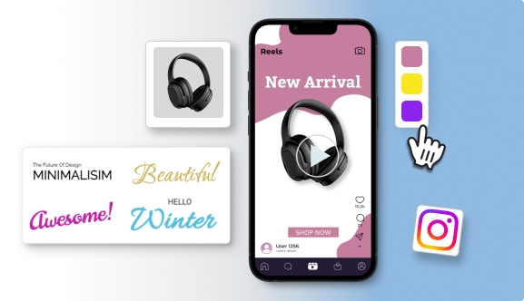
5. Tools for Colour Selection
Not a designer? No problem. Use predis.ai to make it easy to experiment with Color Psychology in Instagram Ad Design, align with combinations and build cohesive palettes. You can browse pre-made templates or use brand kits to keep your visuals aligned.
Many of these tools even let you preview how colours look on mobile devices—ideal for Instagram ads.
6. Accessibility and Best Practices
Good design should be inclusive and easy to read. Here’s how to ensure your colours work for everyone:
- Use a contrast checker (like WebAIM) to make sure your text stands out from the background.
- Avoid colour pairings that are hard to distinguish for people with colour blindness (e.g. red and green).
- Stick to clear, readable fonts with enough spacing and contrast.
Accessible design isn’t just kind—it improves clarity and increases your chances of engagement across a wider audience.
Final Thoughts: Colour with Purpose
Colour isn’t just decoration—it’s communication. When used with intention, it becomes one of the most powerful tools in your Instagram ad strategy.
Choosing the right Color Psychology in Instagram Ad Design helps you shape how people feel about your brand, highlight key messages, and guide your audience toward taking action. From sparking emotion to creating instant recognition, every shade and tone plays a role in your visual story.
It’s important to balance beauty with strategy. Aesthetics catch the eye, but psychology keeps people engaged. By understanding how colour influences perception and behaviour, you can design ads that don’t just look good—they work.
In a fast-moving, visual-first platform like Instagram, mastering the psychology in Instagram ad design is what helps your brand stand out from the noise, connect on a deeper level, and ultimately convert viewers into loyal customers.
So next time you’re creating an ad, don’t just choose colours that you like—choose colours that mean something.
Frequently Asked Questions
1. What is Color Psychology in Instagram Ad Design?
Colour psychology in Instagram ad design refers to using colours to evoke specific emotions, influence perception, and encourage actions—like clicking, saving or buying—on Instagram. It helps brands visually connect with their audience and enhance ad performance.
2. Which colours work best for Instagram ads?
The best colours depend on your goals and audience. For example:
- Red is great for urgency or sales.
- Blue builds trust and is ideal for finance or health brands.
- Yellow adds energy and grabs attention.
- Black or white suits luxury and minimalistic aesthetics. Always consider your brand identity and test what resonates most with your audience.
3. How can I use colour psychology without a design background?
You don’t need to be a designer to apply colour psychology. Use design tools like Canva, Adobe Express, or Coolors.co to find colour palettes. Stick to 2–3 core colours, make sure there’s enough contrast, and keep your branding consistent.
4. Can colour really impact ad performance on Instagram?
Yes, colour directly influences whether someone stops scrolling or interacts with your ad. The right colour combinations can increase brand recognition, click-through rates, and even sales conversions.
5. Should I use different colours for different Instagram ad campaigns?
It depends on the campaign goals. Seasonal offers or promotions may benefit from different palettes, but staying within your brand’s visual style is crucial. Use alternate shades or accents to maintain recognition while keeping it fresh.
6. How do I test what colour works best in my Instagram ads?
Use A/B testing by creating multiple ad versions with different colour schemes. Track key metrics like engagement, clicks, and saves using Instagram Insights. This helps identify which colours perform best with your audience.
7. Are there colours I should avoid using in Instagram ads?
Avoid colours that clash or cause visual fatigue (e.g., too many neons). Also, don’t use low-contrast colour combinations that reduce readability, like light grey text on a white background. Always ensure your design is clear and accessible.