In a world of information overload, visual communication cuts through the noise. A well-crafted design on LinkedIn instantly grabs attention, establishes credibility, and sets the tone for your message. It’s the silent first impression that primes your audience to engage with your B2B offering.
Before getting into the specifics of the design, remember the audience you are speaking to. Unlike Facebook, which has a diverse user base, LinkedIn’s primary users are professionals seeking career advancement, industry insights, and business solutions. They are not looking for cat videos or amusing memes; they are on a mission.
If you’re advertising on LinkedIn in 2025, whether you’re a B2B brand, a service provider, or a thought-leader — the rules have changed. The platform’s algorithm, ad formats, and user behavior have evolved. This means that old templates might still work … but you’ll get a much better return if you adapt to what LinkedIn rewards now: authenticity, value, clarity, and smart targeting.
Below you’ll find a range of ad-format examples along with ideas and best practices to make them work for you today.
This guide equips you with data-driven design tips and proven strategies to craft high-performing LinkedIn ads that resonate with your target audience and fuel conversions. Clear and concise instructions to turn your LinkedIn presence into a lead generation powerhouse.
What’s Different About LinkedIn Ads in 2025
Here’s the thing: user behavior has shifted. People scroll LinkedIn more like a content platform than a resume board. That means ads need to feel native and relevant.
A few important changes:
- Short videos outperform static images in both click-through and engagement.
- Value-first messaging beats pushy sales copy every time.
- Precise audience segmentation based on roles, industries, and buying committees is far more effective than broad targeting.
- Retargeting and multi-step funnels work better because B2B decisions aren’t instant.
- Mobile-friendly design is non-negotiable; most users now browse on phones.
What this really means is that your ads can’t look like ads. They need to feel like useful posts that help someone think, decide, or take the next step.
Essential Design Elements for LinkedIn Ads
Crafting magnetic LinkedIn ads requires more than a catchy tagline. Let’s examine the essential design elements that will make your B2B ads stand out and convert.
1. Catchy Visuals
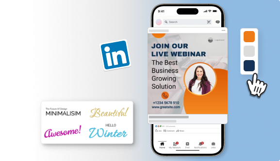
Ensure that your visuals align with your brand identity, are high-resolution, and are easily distinguishable. Consider sleek designs, formal fonts, and a color palette representing your field or brand principles. Steer clear of stock images that appear cliched—genuine representation is crucial.
2. Data-Driven Storytelling
Facts and figures are in high demand among LinkedIn users. Utilize data visualizations such as charts, graphs, or infographics to demonstrate the benefits of your product or service. Numbers possess a convincing influence that connects with this particular audience.
3. Problem and Solution
LinkedIn professionals are constantly seeking solutions to common challenges. Use your ad design to identify a pain point relevant to your target audience and then showcase how your offering is the answer. This problem-solving approach speaks directly to their needs and grabs their attention.
4. Headlines that Convert
Headlines are precious real estate in any ad format. On LinkedIn, keep them concise, clear, and benefit-oriented. Highlight a specific value proposition or pique their curiosity with a thought-provoking question.
5. Power of People
People trust people. Showcase your team’s expertise or incorporate testimonials from satisfied customers in your ad design. It builds trust and credibility, making your offering more relatable to potential clients.
6. Subtlety is Key
Unlike some social media platforms, a hard-sell approach won’t fly on LinkedIn. Focus on building brand awareness and establishing yourself as a thought leader in your industry. Offer valuable content or insights, and let the conversion follow organically.
Design Trends to Keep an Eye On in 2024
- Micro videos for maximum impact: Micro-video content is highly effective for making a powerful impact by delivering brief, captivating videos. Utilize LinkedIn’s built-in video options or try out tools like carousels to display product demonstrations, client testimonials, or articles demonstrating expertise.
- Interactive content for engagement: LinkedIn is adding more interactive elements like polls and quizzes to boost engagement. Utilize these resources to interact with your viewers, collect valuable information, and enhance the immersive nature of your advertisement.
- Accessibility: Make sure your LinkedIn ad design is accessible to all users. Use alt text for images and closed captions for videos, and avoid placing text on busy backgrounds—minor tweaks make a big difference.
By adhering to these design recommendations and keeping up with new trends, you can create LinkedIn advertisements that attract attention, establish credibility, and produce prospects for your B2B company. Keep in mind that the focus should be on quality rather than quantity.
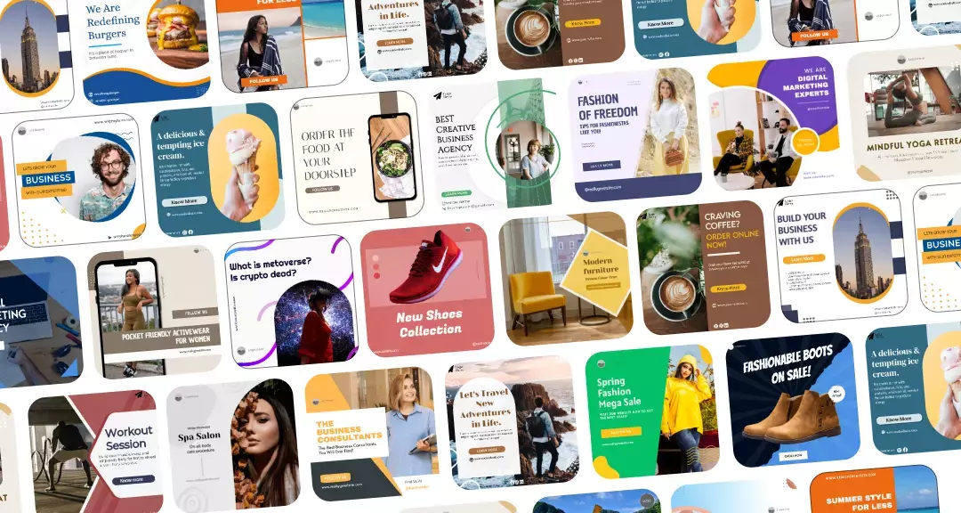
With Predis.ai, you can input a few keywords related to their B2B offering and generate multiple design ideas. This allows you to see different visual approaches and spark inspiration for your LinkedIn ad.
Optimizing Your LinkedIn Ad Campaign
Design is only a pixel of the whole picture. Below are a few suggestions for maximizing the effectiveness of your LinkedIn advertising campaign:
- Target with Precision: LinkedIn’s robust targeting choices enable you to connect with key decision-makers within your field. Use characteristics like age, occupation, organization size, and expertise to guarantee that your advertisement targets the appropriate audience.
- A/B Testing: Do not hesitate to try out various visuals, headlines, and CTAs to optimize results. A/B Testing can be beneficial. A/B testing enables you to determine what connects the most with your audience and consistently improve your strategy.
- Track and Analyze: Be mindful of data such as impressions, clicks, and conversions. Utilize this information to enhance your targeting, advertising content, and visuals for upcoming campaigns.
A carefully crafted advertisement tailored to your specific audience can have an impact bigger than multiple generic messages. Therefore, implement these tips, observe your engagement increase significantly, and turn those LinkedIn connections into committed customers.
LinkedIn Ad Formats That Perform Best in 2025
Let’s break down each format, where it shines, and how you can use it right.
1. Sponsored Content (Feed Ads)
Single-Image Ads
Clean visual. Clear message. Strong hook.
Example idea:
Headline: “Why most mid-sized teams overspend by 30% — and how to fix it.”
Copy: Short breakdown + CTA to learn more.
Video Ads
15–30 seconds works best. Simple framing, tight editing, subtitles always.
Example idea:
Show a quick transformation: “Before using our tool → after.”
Or a founder speaking directly to the camera with one key insight.
Carousel Ads
Perfect for step-by-step storytelling or demonstrating benefits one slide at a time.
Example idea:
“5 problems we solved for our clients this year — slide by slide.”
Each card shows a pain point and how you tackle it.
Document Ads
Think of these as mini downloadable guides right in the feed.
Example idea:
“2025 Checklist: How to optimise your team’s workflows.”
Users can flip through pages before downloading.
2. Message & Conversation Ads
Delivered directly to someone’s inbox — but these only work if the message feels personal and relevant.
Message Ads
Straightforward outreach with one strong CTA.
Example idea:
“Thought you might find this helpful — here’s a case study from a brand like yours.”
Conversation Ads
Multiple options inside one message, so the user chooses what they want.
Example idea:
Buttons like “Watch demo,” “See pricing,” “Download guide.”
Works well for nurturing warm audiences.
3. Dynamic Ads
These use LinkedIn profile data to make the ad feel personalised.
Good for: follower growth, event sign-ups, remarketing.
Example idea:
“See how companies like yours scale faster with our platform.”
4. Text Ads
Small, simple, efficient. Mostly useful for retargeting or for brands with limited budgets.
Example idea:
“Struggling to streamline your workflow? See how teams fix it.”
5. Emerging Formats
LinkedIn has leaned heavily into video this year.
- Vertical/short-form video placements are getting more impressions.
- Interactive elements like polls or quiz-style creatives are gaining traction.
- Lead-gen forms tied to value-focused content are converting better than traditional landing pages.
Decode Winning B2B LinkedIn Ad Designs
LinkedIn’s B2B marketing is competitive, and crafting stand-out ad creatives is key to reaching your target audience. But where can you get inspiration and see what’s working for others?
Look no further than the powerful tool at your disposal: the LinkedIn Ad Library. This goldmine lets you peek behind the curtain and analyze your competitors’ ad designs, giving you valuable insights to inform your creative strategy.
Here’s a breakdown of three successful LinkedIn ad designs and why they resonated with their target audience:
Ad 1: Salesforce – Value Proposition
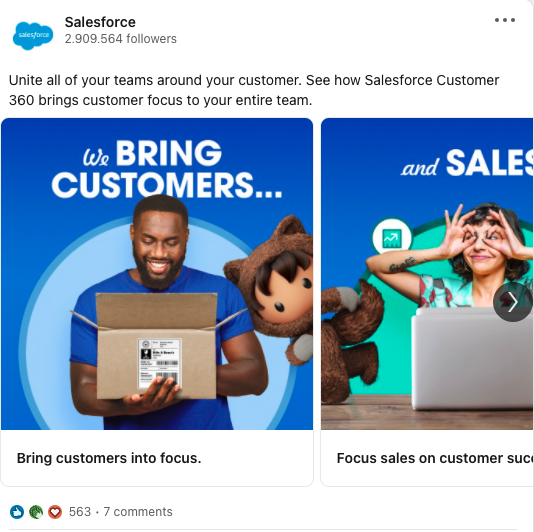
This ad by Salesforce utilizes a carousel format to showcase multiple value propositions.
Key Elements
- Simple and Vibrant Design: The ad uses clear visuals with prominent Salesforce branding, making it appealing and instantly recognizable.
- Multiple Value Propositions: Each card highlights a distinct benefit, catering to a broader audience and sparking greater interest.
Why it Worked
The ad effectively uses clear visuals and concise messaging to communicate multiple value propositions. This approach grabs attention, highlights the brand, and caters to a wide audience segment within the target market.
To create similar LinkedIn carousels in seconds use Predis.ai’s AI-powered LinkedIn Carousel Maker to Dominate your LinkedIn branding with professional carousels designed to captivate your audience.
Ad 2: Gong – Lead Generation
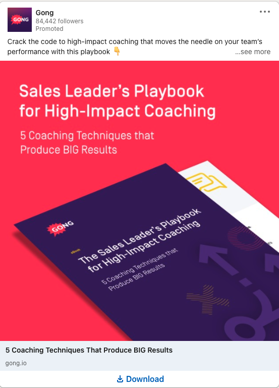
Gong utilizes a series of lead generation ads with clear CTAs and valuable downloadable content.
Key Elements
- Mobile viewing made easy: Gong understands the mobile-dominated landscape. Their 1×1 square images are perfectly optimized for mobile feed viewing, ensuring consistent and visually appealing ad delivery across all devices.
- Frictionless Lead Gen Forms: Gong embraces a simple lead gen form with minimal fields, minimizing user effort and maximizing conversions.
Why it Worked
By combining these design elements – frictionless forms, square visuals, and value-driven messaging – Gong crafts lead generation ads that are not only informative but also visually compelling and mobile-friendly. This strategic approach ensures their message resonates with the right audience, boosting conversions and driving lead generation success.
By understanding the key elements that make these LinkedIn ads successful, you can gain valuable insights to craft your high-performing campaigns. Remember, successful LinkedIn ad strategies go beyond product features. They focus on understanding your audience’s needs, communicating value propositions clearly, and building trust through various creative approaches.
Metrics that Indicate Success
Knowing how your ad performs is crucial for optimizing your LinkedIn campaign. Here are some key metrics to track and analyze:
- High Click-Through Rate (CTR): This metric measures the percentage of users who view and click on the ad. A CTR significantly above the LinkedIn average (typically around 0.5%) suggests the ad is visually appealing and the value proposition resonates with the target audience.
- Low Cost-per-Click (CPC): This metric represents the cost you incur for each click on your ad. A lower CPC indicates that your targeting is precise and the ad reaches the right people, leading to higher conversion rates.
- Strong Lead Generation: The ultimate goal is to convert ad clicks into qualified leads. A successful ad campaign experiences a significant increase in website traffic, downloads, or sign-up for the free trial, demonstrating its effectiveness in attracting potential customers.
Create impactful LinkedIn ads that drive engagement and build connections with Predis.ai's LinkedIn Ad Maker.
Design Fails to Avoid in Your LinkedIn Ads
A poorly designed ad can backfire, leaving you invisible in the feed. Here are some design blunders to steer clear of:
- Stock Photo Clichés: Ditch the overused handshakes and boardrooms. Opt for industry-specific imagery, authentic customer photos, or eye-catching graphics.
- Avoid Text Overload: Keep your ad copy concise and impactful. Let the visuals do the heavy lifting – they can convey a lot without overwhelming viewers with text. Craft compelling ad copy in a flash by leveraging Predis.ai’s ability to generate accompanying text and hashtag suggestions based on the chosen design and target audience.
- Color & Font Feuds: A visually jarring ad is a recipe for skipped impressions. Maintain a cohesive color scheme that aligns with your brand and complements your chosen visuals.
- Microscopic Text & Unclear CTAs: There’s a fine line between minimalism and disappearing into the feed. Ensure your text is large enough to read on all devices, especially mobile.
- Lack of Visual Hierarchy: A cluttered ad with no clear focal point leaves viewers confused. Use size, color, and negative space to establish a clear hierarchy that guides the user’s eye toward the most important message.
- Forgetting About Mobile: The majority of LinkedIn users access the platform on mobile devices. Avoid complex layouts, excessive text, and tiny elements that become illegible on mobile.
By avoiding these design pitfalls, you can create LinkedIn ads that are not only aesthetically pleasing but also strategically crafted to capture attention, communicate your message effectively, and ultimately achieve your marketing goals.
Wrapping Up
Creating a fruitful LinkedIn advertising campaign requires more than just focusing on aesthetics. It involves creating a message that connects with busy professionals, acknowledges their difficulties, and presents your brand as the solution. Therefore, implement these insights and witness your LinkedIn profile becoming a potent source for generating leads.
Predis.ai provides a robust marketing platform powered by AI that can assist you in enhancing your LinkedIn ad campaigns for optimal results. Are you interested in learning more about how Predis.ai can assist you in creating LinkedIn Ads with high converting rates? Sign up on Predis.ai now!
