You pour your heart and soul into crafting an Instagram Story masterpiece – stunning visuals, clever captions, and a compelling call to action. Just as you hit “post,” your creation gets butchered by cropping or distortion. Heartbreak.
That’s where the value of Instagram story size becomes evident. Correct dimensions ensure your content displays rightly on various devices, amplifying its impact.
We’re here to empower you with the ultimate Instagram story size guide. Mastering these dimensions will level up your content game and delight your audience.
Revealing the Perfect Instagram Story Size Guide in 2024
In the digital landscape, where attention spans are fleeting, your content presentation can be a game-changer. When you upload content that doesn’t align with the recommended Instagram story size guide, the platform automatically crops or adjusts it.
It could result in a compromised visual appeal that loses your audience’s interest. So, what’s the magic formula for creating alluring Instagram stories that resonate with your audience?
1. Ideal Dimensions
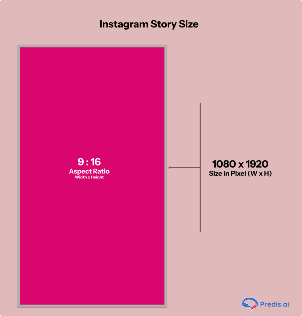
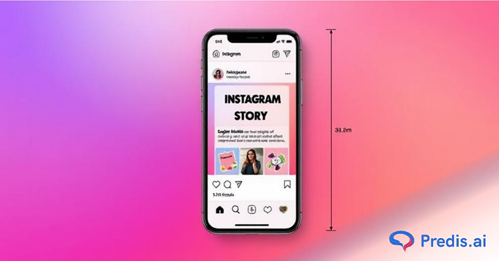
In 2024, the recommended Instagram Story size is 1080 x 1920 pixels, with an aspect ratio of 9:16. This size is also considered a safe zone for positioning essential text, graphics, photos, and calls to action to ensure complete visibility on any device.
The aspect ratio of 9:16 implies that for every 9 units of width, there are 16 units of height, creating a vertical rectangle shape that fits perfectly on mobile screens. It offers an immersive viewing experience without the risk of cropping or distortion.
Instagram accepts various resolutions, such as 720 x 1280, 1440 x 2560, and 2160 x 3840, as long as you maintain the 9:16 aspect ratio.
2. File Size and Format
Want to deliver seamless visual experiences that maintain the highest quality standards? Follow these parameters:
- Images: Instagram accepts JPG and PNG formats for images, with a max file size of 30 MB.
- Videos: Recommended formats are MP4 and MOV, with a max file size of 4GB.
Adhering to these safe zones can ensure that your Instagram stories maintain their visual appeal. It will also help you effectively convey your message across different devices and screen sizes.
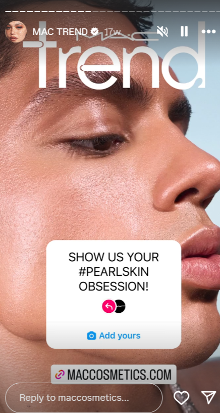
For inspiration, check out this well-executed MAC Cosmetics campaign, “#Pearl Skin,” on their IG story.
How to Create an Instagram Story?
There are a couple of easy ways in which you can create Instagram stories. One is through the Instagram app and another way through applications such as Predis AI.
1. Creating Stories on your Instagram App
- Open the Instagram app, and tap the + button at the bottom.

- Select the “Story” option at the bottom to start creating a story.
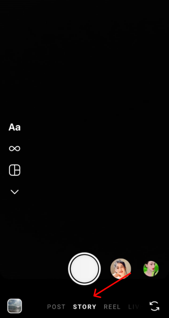
- Once you have created a story and edited it to your preference. Hit the > button in the bottom right corner.
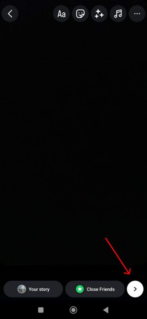
- Hit “Share” and you are done.
And voila! You have successfully created a story.
But the thing with creating a story on Instagram itself is that you have to post it immediately. There is no option for you to schedule it for a later time.
And if you prefer working on a desktop, then Instagram native editor is not going to work for you as the story option is not available.
Additionally, there is no space to work collaboratively with your team on this application.
To overcome these limitations, you can use free content creation platforms like Predis AI to plan, schedule, and post your content.
2. Creating Stories with Predis AI
- Start creating your story with this free tool. Sign up with your email ID and proceed.
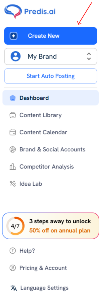
- Start creating a new post by clicking on the “Create New” option on the left-hand side.
- Click on the type of post that you want to create and then hit “Continue”
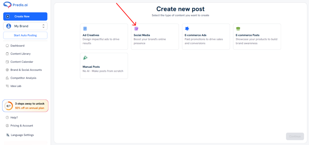
- For Instagram stories, click the social media > single image > Portrait (1080 x 1920) and hit “Continue”
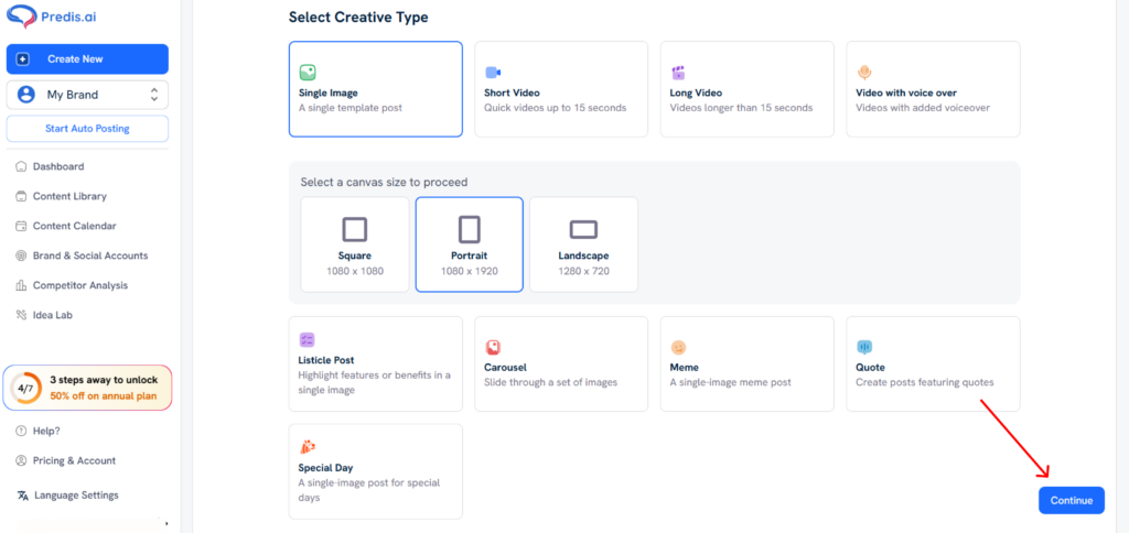
- Generate the post with a prompt or create your own with a media of your choice. Hit “Generate” when you are done.
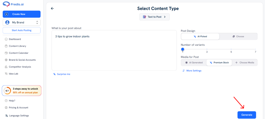
- Click the post that you want to post and then hit “Publish”
- Select the platform you want to post this on. In this case, it is “Instagram Story” and select “Continue”
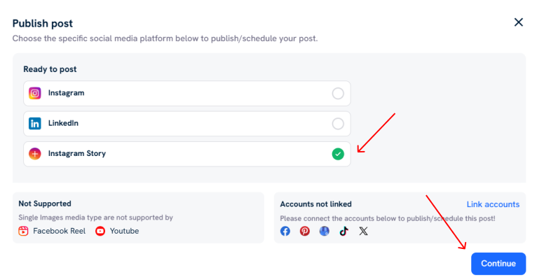
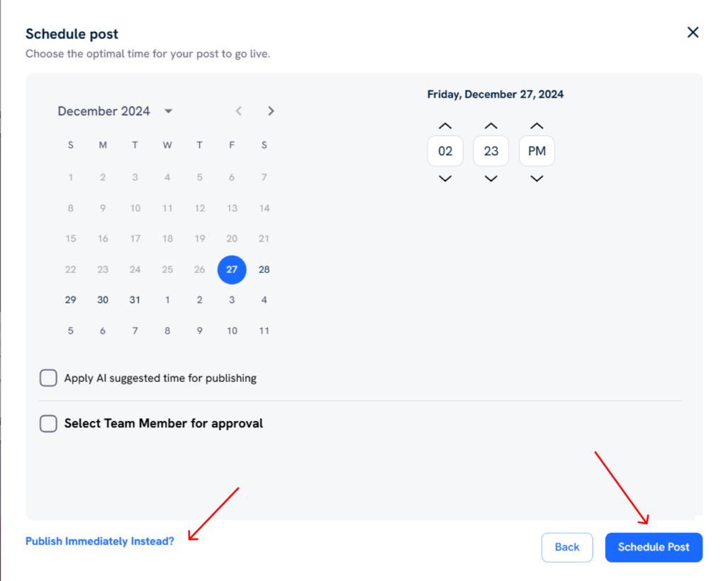
- You can schedule this story to a later time if you want or you can publish at the same time itself. After making your choice, click “Publish now” in case of immediate posting or “Schedule Post” in case of scheduling. And you are done.
How to Optimize Your Instagram Stories Size?: 5 Expert Tips
Now that you have this ultimate Instagram story size guide, it’s time to enforce it. Create your next IG story with the correct dimensions and see the difference it makes! Here are some recommendations to help you do that:
1. Start with a Clear Goal
Clarity of purpose lays the foundation for a compelling IG story. Ask yourself – Do you want to promote a product, share behind-the-scenes footage, or engage your audience in a conversation?
This tactic will help you choose the right size and format for your content. For example, if you’re introducing a new product, a full-screen image or video that fits the optimal size of 1080px by 1920px can make a powerful impact.
2. Leverage the Power of Templates
Use pre-designed Instagram story templates on platforms. They follow the ideal Instagram story size guide, ensuring your content displays perfectly. Plus, you can customize them to match your brand’s aesthetic and messaging.
For example, a travel brand can use a multi-image template to display famous spots of a destination within one story, optimizing the space. Now that’s a win-win!
3. Craft Captivating Captions
Did you know that most mobile-watching millennials turn off sound when they watch videos? So, use concise, compelling captions that complement your visuals, adding depth and context to your story.
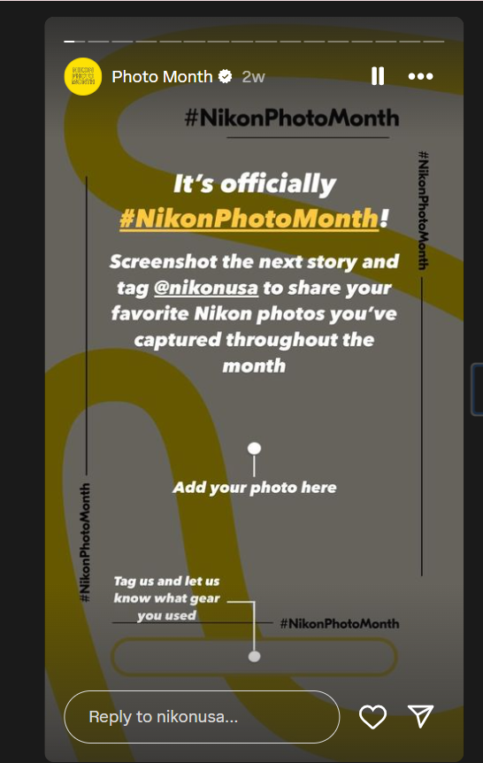
But that’s not all! To ensure your text is visible, it should fit within the safe zone of your IG story (a margin of 14% from the top and bottom of the screen).
For example, look at Nikon USA’s Instagram story, which displays the perfect use of text.”
Check out Predis.ai's Caption Generator for catchy and engaging captions!
4. Select Engaging Visuals
Choose high-quality images or videos that fit the optimal Instagram story size guide. If your visuals are too large, Instagram may crop them; if they’re too small, they may appear distorted. Using editing tools will enhance visuals and create a cohesive, eye-catching narrative.
5. Incorporate Interactive Elements
Add stickers, polls, and questions to enhance engagement and build community around your content. Remember, these elements can also increase your story size. Hence, you must use them judiciously if you’re concerned about load times.
For example, OnePlus conducted a crucial poll through its concise and on-point IG story.
Instagram Story Sizing Made Easy: Key Do’s and Don’ts
This ultimate checklist will walk you through the best practices for calibrating your Instagram story size. Whether you’re an experienced IG user or a newbie, following these do’s and don’ts will help you create engaging stories. Here’s How:
- Do Optimize for Mobile Viewing: Consider the size and placement of text and elements. It will ensure your Instagram story frame is easily viewable on mobile devices.
- Do Use the Right Aspect Ratio: Upload stories in an aspect ratio of 9:16 to prevent cropping or zooming.
- Do Use Story Highlights: Curate and organize your best stories into highlights. It will help you showcase your brand’s essence and engage new visitors with compelling content.
- Do Avoid Content Overlap: Avoid placing critical content near the edges where Instagram’s interface elements might block it. Stick to safe zones to ensure your message and visuals remain clear, unobstructed, and always in the spotlight.
- Don’t Overlook Quality: While authenticity is vital, ensure your content meets quality standards. Blurry images or poorly edited videos can detract from the impact of your story.
- Don’t Overwhelm with Text: Avoid crowding your visuals with too much text. Doing so ensures that your message shines through and resonates with your audience. Keep your text concise for a balanced, appealing story.
- Don’t Ignore Load Times: Larger files may take longer to load, especially for users with slower internet connections. Compress your images and videos to stay within size limits while preserving stunning visuals.
By following these best practices and using our Instagram story size guide, you can create visually stunning and engaging stories that stand out on social media.
Staying Ahead of the Curve: Viral Instagram Story Design Tactics
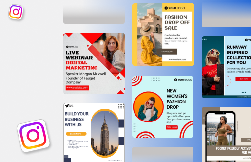
In 2024, several emerging trends will shape how brands and creators approach Instagram story design. Check out some of the latest ideas that are making waves:
- Vertical storytelling is the new big thing for brands targeting mobile-first audiences. Advertisers are seeing a 33% increase in ROI by using vertical video ads. This format fits perfectly with Instagram stories and will become even more popular in 2024 and beyond.
- Some brands use split-screen techniques to deliver more creative content. This trend allows them to offer dual narratives or show different perspectives within the same story frame.
- 35% of Instagram users prefer short narrative stories with a mix of texts, photos, and videos. It shows the effectiveness of well-sized micro-animations in enhancing the storytelling experience.
- Brands use the ephemeral nature of IG stories to create exclusivity and urgency. They tailor the content for quick consumption – concise and large enough text to read at a glance and compelling images or videos even at a smaller size. This strategic sizing drives higher engagement as users don’t want to miss out on exclusive content.
Remember – Staying in sync with these trends and adapting your sizing strategy will help you gain a competitive edge on the platform.
Predis.ai's AI-powered Instagram stories generator can transform your stories into stunning artworks.
Case Study – Mercedes Benz
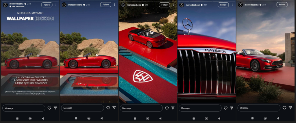
If you have ever put up a series of stories you know that after the first 2 stories, the engagement rate drops. But this clever story by Mercedes Benz ensures that you swipe through all the images without fail.
The pictures are stunning, so there is not much to complain about from the user’s end too. And hey, you get a free wallpaper at the end too. (A perfect way for people to keep remembering your brand!)
Bottom Line
Congratulations! You’ve reached the end of our ultimate Instagram story size guide for 2024. With these correct dimensions, tips, and future insights – you can take your stories to the next level. Keep experimenting, stay agile, and put your audience at the forefront of your strategy.
The best part? Elevate your Instagram presence with Predis.ai. We offer everything you need – automated content creation, customization, and scheduling.
Do not wait any longer. Sign up now and start creating flawless Instagram stories. Let’s make your feed pop!
Here are some more ideas, tips, and best practices to help you.
