


Explore this content with AI:
Let’s be real! Creating Facebook ads is easy, but making them stand out? That’s where most of the businesses and brands struggle. With millions of ads competing for attention every day, your visuals should stand out from the crowd, so that people stop and scroll instantly. And guess what plays a huge role in this? Fonts and colors do! In this blog, you’ll learn how to smartly use fonts and colors in Facebook ads in order to catch attention, increase engagement, and drive more clicks.
Ready? Let’s dive in.
Why Fonts and Colors Matter in Facebook Ads?
Fonts and colors help your brand to do more than just “look pretty”. They trigger emotions, reflect your brand personality, and guide your audience to take action.
Here’s why you should care
- Colors influence buying decisions.
- Fonts impact readability and trust.
- Together, they create visual consistency.
- When done right, your ad not only grabs attention but stays in people’s minds.
Sell More via Facebook 💰
TRY FOR FREE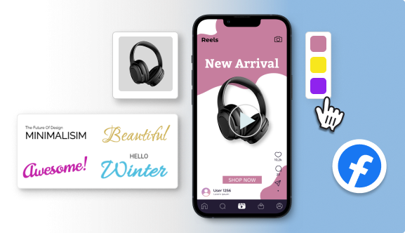
How to Choose the Best Fonts for Facebook Ads?
1. Define Your Brand Voice First
Before picking any font, ask yourself the below. Your answer should guide your font choice.
- Is my brand fun or formal?
- Modern or vintage?
- Bold or minimal?
2. Always Prioritize Readability
Fancy fonts may look good on a website but they can fail on ads, especially when using them on mobile. You need to always stick to clean and easy-to-read fonts such as:
- Montserrat
- Lato
- Roboto
- Open Sans
- Poppins
3. Limit the Number of Fonts
Less is always more in ad design.
- Always use one font for headlines and one font for body text.
- Too many fonts create clutter and confuse the viewer.
- Clean and simple design is what attracts the user.
How to Pick the Right Colors for Facebook Ads?
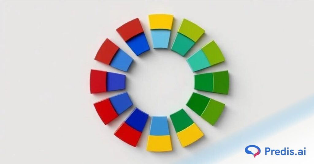
1. Understand Color Psychology
We all know that colors speak louder than words. Use the below colors to express some of the emotions through your ad copy! Here’s a quick cheat sheet:
- Red = Urgency, passion
- Blue = Trust, calmness
- Yellow = Happiness, positivity
- Green = Growth, health
- Black = Luxury, power
Always aim to choose colors that align with your brand and message.
2. Use High-Contrast Colors for Better Visibility
- Ensure your text color stands out against the background. This makes your ad easy to read even when scrolling fast.
- You can test your color combinations by using tools like Contrast Checker.
3. Stick to Brand Colors but Add Contrast
We all are aware of the fact that consistency is key. But you should keep on experimenting with shades or accent colors that fall within your brand palette, to highlight offers or CTAs. For example:
- If your brand color is blue, use orange or yellow for CTA buttons to make them pop.
- You can check the color combinations using the color wheel.
Smart Tips to Combine Fonts and Colors in Facebook Ads
- Focus on creating a clear visual hierarchy. Your Facebook ads headlines should grab attention first.
- On your Facebook ad, highlight offers or discounts using bold colors.
- For a clean and modern look, always leave enough white space and keep text short and punchy.
- Based on how your Facebook ad is doing, test and tweak the fonts and colors.
Best Free Tools to Find Fonts and Colors for Facebook Ads
Here are some life-savers for non-designers:
| Tool Name | Purpose |
| Predis AI | Facebook Ad Maker |
| Canva Font Pairing | Find perfect font combinations |
| Coolors.co | Generate color palettes |
| Adobe Color Wheel | Explore color harmony |
| Fontjoy | Pair fonts effortlessly |
| Contrast Checker | Test text readability |
Real Examples of Facebook Ads Using Fonts and Colors Right
How do the best brands use fonts and colors in their Facebook ads? Let’s take a look.
These real-life examples show that when you mix simplicity, clarity, and creativity in a smart way, you can get great results.
1. Nike: Bold, Simple, and Strong
Nike’s Facebook ads show how to use styles and colors in a way that makes sense.
What’s good about them
- Sans serif styles that are clean, like Futura or Helvetica.
- Headlines that are big and bold and get people’s attention right away.
- For the most effect, use only black and white color schemes.
- Bold red is sometimes used to draw attention to deals or offers that are only available for a short time.
What You Should Do
Keep the structure of your ad simple but strong. Use big letters and bright colors that stand out to make your design stand out without being too busy.
2. Airbnb: Friendly Fonts with Soft, Inviting Colors
Even in their ads, Airbnb knows how to make people feel welcome.
What’s good about them
- Use of fun, rounded fonts that make things feel friendly.
- To make a room feel warmer, use soft pastel colors like pink, peach, and purple.
- Even with creative design features, it’s easy to read.
- It’s very clear that the text goes from lead to benefit to call to action.
What You Should Do:
Choose styles and colors that show who your brand is. For brands that are about travel, hospitality, or living, use soft colors and friendly fonts.
3. Zomato: Quirky Fonts and Bold Color Play
You know this works if you’ve ever stopped scrolling because of a Zomato ad.
What’s good about them
- Headlines that get people’s attention should use fun, quirky styles.
- Red, black, and white are often used to make a loud statement.
- Copy that is creative and goes well with big fonts.
- Using spaces wisely to keep things simple.
Remember this: If your brand voice lets you, don’t be afraid to break the rules. Use an AI ad creator free with strange styles and bright colors to make ads that make you stop scrolling.

4. Apple: Sleek, Clean, and Ultra-Minimalist
The Apple ads on Facebook show that less is sometimes more.
What’s good about them
- Sans-serif styles that are very clean, like Helvetica Neue or San Francisco.
- Use of the color scheme of white, black, and gray all the time.
- Use of color strategically only when showing a product variant.
- Crisp images and short, easy-to-understand text.
What You Should Do
If your product is about luxury or new ideas, make it simple. For a high-end look, use simple color patterns and clean fonts.

5. Spotify: Vibrant Colors with Playful Typography
Spotify’s ads are always fresh, young, and lively.
What’s good about them:
- Fonts that are funky and round that Gen Z and millennials like.
- For a trendy look, use bright color gradients that look like neon.
- Using multiple styles and colors in creative ways that don’t lose their clarity.
- Smart placement of calls to action using colors that stand out.
What You Should Do:
Try using bright colors and fun styles for brands that are aimed at young people. Just make sure that the text can be read on all platforms.
Final Thoughts on These Examples
Each of these brands uses fonts and colors based on the below:
- Their target audience
- Brand personality
- Emotional triggers
- Simplicity & clarity
And that’s exactly what you should aim for, as well! It’s not about copying them, but it’s about understanding why it works and applying it to your brand voice.
Final Tips to Make Your Facebook Ads Pop
By now, you know how fonts and colors can make or break your Facebook ad. But before you start designing, here are some quick, practical tips to make sure your ads not only look good but also convert like crazy.
- Keep it clean, not cluttered.
- Test multiple color and font versions.
- Use big, bold headlines.
- Always design for mobile-first.
- Stick to your brand style but don’t be afraid to experiment.

Conclusion
Fonts and colors are not just design choices, they’re marketing tools. When used smartly, they can boost your Facebook ad performance, drive engagement, and get you more clicks.
Remember, clarity beats creativity every time in ad design. So, keep it simple, bold, and brand-aligned.
FAQs
Sans-serif fonts like Montserrat, Lato, and Open Sans work best because they’re clean and easy to read.
Ideally, 2-3 colors max. Stick to your brand palette and use a contrasting color for CTAs.
Absolutely! Colors can trigger emotions, increase brand recall, and influence user actions