
Explore this content with AI:
One of the many marketing strategies that survived and thrived during the Internet era is the Banner advertisements. Marketers have worked hard to figure out the right formula to achieve conversions in Banner ads. But you do not have to go through the hard work again. You can simply take a peek at the ads that are making it big on the Internet, making their voice heard in the clutter of web pages, and learn a thing or two. Here are some banner ad examples, we have compiled to help you get started.
After all, when 185 Billion USD is spent on Banner advertising in 2025, it does not hurt to be prepared, right?
12 Best Banner Ads Examples To Get You Inspired
Here are some banner ad examples from brands that did it right and what you can learn from them:
1. Cerave
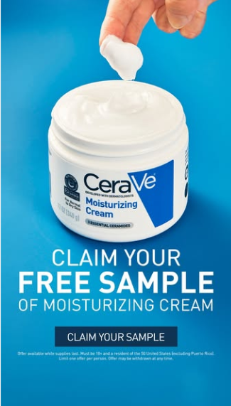
This banner ad examples is simple yet effective. That is what is the theme line of this ad by Cerave. With a simple value proposition and a clear-cut way of getting it across, Cerave has nailed its banner design and copy best practices with this ad.
2. Gisou
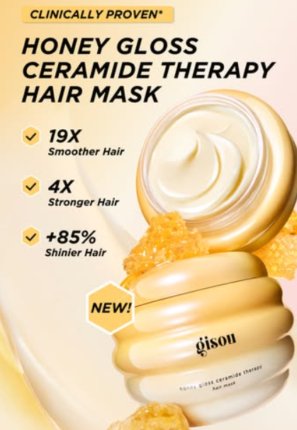
Using warm and interesting colors is a great way of attracting and retaining the attention of your audience. But, you cannot go out of your way to incorporate colors that do not align with your brand. Also, when choosing a color for your ad you need to look at the kind of feeling the color instills in the viewer.
For example, in this banner ad example, Gisou’s warm Yellow color palette instills a sense of happiness and joy in the reader. This color is also in their brand palette and in alignment with the kind of emotions they want to elicit, which makes their color choice appropriate.
3. Salesforce

This minimalistic approach to an ad copy makes it effective. The CTA option too goes with the whole simple approach. Even though the whole ad is very simple and neat, it does not fail to convey the whole message.
And their claim to add value in the next 5 minutes, instills curiosity in the reader. Thus making the reader want to interact with the ad and learn more.
4. Hulu
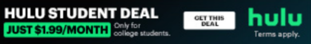
Let’s face it, the last thing on a College student’s mind who is burdened with lectures and part-time jobs is getting a Hulu subscription. But they are also the ones who would love to take one so they can relax after a long day.
So how do you make it easier for your target demographic to get your product? You make it affordable for them. And that is exactly what Hulu has done here.
Their brand colors are captivating enough and they have beautifully incorporated it into their ad. And the CTA is a chef’s kiss. If you are a student interested in this offer, there is no way you would not click on that CTA.

5. LinkedIn
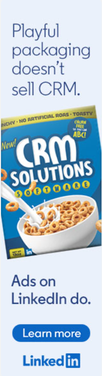
In the world of serious business talks, you would expect LinkedIn the master of B2B platforms to have the most professional ad. But, LinkedIn said, nahh!
In this totally unserious turn of events, LinkedIn put out a quirky ad and we must say we are pleasantly surprised. But is it any less effective, No way!
In fact, these kinds of ads feel like a fresh breath among all the others!
6. Tableau
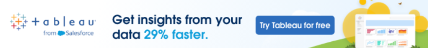
All your competitors and mom-and-pop stores down the street are saying that they can bring greater results in half the time. But if you ask them the proof behind this claim, a lot of them might draw a blank.
But Tableau would not. Because they are not only claiming to provide quicker results but also have cold, hard stats that can back their claim.
And they don’t want you to just take their word for it. They are inviting you to try their product for free which reinforces the confidence users have in them.
7. Paypal
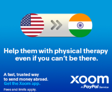
Sending money home is not just that. It is being able to protect and care for them, even when you are not physically with them.
Someone on PayPal’s marketing team made it their mission to bring this emotion out with their copy. And we have to admit, they did a pretty good job at it.
There is a lesson for us here, which is to use the copy or the image or a combination of both to bring out the emotion we want from our audience. However, this ad feels incomplete without a CTA, you can find tips on how to write a winning copy.
8. Shopify

I bet even non-business owners will get riled up and get a surge of motivation with this copy.
No? Only me? Okay fine. I don’t know about you all, but this ad got me really piped up to take my store global (PS: I don’t even have one!). And the CTA that says “Find out more” really ties up the whole narrative and gives a clear look into the kind of value the user can expect by clicking on this CTA.
And that is the power of emotions. When you get people to feel something, the clicks and interactions follow.
9. Workday
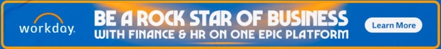
We have to admit that making finance and HR interesting is almost impossible. But still, kudos to Workday for creating a better experience for Workday customers.
Their attempt at making the ad copy light-hearted and interesting is commendable. They have also cleverly included their value proposition which is the seamless integration between Finance and HR platforms, such as employee file management software and their consolidated view in one dashboard.
Although their CTA is a bit on the generic side, it still works well with the rest of the ad.
10. Adobe
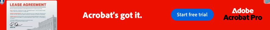
The focus of this banner ad example is the CTA, not the copy, not the visuals. Just the CTA!
Although the visuals and the caption combine together to give you the idea that “Any document requirements you have, Acrobat has it”, your attention is pulled elsewhere. That is the gigantic CTA that is placed right in front of your line of sight.
11. Monday.com
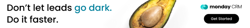
We are a fan of the visuals in this ad. Showing a rotting avocado to symbolize a rotten lead, is brilliant! To highlight these visuals, they left the rest of the ad pretty much devoid of any other design elements. And, honestly, it still works!
12. Semrush

Want a creative way to include your testimonial in your ads, then this is how you get it done.
In this dynamic ad by Semrush, they say “Want to increase your revenue by 1800%? The Cycleverse did it and you could too”. By giving a stat they are reinforcing their ability to make the improvement happen. And by showcasing their previous client who did it, they show proof of work for the same.
Finally, a CTA that says “Discover How” to improve your revenue, would be enough to create intrigue. Overall, Semrush used clever wordplay to make their audience interested.
10 Tips For Creating The Best Banner Ads:
You saw the ads that made it, now let us figure out how you can make a banner ad that will also become successful. Here are 10 tips you can implement in your next ad strategy:
- Keep it visually appealing: When creating an ad, remember the amount of clutter present on your screen which your ad has to cut through and demand attention. So, if your ad is not visually pleasing then you can kiss that wish goodbye.
- Communicate clearly: Even the most beautiful-looking ads need to convey the message clearly to retain the attention of the viewer. And there is not much space for you to work with. So, make sure to figure out how to get your point across with fewer words.
- Choose ad sizes wisely: When making an ad adhering to the proper size standards is vital. If you do not, then your ads might look stretched or constricted and we want neither. Some of the recommended sizes are: 728 x 90 (horizontal banner), 300 x 600 (Half page), 300 x 250, 336 x 280.
- Effective banner placement: The reason we put so much effort into making an ad is to ensure that people see it. So placing the ad in a place where the viewers can see it is crucial as well. We would suggest you get the top banner since it improves your chances of being noticed.
- Follow best practices: It is okay to reinvent the wheel every now and then but it should make sense to the audience. If your brand new idea is to forego a CTA button, then we urge you not to go through with it. That being said always make sure to have your company logo, CTA, and the offer you are publicizing at the forefront of your ad.
- Minimalism is the way to go: let us accept the reality that a lot of ad formats do not provide you with lots of space to work with. Within that space, you have to work in a value-delivering copy, a CTA, and stunning visuals. To be able to pack so many of these elements seamlessly you need to adopt a simple design.
- Evoke a sense of urgency: Motivate your user with a limited-time offer to make a purchase as soon as possible.
- Know your audience: What makes your user tick, what kind of ad tagline will make your audience want to interact with your ad? Put this knowledge to use when creating an ad to make it an engaging one.
- Why are you worth their time?: An average person is bombarded with ads from the moment they step online. So, if you want them to spend a couple more minutes on your ad, then you need to prove your worth. The offer needs to be scroll-stopping to ensure they will interact with your ad.
- Fast and responsive ads: The precious minutes it takes for your ad to load can cost you a viewer. So, create an ad that will load before your viewer loses patience and interest.
Conclusion
Creating a banner ad for the first time can be quite intimidating but with a little bit of inspiration from these banner ad examples, you can figure out the end design that you want to achieve.
However, giving life to the design in your mind is an altogether different thing. In this step, you need design knowledge, copywriting skills, and much more to create a good ad.
But, you can skip all these steps and get straight to downloading the fully designed ad creative in a matter of minutes with Predis AI. You can either generate one with our AI capabilities or you can leverage our vast library of templates to create one manually.
So sign up today and get your ad running by the end of the day!
FAQ:
A banner ad is a form of online advertising that appears on websites and other social media platforms. These ads are small and contain images, CTA, and a converting copy.
Banner ads help improve the visibility of your business, drive traffic to your website, and generate leads.
A good banner ad comprises the following components:
1. High-quality, relevant images
2. Clear-cut ad copy that describes the value proposition properly
3. A strong CTA that prompts action from the user
4. A minimal design
5. A cohesive ad that binds all these elements together seamlessly
According to Predis.ai, the creative elements in banner ads that drive clicks include clear, concise text, eye-catching visuals, a strong call-to-action, and clean design. These elements work together to grab attention and encourage users to take action.