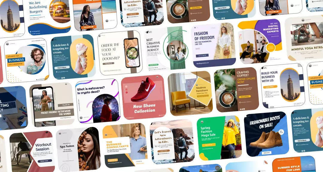
Online advertising offers a multitude of fun and creative ways for your business to connect with prospects. One effective strategy for attracting customers and boosting brand awareness is using banner ads.
In 2024, it is anticipated that ad spending in the banner advertising marketplace will total $174.4 billion. With an expected 5.69% annual growth rate (CAGR 2024–2028) in ad spending, the market is anticipated to reach US$217.6 billion in value by 2028. These numbers speak for themselves!
Ad banners are a large component of the marketing industry. They are effective because messages coupled with images tend to increase viewer attention and instantly grab the viewer’s attention.
This blog presents you with effective insights into the operation of banner ads, as well as the basics necessary for creating a banner ad. Let’s dive in!
What Are Banner Ads?
Online commercials that show up on web pages are known as banner ads, sometimes known as display advertising or web banners. Small passages of text are interspersed with graphics, such as GIFs, JPGs, or recordings, to pique the reader’s interest and motivate them to take action.
Placement of ads can be at the side, top, or end of the page, typically occupying only a small portion of the page—a half-page at most. An eye-catching advertisement can build brand awareness and lead generation of leads for your company. When a visitor clicks on the advertisement, they are taken to your company’s website, which could increase sales.
Key Features of a Banner Ad
Here are the key components of a banner ad:
1. Interactive and Unambiguous Content
Banner ads take up a small space on the web page. Hence, the text used in banner ads should be kept to a minimum to prevent stuffing. Messaging must be direct, succinct, and clear. To get your point across, use no more than one or three essential phrases.
2. Call for Action (CTA)
The goal of a banner ad is to persuade its intended audience to perform a specific action, just like any other form of content promotion or commercial. For instance, persuading the reader to click on a blog promotion or email list subscription link. A CTA needs to be action-focused, direct, and clear to grab the attention of the viewers.
3. High-Quality Visuals

Text and images are combined in banner ads to produce an attractive display. Good quality and visually compelling images are the cornerstone of a banner ad. They should be free of blur and have an appropriately high pixel resolution. The layout (horizontal or vertical) must additionally be taken into account while designing the visuals.
4. Brand Consistency
Your banner ad should showcase the visual brand of your business. Most likely, you can employ a logo, your brand color scheme, and font regularly for all of your promotional materials, including advertisements and your online presence.
If your banner ad is in line with this visual representation, your intended audience will be able to recognize and remember it.
5. Fine Animations
Not every banner ad features animated images, but the ones that do have excellent visuals; the animations must be clean, vibrant, and high-resolution; the accompanying audio should sound natural and uninterrupted.
Tips on How to Create a Banner Ad
The process of organizing, designing, and implementing a banner advertising campaign involves numerous steps.
We’ll walk you through the customary procedure here and pass on several standards of excellence.
Tip 1: Establish Your Goals
Setting the main objective of your banner ad initiative is an essential step, as it will influence every aspect of the design process.
Although banner ads can accomplish a variety of goals, the following represent a few of the most popular ones:
- Boost traffic to websites
- Re-target specific audience
- Produce leads
- Increase revenue
- Customer retention
- Enhance brand recognition
Establishing your goals upfront will make it easier for you to make decisions about everything, including the content, call to action, style, and layout.
Tip 2: Select the Appropriate Banner Format
There are many different sizes and forms of banner ads, so it’s critical to select the right one for your website, positioning, and advertising goals.

The following is a list of common banner sizes to take into account:
- A wide, horizontal advertisement that is frequently positioned at the top of websites, the 728×90 leaderboard ad is ideal for major releases and brand messaging.
- The 160×600 skyscraper ad is a slender, vertical advertisement that usually shows on the sides of websites. It is perfect for displaying several goods or services.
- The medium rectangle ad, measuring 300 by 250 pixels, is a flexible ad size that works well for promoting products on different sections of websites.
- Bigger and more noticeable than the medium rectangle, the large rectangle advertisement (336 x 280) is ideal for highlighting goods or services.
Different platforms, from Google Ads to Facebook, have some of their own specific requirements and custom dimensions, so be sure to check those out once you know exactly where you want to host your banner ads. That way, you’re in a good place when you come to start your banner ad design work.
Tip 3: Choose a Colour Scheme that Blends with Your Brand

You might want to use your brand colors conservatively when it comes to your color scheme. After all, building brand identity is crucial in every aspect of marketing. Nevertheless, to communicate your purpose successfully, you can expand on your color scheme as a component of your banner ad initiative.
For instance, you may wish to choose a color palette that complements the season or a particular occasion. Additionally, you can explore color psychology for ideas.
Ensure the color combos you select smoothly contrast smoothly or complement one another, and never undervalue the importance of clarity in creating a design that is clear and concise.
Tip 4: Look for a Tool to Assist in Designing Banner Ads
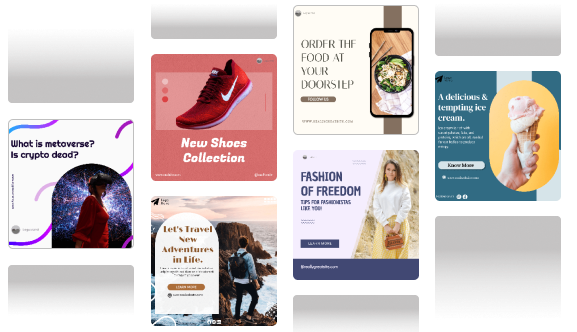
If you’re just getting started or are an accredited designer, it will be worthwhile to take some time to find the top web design tools. Creating eye-catching web banners is now simpler than ever, thanks to offerings like Predis.ai Banner Ad Maker.
It uses AI’s potential to produce bespoke banners in bulk while maintaining quality and minimizing time and expenses. You can effortlessly create eye-catching banner ads thanks to the abundance of tools that provide you with high-quality fonts, photographs, and graphics to incorporate into your designs!
Tip 5: Design Banner Ads with Mobile Compatibility
With this large-scale use of mobile phones, most of your target audience will likely view the ads on their handheld devices. Hence, it is more crucial than ever to design ads that are mobile-friendly.
Select banner ad sizes that correspond nicely on a mobile screen, reduce file size to ensure your ads load swiftly without sacrificing effectiveness, and use fonts and visuals suited for smaller screens for a high-end user experience.
Use Predis.ai online mobile ad maker to generate compelling mobile ads with a wide array of pre-designed templates and brand integration possibilities.
Tip 6: Ensure Your CTA is Compelling and Clear

Your call to action, or CTA, needs to be extremely persuasive and apparent to urge audiences to take action immediately.
Here are a few excellent CTA examples:
- Purchase now
- Limited-time offer. Get free shipping!
- Get Started
- Subscribe
- Sign Up
- Download now!
- Buy now and get 40% off!
Use juxtaposing colors to make the CTA button attractive, and place it, particularly within the advertisement, usually at the end or at an edge where it’s easy to find.
You have to pick the consumer’s destination for the advertisement. According to the subject line of your banner ad, you can navigate them to the following:
- Specific category pages
- Product pages
- Discount page
- Main webpage
Remember, the landing page where visitors are directed ought to accurately convey the intent and appearance of the banner. Imagine it as offering the consumer a trip where the final location is conveyed ahead of time.
Tip 7: Locate the Ideal Font

Although it can often seem like a secondary concern, the font is just as crucial to your design as any of the other components. Furthermore, it can significantly impact how your pitch is received and how much attention it garners.
Select fonts that successfully communicate the message of the advertisement, be it innocence, competence, or a pressing need, and that are easy to comprehend while remaining consistent with your brand image.
Tip 8: Keep it simple
Banner ads have limited real estate which means less space to cram in your content, CTA and images. That does not mean you can pack in as many things as you can. This is just going to overwhelm your audience and your message? Consider it lost in the noise.
To avoid this:
- Utilize white space strategically
- Limit content and only write text for 20 – 25% of the ad.
- Have only one CTA and use directional cues to make it stand out to the viewer
- Utilize hierarchy efficiently by conveying the main message in a headline, a supporting text and a CTA.
- Use contrasting colors to grab the attention of the viewer
Tip 9: Use Dynamic motion strategically
Grabbing the attention of the viewer in a crowded screen is hard. This is why in some cases, marketers add smart animation to grab viewer eyeballs. You can use short animations 15 seconds or less to direct attention towards the CTA.
Using extensive animations ccan disrupt the user experience or even increase the file size, both can be detrimental to the performance of the ad. Reduce file size to 150KB and limit animation frames, so the ad can load quicker.
Tip 10: Localize the content where necessary
Is there any local slang that is close to heart of your target audience? Then consider adding that to the copy of your ad. Small inclusions such as this can improe relevance and can even make your audience interact more with the ad. This can especially tip the scales in your favour when you are running global campaigns.
Takeaway
Despite being neglected frequently, banner ads have the potential to increase visitor numbers and reach a larger audience.
If you have the ideal banner advertising strategy, outstanding ad designs, and compelling copy, you will have no trouble increasing your KPIs and obtaining a significant return on investment from online advertising. And with Predis AI, you can get it done in a matter of seconds. Don’t take our word for it, sign up and find out for yourself!
Use the Predis.ai text-to-banner generator to generate eye-catching advertisement banners that will increase clicks and sales. You can choose from a huge selection of high-quality, royalty-free photos and videos with our banner image generator.
FAQ:
A banner ad is a rectangular ad format with visuals, content and CTA that is usually displayed on a website or apps.
Yes, there are many tools like Predis AI that can help you make banner ads from scratch with a simple text prompt.
Ideally, a banner ad should have 20 – 25% of text. Anything more than that can be overwhelming for the viewer. So, make sure to focus on one core message and optimize it for readability.
Related Content,
