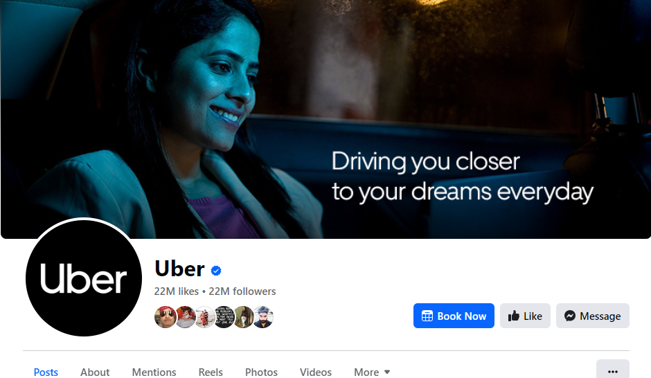
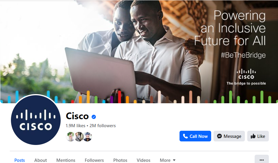
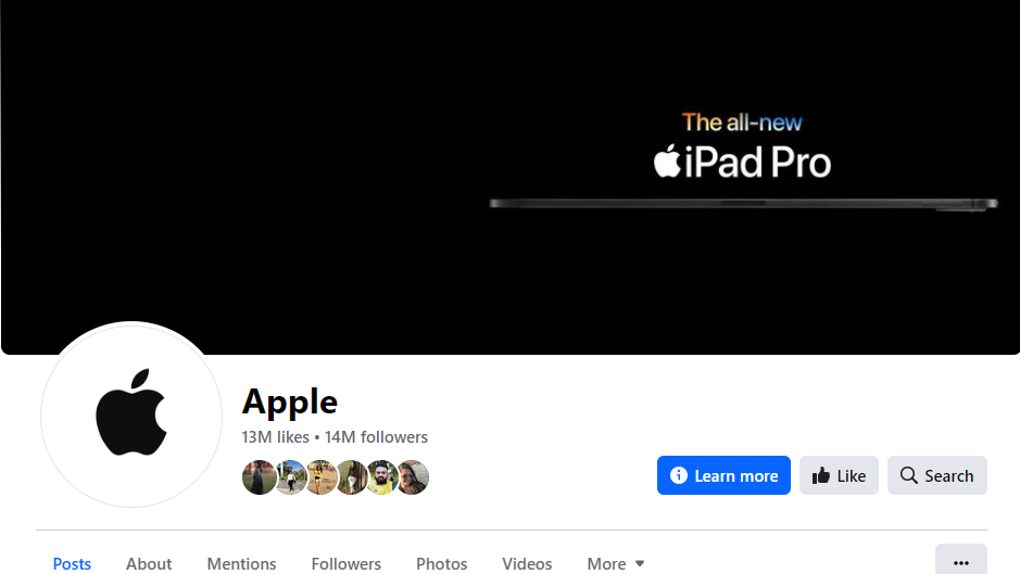
What is the first thing people see when they visit your brand’s Facebook page? Here’s a hint – It occupies significant space on your screen.
If the Facebook banner is on your mind, you are right.
For many, a cover photo or banner is just another picture on the top of your page. What most people don’t see is that a Facebook banner is not just an image! It acts like a teaser – it gives a peek into your brand’s ethos and creates a long-lasting first impression.
Wondering what it takes to create a Facebook banner that keeps your audience glued to the page? Let’s dive in and find out. Scroll down as we discuss the fundamentals of cover photos and what you should consider for the best outcomes.
Get the Basics Right to Create an Attractive Facebook Cover Photo
Before we continue with the blog, here’s a question for you: How do you upload a cover picture for your Facebook page?
Do you find a stock image, crop it to fix the size, and upload it as a banner? It’s the easiest thing to do, right? No—Picking up a basic generic image that ‘just’ fits right isn’t a smart idea. It doesn’t set the tone, so your prospective customers feel disconnected instantly.
So, what is the best way to capture and sustain the attention of your audience and encourage them to take action?
Let’s start with the ideal cover photo dimension:
What is the Ideal Dimension of a Facebook Cover Photo?
The key lies in creating Facebook banners in perfect dimensions. When a cover photo isn’t right-sized, it becomes grainy or blurry and doesn’t create the desired visual effect.
Here’s what you need to know about cover page dimensions:
- Facebook banner photos should be 851 pixels wide and 315 pixels tall for desktop. For mobile, the image should be 640 pixels wide and 360 pixels long.
- In addition, ensure your photo isn’t more than 100 kilobytes.
- The image should be left aligned with a full bleed and a 16:9 aspect ratio.
To summarise, balance creativity with recommended Facebook cover photo sizes for a visually appealing Facebook banner.
Does Facebook Banner Appear Different on Mobile vs Desktop Screens?
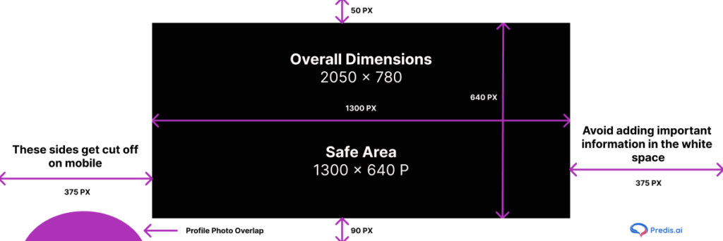
There’s another important aspect that can’t be overlooked, and that’s mobile and desktop screen size.
Therefore, we recommend creating a Facebook banner that fits within the picture area (see the above image). This ensures that the cover photos appear properly regardless of the device.
Mobile and desktop screens have dimensions, so the same banner will appear differently on each device. Therefore, ensure your cover image is optimized. Mobile devices will display a smaller banner—the sides are cropped while the height expands.
Considering that 84.5% of users access Facebook through mobile, ensure creative elements of your banner aren’t cropped on limited screen space.
Why Does Having Facebook Banner Size in Perfect Dimensions Matter?
Creating an image with the ideal dimensions in mind is significantly crucial. Here’s why:
- Impeccable Visuals: Facebook is all about optics, which is why it is the third most visited platform after YouTube and WhatsApp. Thus, having a professionally designed and properly sized banner adds to its aesthetic appeal, leaving a strong impression.
- Uniform Appearance Across Different Devices: Around 14.5% of users access Facebook through desktops and mobile devices. This means the banner should look consistent, regardless of the device. A cover image with proper dimensions plays a crucial role in this.
Create Facebook ads with ease using Predis.ai's Facebook Ad Maker - enhance your social media strategy!
How to Design an Enticing Facebook Banner?
An engaging Facebook banner is a thoughtful amalgamation of creative elements, strong brand messaging, and technical aspects. Here’s how you can make your cover photos alluring:
1. Follow the Facebook Cover Photo Guidelines
Facebook often updates its guidelines to deliver unmatched user experience. So, make sure you go through the guidelines carefully before you start brainstorming for cover page ideas. You can refer to the regulations here. But here’s a quick snapshot of important points:
- Keep the cover image public.
- Make sure the banner isn’t misleading or infringes copyright.
- Get as creative as you want to be. But remember you have reviewed the dimension requirements.
- Always choose an image that describes your page and brand. This will help the audience to have a glimpse of what awaits them as they scroll down the page.
Is adhering to these guidelines important? Obviously yes! Instances of non-adherence may negatively impact your presence on the platform.
2. Make the Facebook Banner the Focal Point
It’s said, “Don’t judge a book by its cover,” but (unfortunately) most of us do so. Think of the banner image as the book cover – so it’s your first (and last) to capture their minds.
A poorly designed, distracting, and confusing image can cause the audience to lose interest and possibly leave forever. As a result, the page’s intent and engagement can suffer. Including a focal and color scheme that aligns with your brand will make a positive first impression. In addition, balancing the negative space by adding unique design elements makes your image stand out.
3. Add a Catchy Call to Action (CTA)
Are you struggling to drive Facebook traffic to your website without boosting ads? Perhaps you haven’t tried adding a click-worthy call-to-action CTA on your cover image.
A Facebook banner is the first thing your prospective client view notices. So, it is a launch pad where you can turn visitors into conversions. And what better way to do it than adding an interesting CTA? Depending on your brand, add a unique CTA button to the bottom right of the banner.
Placing a CTA button strategically on the cover photo drives the users to take interaction with your brand to the next level.
4. Optimize the Facebook Banner for Mobile
90% of users view Facebook from their mobile screens. Hence, it’s crucial to design the banner with a mobile-first approach. Make sure all the critical information and visual elements are visible and accessible on smaller screen space.
5. Use AI-Powered Tools For Banner Templates
Want to create an enticing Facebook cover image? But you don’t have design skills. Worry not! With AI tools like Predis.ai, you can design a banner from scratch without advanced software or design expertise.
Use Predis.ai's Banner Maker for Social Media to create stunning banner images!
6. Update the Facebook Banner Regularly
Facebook keeps changing the guidelines, so update the cover photo to adhere to these rules. Also, change the graphics to incorporate the season’s flavor, an upcoming event, or a new product launch to make the cover photo more appealing.
Best Practices For an Engaging Facebook Banner
While the above points, there are a few considerations to ensure best results. Check them out:
1. Should Align With Your Brand
A Facebook banner image speaks a thousand words – it talks a volume of your brand. So, make sure it aligns with the rest of your page. Use consistent color schemes, fonts, and graphics to make your brand more recognizable.
2. Use High-Quality Images
Since banners are the first thing people see on your Facebook page, a clear and crisp image creates an everlasting impression. Thus, pick only high-definition images to avoid blurriness and pixelation.
3. Keep the Facebook Banner Simple
A cluttered cover banner is optically overwhelming and distracts visitors. A clean and simple design will convey the brand message without overpowering the viewers.
Top 3 Inspirations for Facebook Banner
1. Cohesive Color Palette
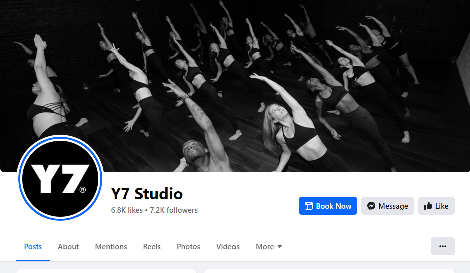
Using a coherent color palette can make or break the banner image. You can incorporate your brand’s color scheme to create a uniform look throughout the page. Check out the Y7 Studio Facebook cover image. Its sleek color palette seamlessly aligns with the brand’s personality.
2. Play with Geometry
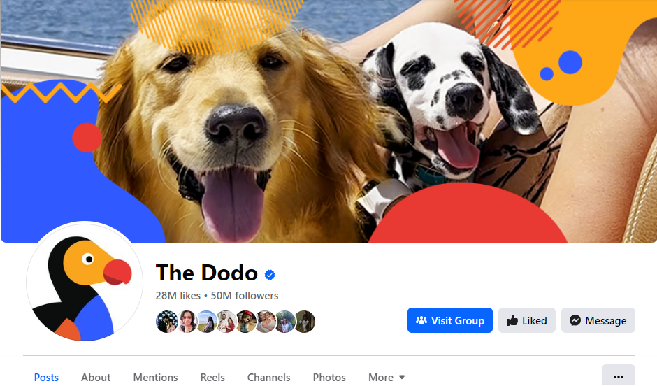
Adding geometrical shapes to the cover image design will make your visuals stand out. You can use color variations to create a mesmerizing effect. Take The Dodo’s Facebook banner, for instance.
3. Showcase Your Company’s Best Selling Product
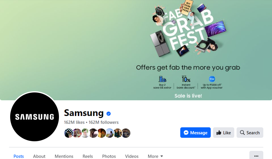
Are you launching a new product or planning a sale? A Facebook banner offers an amazing opportunity to announce a new launch or an upcoming sale. Electronic giant Samsung smartly uses its cover page to tell potential buyers about discounts.
Stand Out on Facebook with AI Content 🌟
Conclusion
While crafting an attractive Facebook banner may seem simple, it can have a huge impact on the prospects. So, you want nothing but the best to create a strong positive impression. These tips will come in handy when brainstorming and experimenting with various ideas for cover page images.
And if you are a beginner and have zero design skills, leverage the power of AI-enabled tools like Predis.ai. This all-in-one tool has everything you need to make Facebook banners interesting, eye-catching, and engaging. Sign up for free now and explore the exciting features.
Related Content,
