

Creativity isn’t just a nice-to-have; it’s the engine that drives attention, engagement, and conversions. As consumers are bombarded with countless ads daily, what makes one stand out while others fade into the background? The answer lies in more than just aesthetics; it lies in psychology.
The psychology of ad creatives goes beyond surface-level design. It taps into how people think, feel, and make decisions. From the colors that spark emotion to the layout that guides the eye, every element of an ad has the potential to influence behavior, often within seconds. Brands that understand and apply these psychological principles can craft creatives that not only look great but also drive meaningful action.
This guide explores the three core pillars of effective ad design: color, emotion, and layout. You’ll learn how each element shapes consumer perception, the psychological triggers behind them, and how to apply these insights to create compelling ads that convert.
Whether you’re a marketer, designer, or business owner, this blog is your complete guide to mastering the psychology of ad creatives—so your next campaign not only catches the eye but also wins the mind and heart.
Understanding the Psychology of Ad Creatives
What makes an ad creative truly effective isn’t just its design, it’s how well it connects with the human mind. To achieve this, great creatives are built around four core psychological principles:

1. Attention
In a world of endless scrolling, grabbing attention within the first 3 seconds is crucial. Bright colors, striking visuals, or bold typography can create a pattern interrupt that stops users mid-scroll.
2. Memory
People remember emotionally charged visuals far better than facts. Ads that embed brand identity into memorable colors, faces, or storytelling are more likely to stick in a viewer’s mind.
3. Emotional Resonance
Emotions drive decisions. Emotional Advertising that evokes a feeling, whether it’s joy, fear, trust, or excitement, creates stronger associations and influences behavior more effectively than logical arguments.
4. Decision Triggers
Good creatives subtly activate psychological triggers like scarcity (“limited offer”), social proof (“over 1 million sold”), or authority (“recommended by experts”), nudging viewers closer to action.
Here’s where it gets exciting: As per the International Forum of Visual Practitioners, 90% of information transmitted to the brain is visual, and the brain processes visuals 60,000 times faster than text. This means the structure, imagery, and color scheme of an ad have the power to influence perception and intent before a single word is read.
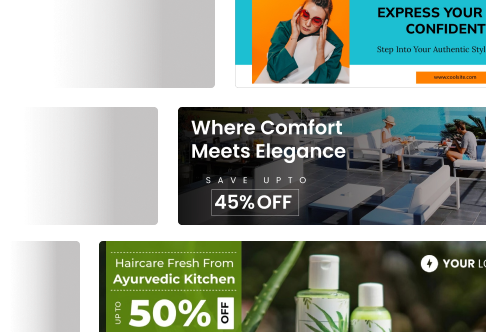
The Role of Color in Good Ad Creatives
Color isn’t just a design choice, it’s a powerful psychological tool that shapes how consumers perceive and respond to ads. Studies show that up to 90% of initial product judgments are based on color alone. Within the first few seconds of viewing an ad, color can instantly evoke emotion, build trust, or create urgency, making it a critical component in the psychology of ad creatives.
Different colors carry different emotional associations, and smart advertisers leverage this to align their messaging with their brand personality and campaign goals. For example, a wellness brand might use green to signal natural, calming wellness, while a fintech app development company may opt for blue to build trust and confidence.
Industries have long relied on color strategy to influence perception:
- Retail and e-commerce frequently use red and orange to create a sense of urgency and trigger impulse buying.
- Healthcare and wellness brands prefer green and blue to promote calmness, care, and cleanliness.
- Luxury brands often turn to black or purple to convey sophistication and exclusivity.
- Tech companies rely on blue tones to reinforce professionalism and innovation.
Key Color Associations in Advertising
Understanding the emotional resonance of each color helps in selecting the right palette for your creative project. Here’s a breakdown of how key colors are typically interpreted in ad psychology:

- Red: Energy, urgency, excitement
→ Often used in clearance sales, fast food, and call-to-action buttons. - Blue: Trust, professionalism, calm
→ Common in tech, finance, and healthcare industries. - Yellow: Optimism, creativity, warmth
→ Great for brands targeting a younger or more playful audience. - Green: Health, eco-friendliness, peace
→ Perfect for organic, sustainable, or wellness-focused products. - Purple: Luxury, mystery, spirituality
→ Frequently used in high-end beauty and luxury goods. - Black: Sophistication, power, elegance
→ Dominant in luxury fashion, automobiles, and high-end technology.
Real-World Ad Examples Using Effective Color Psychology
Hard to believe that colours and appearance do make a lot of difference? Well, let’s give you some examples of successful and powerful brands that have played the game well.
1. McDonald’s
The use of red and yellow in its branding and ads isn’t accidental. Red triggers appetite and urgency, while yellow evokes friendliness and happiness, perfect for a fast-paced food environment.

2. Apple
Its clean use of black, white, and muted tones reinforces simplicity, elegance, and premium quality. The color scheme allows the product to shine while building trust and exclusivity.

3. Spotify
The brand uses green not only for its visual identity but also to reflect innovation and freshness. Combined with contrasting bold colors in ads, Spotify effectively captures the energy of its young audience.

4. Tiffany & Co.
The iconic Tiffany Blue is a brilliant example of brand-specific color usage. It evokes elegance, trust, and timelessness, fitting the luxury jewelry market perfectly.

5. National Geographic
The brand’s yellow border is a subtle yet powerful emotional cue, symbolizing curiosity, adventure, and warmth, aligning perfectly with its storytelling and visual exploration.

Emotion-Driven Ad Creatives: Hooking the Heart
Emotion is the heartbeat of effective advertising. While logic can justify a purchase, emotion inspires it. That’s why the most impactful ads don’t just inform, they move you. In the psychology of ad creatives, emotion is the invisible force that turns passive viewers into active consumers.
Emotional Triggers That Influence Buying Behavior
Great ad creatives know how to tap into key emotional triggers to generate action. Here are the most powerful ones:
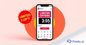
- Fear of Missing Out (FOMO):
Phrases like “limited time offer” or “only 3 left in stock” trigger urgency and scarcity, making people act fast. - Happiness and Positivity:
Joyful, uplifting imagery and messaging make audiences associate those good feelings with your brand, increasing likability and shareability. - Nostalgia:
Brands that lean into nostalgic visuals or music tap into deeply rooted memories that build trust and emotional warmth, especially powerful for older demographics. - Trust and Security:
Emotional safety is critical, especially in industries like finance or healthcare. Clean visuals, reassuring language, and social proof build that emotional assurance. - Belonging and Identity:
Ads that make people feel seen and understood through inclusive visuals, values-driven messaging, or community-driven branding help consumers connect their identity with your brand.
System 1 vs. System 2 Thinking in Advertising
To understand emotional advertising, we need to explore how the brain works, specifically System 1 vs. System 2 thinking, a concept introduced by psychologist Daniel Kahneman.
- System 1 is fast, instinctive, and emotional. It reacts in milliseconds—this is the system advertisers aim to trigger for instant engagement.
- System 2 is slower, logical, and analytical. It kicks in when we evaluate prices, compare features, or make deliberate choices.
Most successful ad creatives are designed to target System 1—through emotion-rich visuals, colors, and messages, because that’s what grabs attention and creates an instant connection. Rational justifications can come later, but the hook must be emotional.
Examples of Emotionally Compelling Ads
Emotion is more than just a nice touch—it’s a strategic tool. When used effectively, it builds trust, fuels action, and turns fleeting attention into lasting loyalty. Let’s look into some real-life examples of powerful brands.
1. Google – “Year in Search” Campaigns
These annual ads compile the most searched-for moments of the year, tapping into global emotions like hope, grief, and resilience. The emotional storytelling builds trust and positions Google as part of the human experience.
2. Dove – “Real Beauty” Campaign
By showcasing real women and redefining beauty standards, Dove connects with audiences through vulnerability and authenticity. The emotional core of self-acceptance and belonging resonated deeply, leading to a surge in brand loyalty.
3. Nike – “You Can’t Stop Us”
Using split-screen visuals and emotionally charged voiceovers, Nike created a sense of unity and perseverance during the COVID-19 pandemic. It fueled feelings of identity, purpose, and empowerment, driving both views and conversions.
4. Apple – “Misunderstood” Holiday Ad
This heartwarming ad tells the story of a quiet teen secretly creating a family video. It strikes emotional chords of love, surprise, and connection—all wrapped in Apple’s sleek product showcase.
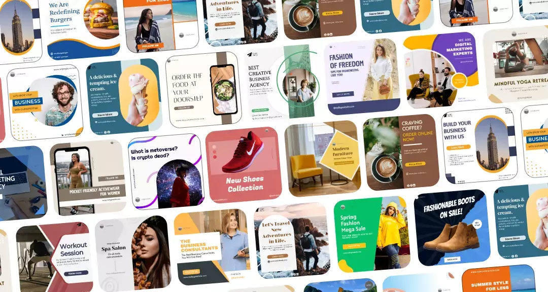
Layout Psychology: Visual Flow & Cognitive Ease
The layout of an ad isn’t just about aesthetics, it’s about psychological guidance. A well-structured creative uses layout to lead the eye, reduce cognitive effort, and highlight exactly what the viewer should notice and do next. In the psychology of ad creatives, layout is what silently persuades the audience by optimizing how the brain visually processes information.
1. Visual Hierarchy and Eye Movement
Humans don’t view ads randomly, we follow predictable scanning patterns, primarily the Z-pattern and F-pattern:
- Z-pattern (ideal for image-heavy ads and landing pages):
Viewers start at the top left, scan across to the right, move diagonally down, and finish at the bottom right. This layout is perfect for placing your logo, key message, and CTA along this visual path. - F-pattern (common in text-heavy designs like blog posts or emails):
The eye moves across the top line (headline), then down the left margin, and occasionally across shorter horizontal lines. Understanding this pattern helps prioritize the placement of headlines, images, and CTAs to match natural reading flow.
Focal Points, such as faces, contrasting colors, or bold headlines, direct visual attention. Smart creatives use one clear focal point to prevent distraction and drive attention where it matters, whether it’s a product, a benefit, or a button.
2. Simplicity and White Space
In design psychology, less is more and for good reason.
Cluttered ads overwhelm the brain. When faced with too many elements, viewers experience high cognitive load, making them more likely to skip, scroll past, or forget the ad entirely. Clean designs with ample white space help guide focus, emphasize key points, and make content easier to digest.
White space isn’t “empty”, it’s strategic breathing room. It creates a calming visual experience, reducing viewer fatigue and enhancing message clarity.
3. CTA Placement and Conversion Psychology
The call-to-action (CTA) is where emotion meets logic, and placement can make or break its performance.
Best Practices for CTA Placement:
- Align the CTA with the Z-pattern’s bottom right for natural flow.
- Keep it above the fold in digital ads or mobile designs to ensure visibility.
- Use contrast (like a bold color or button) to make the CTA stand out without disrupting harmony.
Contrast and Positioning play a vital role in click behavior. A high-contrast button grabs attention and signals interactivity, while consistent spacing and alignment increase trust and legibility.

Psychology of Ad Creatives Across Platforms
Understanding how to adapt your creative strategy per platform is crucial for maximizing engagement and conversion.
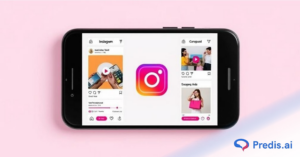
1. Instagram: Emotion-Packed Visuals
Did you know? 60% of Instagram users say they discover new products on the platform, and visual storytelling directly influences buying decisions. Instagram thrives on aesthetic appeal and instant emotional connection. Since it’s a visual-first platform, users scroll quickly, making bold imagery, minimal text, and vibrant color psychology essential.
- Emotional Triggers: Inspiration, aspiration, joy, belonging.
- Effective Tactics: High-contrast color palettes, human-centric visuals, storytelling through Reels and Stories.
- Design Psychology: Use vertical formats and focal points in the center to capture attention fast.
2. Facebook: Relatable and Community-Driven
Did you know? Posts with human faces receive 38% more likes than those without. Emotional resonance drives more shares and comments on Facebook. This tool is more content-heavy and community-oriented, so ad creatives must balance visuals with value-driven copy.
- Emotional Triggers: Trust, relatability, nostalgia, social validation.
- Effective Tactics: Use authentic images (real people > stock photos), engaging headlines, and emotional storytelling.
- Design Psychology: F-pattern reading makes it ideal to place headlines and CTAs early and visibly.
3. Display Ads: Clarity and Instant Recognition
Did you know? Users form an opinion about a display ad in less than 0.05 seconds. Visual clarity is everything. Display ads rely on split-second recognition. Viewers are often browsing elsewhere, so creatives must grab attention with visual cues, not lengthy messages.
- Emotional Triggers: Curiosity, urgency, convenience.
- Effective Tactics: Strong color contrast, large fonts, and instantly recognizable brand elements (logos, icons).
- Design Psychology: Z-pattern layout, limited copy, and strong CTA buttons increase click-through rates.
4. YouTube: Long-Form Emotional Storytelling
Did you know YouTube ads that elicit an emotional response see a 3x lift in brand recall compared to neutral content? YouTube allows for deeper, story-driven creative experiences, especially with skippable ads where the first 5 seconds are critical.
- Emotional Triggers: Empathy, excitement, surprise, trust.
- Effective Tactics: Emotional hooks in the opening, cinematic visuals, product demos with strong narrative.
- Design Psychology: Use audio-visual synchronization to reinforce emotional appeal; end with a compelling CTA screen.
Boost Ad Impact with Predis.ai
Mastering the psychology of ad creatives is essential, but doing it manually can be time-consuming and complex. That’s where Predis.ai steps in, using cutting-edge AI to supercharge your ad creative process and maximize impact.
AI-Powered Color Choices That Convert
Predis.ai analyzes your brand identity and campaign goals to automatically select color palettes that resonate emotionally and align perfectly with your brand. By tapping into color psychology principles like using red for urgency or blue for trust, Predis.ai ensures your ads evoke the right feelings and grab attention instantly.
Craft Emotionally Resonant Messages Instantly
With Predis.ai, generating emotionally compelling copy and visuals happens in seconds. The AI crafts messages tailored to your target audience’s core emotions, whether it’s excitement, nostalgia, or belonging, helping you connect deeply without guesswork or delays.
Smart Layouts Designed for Engagement
Predis.ai’s auto-layout feature applies the psychology of visual hierarchy and proven CTA placement, creating designs that naturally guide the viewer’s eye and encourage action. Whether it’s following Z-pattern scanning or optimizing white space, Predis.ai delivers layouts built for conversion.
Fast Testing & Optimization
Success comes from constant refinement. Predis.ai allows you to quickly A/B test multiple creative variations, uncovering which emotional triggers, colors, and layouts perform best. This data-driven approach removes the guesswork, helping you optimize for maximum psychological impact and ROI.