“Never judge a book by its cover.”
While this adage is true, the virtual world is all about first impressions. That’s why it becomes important to have an impressive Facebook cover image.
Banners aren’t just graphics—they are like movie teasers. The Facebook cover image whets your audience’s appetite, motivating them to scroll down and learn more about your brand.
However, creating a strikingly attractive banner is easier said than done. A lot of factors determine whether the banner will capture your audience’s mind and heart. One such component is Facebook banner size.
Getting Facebook banner dimensions right ensures a seamlessly consistent experience across all devices.
If your Facebook cover image isn’t garnering enough attention, stay tuned. In this blog, we will explore how to correct the Facebook banner format. We will also learn about the ideal size, cover image safe zones, and best practices.
Facebook Banner Size 101: Everything You Should Know
For those who have no idea what a cover image or banner is, it’s the image or video at the top of your Facebook page.
Let’s move on to the main point: What is the ideal Facebook cover image dimension?
With Facebook algorithms getting frequent updates, keeping up with the latest size requirements is vital. In the following sections, we’ll take a look at the Facebook banner size guide for 2025
What is the Ideal Facebook Banner Size?
Having the right-sized cover image can make or break your brand’s identity.
When you don’t follow the dimensions properly, the image becomes blurry and pixelated. This can create an unfavorable impression, resulting in lower engagement or follower count.
So, it’s important to follow Facebook’s guidelines. Here’s a quick look at what social media platform has to say about the banner dimensions
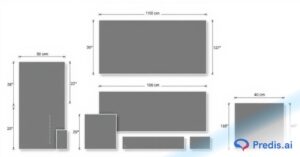
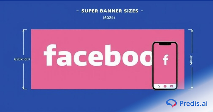
Desktop display: 820 × 312 px. This is how it appears, even if you upload a slightly larger image. For mobile devices, it should be 640 x 360 pixels.
JPG for photos, PNG for text-heavy graphics, save in sRGB for accurate color.
There are certain key points that you need to take into account so that your cover image looks impeccable:
- Make sure your cover image is less than 100 kilobytes. When the image file is heavier than the prescribed limit, Facebook automatically compresses the image. Result? – a low-quality image that appears less sharp and detailed.
- Keep file under ~100 KB to reduce Facebook’s aggressive compression.
- Keep only as minimum, but promote recommended high-res size: 1640 × 720 px (2× Retina).
- Use 16:9 as a helpful guide, but emphasize flexible cropping across devices.
- Use 2× size (1640 × 720 px) for sharper display on high-resolution screens.
Facebook Banner Dimensions: Desktop Vs Mobile Devices
For 97 percent of US adults accessing social network services via mobile phones, the Facebook banner appears differently than on the desktop.
This means optimizing cover images for small-screen devices such as smartphones and tablets is crucial.
To optimize the Facebook banner format for mobiles, having a complete idea of the “safe zone” is necessary.
Before we move further, let’s understand what a safe zone is.
Additional Facebook Banner Sizes (Groups & Events)
For Facebook Groups, a recommended cover size is 1640 × 856 pixels, while Event covers display best at 1920 × 1080 pixels with a 16:9 aspect ratio.
Stay Within Safe Zones: Optimize Your Cover Page for Mobiles
Does your cover page look misaligned or cropped out?
If you are facing this problem, you aren’t alone! Many struggle to get the Facebook banner format correct.
Each social media platform has its specifications for image dimensions. So, when creating images for multiple platforms, it’s essential to consider their specifications to ensure better performance.
And that’s why you need to know about the safe zone.
But what’s the safe zone?
Let’s call it Facebook cover image’s “Goldilocks Zone.” It’s the designated area covered by text and other graphic elements without getting auto-cropped, cut off, or overshadowed. These zones are unique for each post type, platform, and device; therefore, knowing these nuances is important.
One of the most versatile platforms, Facebook is compatible with various content types, including videos, images, and text. An optimized Facebook banner format ensures it appears crystal clear and attractive in users’ feeds.
The outcome is increased engagement and brand visibility, making your Facebook marketing game strong!
Now, let’s learn how the safe zone works and what are the dimensions you need to follow:
Though we have covered highlights of the Facebook banner dimensions, here’s a quick look at the key points:
| True 2025 safe zone | centered 820 × 360 px where all text/logos must stay. |
| Recommended Size | 1640 x 720 pixels |
| Recommended File Size | 100kb for faster loading |
| Recommended File Type | sRGB JPG (loads faster), PNG |
| Display Size | Desktop: 820 x 312 pixels Mobile: 640 x 360 pixels |
Pro Tip:
The profile picture covers the left side of the Facebook banner. Profile picture overlap varies. Keep key elements away from bottom-left + bottom-center.
Place your most important elements at the center of the design and take a mobile-first approach to avoid unexpected cropping across different devices.
Why Respecting Facebook’s Safe Zone Matters
Respecting the safe zone doesn’t mean you are just following some trend—it’s about creating content that’s captivating and instantly captures the audience’s attention.
Following safe zone guidelines improves the visibility of critical graphic elements to ensure a consistent appearance across various devices. This ensures that your brand message is conveyed efficiently, regardless of where the audience views your page.
Additionally, adhering to the safe zone amplifies the reach and effectiveness of your Facebook marketing efforts. As a result, you can see a steady rise in engagement, further driving your bottom line.
Practical Tips to Improve Content Effectiveness in Safe Zones
- Test on Multiple Devices Before Final Posting: Always preview your Facebook banner size on various devices, from smartphones to desktops. This step is vital in ensuring that all the key elements have a consistent and impactful appearance across different devices.
- Make the Most of AI-Powered Templates & Grids: Numerous tools like Predis.ai offer grid overlays and pre-designed templates for safe zone alignment. These tools provide accurate positioning for the Facebook banner format, thus enhancing precision.
- Keep it Simple: A clutter-free Facebook banner format is more effective. So, make sure the cover image doesn’t have an overwhelming amount of text and visuals. This will keep your cover image within the designated safe zone and ensure better visual appeal and engagement.
- Keep Up with the Regular Platform Changes: Facebook keeps updating its algorithm. As the platform evolves, so do the safe zone criteria. So, keep abreast of these updates to ensure the Facebook banner dimensions are correctly optimized.
- Take Inspiration from Top Pages: Observe and analyze Facebook cover images from popular pages. Take notes on how they use safe zones to take inspiration from their visual elements.
- Smartly Incorporate Important Visual Cues: Using intelligent visual cues like a subtle background will define a safe zone in your Facebook cover image.
Knowing Facebook banner dimensions is the first step in making the cover image attention-worthy.
Designing cover pages may have become easy and quick, thanks to template-based tools like Predis.ai. However, you are bound to encounter roadblocks. Not paying attention to certain details can result in discrepancies which eventually ruins the entire purpose of your Facebook marketing.
In the section below, we have listed some of the common mistakes you should avoid to get an outstanding Facebook banner.
Facebook Banner Size: Common Mistakes That Can You Ruin Your Brand Story
1. Not Respecting the “Safe Zone”
We discussed safe zones and the importance of following them. To ensure your design falls within the safe zone, double-check how the banner looks on multiple devices before making the final cut.
2. Using Copyrighted Images
Another common mistake in Facebook marketing is using copyrighted material. The best approach is to upload images from reputable stock photo sites, which offer a wide range of free images.
3. Cluttering Your Facebook Banners With Graphics
A photo with too many graphic elements or text will overwhelm the audience’s senses. Result? – they might not scroll down or just leave the page. This will not bring you the required engagement.
Another common pitfall is that the graphic elements—images, fonts, or colors—often aren’t cohesive. This can distract the audience, discouraging them from exploring the page.
Nike’s Facebook cover image is a classic example of how minimalist elements can be used smartly to deliver the brand’s core message
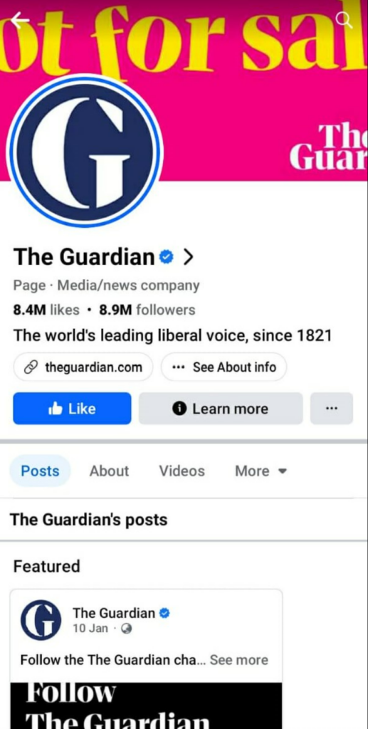
4. Not Optimizing Facebook Banner For Mobiles
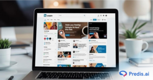
Mobile phones are everywhere, and most of us spend hours scrolling Facebook on our phones. This means you need to optimize the cover page for mobiles as well. See the image below. This Facebook cover by a leading name in the journalistic circle has a great design, but it’s not entirely visible to someone visiting the page.
5. Using Low Quality and Blurry Images
Using low-quality images will make your cover look pixelated and blurry. The result—it will make your page look extremely unprofessional. People will not want to stay and explore your page, yielding minimal engagement.
6. Cover Not Aligned With Other Branding Elements
Consistent branding is the first condition to attract more eyeballs and hold audiences’ attention for a long time. However, many in Facebook marketing often get cover images that aren’t aligned with the brand elements. Make sure the banner matches your brand’s personality and ethos.
For example, capturing tempting food pictures for a restaurant’s Facebook page would align with the brand.
7. Considering Facebook Banners “Cut from the Same Cloth”
Attention spans are dwindling, and you have only 3 seconds to capture and sustain anyone’s attention.
By taking the one-size-fits-all route, you are missing a golden opportunity to grab eyeballs and create a strong visual impact. A well-designed Facebook cover image that speaks about your brand and its core value is a great teaser. It gives a glimpse of your product/service, compelling the users to scroll down.
8. Unclear Brand Story
A breathtaking cover page is a prelude to your brand’s story. It’s the first thing that most viewers notice (and judge). So, it becomes crucial to lay the foundation of your storytelling well through the banners.
Always remember: Add elements like colors, logos, and graphics that align with your company’s core values and branding.
Best Practices to Get the Facebook Banner Dimensions Right
Getting your Facebook banner size correct is pivotal. But there are some considerations to take into account to ensure your cover images serve their purpose effectively.
Here are some of the “Do’s” you need to remember:
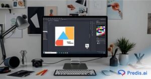
1. Use AI-Powered Templates
Designing is not everyone’s cup of tea. Putting all the visuals together, and that too in a prescribed dimension, requires years of practice. However, hiring an expert only adds to the overheads—definitely not a feasible option for small or medium businesses.
So, what’s the solution? Get help from AI-powered tools! And the best part is you don’t need to be a designer. You can use the in-built tools to edit the template, giving it a personal touch. Also, these are designed according to the dimension guidelines of specific social media platforms.
Check out Predis.ai’s huge library of pre-designed templates for Facebook banners!
2. Test the Waters before Sailing the Ship
Social media is all about creating great first impressions, and a cover image is the gateway to making a lasting impression.
So, you do everything to create an extraordinary cover image.
However, there’s a catch—Facebook doesn’t follow a cookie-cutter approach. You can’t use one cover page and expect it to draw the attention of potential customers. You need to be prepared with Plans B, C, D, and so on.
So, create 2-3 options for Facebook banner formats. Try different designs, and A/B test them with a small group.
This will help you understand which design works best and find the most suitable option while maintaining the Facebook banner dimensions.
In addition, A/B testing allows you to find out what kind of design or messaging hits the chords with your audience.
3. Focus on the Safe Zone
We all know how important it is to play within a “safe” zone! These pre-designated areas give a seamless viewing experience, irrespective of which device they use.
Therefore, keep the text and design elements within the area. Anything that goes beyond the boundaries of the safe zone will get cut off, ruining the user experience.
To ensure safe zones are always adhered to, check how your cover photos appear on multiple devices before you pick a final image.
4. Put the Spotlight on the Product
Imagine you have an online furniture store. You hired a professional photographer to click your products. The results are outstanding – the photos are incredibly aesthetic and look professional.
However, when you add the image to a Facebook banner, it gets partially cropped. Only the walls and legless couches are visible. Would that motivate the buyer to check out your page or product?
The answer is no!
While designing the banner, make sure the main product gets the spotlight. This will pique the interest of your targeted audience, encouraging them to scroll down, explore more, and even make a purchase. Make sure you have positioned the products on the banner so that they are fully visible.
5. Make the Most of Video Banners
Static photos are good, but interactive videos are just great. Now, Facebook business pages have the option to upload a cover video as the banner.
The purpose is to make the banner more engaging, delivering a richer experience for the users. The benefits of uploading video banners are limitless: you can share valuable information, showcase your product in the most interesting way, and offer a BTS look.
Here are a few things you need to take care of before uploading video covers:
- The Facebook video banner should be 820 x 312 pixels, but keeping the dimensions 820 x 462 pixels is recommended. Video banner specs vary; Facebook may adjust crop dynamically. Double-check at upload.
- The resolution can be up to 1080p, and the ideal file size should be less than 1.75 GB. The required formats are .mp4 or .mov.
- Don’t upload a video that is less than 20 seconds or over 90 seconds long.
Additionally, remember that videos are displayed on a loop. This means they will play continuously until the user exits your page. So, make sure to have natural transitions to make the loop look seamless.
6. Add Your Personal Touch
Every brand is different, and so should its branding elements. Generic images or messages will not create a long-lasting impact. People may just look and forget it.
But that’s the last thing you want for your Facebook marketing to yield high returns.
One way to entice your target audience is to add a personal touch to your Facebook banner format. Customize your image with design elements to give it a personality and make it unique. Rather than going for generic images, you can browse through templates on Predis.ai. Choose various shapes, icons, and color palettes to create something that speaks about your brand.
7. Apply the 80/20 Rule
Maintaining the 80:20 ratio is the golden rule for marketers. With visual platforms like Facebook rising, following this rule is the best way to create outstanding optics and storytelling.
But what’s this 80/20 rule? – Simple, 80% of a Facebook banner’s impact comes from 20% of its elements, including graphics and text.
Therefore, make sure graphical elements and text occupy only 20% of the banner’s area. Let the overall design create the impact.
Getting Facebook Banner Size Correct Becomes Easy with Predis.ai
Getting perfect Facebook banner dimensions will help you make an unforgettable first impression among users. Correctly sized deliver a consistent viewing experience by displaying the cover image on mobiles and desktops without any abrupt cropping.
While designers are adept at getting the dimensions right, hiring professionals may not be (financially) feasible for everyone.
If you are new to designing or looking for tools to take your Facebook marketing notches higher with its features, try Predis.ai.
A comprehensive and AI-enabled, Predis.ai offers everything—from creating Facebook covers to ad copies and scheduling the post—in a single tool.
Sounds interesting? Why don’t you explore the features and find the amazing benefits they can bring to your business?
Sign up for Free now and get your social media marketing game right.