WooCommerce is the world’s most popular eCommerce platform. This open-source WordPress plugin gives you the tools and flexibility to build a successful online business. Yet, even the best WooCommerce stores can suffer from high bounce rates.
So, what’s going wrong? A high bounce rate means visitors aren’t sticking around to explore or buy your products. When they don’t, they’re gone, taking potential sales with them.
That’s a massive chunk of missed opportunities! But don’t worry—we’ve got the solutions you need.
8 Proven Strategies to Decrease WooComerce Store Bounce Rate
Here, we’ll explore the top 8 strategies to decrease WooCommerce bounce rate. Let’s get started!
Tip 1: Speed up Your Website and Keep Customers Hooked
A slow website is the quickest way to lose potential customers. Imagine clicking on a link and having to wait and wait. Frustrating, right? Most online users will leave websites that take too long to load.
On the other hand, a website that loads within a second converts 2.5 times more visitors than a site that loads in five seconds or more. This significant difference highlights the crucial importance of speed in reducing your WooCommerce bounce rate.
Also, fast loading times enhance user experience and improve search engine rankings. So, how do you harness these benefits? Check out these expert strategies:
- Use Speed Tools: A good starting point is using Google PageSpeed Insights. This robust tool identifies speed issues, gives scores, and offers specific fixes tailored to your site.
- Compress Images: Large visual files can drag down your load times. Compress images while preserving quality and save them in the proper format (JPEG for photos, PNG for graphics with fewer colors).
- Leverage Browser Caching: Store commonly used resources on users’ devices to speed up page loading. This way, your site doesn’t have to reload all the elements for returning visitors.
- Reduce HTTP Requests: To decrease load times, lower the number of elements on your page (scripts, images, CSS files). Each aspect requires an HTTP request, and fewer requests mean faster loading.
Take Marey, for example, a firm specializing in tankless water heaters. They rely on WooCommerce to power their online store. One standout feature is the custom module “Find Your Heater,” which simplifies finding the right product. The result? A significant reduction in bounce rate, increased page load speed, and a better shopping experience.
Tip 2: Make Navigation a Breeze for Your Visitors
Have you ever left a website because it was too difficult to navigate? If so, you’re not alone; the same thing can happen to your WooCommerce store if cluttered and disorganized.
On average, website users spend about 6.44 seconds looking at the main navigation menu. This brief interaction time underscores the importance of having simple and accessible content for a positive user experience.
Here’s how you can improve your store’s navigation:
- Clear Menu Structure: Organize your menu with clear categories and subcategories. Think of it as the roadmap to your site. A well-structured menu helps visitors find what they’re looking for with ease.
- Breadcrumb Navigation: Include breadcrumb trails to help visitors understand their location within your site. They act like “You are here” signs, guiding users to previous pages.
- Search Bar: Make sure your search bar is visible and functional. This feature helps visitors locate specific items fast—especially if your store has a large inventory.
- Logical Content Organization: Arrange your content in a logical order that guides visitors through your site. Keep related products and information together to create a seamless browsing experience.
- Accessible Design: Ensure your website is accessible to all users, including those with disabilities. It includes adding alt text for images and providing text descriptions for screen readers.

For example, fashion brand Zara nails it with sleek, minimalist navigation. They keep it simple with a two-dash bar in the top left corner, allowing their stunning product visuals to take center stage. This intuitive approach enhances the shopping experience and keeps visitors returning for more.
Tip 3: Optimize Your WooCommerce Store for Mobile
Did you know mobile phones are leading the charge in global digital commerce? As of the first quarter of 2024, smartphones comprised 77% of retail site traffic and generated two-thirds of online orders.
So, if you want to capitalize on this growing trend, optimizing your WooCommerce store for mobile is essential. But here’s the catch: mobile users expect a smooth, fast, and visually appealing experience.
And if it’s not there, they feel frustrated and annoyed, leading to higher bounce rates. Here are some insider tips to help you out:
- Responsive Design: Use flexible grids to ensure your site looks great on any device. A responsive design adjusts its layout based on screen size, providing a seamless experience for mobile users.
- Touch-Friendly Navigation: Make buttons and links easy to tap with your fingers. Ensure all interactive elements are large enough to be easily clickable, avoiding user frustration.
- Reduce Popups: Intrusive popups can lead to higher bounce rates and a poor user experience. Limit their use and ensure they are easy to close.
For instance, revamp your WooCommerce store for mobile users by taking a page from Apple’s playbook. Their website is clean, easy to navigate, and provides a seamless experience across all devices. Its design demonstrates how effective optimization enhances user engagement and reduces bounce rates.
Boost Sales on Social Media with AI⚡️
TRY NOWTip 4: Craft Compelling Product Descriptions
Imagine browsing through an online store and finding a product description so engaging that you can’t resist buying. That’s the power of well-crafted product descriptions.
It’s not about listing features; it’s about telling a story, showcasing benefits, and connecting with your audience. This approach will decrease WooCommerce bounce rate by keeping visitors eager to explore more. Here’s how:
- Use Storytelling: Tell a story that connects with your audience. Describe a scenario where the product plays a crucial role. For instance, “Buy this elegant evening gown now! Its design will make you feel confident and beautiful, no matter the occasion.”
- Incorporate Social Proof: Include customer reviews, testimonials, and ratings in your product descriptions. Social proof builds trust and helps potential customers feel confident in their decisions.
- SEO Optimization: Incorporate relevant keywords into your descriptions to improve search engine rankings. It will help potential customers find your products more quickly when they search online.
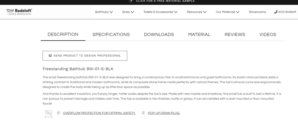
Check out this WooCommerce online store for inspiration. Badeloft, an online retailer of boutique bathroom fixtures, excels at product descriptions. Their website highlights how its products transform a bathroom into a luxurious, spa-like retreat, making every bath an indulgence.
Tip 5: Drive Action with Clear and Compelling CTAs
Imagine a visitor on your site who is intrigued by your product descriptions but unsure what to do next. That’s where a clear and compelling call-to-action (CTA) guides your potential customers toward buying.
Without strong CTAs, visitors might leave your site without taking any action, leading to higher bounce rates. Here’s how to create CTAs that convert:
- Use Action-Oriented Language: Your CTAs should inspire immediate action. Use strong verbs like “Shop Now,” “Get Started,” or “Sign Up Today.”
- Create a Sense of Urgency: Encourage visitors to take quick action by using FOMO (fear of missing out) tactics. Phrases like “Limited Time Offer” or “Get 40% Off Now” prompt faster decisions.
- Be Specific and Direct: Avoid vague CTAs like “Click Here.” Be specific about what the visitor will get, such as “Buy Now” or “Start Your Free Trial.” Clarity drives action, making visitors more likelier to engage.
- Opt for Strategic Placement: Position your CTAs where they make the most sense. Try placing them at the end of a product description, within the main navigation, or after engaging content. Ensure they’re easy to find without scrolling too much.
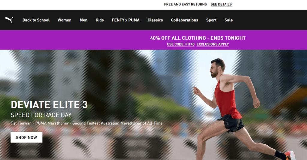
Take inspiration from Puma‘s online e-commerce site. They use bold typesetting, influential brand ambassadors, and compelling CTAs that drive action and engagement.
Tip 6: Stop Losing Visitors with Exit-Intent Popups
Ever noticed how some websites grab your attention just as you’re about to leave? That’s the magic of exit-intent popups. These strategic popups detect when visitors are about to leave your site and present them with an irresistible offer to keep them engaged.
Here’s how to use exit-intent popups to improve WooCommerce bounce rate:
- Offer a Discount or Incentive: Engage visitors by offering a special deal as they’re about to leave. For example, “Wait! Get 10% off your first order if you sign up now!” This tactic can turn a potential bounce into a sale.
- Collect Email Subscriptions: Encourage users to subscribe to your newsletter for exclusive content, deals, or updates. This tactic will help you build a verified email list without sending emails and contact potential customers.
- Showcase Popular Products: Highlight best-selling or highly rated products. This will pique the interest of visitors who may have missed these items during their initial browsing.
- Ask for Feedback: If a visitor is about to leave, ask for their feedback. A quick “We’d love to hear why you’re leaving! Help us improve” can provide valuable insights into potential bounce rate issues on your site.
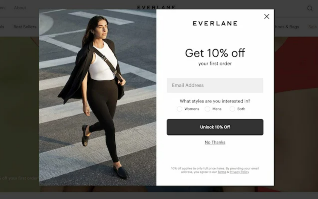
For example, Everlane is a master at using exit-intent popups. As you’re about to leave, they entice you with a tempting discount to encourage you to subscribe. Their simple sign-up form allows personalized email marketing and prevents visitors from bouncing without engaging.
Tip 7: Simplify Your Checkout Process for Higher Conversions
Did you know that 25% of online shoppers abandon their cart because they’re forced to create an account? While asking them to sign up is fine, making it mandatory can drive them away.
Many customers want a quick, hassle-free checkout. Here’s how to make that happen:
- Streamline Process: Reduce the number of steps needed to buy a product. Try a single-page checkout or a progress bar so customers know how close they are to finishing.
- Clear and Concise Forms: Keep your forms short and straightforward. Ask for only the essential information needed to complete the order. To save time, use auto-fill features for fields like address and payment details.
- Different Payment Options: Offer diverse payment options, including credit cards, PayPal, and digital wallets. Having all payment options on one page caters to all customer preferences and decreases the likelihood of bouncing.
- Use Trust Signals: Display trust badges, security certificates, and clear return policies. It assures customers that their payment details are safe and that they can shop confidently.
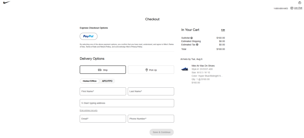
For instance, check how Nike enables the guest checkout option to make the process faster and more appealing. This simple step reduces friction and encourages more customers to buy what they want without the hassle of creating an account.
Step 8: Embrace Personalization to Boost Customer Experience
Personalization is a game-changer that enhances user experience and reduces bounce rates. Tailoring your site to individual visitors makes them feel valued and understood, which keeps them engaged and drives conversions.
Here are some expert tips to help you ace the personalization game:
- Use Personalized Recommendations: Show customers products based on browsing history and preferences. It can increase engagement and sales.
- Leverage Dynamic Content: Create a personalized experience for each visitor based on their behavior. Tailored greetings, offers, and content can significantly enhance the user experience.
- Email Personalization: Send personalized emails based on customer behavior and preferences. These customized email campaigns can result in higher open rates and conversions.
Amazon is a leader in personalization, using personalized recommendations and dynamic content to create a unique shopping experience for each visitor. Their tailored approach keeps customers coming back and reduces bounce rates.
Bonus Strategy: Track and Analyze the Bounce Rate
Knowing why visitors leave your site is essential for making meaningful improvements. Keep a close eye on your bounce rate to pinpoint areas that need attention and take effective action. Follow these best practices:
- Discover which pages are causing visitors to bounce with tools like Google Analytics. Uncover user behavior patterns, pinpoint where visitors drop off, and gather valuable data to make informed decisions.
- Look for patterns in your data. For instance, a high bounce rate on product pages may suggest that your product descriptions need improvement or that the page takes too long to load.
- Test different aspects of your site to see what works best. A/B testing can help determine which changes lead to lower bounce rates and keep visitors engaged longer.
Wrapping Up
Reducing your WooCommerce bounce rates is vital to boosting engagement and sales. By implementing these top strategies, you can create a more appealing, efficient, and personalized shopping experience that keeps visitors coming back for more.
But why stop there? Make your online store even more engaging with Predis.ai. Harness the power of AI to create captivating content and stunning visuals that grab your users’ attention. It’s like having an expert who drives traffic and conversions—at your fingertips!
Ready to decrease WooCommerce bounce rate and skyrocket your sales? Start using Predis.ai today and experience the difference firsthand.
Check out these comprehensive blogs for more tips on mastering your WooCommerce store.
Guide to Social Media Marketing for WooCommerce Stores


