Banner ads are still persuasive in the modern online marketing world to attract the desired number of viewers and develop interest. Although there are multiple forms and techniques of advertising, the banner ad format is still prominently used by marketers because of its ample opportunities and versatility.
According to recent research, the money spent on digital ads in the United States will increase to over $220 billion U.S. dollars by the end of 2024, and the most important kind of them is banner ads. Furthermore, according to Statista, display ads are projected to grow by 5.69%, emphasizing the significance of banner ads in digital marketing.
However, banner advertising, even today, is greatly reliant on the design of the advertisement. While poor advertising can, in the long run, result in low click-through rates, which leads to a waste of advertising expenses, effective banner ads can drastically go a long way in branding, interaction, and sales.
In this blog post, let’s look into some standard strategies that are helpful when creating friendly and eye-catching banner advertisements that interest people and cause them to click and convert.
Understanding the Basics of Banner Ads
Before we talk about banner ad design tips, let’s first take a look at what a banner ad is.
While scrolling to webpages, do you come across ads that are either rectangular or square in shape? Those are the banner ads. They are placed strategically so that you can find them easily.
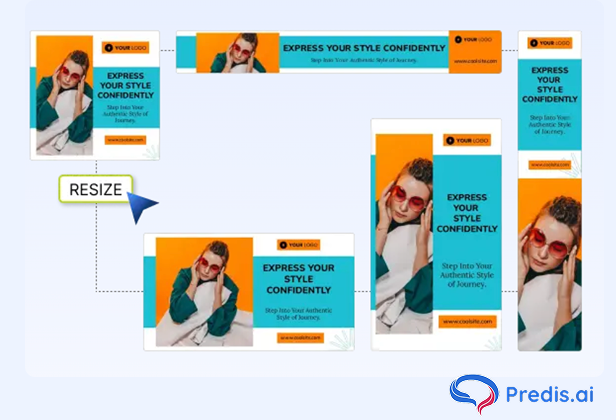
They come in a range of sizes, including:
- Leaderboard (728×90 pixels)
- Medium Rectangle (300×250 pixels)
- Wide Skyscraper (160×600 pixels)
- Mobile Leaderboard (320×50 pixels)
Effective Banner Ad Design Tips
Though there are several unique ad formats and technologies available in the market, banner ads are still strongly prevalent. They capture attention, drive traffic, and boost conversions.
So, if you want to design banner ads that attract clicks and convert them into meaningful actions, here are the best practices.
1. Define Your Goal
Each banner ad must seek to achieve set goals. What are you trying to accomplish? Is it increasing brand awareness, driving traffic to the site, or promoting a specific product or offer?
Your design should reflect the objective. For example, a banner ad with the aim of creating more brand awareness may have more emphasis on visuals and logos. But, if your goal is to drive traffic, your banner ad must include a stronger call-to-action (CTA).
2. Understand Your Audience
Having substantial knowledge about your target audience is vital in this context. Demographics, interests, and behaviors should be reflected in your banner ad. Use market research techniques to gain insight into what your audience prefers and use these findings when deciding on design aspects.
3. Utilize High-Quality Photos
Banner ads depend heavily on their visual appeal aspect. Therefore, avoid generic stock photos.
Instead, take advantage of high-resolution pictures that will grab the attention of viewers. Opt for ones that reflect your brand’s image and convey the intended message clearly through visual means. Furthermore, if possible, use custom graphics or photographs that can make you stand out from other adverts.
4. Optimization for Different Devices
Your banner ad needs to look good either on desktop or smartphone screens. Test the designs on different screen sizes to ensure they are responsive and maintain their appeal regardless of which device they’re viewed on.
5. Use Animation Wisely
Though animated banners can be more engaging than static ones, care must be taken when using them. The animation should be a little sharp but rather smooth and get attention without alarming users too much. In order to immediately catch users’ attention, the primary message and CTA must appear within the initial seconds of the animation.
6. Test Different Variations
Banner ad design is a sophisticated advertising tool. Create different iterations of your Ad and test them to determine which one works best. Try out several headlines, images, colors, and CTAs to find the most captivating blend.
7. Stick To Design Rules
Most advertising platforms have specific guidelines on design and restrictions when it comes to banner ads. Know these guidelines so as not to be turned down by the system for any reasons at all or rejected your ads. It includes file size limits, acceptable formats, and animation length restrictions.
Create stunning banners effortlessly using Predis.ai's AI Banner Maker—boost your ad performance and conversions.
Effective Banner Ad Campaigns: Latest Case Studies
Here are some of the latest case studies that can help you create effective banner ad campaigns.
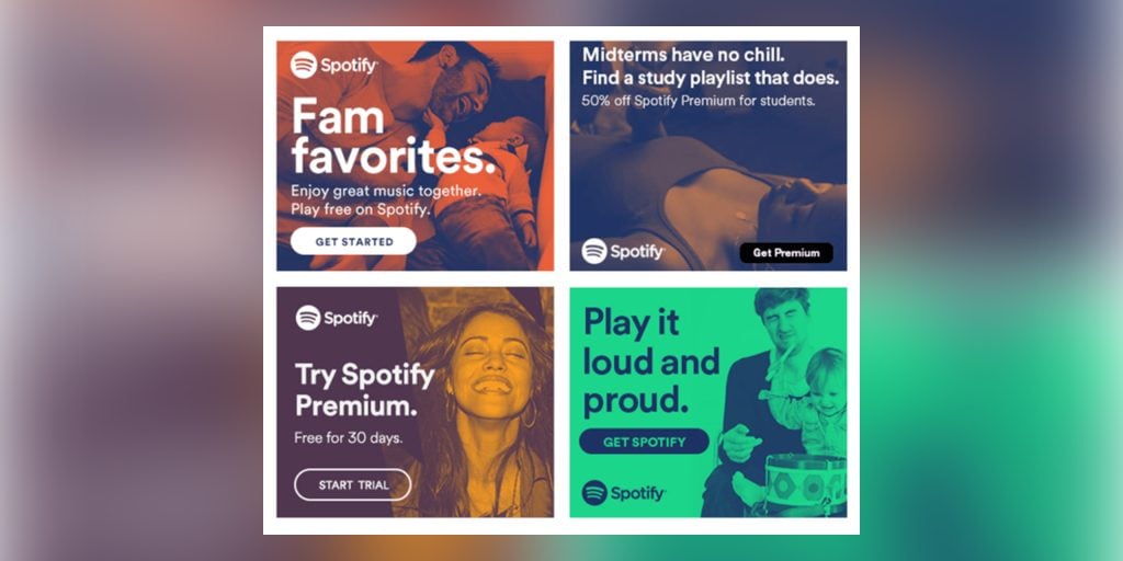
Case Study 1: Spotify’s “Listening Is Everything” Campaign
Objective: Promoting the consumption of music from Spotify to increase the number of users of Spotify’s paid services.
Strategy:
- Personalized Visuals: Applied data visualization where the locations targeted choice of playlists and artists based on users’ demographic data.
- Simple, Catchy Tagline: Huge letters “Listening Is Everything” were used as the company’s tagline that highlighted the importance of the service.
- Strong CTA: The “Listen Now” button and “Upgrade to Premium” were clearly present, thus prompting an instant call to action.
Results: From this campaign, they got a huge uplift in premium service subscriptions and an increase in user interactions with personalized playlists, thus supporting the idea of data-driven creativity in advertising.
Case Study 2: Zoom’s “Connect From Anywhere” Campaign
Objective: Recommend Zoom’s video conferencing applications to support and make remote arrangements easier.
Strategy:
- Relevant Imagery: Illustrated the range of people and their Zoom call contexts, including home office setups and in class settings.
- Clear Messaging: The freedom it offers and how you can quickly connect anytime with the web conferencing tool was summarized with a catchy phrase, “Connect From Anywhere. ”
- Consistent Branding: Supported recognition and awareness of Zoom through brand colors and design.
Results: The campaign boosted the number of new users and existing active users, with increased user engagement noticed among both remote workers and educational institutions.
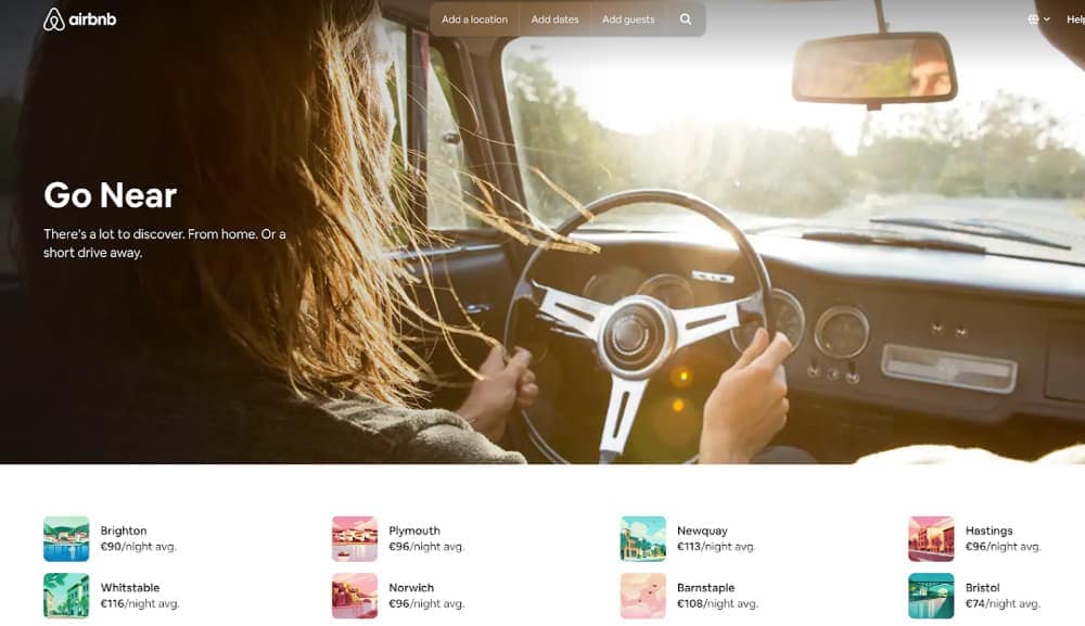
Case Study 3: Airbnb’s “Go Near” Campaign
Objective: Promote domestic tourism and ‘staycation’ holidays if you are unable to travel abroad.
Strategy:
- Localized Imagery: Met cinematic expectations showcasing beautiful, less-known local attractions.
- Relevant Messaging: Some of these are ‘Go Near’ to encourage people to travel nearby as they were still reluctant to travel far from home.
- Consistent Branding: Kept the design aesthetic of Airbnb playful and inviting and remained functionally and aesthetically accessible.
Results: It was claimed that the reaction of the campaign led to an increase in bookings for a stay near the locals only, proving the importance of timely oriented advertising.
Case Study 4: Apple’s “Privacy. That’s iPhone.” Campaign
Objective: Promote the privacy features of the latest iPhone models.
Strategy:
- Informative Visuals: Used graphics and animations to explain privacy features in a user-friendly manner.
- Clear, Direct Message: The tagline “Privacy. That’s iPhone.” was simple yet powerful, directly addressing consumer concerns.
- Strong CTA: Encouraged users to learn more with “Find Out How” buttons, leading to detailed information on Apple’s website.
Results: The campaign resulted in a substantial rise in iPhone sales and enhanced customer perception of Apple as a leader in privacy protection.
Advanced Techniques for Effective Banner Ads
Below are some advanced techniques for effective banner ads.
1. Personalized Ads
Your banner ads can be significantly more effective if you personalize them. Utilize data to make advertisements that are tailored to specific user groups. It could mean letting users see different products based on their search history or even giving offers on a location basis.
2. Interactive Elements
Engagement is increased through interactive elements. For instance, this may involve expandable ads whereby users have an option of clicking on them so as to show more information about it or having mini-games or quizzes in the ad itself. Make sure these elements are simple and add value to customer perception.
3. Use of Video
Video adverts are usually more compelling than static images. Short videos that provoke curiosity can capture attention faster and can deliver more information. Be concise with your video content and give a clear CTA within it.
4. Geo-Targeting
Geo-targeting enables businesses like yours to show ads to individuals at various locations where they need them shown within certain areas. This is especially vital for local businesses or events being held there. Adapt your message per user’s location for higher relevance and better results.
Common Pitfalls to Avoid
Some common pitfalls to avoid when creating a banner ad design are as follows:
1. Information Overload
One of the most common errors is trying to put less information. Keep in mind that the aim is to capture one’s attention and motivate them to click on it. Hence, providing a little bit of information will make people want more.
2. Substandard Quality Images
Low-resolution images can destroy your brand image. Always use high-resolution images, and ensure that they are well optimized for the web.
3. Weak CTA
A weak CTA or lack thereof can lead to reduced click-through rates. Therefore, your call to action should be persuasive, actionable, and easy to find.
4. Neglecting Analytics
You have to review your ad metrics and work on your strategy accordingly. Besides, analyze the performance regularly to find out what works and what does not depending on the data.
Final Thoughts
Designing effective banner ads is an excellent combination of art and science. It requires a balance of innovative design, strategic consideration, and data-driven optimization. Moreover, continuous testing and optimization are key to staying ahead in the dynamic digital advertising landscape.
Whether you’re a small business or a large corporation, learning the art of banner ad design can greatly impact your marketing success. By enforcing the best practices and advanced strategies, you can create banner ads that not only capture attention but also drive meaningful results.
Transform your social media strategy with Predis.ai, the ultimate tool for content creation and optimization. Whether you’re a seasoned online marketer or just starting with your social media post generator, Predis.AI empowers you to craft compelling, data-driven posts that captivate your audience and boost engagement. To know more, sign up on Predis today.
Elevate your ad campaigns with Predis.ai's AI Ad Generator—design compelling ads effortlessly.
Related Content,
Inspiring Examples for Dynamic Banner Ads
Banner Ad Costs in 2024: A Comprehensive Guide
Top Banner Ideas for the Automobile Industry
Creating a YouTube Banner: Best Practices
