There are 8 billion people on Earth, of whom 33% shop online. The global eCommerce market is projected to reach a value of $6,478 billion by 2029.
This is how massive the scope of eCommerce is.
Every business and brand indulging in eCommerce makes the best possible effort to optimize its online store and maximize profits. The objective is to reach the target audience and gain maximum conversions.
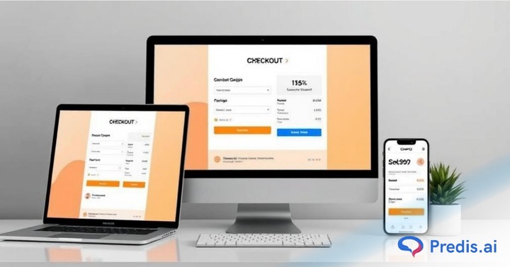
One crucial aspect of eCommerce stores is the checkout page. Normally, this section is ignored and doesn’t get the attention it deserves.
Imagine a customer who has just finished adding your products to the cart and wishes to checkout. Now, if he has to fill in a lot of information or forms before making the payment, or if the checkout page is not mobile-friendly, it will dissuade him from continuing with the purchase. And so, businesses lose customers.
Businesses must avoid such scenarios and apply the best checkout designs to their e-commerce stores. Checkout page designs for e-commerce have the power to convert visitors into consumers and, if not framed well, can lead to lost sales and decreased profits.
Consider this a red flag, especially if visitors abandon carts at checkout. Let’s delve deeper into the concept of checkout page designs for e-commerce and learn some best practices to earn the trust of our audiences!
What is an Optimal Checkout Design?
The checkout design isn’t really about how your checkout page looks or how beautifully or aesthetically it is designed. Instead, it should include ease of use, mobile-friendly loading, accessibility, user experience, multiple payment options, and credibility.
However, achieving these elements requires professional e-commerce website design that integrates seamlessly with your overall store architecture and user flow.
The checkout page is the final stage when your customers finalize their purchases. This is the page where they choose payment methods, provide their shipping and billing details, and confirm their orders.
It’s essential to create a checkout page that converts well. If the process is smooth, multiple conversions happen at the checkout. You should continuously test and optimize your checkout to improve conversions.
What is Checkout Abandonment?
Imagine a customer who likes your products, adds items to the cart, and reaches the checkout process. However, if he leaves before completing the transaction, it is called checkout abandonment.
In simple terms, it is a lost opportunity to make profits and complete sales! The average cart abandonment rate is 70.19%, and here are some of the key reasons, as reported by consumers:
- 48% Extra costs too high
- 26% The site wanted me to create an account
- 25% I didn’t trust the site with my credit card information
- 23% ecommerce delivery was too slow
- 22% Too long or extremely complicated checkout process
- 21% I couldn’t see I couldn’t calculate the total order cost up-front
- 18% Returns policy wasn’t satisfactory
- 17% of Websites had errors / crashed
- 13% There weren’t enough payment methods
- 9% The credit card was declined
Businesses must understand and address such issues through analytics. A user-friendly and mobile-friendly checkout page can eliminate the risk of cart abandonment and enhance the user experience.
Types of Checkout Designs
There are two types of checkout designs:
1. One-Page Checkout Page Designs for E-Commerce
Everything you need while checking out is on one page, which is a highly preferred checkout design and speeds up the process.
Customers don’t need to go through additional page loads, as navigating through multiple pages could be cumbersome. Besides, they can easily scroll to review information.
However, businesses that ask for a lot of information from customers using that one page can drive consumers away. It is also technically tedious to have everything on one page.
2. Multiple-Page Checkout Page Designs for E-Commerce
Businesses can divide the checkout process into multiple pages to make it easier to manage. Although this may seem time-consuming at first, such designs help businesses extract critical information from consumers and track where they dropped out of the process. Many companies rely on a flat fee design service to build such structured checkout flows, ensuring a balance between user convenience and data-driven insights.
You must use data analytics to see which checkout design works best for you—a one-page or a multi-page design. Both can be effective if designed with the end user in mind. If you’re setting up from scratch, choosing a flexible ecommerce website builder can simplify implementing either checkout type efficiently.
Main Elements of an Effective Checkout Page
When creating an enticing and mobile-friendly checkout page for your eCommerce store, consider the following elements:
- Effective Web Design: An effective web design for checkout pages is not just about aesthetics; it’s about crafting a smooth and intuitive experience for users. With the right design elements in place, users can easily navigate through the process, making it more likely they’ll complete their purchases.
- Step-by-Step Guidance: Walk users through each phase of the checkout process. Use the right text, symbols, or emoticons to help customers fill in their details to select billing and shipping options.
- Order Customization Options: Allow users to modify their order directly from the checkout page. Even if the customer wants to modify the order at the last minute, they should be able to access their shopping details from the checkout page.
Top Practices for Implementing the Best Checkout Page Designs for eCommerce
Here are 14 best practices for designing a checkout page that optimizes your conversion rate:
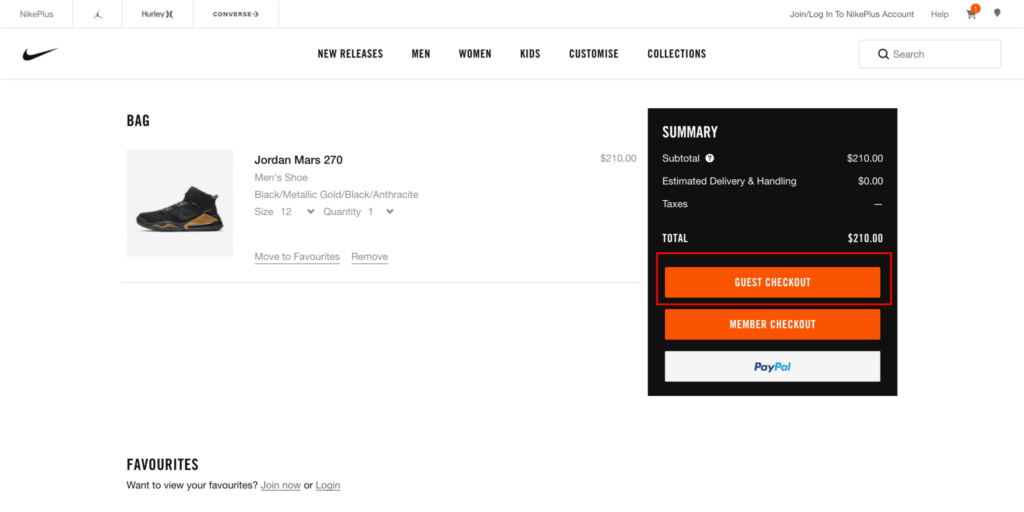
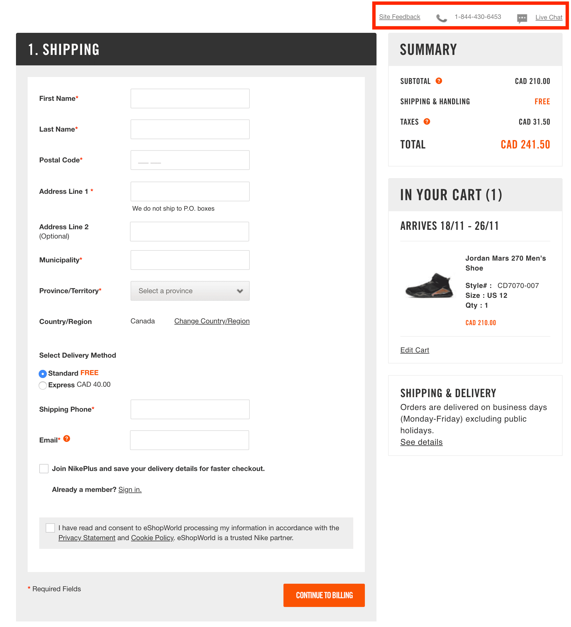
1. Enable Guest Checkout
Give your consumers the leverage to sign in as guests and purchase products. Let customers choose whether to create an account. While it’s good for lead generation, don’t force it on them.
Customers who are looking for a one-time purchase won’t be very happy with such a forceful registration process. You can suggest it after consumers have completed the purchase process.
Check out how Nike offers a guest checkout process:
2. Avoid Distractions
Undoubtedly, discounts, deals, and promotions can help you augment sales. However, placing them on the checkout page could distract your leads and prevent them from completing the transaction.
3. Don’t Forget Mobile Users
With more than 61.95% of website traffic coming from mobile devices, it’s essential to optimize your checkout process via e-commerce mobile app development for mobile users.
4. Inform Shoppers of Additional Costs
To prevent surprises at checkout, clearly disclose any extra costs like taxes and shipping fees early in the process. This transparency helps maintain trust and reduces cart abandonment.
5. Use Form Validation
Instantly notify users of errors during form entry to prevent frustration at the end of the checkout process. This keeps the experience smooth and reduces the chances of abandonment.
6. Offer Multiple Payment Options
If you do not offer preferred payment options to consumers, it becomes a common reason for cart abandonment. Offer a variety of payment methods through an EPOS system to your audience and capture more sales.
For instance, a Bitcoin payment option. It has become faster and more secure than some traditional payment methods. Also, it’s responsible for over 40% of the total crypto market capitalization. This indicates its stability in time.
7. Prioritize Your Audience’s Comfort and Offer Assistance
Design your checkout process, and don’t expect your consumers to fill in a lot of information or text in form fields. Simply stick to fundamental information and guide users through the process efficiently.
8. Ensure Responsive Design
As mobile shopping grows, ensure your checkout design is responsive and functions across all devices. This includes making buttons larger and more tappable to accommodate interactions.
9. Use a Progress Bar
Show customers a visual representation of their checkout progress. This can provide clarity and motivate them to complete the purchase.
10. Send a Purchase Confirmation Email
After a purchase, send a confirmation email that reassures customers about their order. You can also introduce deals and discounts which offer additional value. This enhances customer satisfaction and loyalty.
11. Request for Customer Reviews
Social proof is a significant marketing technique. Many customers prefer hearing from other buyers to know how they feel about the product and service.
You can give an option to your consumers (after they complete the purchase) for their opinion or rating on the checkout process. This can reassure shoppers about the quality of the product and the service.
12. Use Emotion to Inspire
To encourage purchases, create urgency and a fear of missing out. You must emotionally connect with customers and make them feel that the offer is exclusive.
This will help add value and increase sales. To motivate buyers, you can show them when a deal is about to end, when a product is nearly sold out, or even when inventory is low.
13. Use Checkout Buttons to Make the Process Ultra-Fast
Add fast checkout buttons, which will make the payment process quick and easy for customers. This works best for consumers who already have their saved information with you. This encourages them to come back again for shopping as it saves them time and effort on repeat purchases.
14. Auto-Save Feature of the Checkout Progress
Even if the consumer leaves some products to check out later, you must have the feature of auto-saving their cart or checkout progress. This can help recover abandoned carts and let customers easily pick up where they left off.
It can also help you track abandoned carts, and you can use this information to reconnect with consumers. Send emails reminding customers of what they missed and making it easy for them to complete their purchases.
Lessons from the Best Checkout Page Designs
While there are various approaches to checkout design, all effective strategies share common features:
- Simplicity and Speed: To expedite the process, keep form fields to a minimum and consider using a single-page design.
- Constant Updates: Use progress indicators to inform shoppers of their checkout status.
- Accessible Support: Make help readily available through visible contact options like phone numbers or live chat.
- Trust Signals: Display security badges and payment logos to reassure customers about the safety of their transactions.
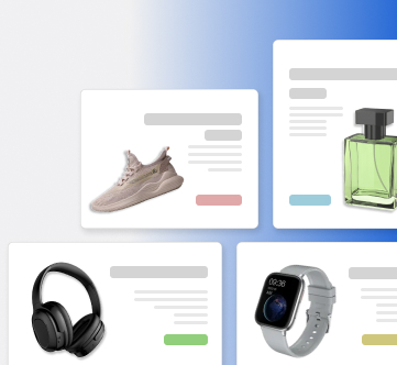
- Visual Confirmation: Include product images in the checkout to remind customers of what they’re purchasing and reinforce their buying decision. Use Predis.ai to create exceptional checkout designs for your e-commerce store.
- Flexible Cart Editing: Allow easy modifications to the cart directly from the checkout page to prevent customers from leaving due to minor changes.
10 Best Checkout Page Examples
Here’s a look at 10 standout checkout page examples that can inspire you to enhance your eCommerce platform.
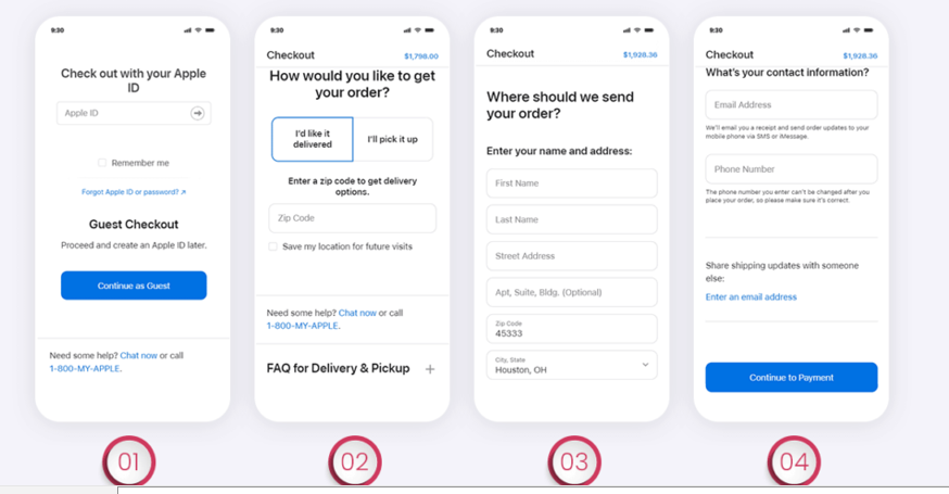
1. Apple
Apple’s checkout page revolves around simplicity. It allows users to check out as guests and avoid unnecessary clutter. They’ve even removed the progress indicator to streamline the interface further.
Apple ensures that help is always at hand with a chat and a call button at the end of the checkout. They also have a FAQ section to answer any queries during the purchase process.

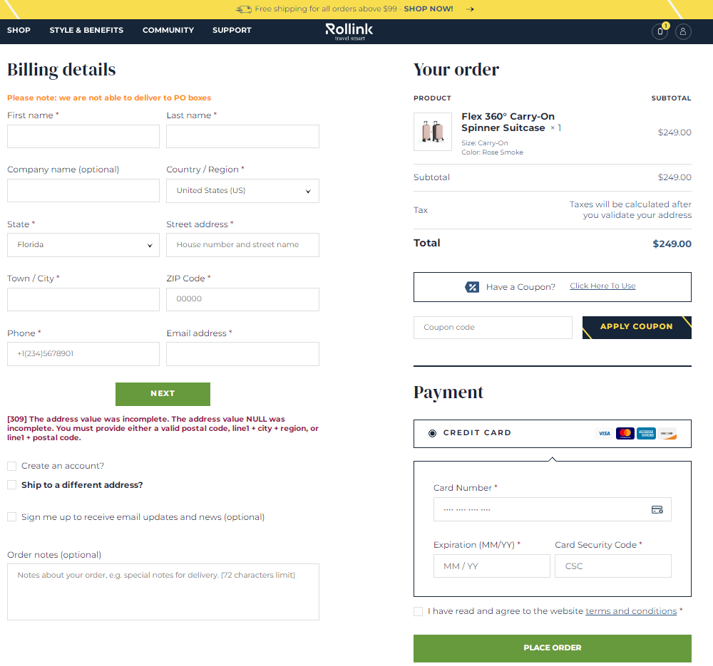
2. Rollink
Rollink, known for its collapsible suitcases, offers a checkout experience that includes a coupon code field, a detailed cart overview, multiple payment options, and a clear “Place Order” button. This approach features mandatory fields and visual aids to guide users through correct information input.
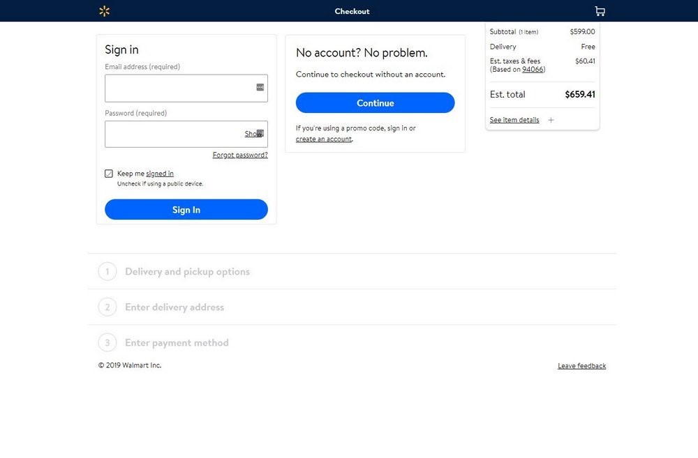
3. Walmart
Walmart offers a straightforward 3-step checkout process that focuses on delivery and payment options. Such a process allows customers to either pick up their purchased products from a nearby store or have them delivered to their address.
The brand provides multiple shipping options, minimal forms, and the convenience of saving items for later purchases.
4. Casper
Just like Apple, Casper simplifies the checkout process with a clean one-page layout that appears as multiple steps to aid navigation.
Each section only displays after the previous one has been completed, and edit options are readily available, making it especially user-friendly for mobile shoppers.
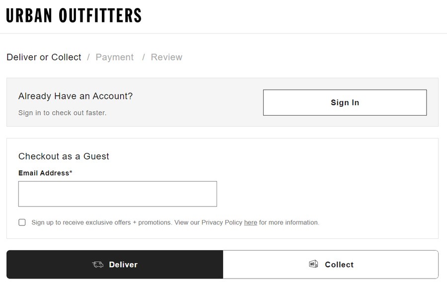
5. Urban Outfitters
Urban Outfitters uses a 3-step checkout process. This process allows customers to enter contact info and payment details and, finally, review their order before payment, which is similar to the approach used by some major retail stores.
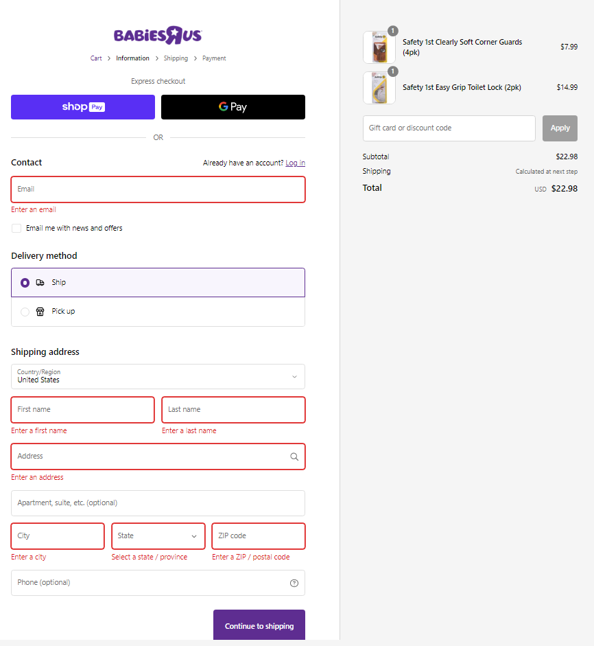
6. Babies R Us
Babies R Us integrates helpful visual cues in their checkout form to indicate missed mandatory fields. They also keep shipping costs transparent, which encourages a trustworthy environment.
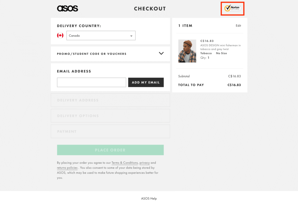
7. ASOS
ASOS’s checkout process is streamlined and mobile-friendly. It has a 4-step process that could be optimized further by combining shipping address and method into one step.
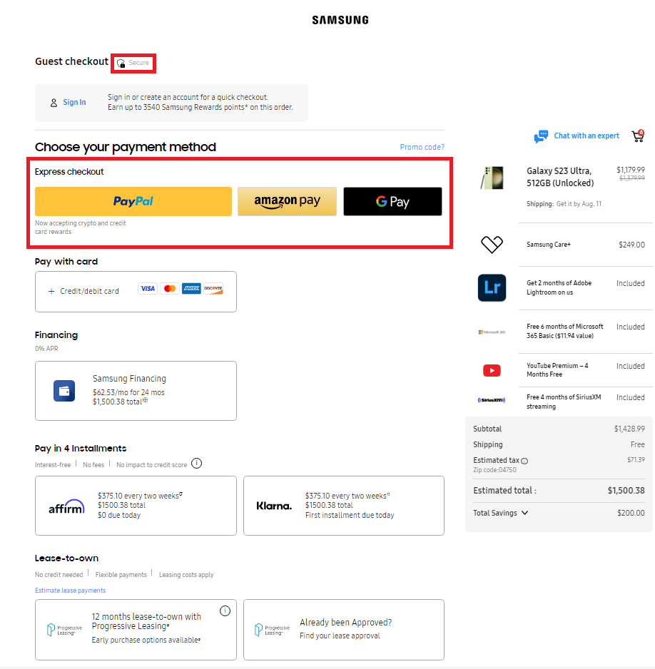
8. Samsung
Samsung’s checkout page showcases a variety of payment options and promotional code fields, along with the ability to modify the shopping cart directly from the checkout page, emphasizing flexibility and customer empowerment.
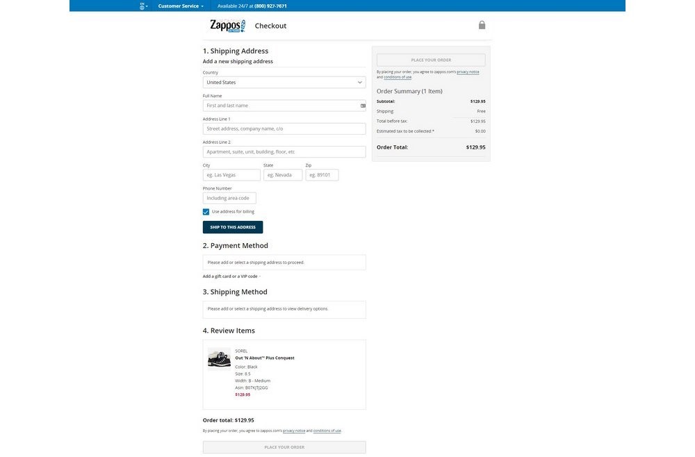
9. Zappos
Zappos features a comprehensive but straightforward checkout process that guides new users smoothly through each step, although it does require users to sign in or create an account.
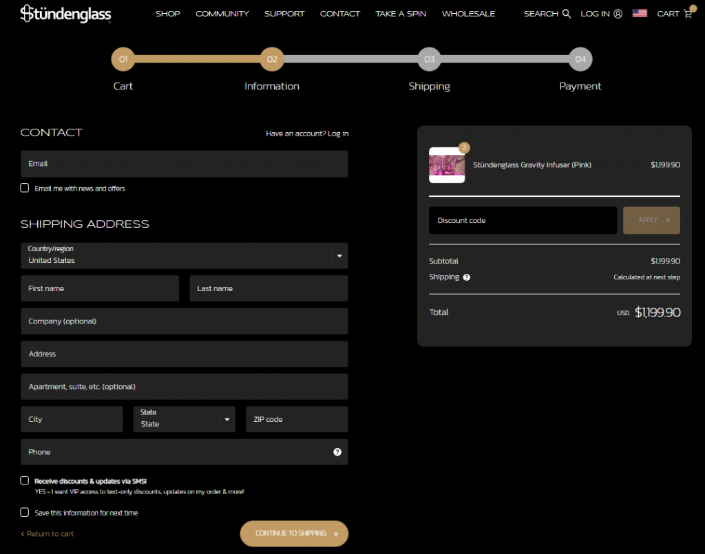
10. Stündenglass
Stündenglass, known for its innovative Glass Gravity Infusers, offers a checkout experience on a visually appealing dark-themed layout. This design emphasizes progress tracking and integrates a discount code field smoothly into the checkout process.
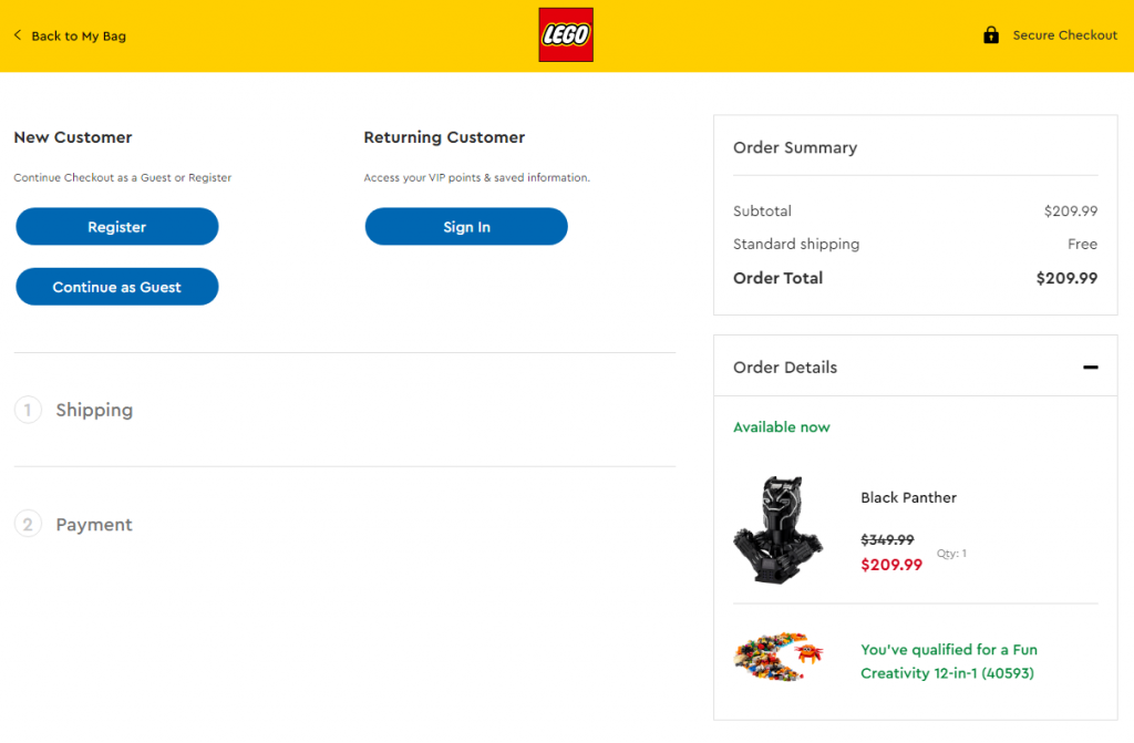
11. Lego
Lego’s checkout page design is simple and effective, with a 2-step process that facilitates a quick and easy checkout experience. They also provide a guest checkout option to eliminate potential friction.
How to Evaluate Your Checkout Page Design?
To ensure a seamless shopping experience, it’s essential to evaluate your checkout page thoroughly. Here are some critical tests to conduct:
- Functional Testing: Verify that the payment process handles orders correctly. It should include accurate calculations for totals and taxes.
- Cross-Browser Testing: Using automation testing tools, ensure the checkout flow functions well across different browsers and operating systems. To dive deeper into this topic, explore this guide on cross-browser testing, which covers key strategies and tools for achieving consistency and reliability across environments.
- Integration Testing: Check the integration with your payment gateway to confirm that transactions flow smoothly.
- Performance Testing: Test the site’s ability to handle multiple transactions to ensure stability and speed during high traffic.
- Security Testing: Ensure that all sensitive data, such as payment information, is securely encrypted during checkout by leveraging professional mobile app security testing. Conduct regular security assessments to identify and address potential vulnerabilities.
- Geolocation Testing: Test the checkout experience from different locations to ensure correct language, currency, and tax calculations.
You should also monitor these key performance indicators (KPIs) to understand your checkout page’s effectiveness:
- Cart Abandonment: Track the percentage of visitors who leave their carts without purchasing.
- Checkout Engagement: Measure how actively users interact during the checkout process.
- Checkout Conversion: Gauge the success rate of users who complete purchases versus those who start but do not finish the checkout.
- Accelerated Checkout: Count instances where users choose quick payment options to skip standard checkout steps.
- Mobile Abandonment Gap: Compare the effectiveness of the checkout process on mobile versus desktop platforms.
Boost eCommerce Sales with Social Media 🤩
MAKE POSTS WITH AI
What are the Standard Checkout Process Steps?
The checkout design process involves several steps that every online business must consider:
Step 1: Simplify the Purchase Sequence
Make the buying process simple. A clean interface helps. The fewer steps, the better: gather personal and shipping info, ask for payment details, and confirm the order. Anything else can come after the purchase, like asking users to create an account or verify their email.
Step 2: Ensure Quicker Page Loading
Slow pages lose visitors. If your site takes over five seconds to load, your conversion rate drops. A fast website offers a better user experience, encourages repeat purchases, and speeds up checkout. Remove unnecessary elements, use smaller media files, upgrade your servers as needed, and monitor load speed using tools.
Step 3: Create an Optimal Checkout Design for Mobile Devices
Most online shopping is done on mobile devices. Ensure your site is mobile-friendly so users don’t have to zoom in or deal with blocked buttons. Create a mobile version of your site for a better mobile experience.
Step 4: Guide customers to find what they want
There could be customers who are looking for additional bundled-up products or consumers who simply want to go through your inventory list. Make contingency options within your checkout design space to allow consumers to get what they want.
Step 5: Avoid Extra Charges at Checkout
Unexpected or hidden charges are a major reason for cart abandonment. Inform customers about taxes and customs fees upfront and avoid surprising them with extra costs at the end. Offer free shipping codes or include shipping in the product price to avoid added fees at checkout.
Step 6: Provide an Autosave Feature
Save customers’ data to facilitate repeat purchases. Allow them to save their billing information, payment details, and cart contents to avoid re-entering information each time.
Step 7: Make Returns as Easily Accessible as Purchasing
Returns are heartbreaking for businesses; however, you must ensure that the return procedure is smooth, which will help you attract repeat customers. 96% of customers say they will return to a business if it offers a smooth return procedure.
Step 8: Form a Relationship with your Consumers
Your transaction isn’t over even after the customer pays at the checkout process. You must keep in touch with your customers and nurture a relationship with them. Remind them of products that they liked or selected but didn’t purchase.
Email them about new offers and deals that can lure customers. To invite them back to your store, reward them with a loyalty bonus or next-purchase discount. The goal is simple—to get your products into the customers’ hands!
Conclusion – Checkout Page Design
Developing excellent checkout designs means having a thorough understanding of your customers’ needs. It also means continuously testing your eCommerce store page and enabling different enhancements.
Whether you choose a one-page or multi-page checkout design, you must take measures to speed up the process, remain uncluttered, and offer a more organized layout.
Use exceptional tools like Predis.ai and create the best checkout designs for your e-commerce store. Consider implementing the best strategies as discussed above, and draw inspiration from successful examples.
Let the experts help you identify improvement areas to enhance your checkout effectiveness, reduce cart abandonment rates, and boost eCommerce sales. Remember, a smooth checkout experience can help you win high conversion rates. Sign up today for more information.
Transform your eCommerce marketing with compelling product ads made easy using AI-powered Predis.ai's Ecommerce Ad Maker.
Related Content,
Top Strategies for eCommerce Conversion Rate Optimization