


Typography plays an important role in advertising. It’s not just about choosing a font that looks good, it’s about selecting the right typeface that communicates and helps set up your brand message effectively. The right font can capture attention, create an emotional connection, and influence how customers perceive your brand.
Think about some of the biggest brands in the world: Coca-Cola, Google, or Nike. Their fonts are instantly recognizable and contribute to their brand identity. Imagine if Coca-Cola suddenly changed its logo to a plain, blocky font. It would lose its classic, elegant feel. That’s how powerful typography can be in branding and advertising.
This article will explore why typography is important in advertising, how it affects consumer perception, and how to choose the best fonts for ads.

Importance of Typography in Advertising
Typography is more than just letters on a screen or paper. It’s a design element that helps convey emotions, build brand identity, and guide the viewer’s focus.
1. First Impressions Matter
The font you use in an ad is one of the first things people notice. Studies suggest that people form an opinion about a brand within 50 milliseconds of seeing its visual elements, including typography. If your ad uses a messy, difficult-to-read font, people might assume your brand is unprofessional or outdated.

For example, luxury brands like Chanel and Dior use clean, elegant serif fonts to create a sense of sophistication. On the other hand, brands targeting a younger audience, like Spotify, use bold and modern sans-serif fonts to appear fresh and dynamic.
2. Enhances Readability and Communication
Your ad’s message needs to be clear and easy to read. If customers struggle to read your text, they’ll move on without engaging. A study by the MIT AgeLab found that simple, easy-to-read best fonts for ads improved reading speed by 35% compared to decorative or overly stylized fonts.

For instance, a billboard with a fancy cursive font may look artistic, but if drivers can’t scan it, the ad fails its purpose. That’s why brands often use Helvetica or Arial for advertising, these fonts are clean and readable at any size.
3. Builds Brand Identity and Recognition
Fonts create a visual personality for your brand. A bold, heavy font can make your brand look strong, while a light, handwritten font can feel friendly and informal.
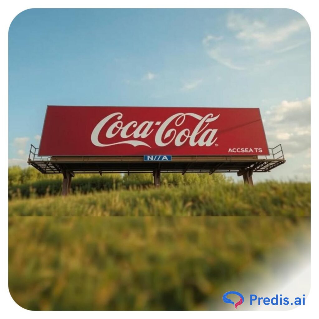
Think about Coca-Cola’s iconic script font. It conveys tradition, nostalgia, and elegance. Now compare that to Google’s simple and modern sans-serif font, which feels friendly, innovative, and approachable. Choosing the best fonts for ads can help shape how people perceive these brands.
4. Creates Emotional Connections
Different fonts evoke different emotions.

- Serif fonts (e.g., Times New Roman, Garamond) with tradition, trust, and authority.
- Sans-serif fonts (e.g., Helvetica, Futura) with modernity, simplicity, and clarity.
- Script fonts (e.g., Pacifico, Brush Script) with creativity, elegance, and warmth.
- Bold, heavy fonts (e.g., Impact, Bebas Neue) with strength, urgency, and excitement.
How the Right Font Influences Brand Perception and Engagement
Choosing the right font can greatly affect how people interact with your ads. It affects:

1. Trust and Credibility
People subconsciously judge a brand’s credibility based on typography. A study found that people were more likely to believe statements written in a serif font (like Baskerville) than in a casual sans-serif font (like Comic Sans).
Example:
- A financial services company using Baskerville or Garamond appears more professional and trustworthy.
- A casual café using Lobster or Pacifico looks more inviting and relaxed.
2. Attention and Engagement
The right typography grabs attention and keeps people engaged. If a font is too plain, people might overlook it. If it’s too fancy, they might struggle to read it.
Example:
- Bold, uppercase fonts like Impact or Bebas Neue work well for headlines because they immediately capture attention.
- Soft, rounded fonts like Montserrat or Poppins create a friendly and inviting feel for lifestyle brands.
3. Call-to-Action (CTA) Effectiveness
Your Call-to-Action, such as “Buy Now,” “Sign Up,” or “Learn More,” should stand out. The best fonts for ads that are bold and high-contrast increase the chances of people clicking.
Example:
- A thin, light font for “Order Now” may go unnoticed.
- A bold, high-contrast font (e.g., Poppins Bold or Oswald) increases visibility and urgency.
4. Multi-Platform Adaptability
Your ads appear on various platforms like social media posts, billboards, websites, and print. The right font should be versatile and look great on all screens and sizes.
Example:
- Helvetica and Roboto are commonly used in digital ads because they are legible on both small and large screens.
- Futura and Gotham are great for print ads because they maintain clarity in high-resolution formats.
Factors to Consider When Choosing a Font for Ads
Choosing the right font for your ads is important. A well-chosen font makes your message clear, attracts attention, and creates the right impression of your brand. Here are 10 important factors to consider when selecting fonts for advertisements

1. Readability and Legibility
The most important factor is how easy your font is to read. A font may look stylish, but if people struggle to read it, your ad loses its impact.
- Readability refers to how easily words and sentences can be understood at a glance.
- Legibility is about how clear individual letters and characters appear.
Example: A script font like Brush Script might look elegant, but it can be hard to read in a long paragraph. Instead, a simple sans-serif font like Helvetica is much easier to read, especially in digital ads.
2. Brand Identity and Personality
Your font should match your brand’s personality and values. The best fonts for ads communicate emotions and set the tone for your business.
- Serif fonts (e.g., Times New Roman, Garamond) → Traditional, trustworthy, and professional brands.
- Sans-serif fonts (e.g., Helvetica, Futura) → Modern, clean, and minimalistic brands.
- Script fonts (e.g., Pacifico, Lobster) → Elegant, creative, or personal brands.
- Bold and heavy fonts (e.g., Impact, Bebas Neue) → Powerful, strong, and urgent messaging.
Example: A law firm should use a serif font like Garamond to appear professional and credible, while a fashion brand might use a sleek, stylish font like Futura for a modern feel.
3. Font Size and Scalability
Your font should look clear and readable in all sizes, whether on a billboard or a mobile screen. Some of the best fonts for ads look great in large text but become hard to read when shrunk.
Example: Arial or Montserrat works well because they stay readable even when resized, while thin or overly decorative fonts may become unclear on smaller screens.
4. Contrast and Visibility
The font should stand out from the background to ensure easy reading. Low contrast (light text on a light background) can make text hard to see, while high contrast (dark text on a light background) improves visibility.
Example: White text on a dark blue background (high contrast) is easy to read, but yellow text on a light gray background (low contrast) can be difficult to see.
5. Emotional Impact and Psychology
Different fonts create different emotions. Your font should match the feelings you want to evoke in your audience. This evokes emotional advertising which is a major key to successful brand awareness.
- Rounded fonts (e.g., Poppins, Fredoka One) feel friendly and approachable.
- Thin, elegant fonts (e.g., Playfair Display) feel luxurious and sophisticated.
- Bold fonts (e.g., Impact, Oswald) feel strong and urgent.
Example: A children’s toy brand might use a fun, bubbly font like Comic Sans, while a luxury watch brand would use an elegant font like Baskerville.
6. Compatibility Across Platforms
Your ads will appear in different formats social media, websites, print, TV, and billboards. Your font should work well across all platforms.
Example: Roboto and Open Sans are popular digital fonts because they are optimized for screens, while Garamond works well in print.
7. Number of Fonts Used
Using too many fonts can make an ad look cluttered and unprofessional. Stick to 2-3 fonts to maintain consistency.
- Primary Font – Used for headlines (e.g., Bebas Neue).
- Secondary Font – Used for body text (e.g., Lato).
- Optional Accent Font – Used for emphasis or branding (e.g., a stylish script font).
Example: A real estate ad might use Bebas Neue for the headline, Lato for details, and a script font for a call-to-action like “Luxury Living Awaits!”
8. Font Weight and Style Variations
Some fonts come with different weights (light, regular, bold, extra bold) and styles (italic, uppercase). Choosing a font with multiple variations gives you flexibility.
Example: Montserrat has multiple weights, allowing you to use a thin version for subheadings and a bold version for CTAs like “BUY NOW!”
9. Cultural and Industry Relevance
Certain fonts are associated with specific industries or cultures. Choosing the wrong font can send mixed messages.
Example: A tech startup should use a modern sans-serif font like Inter, while a wedding planner should go for an elegant script font like Great Vibes.
10. Licensing and Accessibility
Some fonts require a license for commercial use, while others are free. Make sure you check font usage rights before using them in ads.
Example: Google Fonts (e.g., Roboto, Poppins, Open Sans) are free to use, while premium fonts like Gotham or Proxima Nova require a paid license.

Best Fonts for Advertising
Choosing the right font for advertising is essential to create a strong brand identity, communicate your message effectively, and grab your audience’s attention. Here are some of the best fonts for ads that are categorized by their style and purpose.
1. Serif Fonts (Traditional & Trustworthy)
Serif fonts have small decorative strokes (serifs) at the ends of letters, giving them a classic, professional, and trustworthy feel. These fonts are commonly used in print advertising, luxury brands, and formal industries like finance and law.
- Times New Roman – A timeless, professional font often used in newspapers and formal documents. It conveys credibility and tradition.
- Garamond – Known for its elegant and refined design, this font works well for luxury brands and high-end publications.
- Baskerville – A sophisticated font with high contrast, making it perfect for advertisements that require authority and class.
Best for: Luxury brands, newspapers, law firms, and high-end retail advertising.
2. Sans-Serif Fonts (Modern & Clean)
Sans-serif fonts do not have decorative strokes, making them look clean, minimal, and modern. They are widely used in digital ads, tech companies, and brands that want a fresh and approachable look.
- Helvetica – One of the most popular advertising fonts, known for its clean and neutral appearance. Used by brands like American Airlines and Toyota.
- Futura – A geometric and stylish font that conveys innovation and forward-thinking. Often used in fashion and technology ads.
- Avenir – A sleek, futuristic font with a balanced design, making it ideal for both digital and print advertising.
Best for: Tech companies, startups, modern brands, and digital marketing.
3. Display Fonts (Bold & Attention-Grabbing)
Display fonts are designed to stand out and capture attention. These fonts are often used for headlines, billboards, and advertisements that need to make a strong impression.
- Impact – As the name suggests, this bold font is highly visible and great for powerful messages in advertising. Used in memes and urgent sales banners.
- Bebas Neue – A modern, bold, and tall font that works well for headlines and branding. Often used in posters and product ads.
- Playfair Display – A high-contrast serif font that blends classic elegance with a modern touch, ideal for fashion and luxury advertising.
Best for: Billboards, posters, bold headlines, and urgent call-to-action messages.
4. Script Fonts (Elegant & Personalized)
Script fonts mimic handwritten or calligraphy styles, adding elegance, personality, and warmth to an ad. These fonts are great for creative and lifestyle brands.
- Lobster – A stylish and eye-catching script font with a bold, modern twist. Used in food and fashion branding.
- Pacifico – A friendly and casual handwritten font, perfect for lifestyle brands and personal branding.
- Brush Script – A classic, slightly vintage handwritten font that conveys creativity and uniqueness.
Best for: Beauty brands, fashion, food packaging, and personalized branding.
5. Custom & Unique Fonts (Brand Identity & Recognition)
Some brands use custom fonts, such as those from MuksalCreative, to build a strong brand identity and make their advertisements instantly recognizable. These best fonts for ads are designed specifically for brands and cannot be used by others.
- Coca-Cola’s Spencerian Script – A signature handwritten font that has been associated with the brand for over a century, symbolizing tradition and nostalgia.
- Google’s Product Sans – A clean, modern font that represents simplicity and innovation, used across Google’s branding.
- Airbnb’s Cereal – A friendly, rounded font that enhances approachability and user engagement in digital ads.
Best for: Brands that want a distinct and memorable identity across all advertising materials.
Wrapping It up
Choosing the Best Fonts To Use in Your Ads plays an important role in shaping brand perception, attracting attention, and ensuring readability. A well-selected font can convey trust, professionalism, creativity, or urgency, influencing how your audience interacts with your message.
Different fonts serve different purposes serif fonts add tradition and elegance, sans-serif fonts provide a clean and modern look, display fonts grab attention, and script fonts bring personality and warmth. By understanding these categories, businesses can choose the perfect typeface to align with their brand identity and marketing goals.
However, there is no one-size-fits-all solution when it comes to typography. The effectiveness of a font depends on factors such as the target audience, platform, and advertising medium.