In the digital age, LinkedIn has emerged as an important platform for professionals and entrepreneurs aiming to expand their networks and grow businesses. With over 1 billion users globally, LinkedIn provides an unparalleled opportunity for targeted professional outreach and branding. Particularly, LinkedIn banner ads are the foundation of digital marketing strategies. It offers prominent visibility that can significantly impact professional branding and lead generation.
However, banner ads on LinkedIn are not just digital billboards. Instead, they are powerful tools designed to capture attention and deliver your brand’s message concisely and effectively.
Whether for personal branding or promoting a company, LinkedIn banner ads can be the first point of contact with potential employers, clients, or partners. They represent your business identity or brand essence, encouraging further engagement through their visual appeal and strategic placement.
Come, let’s get started!
Understanding LinkedIn Banner Ads
LinkedIn banner ads are a dynamic and influential part of digital marketing on one of the world’s largest professional networking platforms. Essentially, these are the images or visuals displayed on different LinkedIn pages, each serving specific strategic purposes in branding and marketing.
By leveraging the power of these banners, marketers and entrepreneurs can dramatically increase their visibility among target demographics.
There are three main types of LinkedIn banner ads, each catering to different business and marketing needs:
1. Personal Profile Banners
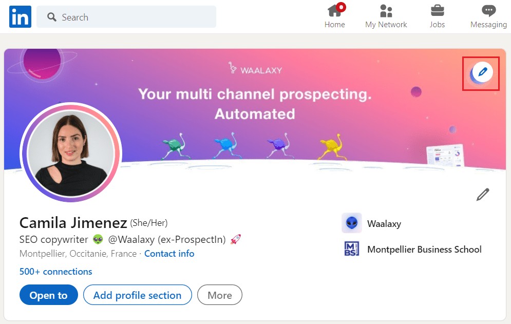
These banners appear at the top of an individual’s LinkedIn profile. They provide a unique opportunity for professionals to express their personal brand, showcase their professional ethics, or highlight significant accomplishments.
Personal profile banners act as the backdrop of your first impression on LinkedIn, making them crucial for personal branding.
2. Company Page Banners
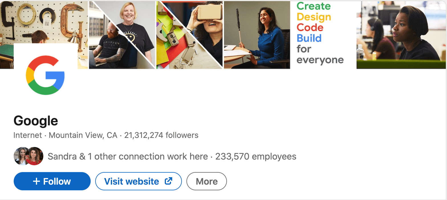
Like personal profile banners, company page banners are used on LinkedIn. They are important for communicating a company’s brand identity, promoting company culture, or announcing other important business events.
Company page banners are larger and can help attract potential employees, clients, or partners by presenting an image of the company’s ethics and industry positioning.
3. LinkedIn Ads
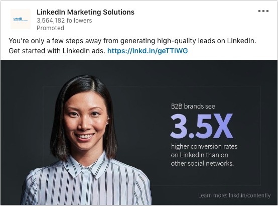
These banners are used in LinkedIn advertising campaigns and are intended to drive specific marketing goals, such as website visits, signup events, or lead generation.
These ads appear in a variety of formats and locations throughout the LinkedIn website and are designed to catch the eye of potential clients through strategic placement and compelling design.
Key Specifications for LinkedIn Banner Ads
Navigating the technical requirements of LinkedIn banner ads is essential to ensuring your banners look professional and work well within the platform. However, different types of LinkedIn banners have unique marketing purposes and come with specific designs. Therefore, adhering to the following guidelines is essential for optimizing banner performance across various devices and user interfaces.
Dimensions and File Sizes
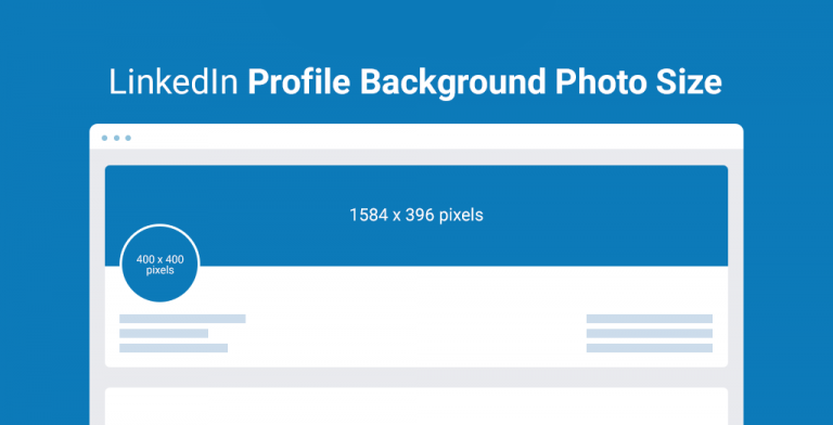
1. Personal Profile Banners
- Standard Dimensions: 1584 x 396 pixels
- Maximum File Size: 8MB
This size ensures that the banner will display correctly on both desktop and mobile devices, maintaining a clean and professional appearance.
2. Company Page Banners
- Standard Dimensions: 1536 x 768 pixels
- Maximum File Size: 8MB
These dimensions are designed to make a striking impact on a company’s LinkedIn page, offering ample space for creative branding and messaging.
3. Linkedin Ads
- Horizontal (Sponsored Content): 1200 x 627 pixels
- Maximum File Size: 5MB
These are often used for sponsored posts and need to be visually appealing to stand out in the LinkedIn feed.
Formats
LinkedIn supports several file types for banner ads, with JPEG, PNG, and GIF being the most commonly used. Each format offers different benefits:
- JPEG: Ideal for photographs and real-life images, offering good quality and compression to maintain file size efficiency
- PNG: Best for banners with text, logos, or images that require transparency
- GIF: Suitable for simple animations, which can be very engaging but should be used sparingly to maintain professionalism
Resolution and Responsive Design Considerations
- High Resolution: It is key in preventing images from appearing pixelated or blurry, especially on high-definition screens. So, make sure it is set to at least 72 DPI (dots per inch) in RGB color mode to keep the visual clear and vibrant.
- Responsive Design: LinkedIn banners need to look good on both desktop and mobile devices. Thus, you need to consider how images and text will display between different screen sizes. For example, important text should be centered and clearly legible, and any critical visual elements should not be placed on the far edges of the banner where they might be cropped out on smaller screens.
Create impactful LinkedIn ads that drive engagement and build connections with Predis.ai's LinkedIn Ad Maker. Elevate your LinkedIn ads game with smart ad creation.
Design Principles for Linkedin Banners
Once the technical specifications of LinkedIn banners are well understood, the next step is to focus on the design aspects to maximize their effectiveness. Good design captures attention and communicates your brand’s message in a clear and compelling manner.
Here, we will explore essential design principles, including color use, typography, imagery, and branding alignment, as well as tips on optimizing banner designs for visibility and engagement.
1. Color Use
Color is a powerful tool in visual communication, influencing perception and emotions. So, choosing the right colors for your LinkedIn banner can set the tone of your message and reinforce your brand identity.
Use colors that align with your brand identity to ensure consistency across all marketing materials. Consider the psychology of colors:
- Blue is often associated with trust and dependability, making it a frequent choice for corporate brands.
- Green can convey growth and freshness, ideal for companies related to health or sustainability.
- Red draws attention and can evoke excitement or urgency but should be used sparingly to avoid overwhelming viewers.
2. Typography
Typography is another important element that affects the readability and personality of your banner. Thus, it is crucial to select fonts that reflect your brand’s personality and are legible in various sizes. Further, limit the number of font types to maintain a clean and professional look.
Use bold or larger fonts for the main message and keep secondary information in smaller, simpler fonts to create a hierarchy that guides the viewer’s eye through the content.
3. Imagery
Images in LinkedIn banners should be high-quality and relevant to your message. Whether you choose stock photos, original graphics, or real-life images, ensure they are professionally rendered and appropriately licensed.
In addition, images should complement the text and not overshadow it. Therefore, consider the use of people in images wisely, as human faces can attract attention and make the banner feel more personal and relatable.
4. Branding Alignment
Every element in your banner should match your overall branding strategy. This includes logo placement, color scheme, font choices, and the tone of the imagery.
Consistency in these elements across all your marketing materials helps strengthen your brand identity and increases recognition.
Optimizing Banner Design for Visibility and Engagement
To maximize visibility and engagement:
- Ensure key information is placed in the central part of the banner, where viewers are most likely to focus.
- Use contrast effectively to make your banner stand out. A high contrast between text and background can enhance readability.
- Consider adding a clear call to action (CTA). This could prompt visitors to visit a website, follow a page, or learn more about a product or service.
Using Predis.ai to Design LinkedIn Banners
After mastering the principles of banner design and content creation, the next step is to bring these elements to life efficiently and effectively. This is where Predis.ai, a sophisticated AI-based social media content generation tool, becomes invaluable.
Predis.ai simplifies the process of creating high-quality LinkedIn banners, ensuring that they meet professional standards and resonate with your target audience.
Streamlining Banner Creation with AI
Predis.ai leverages artificial intelligence to offer design suggestions that are aesthetically pleasing and aligned with your brand’s messaging and goals. This AI-driven approach eliminates most of the design guesswork, giving users optimized templates and layouts for engagement and visibility on LinkedIn. Here’s how Predis.ai enhances the banner creation process:
- AI-Driven Design Suggestions: Based on the latest trends and data, Predis.ai recommends designs that are likely to perform well, taking into account factors like industry specifics, target demographics, and the intended message of your campaign.
- Automatic Resizing: One of the tool’s standout features is its ability to adjust the size of your banners for different platforms automatically. This means that the same design can be created for LinkedIn and other social media platforms, ensuring consistency across your digital presence.
- Efficient Iteration: With Predis.ai, you can quickly modify designs based on feedback or changing requirements, accelerating the production cycle and allowing for agile marketing adaptations.
Enhance your LinkedIn page with custom banners made easy using Predis.ai's LinkedIn Banner Maker.
Best Practices for LinkedIn Banner Performance Optimization
Creating a visually appealing LinkedIn banner is just the first step. The real challenge is to continue optimizing its performance to have a greater and more effective impact. This involves constant testing, analysis, and adjustment based on data-driven insights.
Here, we’ll explore some essential strategies for optimizing your LinkedIn banner ads, emphasizing the importance of A/B testing and analytics and the need for ongoing updates to your banner designs.
1. Embracing A/B Testing
A/B testing is a powerful way to compare two versions to see which performs best in a live environment. This approach allows you to make incremental changes and measure their impact on viewer engagement and conversion rates. Here are a few aspects to consider when doing A/B tests for your LinkedIn banners:
- Variable Elements: Test different calls-to-action, images, or even color schemes to see what resonates best with your audience.
- Duration and Timing: Run each test for a sufficient period to collect actionable data, ensuring that you account for any variability in traffic or audience behavior throughout the week.
- Metric Focus: Decide on clear performance indicators such as click-through rates, engagement levels, or conversion metrics to determine the success of each version.
2. Utilizing Analytics for Insightful Feedback
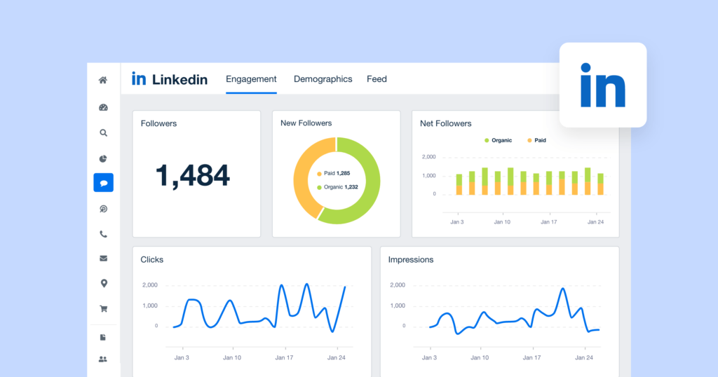
Analytics play a key role in understanding how your banner is performing and identifying areas for improvement. LinkedIn offers advanced analytics that can help you measure the effectiveness of your banner in real-time. Key metrics to monitor include:
- Engagement Rate: Measures the interaction (likes, comments, shares) relative to the number of impressions.
- Click-Through Rate (CTR): It is the percentage of viewers who clicked on the banner out of the total viewers.
- Conversion Rate: Tracks how many of these clicks translated into predefined actions, such as filling out a contact form or downloading a resource.
3. The Importance of Continuous Improvement
The digital marketing landscape is constantly evolving, and what works today may not work tomorrow. Regularly updating your LinkedIn banners is essential to keeping them fresh and engaging. This can involve:
- Refreshing Visuals and Content: Periodically update your banners with new images, updated messaging, or current offers to maintain relevance.
- Seasonal Adjustments: Tailor your banners for upcoming events, holidays, or industry-specific dates to maximize relevance and engagement.
- Learning from Feedback: Incorporate lessons learned from past campaigns to refine your approach, using both qualitative feedback and quantitative data.
Wrapping Up: Optimizing Your LinkedIn Profile for Maximum Impact
In this guide, we have delved into the nuances of crafting and optimizing LinkedIn banner ads. From understanding specific essential specifications to implementing advanced strategies for better performance, the importance of adhering to correct sizes and best practices is clear. These ensure your banners are both professional and effective in engaging your audience.
Efficiency is important in the dynamic world of digital marketing. Predis.ai offers a vital tool that simplifies LinkedIn banner creation with AI-driven design suggestions and automatic resizing.
This not only speeds up the design process but also ensures banners meet high professional standards. Suitable for personal branding, company promotion, or LinkedIn ad campaigns, Predis.ai supports a streamlined workflow that shifts focus from technicalities to strategy.
Sign up for Predis.ai today and transform your LinkedIn marketing strategy with banners that capture attention and drive engagement.
Related Content,
