In an era dominated by rapid-fire digital notifications and fleeting social media trends, you might wonder: Do posters still matter in 2026?
The answer is a resounding yes. While the medium has evolved, the “poster” has simply migrated from the physical telephone pole to the digital “wall.” Whether it’s a high-gloss A1 print in a subway station or a vertical graphic optimized for an Instagram Story, the poster remains the most effective way to distill an event’s essence into a single, persuasive visual.
Today, a poster isn’t just a piece of paper; it’s a multi-format marketing asset. In this guide, we’ll explore the anatomy of high-converting designs and break down specific styles inspired by the world’s most iconic brands and their poster design ideas to help your next event sell out.
What Makes a Great Event Poster Design?
antaŭ picking a color palette, you must understand the “Golden Rules” of visual communication. A pretty poster that doesn’t provide information is just art; a functional poster that doesn’t grab attention is just a flyer.
1. Information Hierarchy
Your reader’s eye should move in a specific order. Generally:
- La Hoko: Event Name or Headliner.
- La Loĝistiko: Date, Time, and Location.
- La Detaloj: Price or specific “vibe” indicators.
2. The Visual Hook
Whether it’s a stunning photograph, a custom illustration, or avant-garde typography, your poster needs one “Hero” element. If everything is loud, nothing is heard.
3. A Single, Clear CTA
In 2026, “Check our website for more” is too vague. Your Alvoko al Agado (KTA) should be singular and urgent: “Scan to Book,” “Register via Link in Bio,” or “Limited Early Bird Tickets Available.”
4. Marka Konsistenco
Your poster is an extension of your brand. If you are a corporate law firm, neon pink “Boiler Room” aesthetics will confuse your audience. Stick to your la identeco de marko, fonts, colors, and tone.
Must-Have Elements in Every Event Poster
Don’t let your creativity overshadow the basics. Ensure these seven elements are present:
- Eventa Titolo: The “What.”
- Dato Tempo: The “When.”
- loko: The “Where” (include a city if promoting nationally).
- Ticket Info: Price or “Free Entry.”
- CTA: A QR code is mandatory for print; a button is mandatory for digital.
- Lineup/Speakers: The “Who.”
- Sponsoroj: Visual social proof.
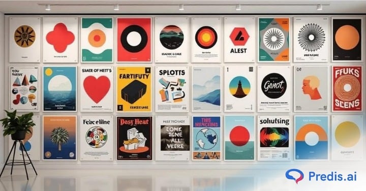
10 Poster Design Ideas Inspired by Global Brands
1. Humor-focused: Rippling Poster Design Ideas
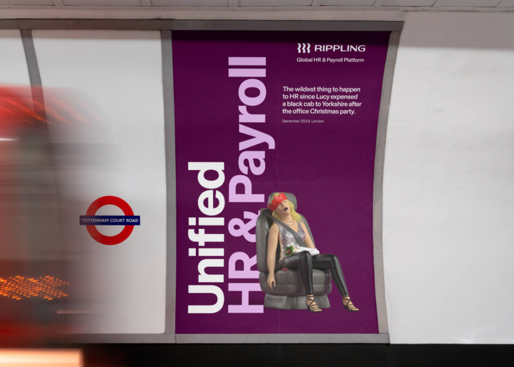
La Aspekto: High-contrast purples, light pinks, and a clear, humorous central visual element.
Plej bona por: Corporate tech events or B2B platforms using storytelling.
Strategio: It signals a “fresh approach” to serious topics immediately, appealing through humor.
This poster works because it’s relatable and clear despite looking “boring” (like a tech ad). It uses a simple trick: humor and storytelling.
By putting a funny story and visual (Lucy’s taxi ride and exhaustion) against a clean purple background, it grabs your eye with its unexpected tone. It also organizes information perfectly—you see the cool brand name (Rippling) first at the top, and once you’re interested, your eyes naturally drop to the bottom where the specific unified service is listed in large font. It feels like the modern, agile company is promoting: fresh, human, and direct.
2. Let the image do the talking: Fnac
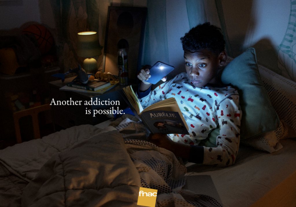
La Aspekto: Soft, cinematic lighting, a relatable domestic setting, and a single dramatic light source (the phone).
Plej bona por: Educational campaigns, bookstores, or cultural institutions promoting healthy habits.
Strategio: It uses “visual irony” to flip a negative stereotype (screen addiction) into a positive message about litefrivola.
This poster works because it tells a powerful story through drama lumigado. It uses a simple trick: the subversion of expectations.
By showing a child looking “hooked” on a light source in the dark, you initially expect to see a smartphone screen; instead, the light is being used to read a book. This creates a clever “aha!” moment that sticks in your mind.
It organizes information perfectly—your eyes start with the bright, glowing face of the child, move to the surprising “addiction” (the book), and then land on the simple white text and small logo. It feels like the brand it’s promoting: thoughtful, clever, and culturally relevant.
3. Deep Dish Drama: The Chicago Town Style
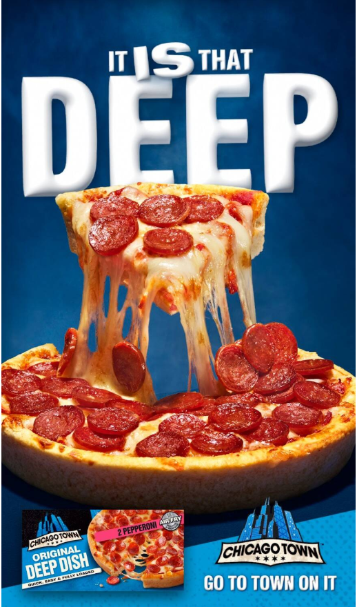
La Aspekto: Hyper-realistic food photography, bold 3D typography, and a “cool” blua kolora paletro to make the warm colors of the food pop.
Plej bona por: Fast-moving consumer goods (FMCG) and food advertising.
Strategio: It uses visuals to trigger an immediate physical craving, focusing on texture and scale to emphasize a specific product feature.
This poster works because it uses exaggerated scale to make a simple product look epic. It uses a simple trick: visual weight.
By placing massive, puffy 3D text at the top and a high-angle shot of a “cheese pull” in the center, it forces you to feel the thickness and “depth” of the pizza.
It also organizes information perfectly—you see the bold claim (“IT IS THAT DEEP”) first, your eyes follow the dripping cheese down to the product, and finally land on the packaging and logo at the bottom for brand recognition. It feels like the brand it’s promoting: fun, satisfying, and over-the-top.
4. Neon Nightlife: The Boiler Room Style
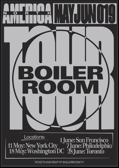
La Aspekto: High-contrast blacks, neon greens or reds, and “glitch” textures.
Plej bona por: Underground DJ sets and electronic music events.
Strategio: It signals an “after-hours” vibe immediately, appealing to a specific subculture.
This poster works because it’s bold and easy to read despite looking “edgy.” It uses a simple trick: kontrasto.
By putting big, chunky light-gray shapes against a solid black background, it grabs your eye from across a room. It also organizes information perfectly—you see the cool brand name (Boiler Room) first in the center, and once you’re interested, your eyes naturally drop to the bottom where the specific dates and cities are listed in a cleaner font. It feels like the underground music scene it’s promoting: raw, loud, and modern.
5. Speaker Portrait: The TEDx Style
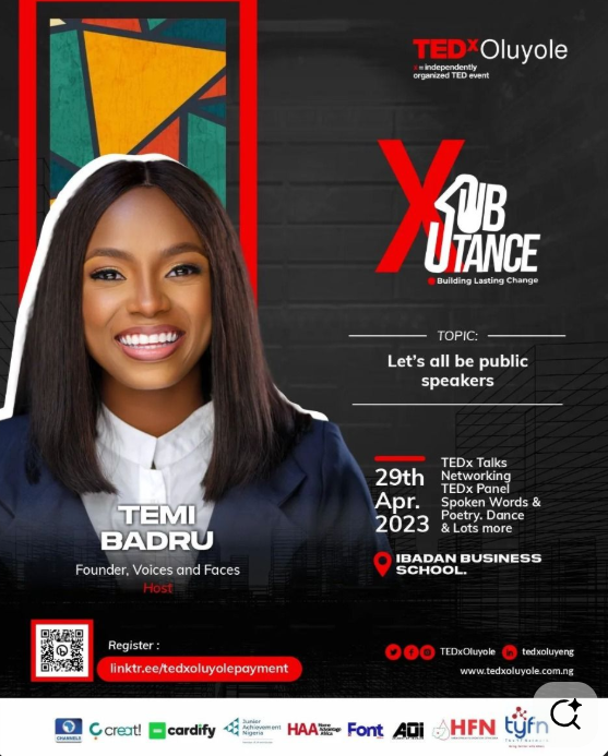
La Aspekto: A high-quality, close-up headshot of the speaker with a solid color background and a “big idea” headline.
Plej bona por: Seminars and thought-leadership panels.
Strategio: Humans connect with faces. Showing the speaker builds instant trust and authority.
Ĝi uzas a clear focal point kaj structured layout to make a lot of information feel organized. The high-quality photo of the speaker on the left creates an immediate human connection, while the bright “TEDx red” accents draw your eyes to the most important parts—the event name and the registration link.
Ĝi uzas visual blocks to separate the speaker, the topic, and the event details, which prevents the design from feeling cluttered. By keeping the background dark and the text white, the “who, what, and when” of the event are instantly readable, making it look professional and trustworthy.
6. Minimalist Magic: The Absolut Style
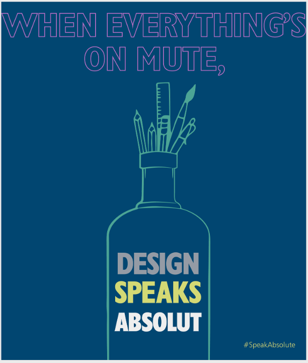
La Aspekto: Clean outlines, flat colors, and a hidden bottle shape made out of drawing tools.
Plej bona por: Art projects or famous brands that everyone already recognizes.
Strategio: It uses a “shape-shifting” trick to show that the brand supports creators and artists.
This design is a winner because it plays a game with your eyes. Instead of showing a real bottle, it just draws the edges and fills the top with pens and brushes, making you realize it’s an ad for “Design” before you even read the text.
The layout is super organized—you read the top part about things being “on mute,” and then your eyes land right on the big, bold words inside the bottle that give you the answer.
7. Bold Rebellion: The Muserk Style
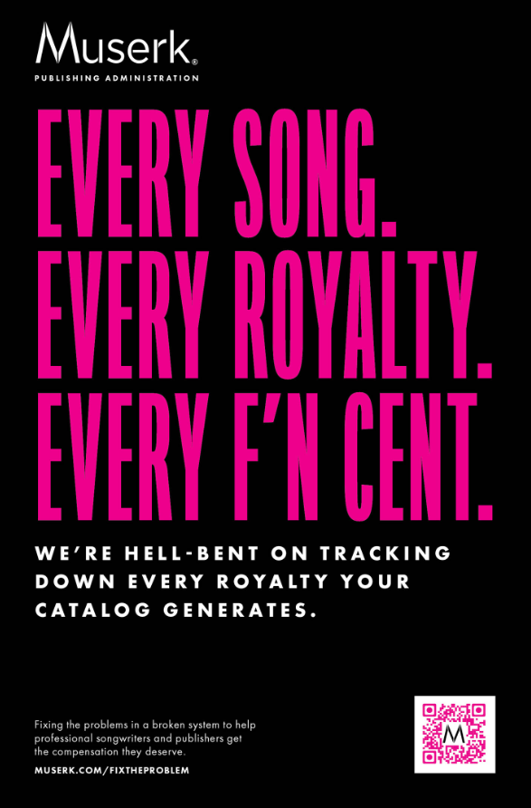
La Aspekto: Massive, ultra-tall hot pink typography set against a deep black background.
Plej bona por: Disruptive brands or services that want to look tough and uncompromising.
Strategio: It uses “aggressive” visuals and blunt language to show that the company is a fighter for its clients.
This poster hits hard because it doesn’t hide behind pretty pictures. It relies entirely on giant, stretched-out words to grab you by the collar.
Using a “shouting” font and slightly edgy language, it makes a boring topic like royalty payments feel intense and urgent. The setup is simple: the big pink text delivers the attitude, the smaller white text explains the mission, and the QR code gives you a place to go next.
8. Retro Nostalgia: The Coca-Cola Style
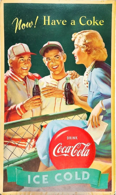
La Aspekto: Distressed textures, warm cream/red tones, and script fonts from the 1950s.
Plej bona por: Food festivals, vintage markets, and “heritage” events.
Strategio: Nostalgia triggers emotional safety. It makes people feel like they are attending something “classic.”
It sells a sento, not just a drink. Using warm, hand-painted illustrations of smiling people at a baseball game, it connects the product to happy memories and social connection.
The design uses a triangular layout—your eyes start at the bright yellow text at the top, move down to the shared bottles in the middle, and land on the iconic red Coca-Cola “button” at the bottom.
The use of complementary colors, like the bright red logo against the green background, makes the branding pop instantly, while the words “Ice Cold” at the base provide a final, refreshing “call to action” that’s hard to ignore.
9. Sponsor-Focused: The Formula 1 Style
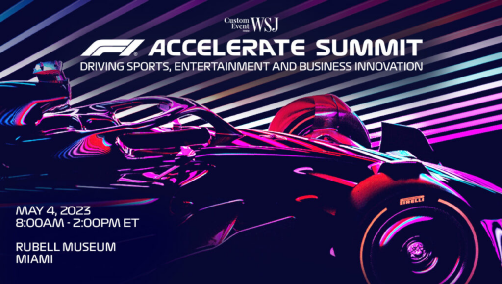
La Aspekto: A clean color palette that perfectly aligns with the aesthetics of the product.
Plej bona por: Professional sports and corporate galas.
Strategio: Shows the design as well-balanced.
The high-contrast, neon pink and blue lighting on the car gives the design a modern, high-tech “synthwave” feel, making the event seem premium and cutting-edge.
By placing the bold white text in the upper-right and the event details in the bottom-left, the design creates a balanced composition that guides your eyes across the entire image without distracting from the main star—the car. It successfully communicates “innovation” and “high performance” before you even read a single word.
10. The Split Layout: The Spotify Style
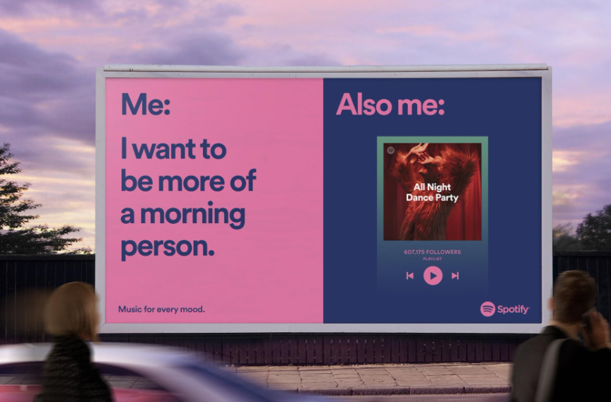
La Aspekto: Left side is a meme; right side is a playlist that complements the joke.
Plej bona por: Meme kind of posters.
Strategio: Perfectly balances the visual (emotion) with the text (information).
Splitting the layout into two high-contrast color blocks, it creates a “before and after” story that is easy to digest at a glance.
The large, bold typography mimics how we speak on social media, making the brand feel personal and funny rather than corporate. It’s smart because it places the product (the Spotify playlist) as the punchline to the joke, showing that the app understands your real-life habits.
By keeping the design minimalist and colorful, it ensures the message is the hero, making you smile and remember the brand while you’re passing by.
Tips to Make Your Posters Go Viral
- Add a Hook Line: “The night you won’t remember” is better than “A dance party.”
- Design for Stories: Create a 9:16 version with “Link in Bio” space at the bottom.
- Interagaj Elementoj: Adding a QR code that leads to a hidden playlist or a “secret” location map creates an instant digital bridge.
- Location-Specific Wit: Mentioning a local landmark or a common neighborhood struggle makes people feel like the poster was made specifically for them.
- Call to Controversy: Making a slightly polarizing statement about a harmless topic (like “Pineapple belongs on pizza”) sparks immediate debate and gets people tagging their friends.
- Vida Profundo: Using 3D shadows or “trompe l’oeil” effects that make the image look like it’s popping off the wall creates a “must-see” moment that looks amazing in photos.
Oftaj Dezajnaj Eraroj por Eviti
- Font Overload: Never use more than two different font families.
- Malalta Kontrasto: Light grey text on a white background is a death sentence for readability.
- The “Clutter” Trap: Trying to include every single detail (like a full menu or 5 paragraphs of bio) on the poster. Save that for the landing page.
- Pixelation: Using a low-res logo or photo. It makes your event look amateur.
konkludo
A poster is the “front door” of your event. Whether it’s printed on cardstock or rendered on an iPhone screen, its job is to make someone stop, look, and take action. By borrowing the visual language of brands like Apple, Nike, and Spotify, you can tap into pre-existing psychological triggers that signal quality, excitement, or prestige.
Don’t just make a poster—make an asset that people want to save, share, and scan.
FAQs
High-contrast pairings: Black and Yellow, Navy and White, or Red and White. These are the most readable combinations from a distance.
Yes, but only for print. On social media, people can’t scan a QR code on their own screen. Use a “Link in Bio” or a clickable button instead.