In an era where digital ads are skipped, blocked, and ignored, print has undergone a massive renaissance. The “digital fatigue” of the average consumer has reached an all-time high. We spend our lives behind glass screens, which has made the nature of high-quality print advertising more premium Dari sebelumnya.
Print isn’t dead; it’s just become more exclusive. When you hold a magazine or look at a billboard, you aren’t fighting a “Close X” button or a 5-second skip timer. You are engaging with art. In this guide, we’ll explore some of the most brilliant print ads ever created and dissect exactly why they work.
Why Print Advertising Still Reigns Supreme in a Digital World
Before we dive into the list, we have to address the elephant in the room: Why print?
- The Haptic Effect: Science shows that physical materials produce more confidence and “realness” in the brain. Touching paper triggers a different neural pathway than scrolling on a smartphone.
- Permanent Authority: A digital ad is ephemeral—it’s here for a microsecond and gone. A print ad is a physical artifact. It suggests that a brand has the budget and the confidence to commit an idea to ink.
- Tanpa Gangguan: Print is the last bastion of “single-tasking.” When someone reads a magazine, they aren’t toggling between 15 tabs. You have their undivided attention.
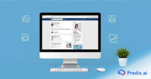
Buat Iklan Banner yang Menakjubkan
Dapatkan ROI yang Lebih Baik dengan Iklan yang Dioptimalkan AI
COBA SEKARANG
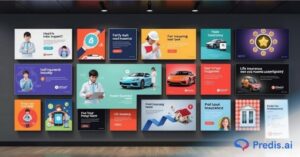
The Print Advertising that stole the show with their designs!
Section 1: Minimalist Masterpieces (The Power of Silence)
Minimalism isn’t just about space; it’s about respect for the viewer’s intelligence.
1. Volkswagen “Think Small.”
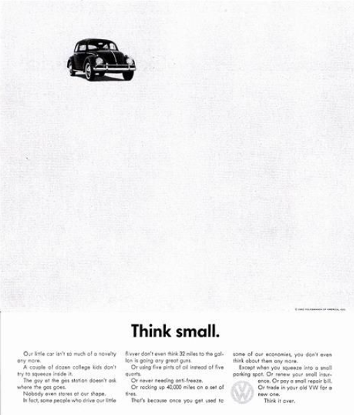
The grandfather of minimalist ads. By leaving the page mostly white, VW forced the eye to focus on the tiny car, subverting the “bigger is better” American mindset of the 1960s.
The “Think Small” ad is a classic because it did the exact opposite of what every other car ad was doing at the time. While other brands showed big, flashy cars and promised high status, Volkswagen was sangat jujur about being small and quirky.
The design used a tiny picture of the car and lots of space to grab your attention, making the Beetle look like the “honest” choice for smart people who didn’t care about showing off. It turned a weakness—being small—into a strength, proving that you don’t need to shout to be heard.
2. McDonald’s “The Golden M Arches” (Directional)
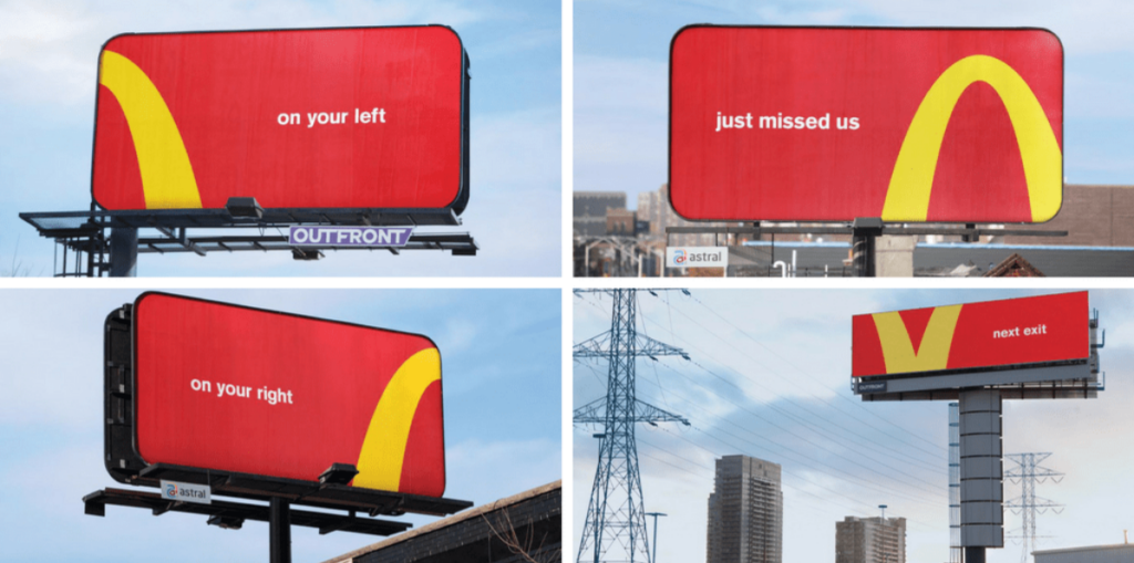
Using cropped sections of the logo to act as traffic signs. It proves that the brand is so iconic that you only need 10% of the logo to recognize it.
These McDonald’s billboards are iconic because they prove that a brand can be so famous that it doesn’t even need to show its full logo or name. By “cropping” the Golden Arches to act as directional arrows, the ads turn a global symbol into a simple, helpful tool for hungry drivers.
Ini adalah kelas master dalam pengakuan merek; it shows that the colors and curves of the logo are so deeply embedded in our minds that we can recognize the brand from just a tiny fragment. It’s clever, minimalist, and gets the message across in a split second.
3. Lego “Shadows.”
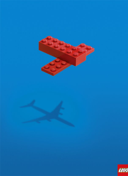
A simple brick on the floor with a shadow shaped like a dinosaur or a jet. It perfectly communicates that the “product” isn’t the plastic; it’s the imagination.
This LEGO ad is brilliant because it perfectly captures the kekuatan imajinasi without using any words. By showing a simple stack of red bricks casting the shadow of a realistic airplane, it highlights that the real magic of the toy isn’t the plastic itself, but what a child sees in their mind.
It celebrates the brand’s core identity—creativity and endless possibilities—using a clean, visual “aha!” moment. It’s iconic because it tells a deep, emotional story about childhood wonder through a very simple and clever optical illusion.
4. Nescafé “Zs.”
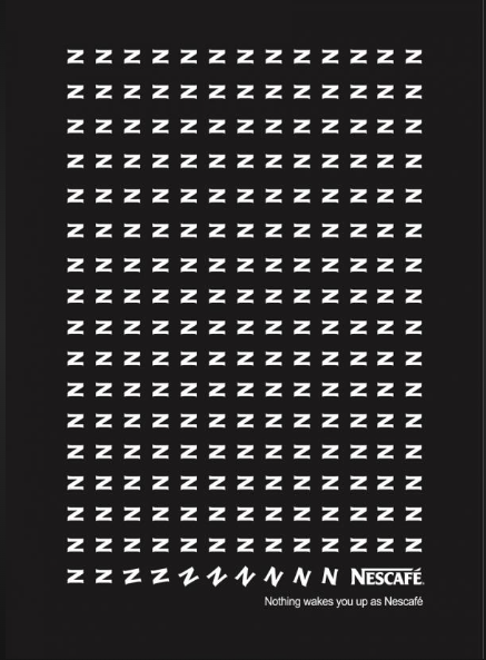
An ad featuring an “N” made of “Z”s that slowly turn into “N”s as they move down the page. It’s a visual representation of waking up.
This Nescafé ad is iconic because it uses cerita visual to show exactly how the product works without even needing a picture of a coffee cup. By turning a grid of “Z”s (representing sleep) into the “N” from the Nescafé logo, the ad creates a clever timeline of waking up.
It’s a great example of minimalism that respects the viewer’s intelligence; you “read” the transition from tiredness to energy just by looking at the changing shape of the letters. It’s simple, memorable, and perfectly summarizes the brand’s benefit at a single glance.
5. Jeep “See What You Want to See.”
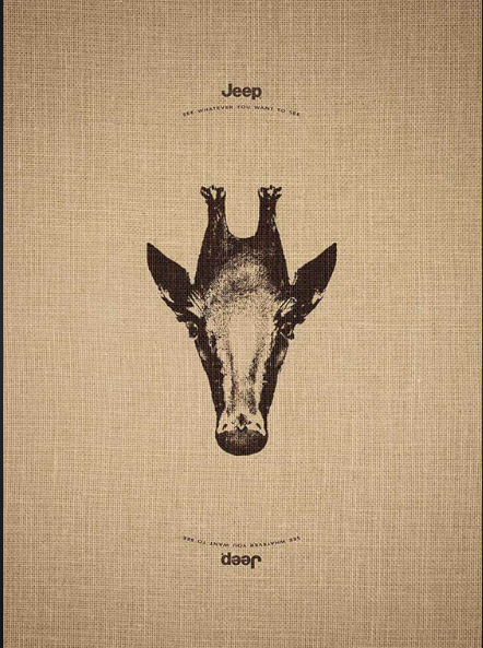
This Jeep ad is iconic because it uses a clever optical illusion to deliver its message of “total freedom.” By featuring an image that looks like a giraffe when viewed one way and a penguin when flipped upside down, the ad literally invites the viewer to “see whatever you want to see.”
This perfectly matches Jeep’s brand identity as a vehicle that can take you anywhere, from the African savannah to the Antarctic ice. It is a brilliant example of desain interaktif that engages the audience’s curiosity, turning a static piece of paper into a playful experience that reinforces the idea of limitless exploration.
6. Colgate “Flashlight.”
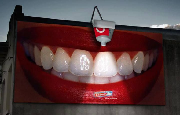
This Colgate billboard is iconic because it uses ambient advertising to turn a real-world object into part of the message. By placing a light fixture inside a toothpaste tube, the ad makes the beam of light look like a streak of whitening paste hitting a tooth. It’s a brilliant way to show “instant whitening” in a way that is impossible to ignore, especially at night.
This ad is memorable because it moves beyond the flat surface of a traditional billboard, using creativity and environment to grab attention and demonstrate the product’s main benefit in a fun, high-impact way.
7. Heinz “No One Grows Ketchup Like Heinz.”
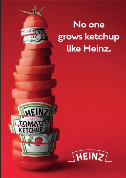
This Heinz ad is a total winner because it tells you exactly what’s in the bottle without showing you a single drop of sauce.
By stacking sliced tomatoes in the shape of their famous glass bottle, they’re hitting you with a “what you see is what you get” message about kesegaran dan kualitas. It’s super smart because it taps into the idea that their ketchup isn’t just made in a factory—it’s grown in a field.
Using tomato slices to mimic the label and cap is a playful way to show that their product is as natural as it gets, making you feel a lot better about reaching for that bottle the next time you’re having fries.
8. Cannes Lions “The Copy.”
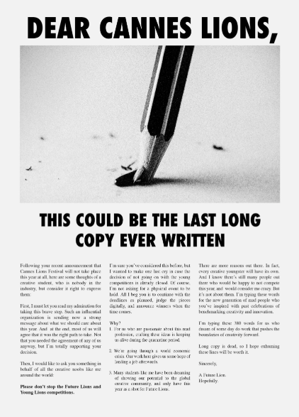
An ad with zero visuals, just 500 words of the most compelling prose you’ve ever read.
This ad is a bold “love letter” to the art of writing in an age where everyone’s attention span is shrinking. By using a broken pencil tip and a massive wall of text, it intentionally breaks the modern rule that “nobody reads anymore” to prove a point about passion and perseverance.
It was written during the pandemic when the world’s biggest advertising festival was canceled, acting as a raw, emotional plea for the industry to keep supporting young talent.
It’s a standout piece because it uses the very thing it’s mourning—long-form writing—to show that great ideas and deep stories still have the power to stop you in your tracks, even when they aren’t “quick” or “easy” to consume.
Section 2: Visual Metaphors & Clever Illusions
This is where the “genius” really kicks in. These ads require a “half-second delay”—the moment where the brain “gets it.”
9. FedEx “Neighbor.”
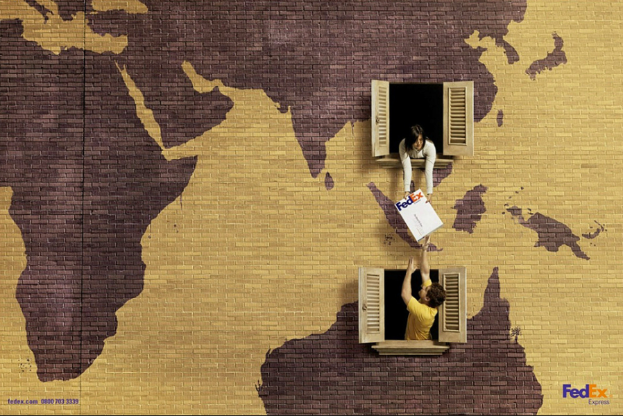
Two windows in different buildings where a package is being handed across—but the “distance” between the windows is actually a map of the world.
This FedEx ad is such a great example of “showing, not telling.” By having two people pass a package between windows that happen to be in different “continents” on a map, it makes the massive job of global shipping look as quick and easy as handing something to your neighbor.
It’s a clever way to shrink the world and tell you that no matter how far a package needs to go, FedEx makes the distance basically disappear. You don’t even need to read a single line of text to get the point: they’re fast, they’re everywhere, and they make international delivery feel personal and effortless.
10. Kielo Travel “Office Binders.”
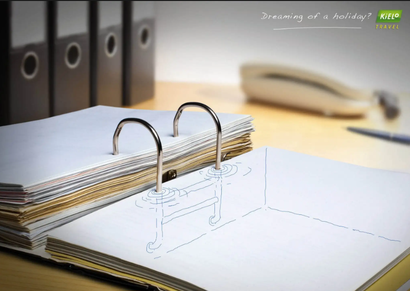
Looking at the spines of white office binders, but the gaps between them form the inside of a swimming pool.
This ad for Kielo Travel is a total standout because it hits on a feeling we’ve all had—sitting at a desk while our minds are miles away. By sketching a pool ladder underneath the metal rings of a boring office binder, it perfectly captures that “daydreaming” moment where mundane office supplies start looking like a vacation.
It’s such a relatable way to show that you’re overdue for a break without using a generic photo of a beach. The smart use of metafora visual turns the very thing making you stressed (paperwork) into an invitation to escape, making the brand feel like the perfect cure for your office blues.
11. Barilla “Fireworks.”
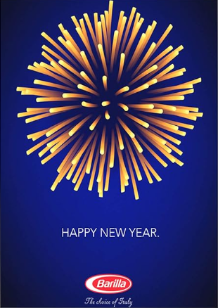
Spaghetti arranged to look like a celebratory firework display for New Year’s.
This Barilla ad is a fantastic example of how a brand can join a holiday celebration without being pushy. By simply arranging dry spaghetti noodles in a burst pattern, they’ve created a “firework” that feels both festive and perfectly on-brand.
It’s a great piece of visual wit because it uses the product itself to build the image, rather than just sticking a logo on a generic New Year’s photo. It’s elegant and lighthearted, making you look twice and smile when you realize those “sparks” are actually the pasta in your pantry—proving that you don’t need a loud message when your product is iconic enough to speak for itself.
12. Orion Telescopes “Flag.”
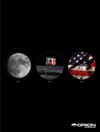
This Orion Telescopes ad is a total mic-drop because it uses a hilarious, unexpected punchline to prove how powerful their gear is. By showing the moon at different zoom levels, it builds up to a final shot so close that you can see a “Made in China” tag on the American flag.
It’s a genius way to demonstrate spesifikasi teknis—like 800x magnification—without boring you with a list of numbers. Instead of just saying their telescopes are clear, they use a bit of cheeky humor to show you that they can catch details you didn’t even know were there. It’s impossible to forget because it takes a legendary historical moment and gives it a funny, modern twist.
13. Keloptic “Van Gogh”
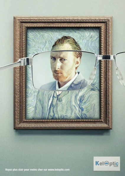
A pair of glasses placed in front of a Van Gogh painting; the part through the lens is a crisp, real-life photograph.
This Keloptic ad is such a clever way to show off their product because it uses one of the most famous art styles in history to prove a point about visi yang sangat jelas. By placing a lens over a blurry, Impressionist Van Gogh self-portrait and revealing a hyper-realistic photograph underneath, they’re telling you that their glasses don’t just help you see—they “fix” the world.
It’s a brilliant visual joke that turns a legendary painting into a simple “before and after” eye exam. You get the message instantly: if these glasses can sharpen the blurry brushstrokes of a masterpiece, they can definitely handle whatever your eyes are struggling with.
14. Ecovia “Stop the Violence.”

Hands painted with cars, showing a head-on collision when the hands punch each other.
This Ecovia ad hits hard because it uses a visceral, aggressive image to bridge the gap between “getting into a fight” and “getting into a car crash.” By painting cars onto the fist and face of the men, the ad visually translates the impact of a drunk driving accident into the familiar language of physical violence. It’s a powerful way to frame a car accident not as an “unfortunate mistake,” but as an act of violence that inflicts real pain.
The raw energy of the photo makes the “Stop the Violence” message feel urgent and personal, forcing you to look at the consequences of drinking and driving in a way that a simple warning sign never could.
15. Faber-Castell “True Colors.”
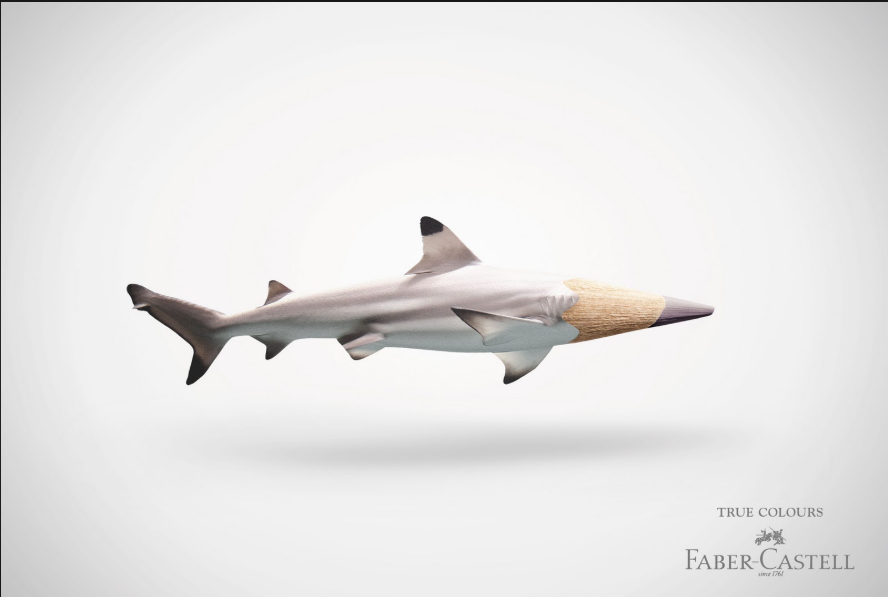
This Faber-Castell ad is a great example of how a simple visual can say more than a thousand words. By blending a shark’s body with the tip of a pencil, they are making a bold claim about their “True Colours”—basically saying that their pencils are so realistic, the colour you draw with is indistinguishable from the real thing.
It’s a clever way to show that their product isn’t just for sketching, but for bringing nature to life with total accuracy. The image is clean, sharp, and does a fantastic job of turning a standard art supply into something that feels powerful and high-quality, all without needing a long explanation.
16. Plant for the Planet
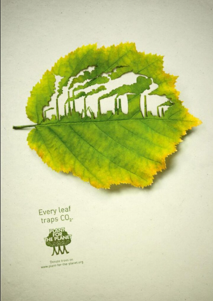
“Every leaf traps CO2.” A leaf shaped like a factory.
By carving a silhouette of a polluting factory directly into a leaf, it visually shows the battle between nature and industry. It’s a genius way to explain that “every leaf traps $CO_2$,” making the leaf look like a literal shield or a filter that’s standing in the way of climate change.
The ad doesn’t need to lecture you. It just uses that striking contrast to remind us that nature is our best defense against pollution. This is making the call to “plant for the planet” feel like a common-sense solution we can all get behind.
17. Oatly
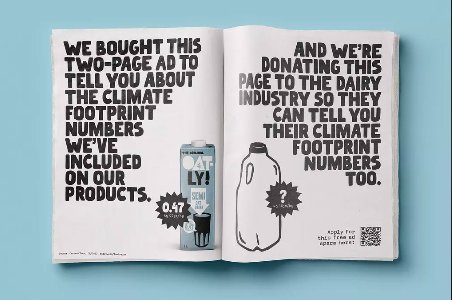
Instead of just bragging about being eco-friendly, they’re literally calling out their competitors. By offering them free ad space to show their own carbon footprint numbers, they taunt their customers. It’s super effective because it positions Oatly as the honest, confident brand with nothing to hide. Simultaneously, making the dairy industry look like they’re keeping secrets.
By using that bold, hand-drawn font and a “double-dog dare” tone, they turn a boring stat about CO2 into a high-stakes drama. This makes you feel like you’re joining a movement just by choosing oat milk over cow’s milk.
The Anatomy of a High-Converting Print Ad
If you want to create your own “genius” ad, you need to understand the four pillars of print anatomy.
1. The Visual “Hook.”
In print, the image isn’t a decoration; it is the headline. A genius ad often works without any text at all. If your visual requires a paragraph of explanation, it isn’t a print ad—it’s an essay. In 2026, we focus on Kontras Tinggi dan Single-Object Focal Points.
2. The Headline (The “Twist”)
If the visual is the setup, the headline is the punchline. Avoid being literal. If you show a picture of a car, don’t say, “This is a fast car.” Instead, say “Arrive before you leave.”
3. The Body Copy (The “Rationalizer”)
Most people won’t read the body copy, but those who do are your “hot leads.” Keep your line lengths short (about 50–60 characters). Use a font that is legible in CMYK—avoid tiny white text on a dark background (known as “knockout text”), as ink bleed can make it unreadable.
4. The Bridge (The CTA)
How does the reader move from the paper to your business? We use Kode QR Dinamis or Augmented Reality (AR) markers to make that happen. A genius print ad in the modern era acts as a portal to a digital experience.
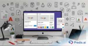
Tingkatkan Iklan Banner Anda
Tingkatkan Iklan Banner Anda ke Tingkat Berikutnya dengan AI
COBA SEKARANG
Step-by-Step: How to Design Your Own Iconic Print Advertising
Step 1: The “One-Thing” Rule
Most failed ads try to say three things. “We are cheap, fast, and high quality!” A genius ad says satu thing so loudly that the others are implied. Choose your “One Thing.”
Jangan dibuka Canva or Photoshop yet. Use a pen and paper. If your idea doesn’t work as a 2-inch sketch, it won’t work as a 20-foot billboard.
Armed with the idea and the sketch in hand, you are now well-prepared to start bringing the print ad to life.
Step 2: Make it from Scratch or use an Ad generator
You basically have two paths from here on out: building from the ground up or letting an Generator iklan AI melakukan pekerjaan berat. Predis.ai is a fan favorite because it bridges that gap—it’s like having a creative director and a graphic designer in one tool. Whether you want to “hand-stitch” every detail or just type a prompt and watch the magic happen, it simplifies the technical side so you can focus on the big idea.
The Two Paths to Great Ads
- The AI Generator Route: This is your “fast-track” option. You type in a simple one-line prompt about your product or goal, and the AI generates everything—the copy, the image or video, and even the hashtags.
- The “From Scratch” (Hybrid) Route: Even if you start with AI, Predis AI gives you a full-featured editor to fine-tune things. You can swap templates, upload your own brand assets (like logos and custom fonts), and manually adjust the layout. It gives you the control of a professional design tool without the steep learning curve.
- Built-in Brand Intelligence: One of the coolest parts is that you can save your “Merek Kit.” This means whether the AI builds it or you do, the colors and styles stay consistent across all your ads, so your brand is always recognizable—just like those iconic McDonald’s billboards.
Step 3: Technical Specs (The “Non-Negotiables”)
- Resolusi: 300 DPI (Dots Per Inch) is the minimum.
- Ruang Warna: Always design in CMYK, not RGB. Your screen shows light; paper shows ink.
- Bleed & Safety: Always give 3mm of “bleed” (extra image) around the edges so the printer doesn’t leave a white line when cutting the paper.
Once the design is ready in these particular specifications, your ad is ready to be published to the world.
Kesimpulan: Masa Depan Itu Nyata
The ads listed above all have one thing in common: They respect the medium. They don’t try to be TV commercials on paper. They use the stillness, the texture, and the permanence of cetak Iklan to make a statement. As we move deeper into a world of AI and virtual reality, the brands that can master the physical world will be the ones that stay in the consumer’s mind—and on their coffee tables—forever.
FAQ: Pertanyaan yang Sering Diajukan
Upfront, yes. But the CPM (Biaya Per Seribu) can actually be lower when you consider the “pass-along” value. One magazine in a doctor’s office might be read by 500 people. A digital ad is seen once and disappears.
Absolutely. Many designers in 2026 use AI for “concepting” and then refine the output in high-resolution software to ensure the print quality is sharp.